
23+ Dining Room Accent Wall Decor Ideas that Look Stunning by Candlelight in 2026

Here’s the thing nobody tells you about dining rooms – you barely see them in daylight. You walk through at noon and you eat in there at 7pm with two lamps and a couple of candles going, which means the wall behind your table has to earn its keep after dark. I’ve painted, paneled, papered, and plastered more dining walls than I can count, and the ones that stop people mid-sentence are almost always deeper, moodier, and more textural than anything I’d put in a living room.
Dining Room Accent Wall Decor Ideas
1. Drench the Long Wall in a Deep, Saturated Green
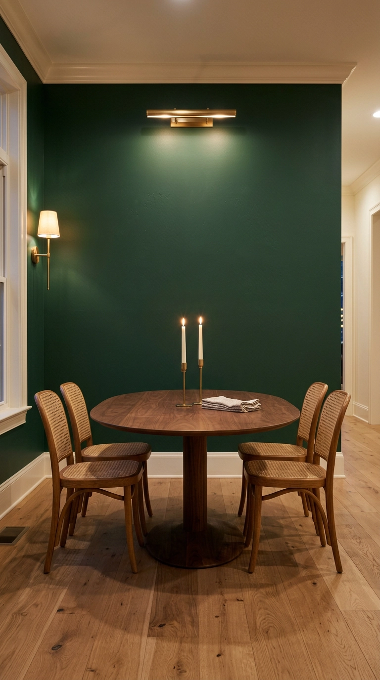
Start with the wall you see from the entry, not the one behind the table – that’s the one your guests read first. A deep green like Farrow & Ball Studio Green or Sherwin-Williams Pewter Green goes almost black by candlelight and turns the whole room into a jewel box, which is exactly why it works here and would swallow a living room whole.
2. Picture-Frame Moulding in Charcoal for Instant Old-House Bones
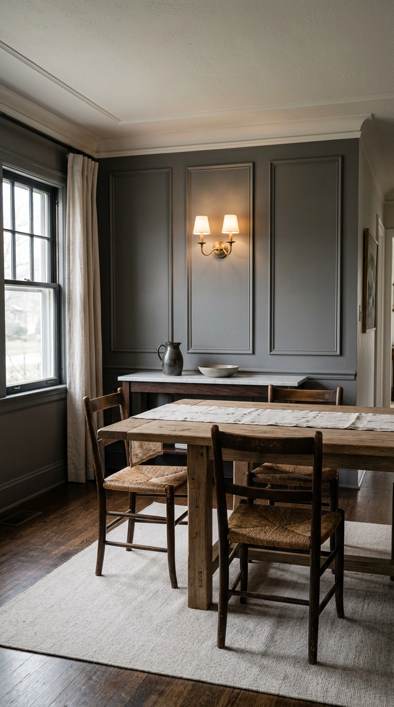
Picture-frame moulding is just thin trim laid out in rectangles on a flat wall, and it fakes a hundred years of architecture for about $150 in primed MDF. Keep the panels taller than they are wide, leave 4 to 5 inches of breathing room between them, and paint trim and wall the same color so it reads as one sculpted surface rather than a craft project.
3. Warm Clay Limewash for a Wall That Moves in Candlelight
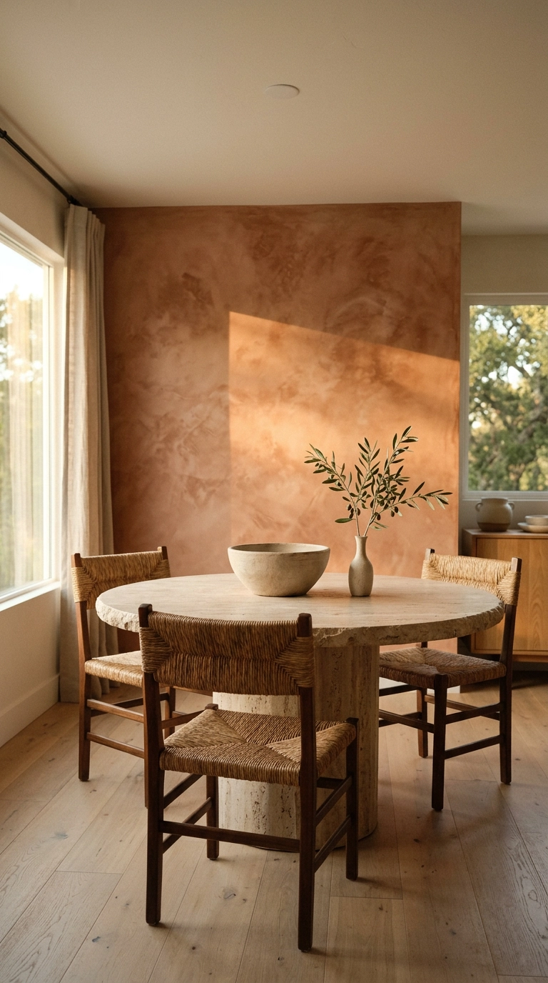
Limewash is mineral paint that dries cloudy and uneven on purpose, so the wall shifts as the light moves across it – flat paint can’t do that. In a dining room lit by candles and one pendant, that mottling reads as depth instead of a mistake.
4. Board and Batten Below, Soft White Above
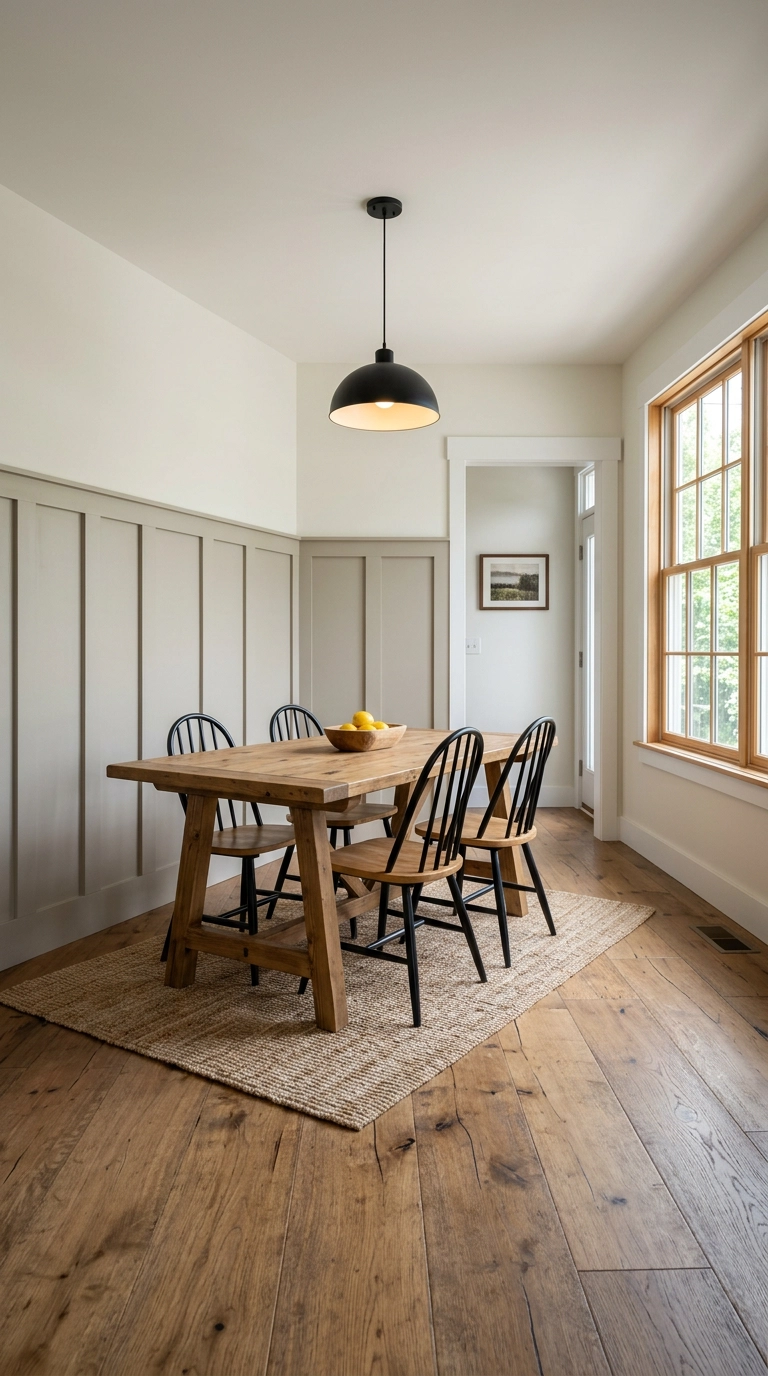
Run the battens to 40 to 44 inches, which lands just above the average dining chair back – any lower and the chairs cut the line in half every time you push them in. The cap rail also takes the beating your chairs would otherwise give the drywall.
5. A Bold Repeating Wallpaper Sized to the Room
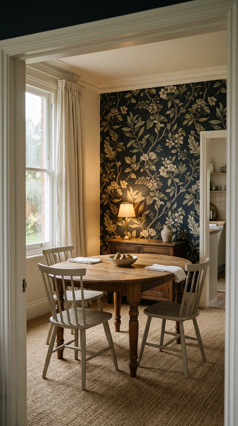
Scale is the whole game with wallpaper. In a small dining room, a big sprawling pattern on one wall actually reads calmer than a tiny busy repeat, because your eye follows a few large shapes instead of counting a thousand small ones.
6. Grasscloth for Texture You Can Feel Across the Table
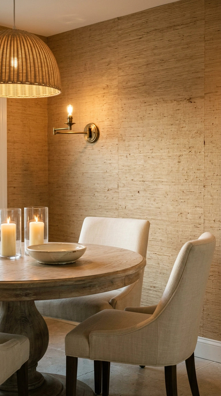
Grasscloth is the move when you want warmth without color. Under warm bulbs the woven fibers throw tiny shadows, so a plain sand-colored wall suddenly has depth from ten feet away where flat paint would look dead.
7. Full-Height Vertical Oak Slats Behind the Table
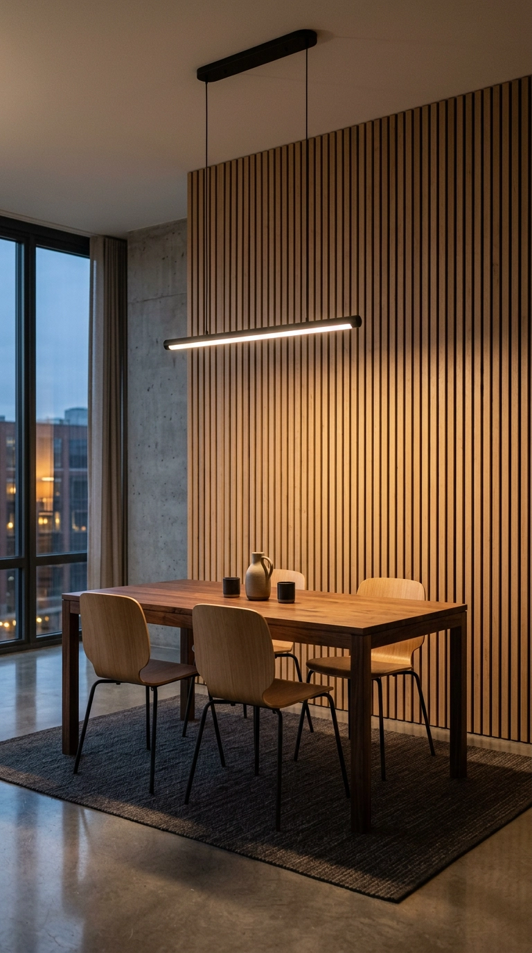
Slat walls live and die by the light. Aim a wash of warm light down the wall from above and each slat casts its own thin shadow, which is why this looks expensive at night and slightly flat at noon.
8. Full-Wall Gallery of Framed Art, Floor to Ceiling
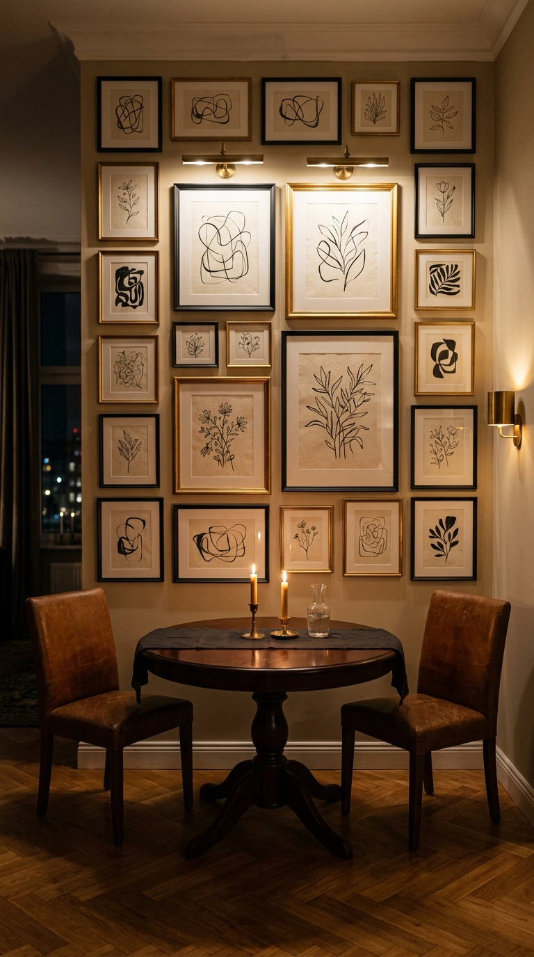
A dining room is the one place a truly dense art wall works, because everyone is seated and stationary for two hours with nothing to do but look. Hang it tight – 2 to 3 inches between frames – and let it run higher than you normally would, since seated eye level is about 46 inches, not 60.
9. An Antiqued Mirror Wall to Double a Small Dining Room
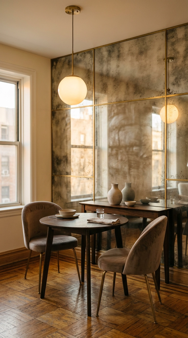
This is the oldest trick in the book and it still works – a mirrored wall on the long side of a narrow dining room visually doubles the width and throws candlelight back into the room twice. Go antiqued or smoked rather than clear, because a clear mirror shows your guests chewing.
10. A Blue and White Plate Wall That Actually Looks Collected
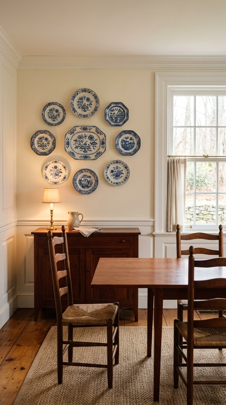
Plate walls go wrong when they’re symmetrical and evenly spaced. Lay the whole thing out on the floor first, use an odd number, vary the diameters, and let one or two plates sit noticeably off the grid so it looks gathered over years instead of bought in one afternoon.
11. Exposed Brick, Softened With a Whitewash
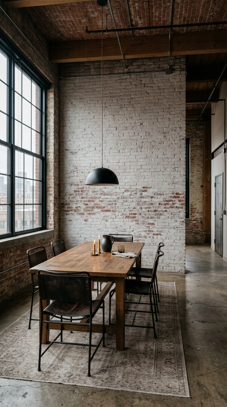
Raw brick can read cold and cave-like under artificial light, so I almost always thin white paint about four parts water to one part paint and wipe it on with a rag. You keep the texture and the shadow lines, you just lose the heavy red that fights everything else in the room.
12. A Built-In Shelving Wall That Doubles as Storage
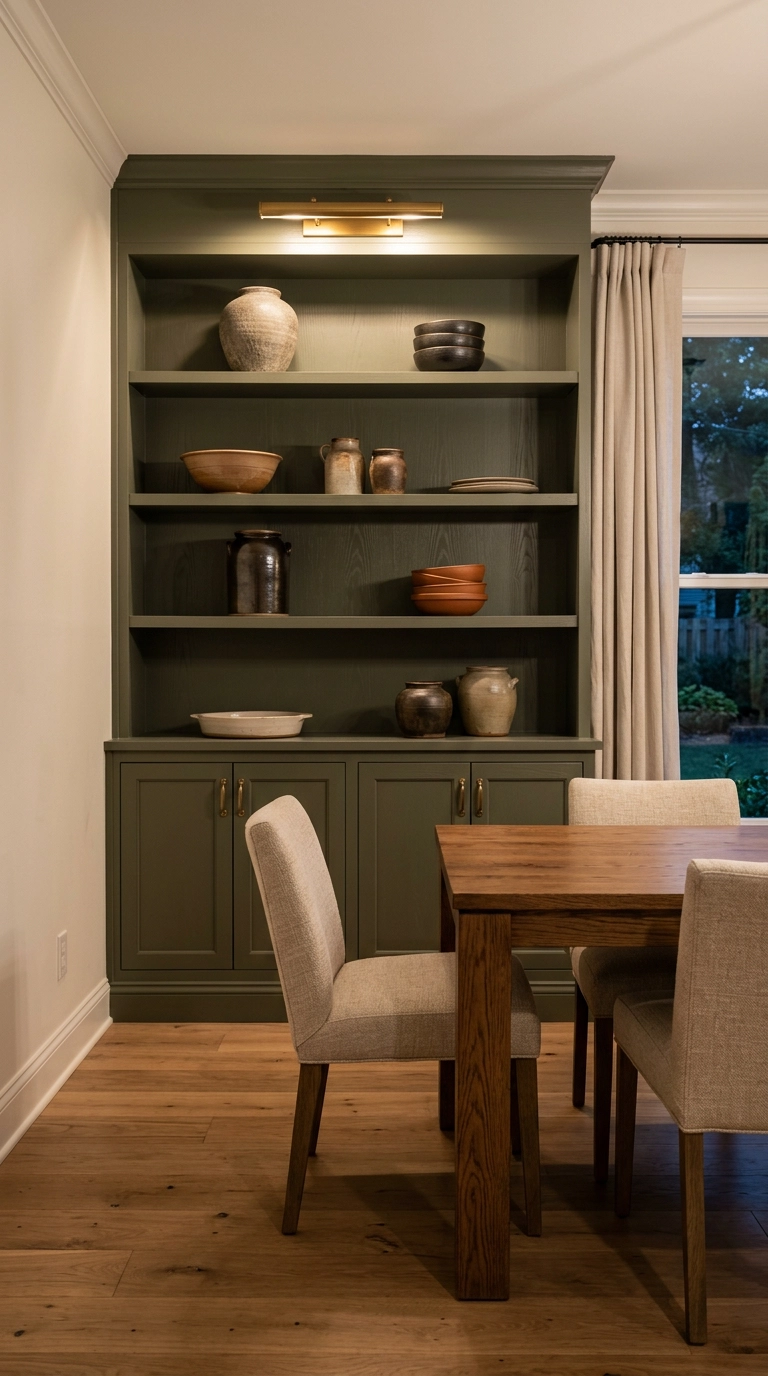
A dining room is usually the most under-used room in an American house, so giving one wall over to built-ins earns its square footage back immediately. Cabinets below for the platters you use twice a year, open shelves above for the pieces you actually like looking at.
13. Oxblood Walls for a Room You Only Use at Night
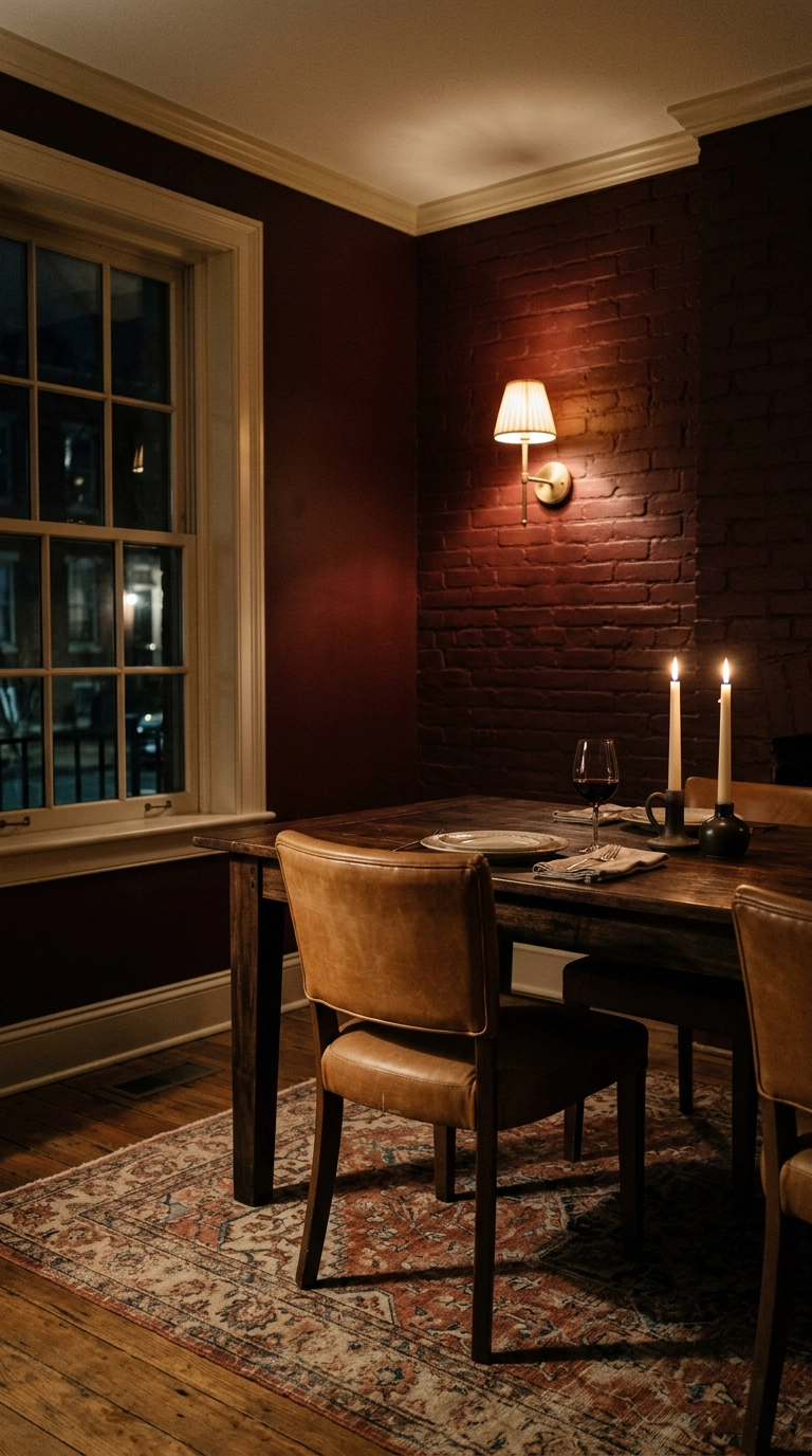
Red is the classic dining room color for a reason that has nothing to do with appetite myths – under warm bulbs and candle flame it glows, where the same shade in a bright south-facing kitchen would feel aggressive. Benjamin Moore Arroyo Red or Farrow & Ball Preference Red are the two I keep coming back to.
14. Tall Wainscoting Run High to Chair-Back Height and Above
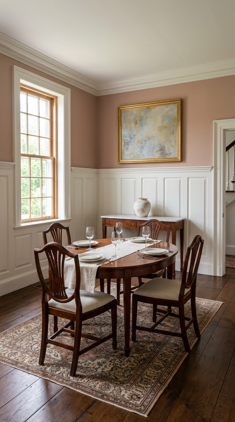
Most people run wainscoting to 32 inches and wonder why it looks stubby. In a dining room I push it to 48 to 54 inches, well above the chair backs, so the panels frame the seated view instead of getting sliced up by chair rails and shoulders.
15. Fluted Wood Panels Behind a Long Sideboard
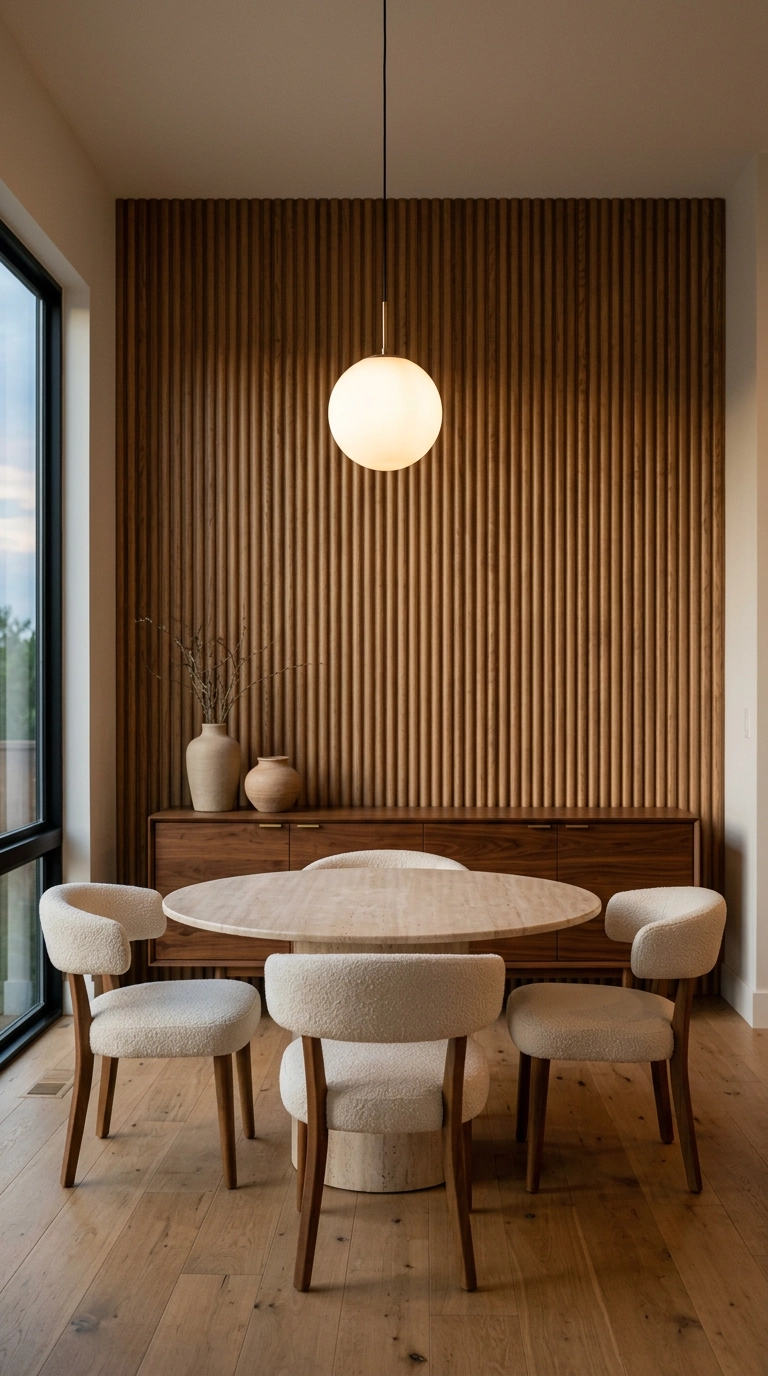
Fluting is slat wall’s more refined cousin – narrower grooves, rounded profile, and far less visual noise. It’s my pick when the dining room opens onto a living space and a chunky slat wall would shout too loud across the sightline.
16. One Oversized Piece of Art Instead of Twelve Small Ones
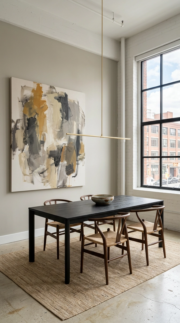
One big canvas beats a gallery wall when your dining room already has a lot going on. Size it to roughly two-thirds the width of the table below it and hang the center at about 57 inches – slightly lower than standard, because you’re designing for seated eyes.
17. Color Drenching – Wall, Trim, and Ceiling in One Shade
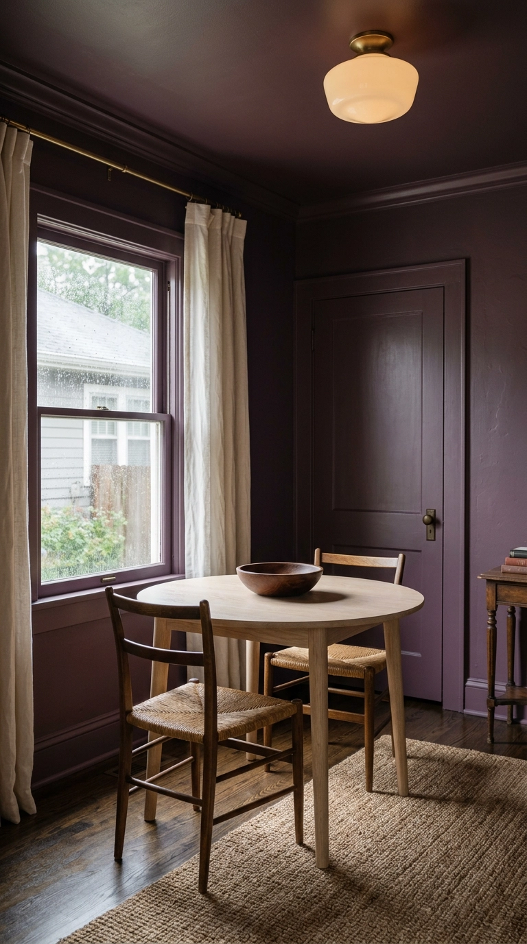
Color drenching means painting walls, trim, and ceiling the same shade so the eye finds no hard breaks – and in a small, boxy dining room that erases the corners and makes the room feel like one deliberate volume instead of a shoebox with edges.
18. Venetian Plaster in Warm Bronze for Real Sheen
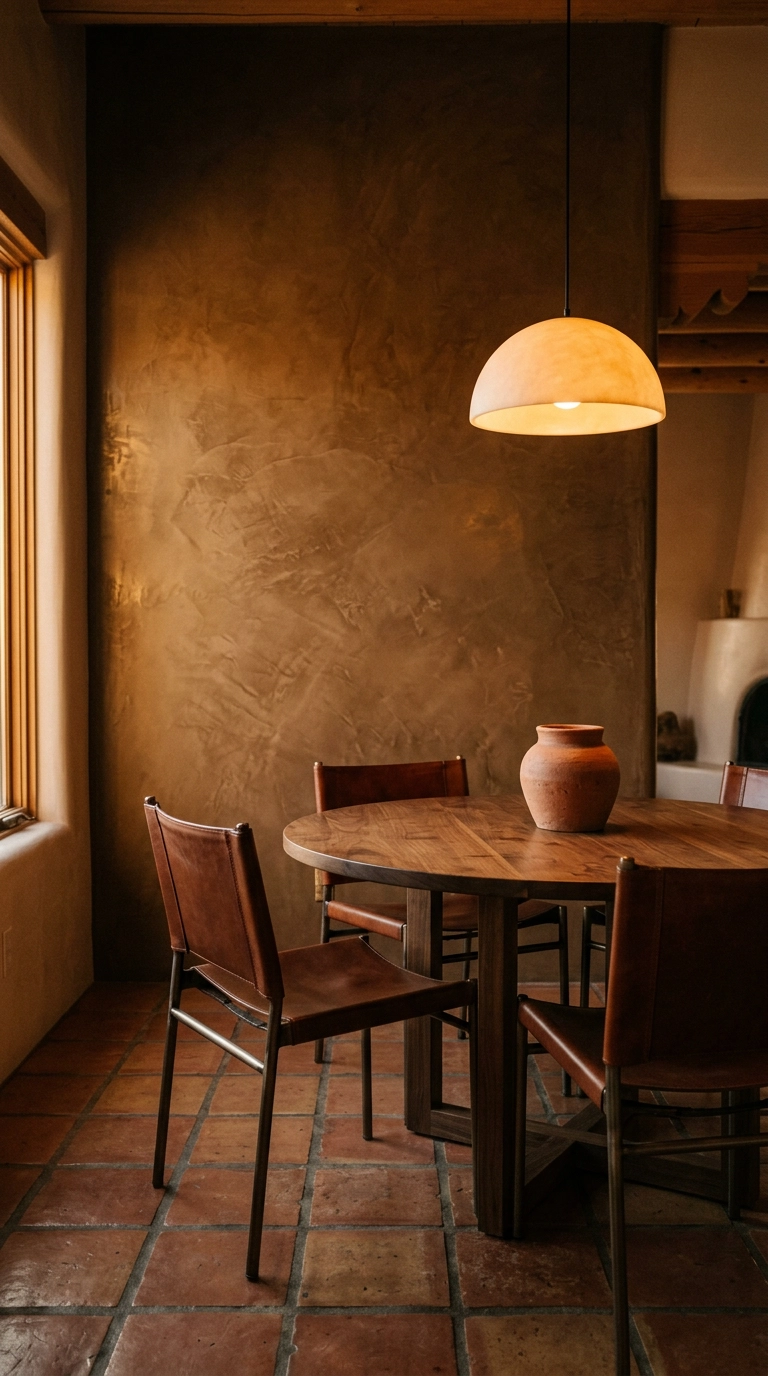
Where limewash goes chalky and matte, Venetian plaster gets troweled and burnished until it has a low metallic sheen – which means it catches candlelight and moves as you shift in your seat. It’s the most expensive-looking surface in this article.
19. A Woven Textile Hanging to Soften a Loud Room
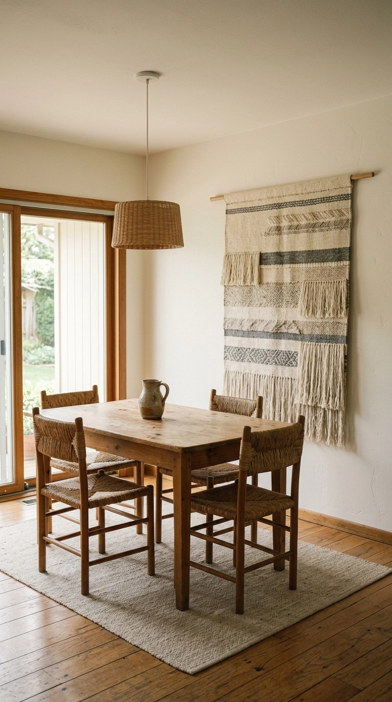
Dining rooms are acoustically brutal – hard table, hard floor, hard walls, and suddenly six people are shouting over each other. A large woven hanging absorbs a surprising amount of that echo while doing the visual work of an accent wall.
20. Tongue-and-Groove Painted Soft Taupe, Run Horizontally
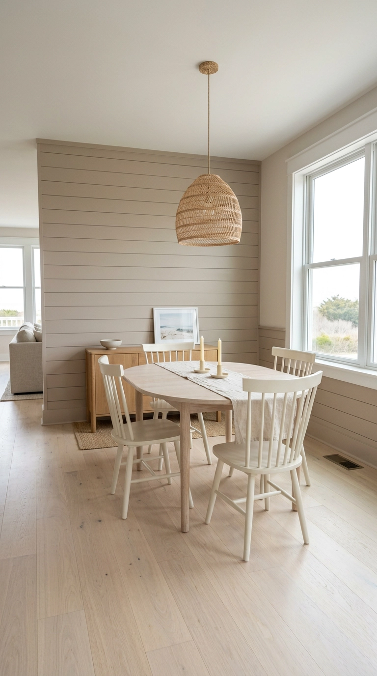
Run the planks horizontally and the wall visually stretches wide, which is the fix for a dining room that feels narrow and tunnel-like. Vertical does the opposite and lifts a low ceiling, so pick based on which problem you actually have.
21. Matte Black With Two Brass Sconces for Pure Drama
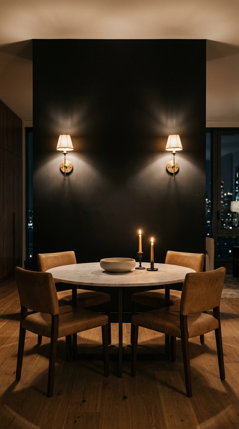
Black walls need something metallic to keep them from reading as a void, and brass is the warmest option under incandescent light. Mount the sconces at about 62 inches so the light falls on the table and faces rather than into standing eyes.
22. A Painted Arch to Frame the Sideboard
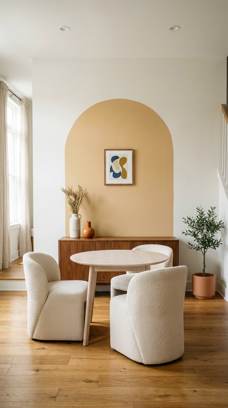
A painted arch is architecture for the price of a sample pot. Center it on the sideboard, make it roughly 6 inches wider than the furniture on each side, and top out around 78 inches so it doesn’t crowd the ceiling.
23. Aged Plaster With a Picture Rail for Leaning Art
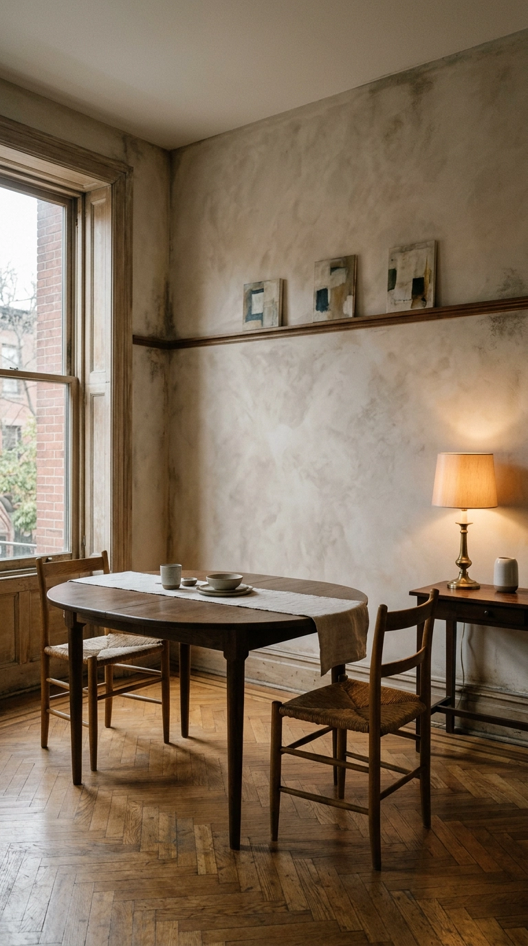
This is my favorite low-commitment version of a gallery wall. One slim rail at 66 inches, art leaned rather than hung, and you can swap the whole arrangement in five minutes without a single new nail hole.
24. A Hand-Painted Scenic Mural for the Wall You See From the Entry
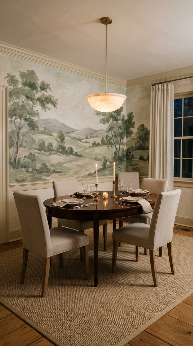
Scenic murals are having a real moment, and the dining room is the right place for one because you’re seated long enough to actually explore it. Keep the palette to three soft colors and let the horizon line land near seated eye level, around 46 inches, so the scene opens outward from the table.
Before You Pick Up a Paintbrush
If you only take one thing from this list, let it be this – choose your dining room wall based on how the room looks at 8pm, not 8am. I’ve watched clients fall in love with a soft grey in the store and then sit down to dinner under warm bulbs to find it’s gone lavender on them. Test at night, with your real lamps, with a candle lit.
The ideas I keep coming back to are the deep drenched green from the top of this list, the limewash that shifts as the light moves, and the picture-frame moulding that makes a builder-grade box look like it has history. Deep moody dining rooms are genuinely everywhere right now, and Farrow & Ball shades like Hague Blue and Studio Green have become shorthand for the whole look. Nate Berkus has been making the case for textured plaster walls for years, and honestly the industry finally caught up to him.
Start with the wall you see from the doorway, spend your money on texture rather than square footage, and don’t be afraid to go darker than feels sensible. If you want more ideas like these landing in your inbox every week, along with the shades and materials I’m actually specifying for clients right now, sign up for my weekly newsletter – I’d love to have you along.


