
24+ Blue Accent Wall Decor Ideas that Look Rich, Calm and Expensive in 2026

I’ll be straight with you – blue is the easiest color to love and the easiest one to get wrong. I’ve watched a gorgeous swatch card turn into a cold, hospital-corridor wall the second it went up in a north-facing room, and I’ve also seen a $45 tester pot make a hallway look like it cost thousands. The difference is almost never the shade you picked, it’s the undertone, the finish, and the light in your actual room, so that’s how I’ve organized this whole list – by the blue itself, from palest dusty to nearly black, and by what you put it on.
Blue Accent Wall Decor Ideas
1. Deep Navy in a Dead-Flat Matte Behind the Sofa
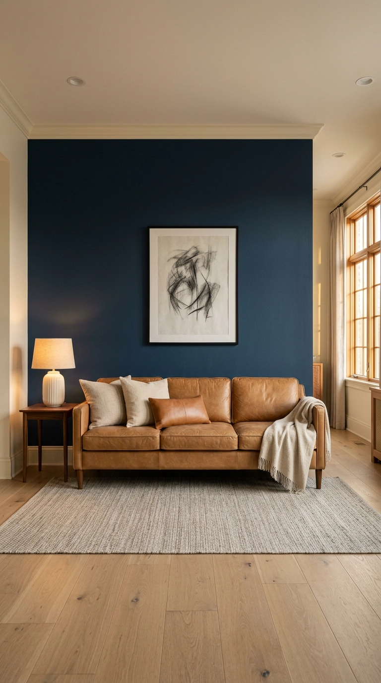
If you only do one thing on this list, make it this. Navy in a dead-flat or matte finish – Farrow & Ball Hague Blue, Benjamin Moore Hale Navy, Sherwin-Williams Naval – absorbs light instead of bouncing it, which is why it reads as velvety depth rather than a shiny blue rectangle.
2. Pale Dusty Blue Limewash for a Wall That Actually Moves
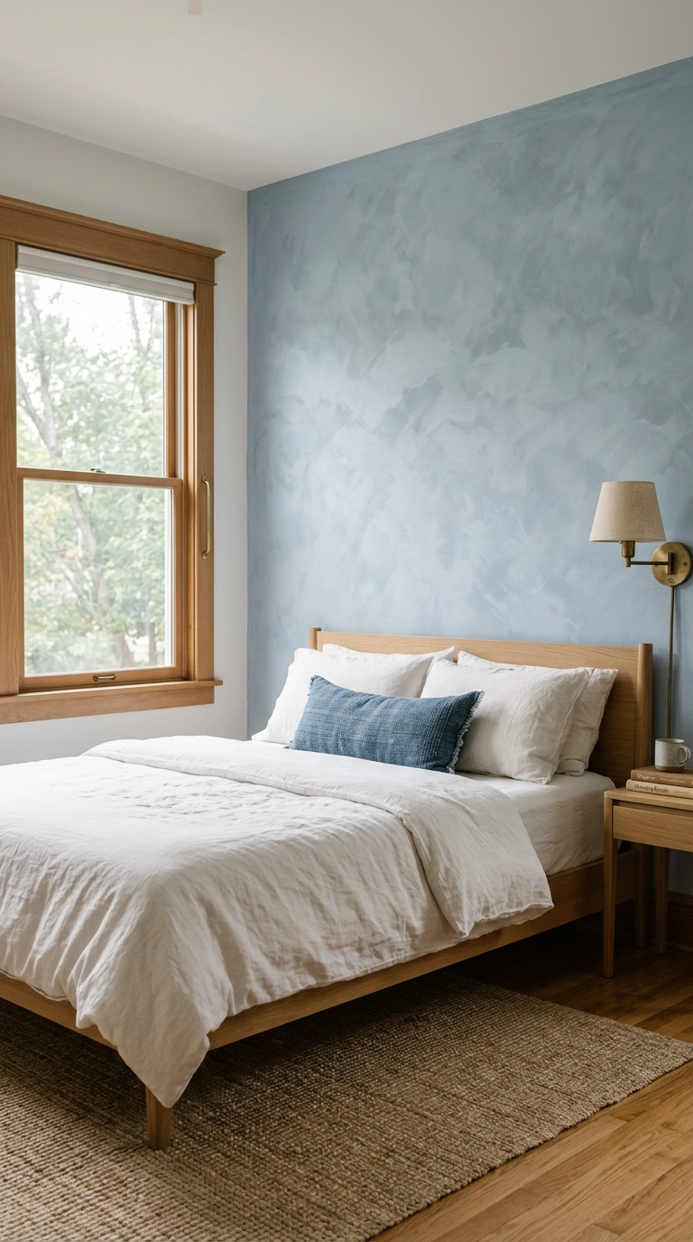
Limewash is the one finish that makes pale blue interesting instead of insipid. Because the mineral pigment settles unevenly, you get soft cloudy variation that shifts all day long – flat paint in the same shade would just look like a dull grey-blue box.
3. Full-Height Vertical Slat Wood Stained a Smoky Blue
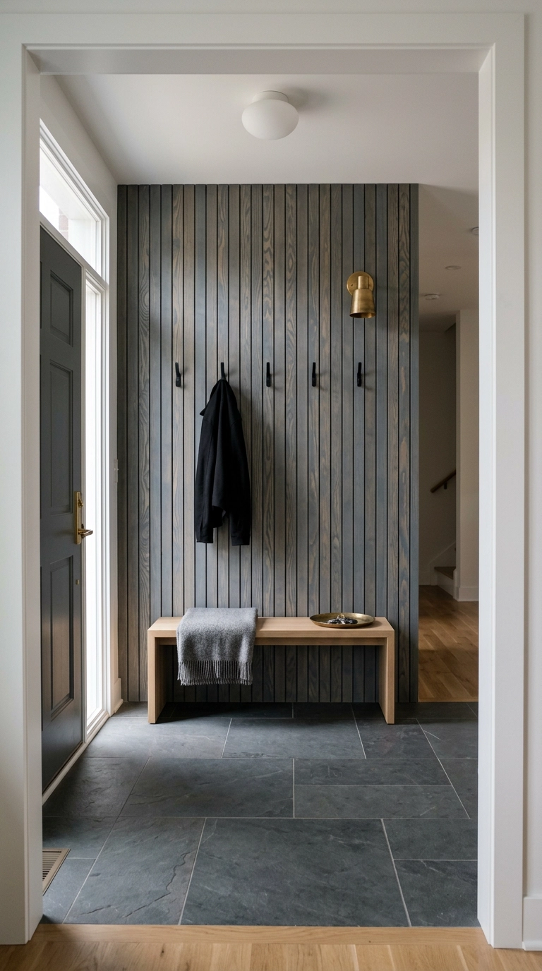
Stain over paint is the move here – blue stain lets the grain read through, so the wall looks like wood that happens to be blue rather than lumber someone painted. In an entryway that matters, because the slats take a beating from bags and shoes and stain hides scuffs that paint would show.
4. Powder Blue Board and Batten in a Kid’s Room, Run Two-Thirds Up
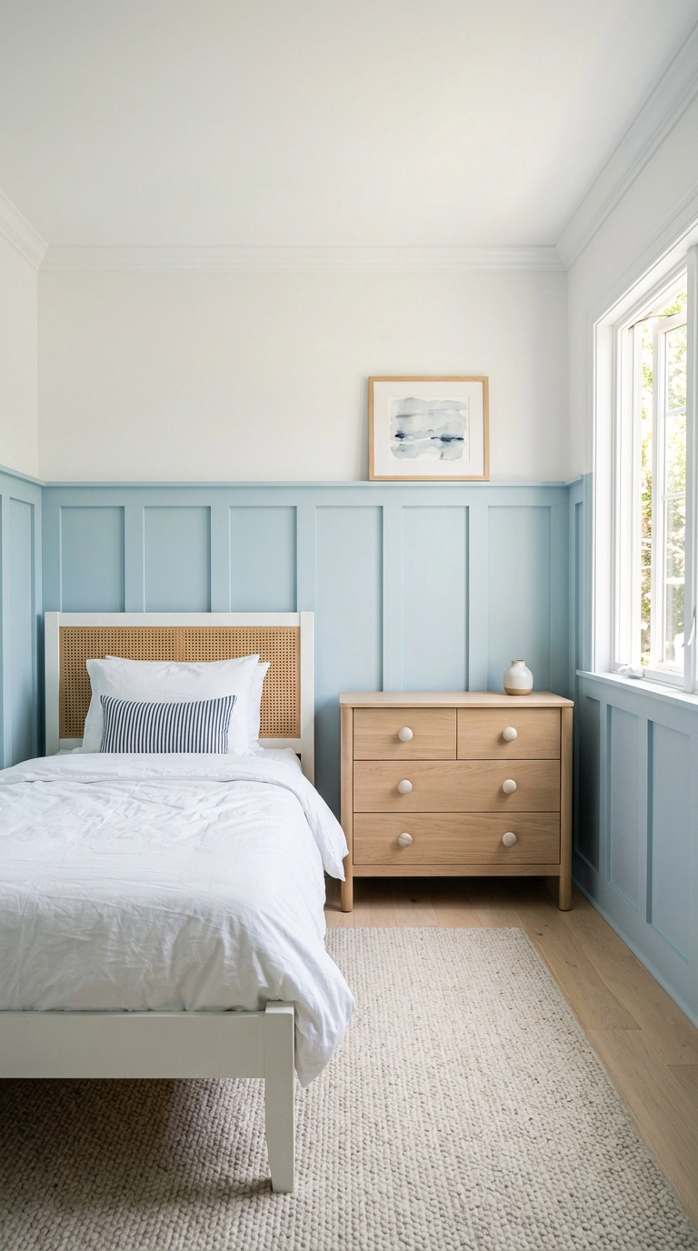
Board and batten is just vertical strips of 1×3 trim over drywall with a top ledge, and it turns a plain kid’s wall into architecture for around $150. Run it to two-thirds of the wall height rather than the usual chair-rail height – it makes an 8-foot ceiling feel taller and gives you a shelf for leaning art.
5. High-Gloss Lacquered Teal in a Windowless Powder Room
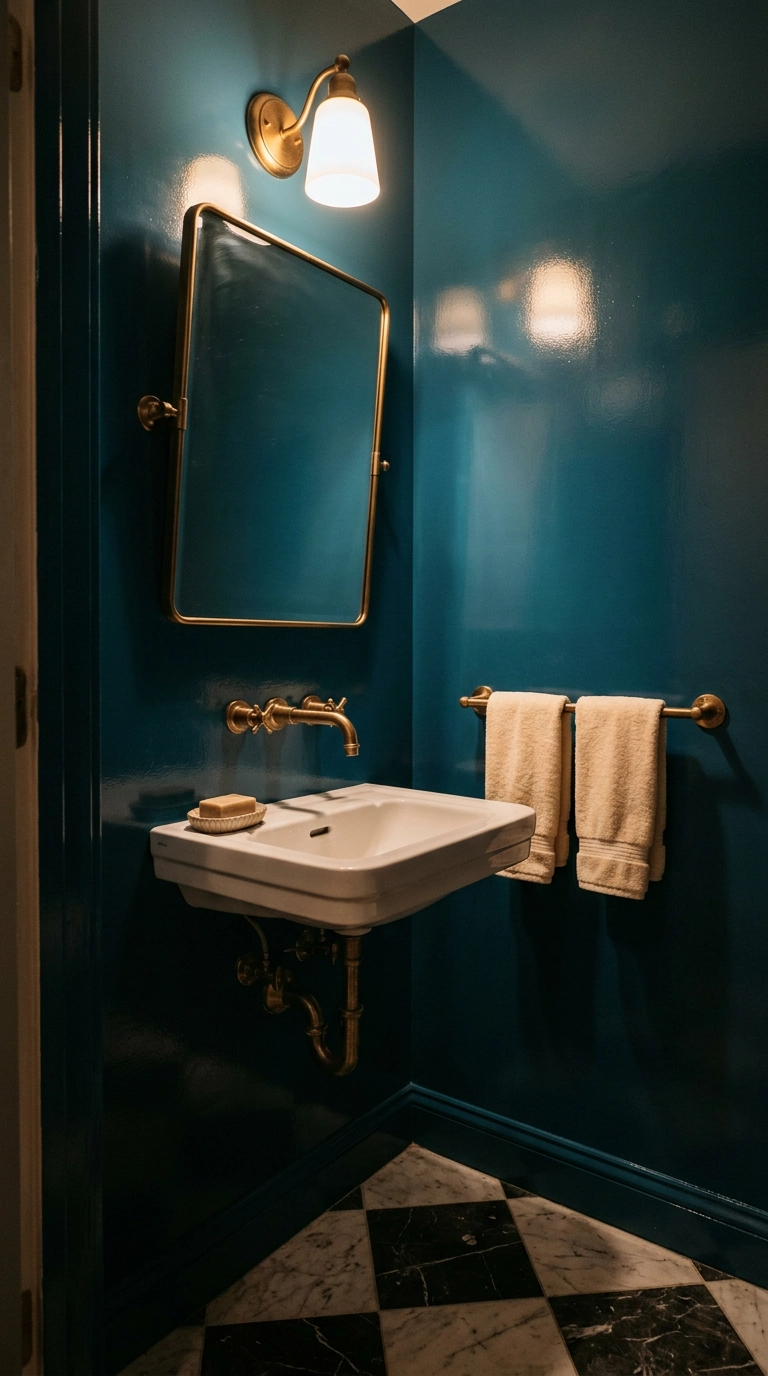
A windowless powder room is the only place I’ll tell you to go full high-gloss. With no daylight to fight, that lacquer bounces your one sconce around the room and makes 25 square feet feel deliberate and jewel-like instead of sad.
6. French Blue With Crisp White Trim in a Sunny Kitchen
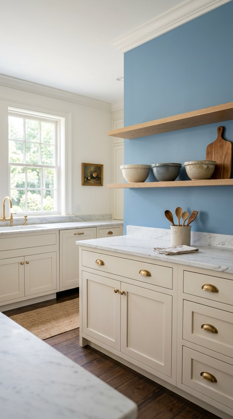
French blue is the sweet spot for kitchens because it’s saturated enough to feel intentional but has enough grey in it that it doesn’t compete with food or wood. Put it on the wall behind open shelving and it becomes a backdrop rather than a statement.
7. Color-Drench a Small Office in Slate Blue – Walls, Trim, Ceiling
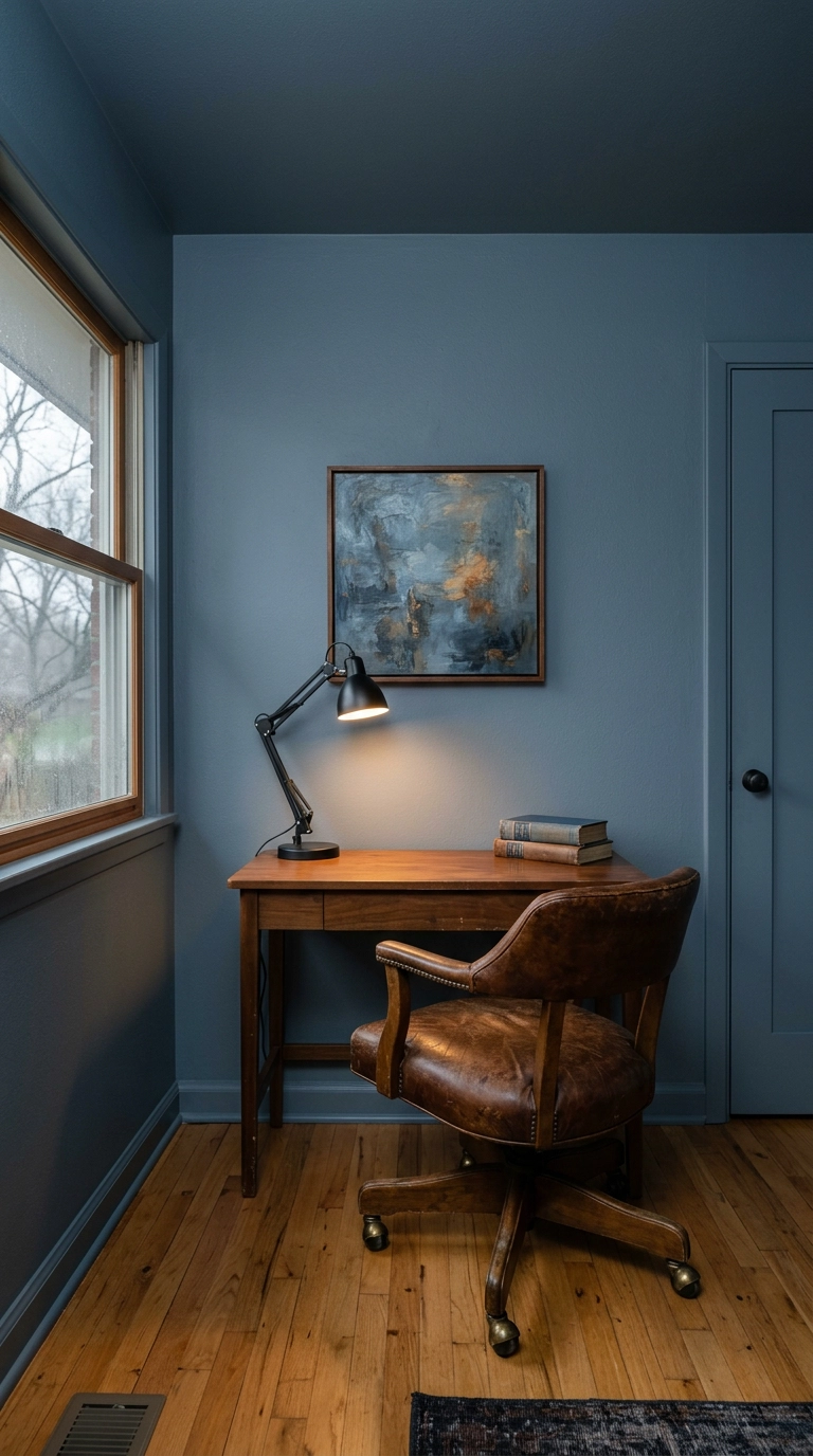
Color drenching means painting the walls, trim, and ceiling the same shade so there are no visual breaks – and it’s the single best fix for a small choppy room. Your eye stops finding edges and the walls seem to recede.
8. Chambray Blue Peel-and-Stick Wallpaper for Renters
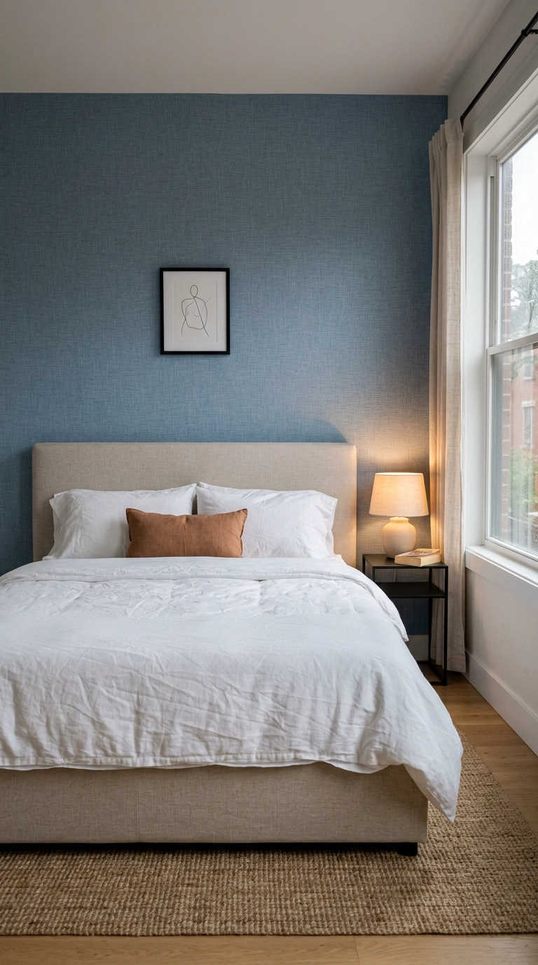
Renters, this is your workaround. Chambray-toned peel-and-stick with a woven texture print gives you the softness of fabric with none of the security deposit anxiety – about $40 to $60 a roll and two rolls covers most single walls.
9. Midnight Blue Shiplap Run Horizontally in a Hallway
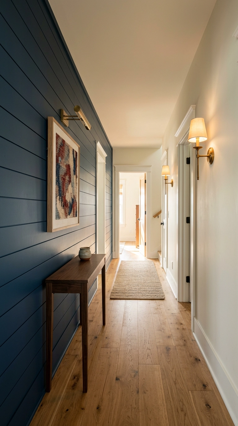
Horizontal planking pulls a narrow hallway visually wider, which is exactly the opposite of what a dark color usually does – so the two cancel each other out and you get depth without the tunnel effect. Midnight blue reads almost black in low light but shows its color where daylight hits.
10. Sky Blue Ceiling-and-Upper-Wall in a Small Bathroom
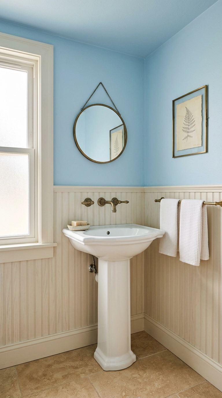
Painting the ceiling the same sky blue as the upper wall does something sneaky – it removes the hard line where wall meets ceiling, and a cramped bathroom suddenly feels like it opens upward. Southern porch ceilings have used this trick for two hundred years.
11. Cornflower Blue Painted Arch Behind a Console
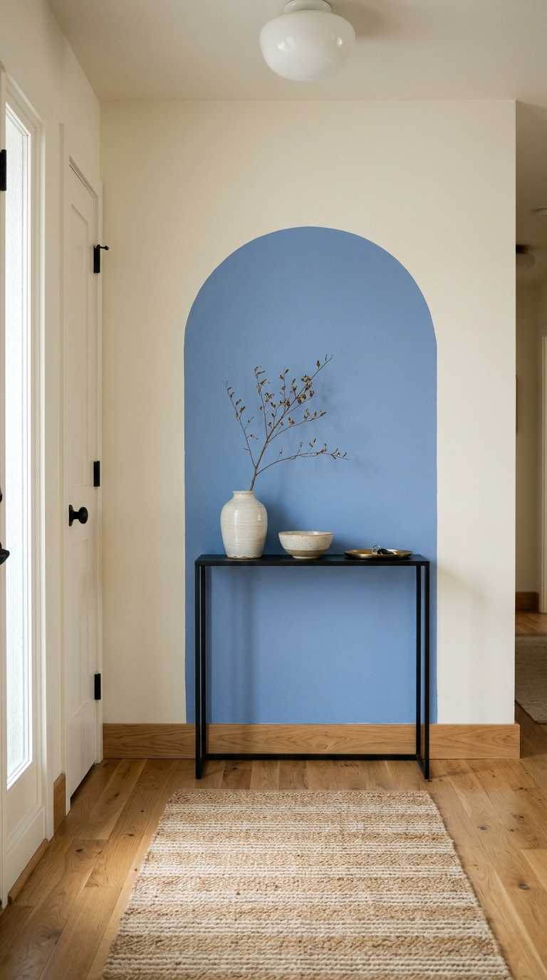
This is the cheapest big-impact idea here – a tester pot, a pencil on a string, and two hours. Draw the arch about 6 inches wider than your console on each side and stop it 8 to 10 inches shy of the ceiling so it reads as a shape, not a failed wall.
12. Indigo Grasscloth in a Bedroom for Texture You Can Feel
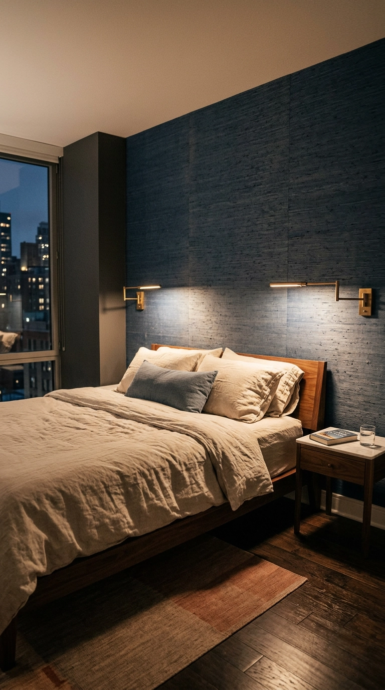
Grasscloth is the answer when you want a dark blue wall that doesn’t feel flat and heavy. The woven fibers catch lamplight in a way paint physically cannot, and the natural color variation between panels is a feature – if you hate seams, this isn’t your material.
13. Petrol Blue Tile Laid Vertically in a Laundry Room
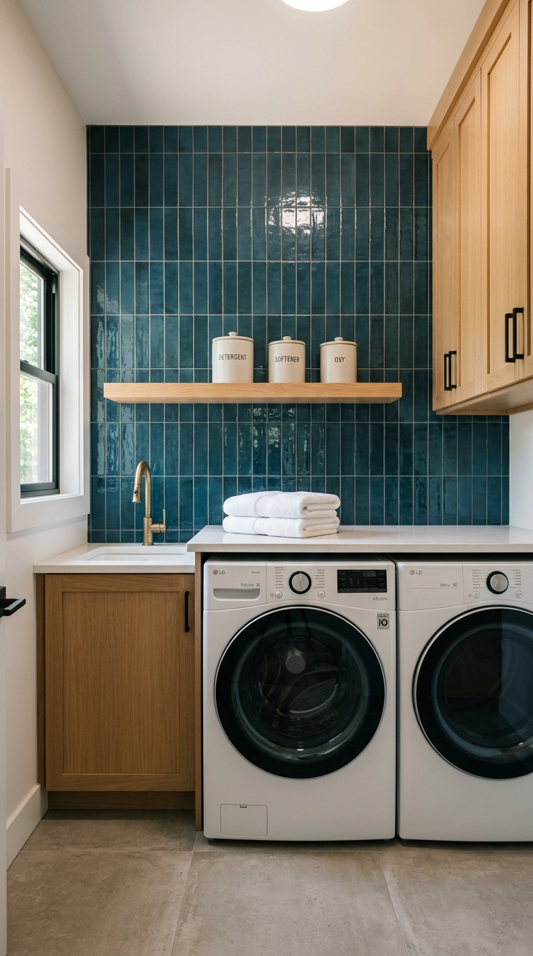
Laundry rooms are small, splashy, and nobody’s precious about them – perfect place for tile you’d be nervous about elsewhere. Petrol blue sits between teal and navy, so it feels moody without going nautical.
14. Storm Grey-Blue Half Wall With a Picture Rail
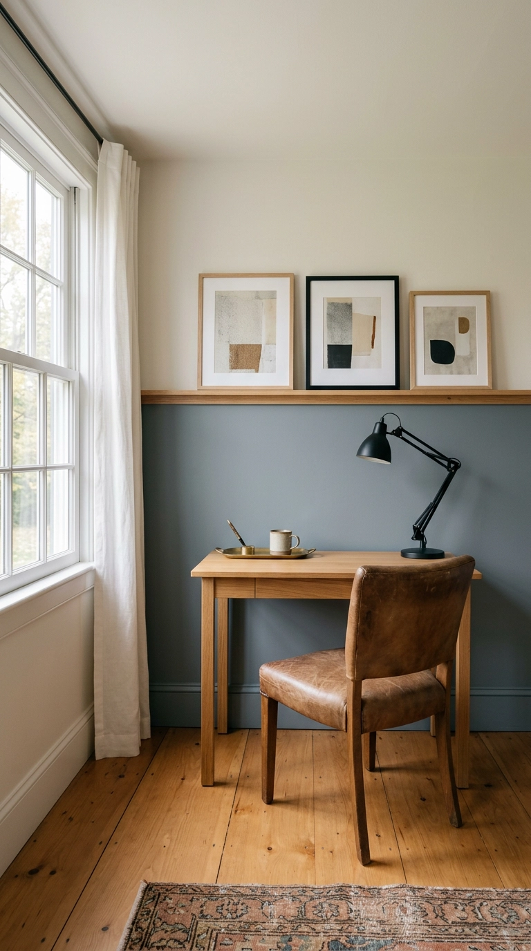
A half wall in a grey-blue like Benjamin Moore Antique Pewter or Farrow & Ball De Nimes gives you color without darkening the room, because the top half stays light and keeps the ceiling feeling high. Run the divide at about 55 to 60 percent of the wall height, never dead center – the eye reads exact halves as a mistake.
15. Denim Blue Fluted Panels Behind a Freestanding Tub
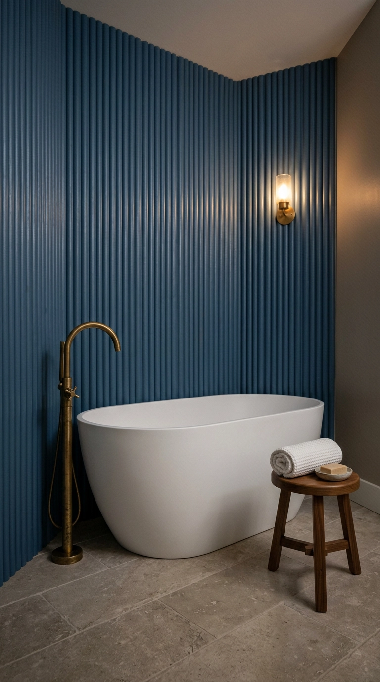
Fluted panels are half-round wood ribs glued and nailed to the wall, and the vertical shadows they throw are what makes the whole thing look custom. Behind a tub, the curve of the flutes echoes the curve of the tub – that repetition is why it feels designed rather than trendy.
16. Blue-and-White Patterned Wallpaper in the Dining Room
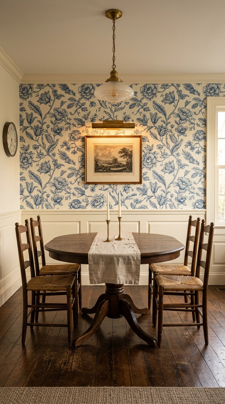
Blue and white pattern is the oldest trick in the American decorating book and it still works, as long as you scale it correctly. In a dining room you’re mostly seated, so choose a large-scale motif – small busy prints read as noise from four feet away.
17. Inky Near-Black Blue in a Stairwell
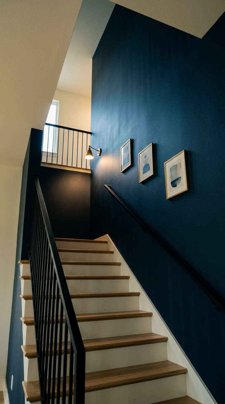
Stairwells are the most forgiving place in the house for near-black blue, because you’re never in one long enough for it to feel oppressive and the ceiling height is usually double. Something like Sherwin-Williams Inkwell or Farrow & Ball Railings reads black in shadow and blue where light lands, which is genuinely beautiful on a moving surface.
18. Colorwashed Dusty Blue in a Nursery, Ombré From the Floor Up
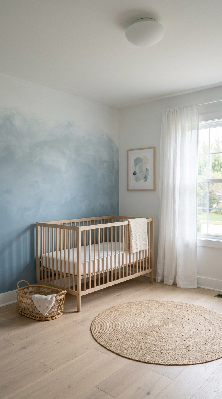
Colorwashing is paint thinned with glaze and brushed on loosely, and the ombré version – deeper at the bottom, fading upward – makes a low nursery ceiling feel like it lifts. It’s also the most forgiving finish there is, because unevenness is the entire point.
19. Prussian Blue Picture Frame Molding in a Den
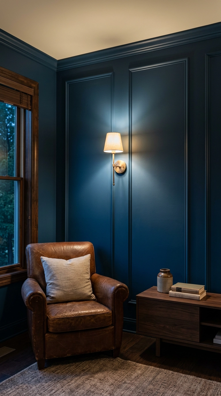
Picture frame molding is nothing more than thin lattice trim glued and pinned into rectangles, and it’s the cheapest way to give a builder-grade box some bones – about $120 in trim and caulk for one wall. The rule that makes or breaks it: keep an identical margin all the way around, roughly 3 to 4 inches off the baseboard, ceiling line, and corners, and paint the trim the exact same color and sheen as the wall so the whole thing reads as one carved plane instead of applied strips.
20. Blue-Grey Limewashed Brick on a Family Room Fireplace
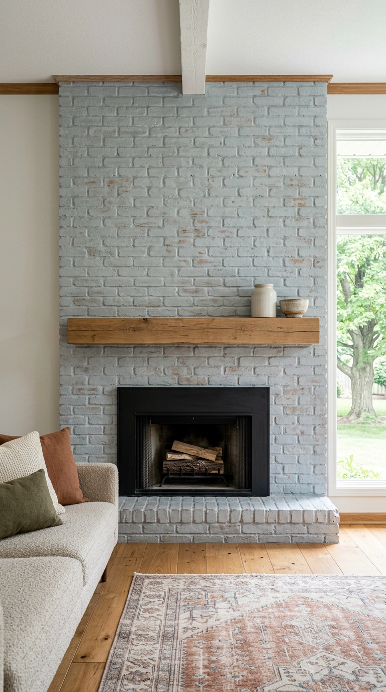
A dated red brick fireplace is the best candidate for blue in the whole house, because you don’t want full coverage. Brush on a thinned lime slurry tinted grey-blue, then sponge the high spots back within 20 minutes so flecks of the original terracotta stay visible – that leftover warmth is exactly what keeps the blue from going cold and slate-toned.
21. Cobalt Velvet Upholstered Panels Behind a Guest Bed
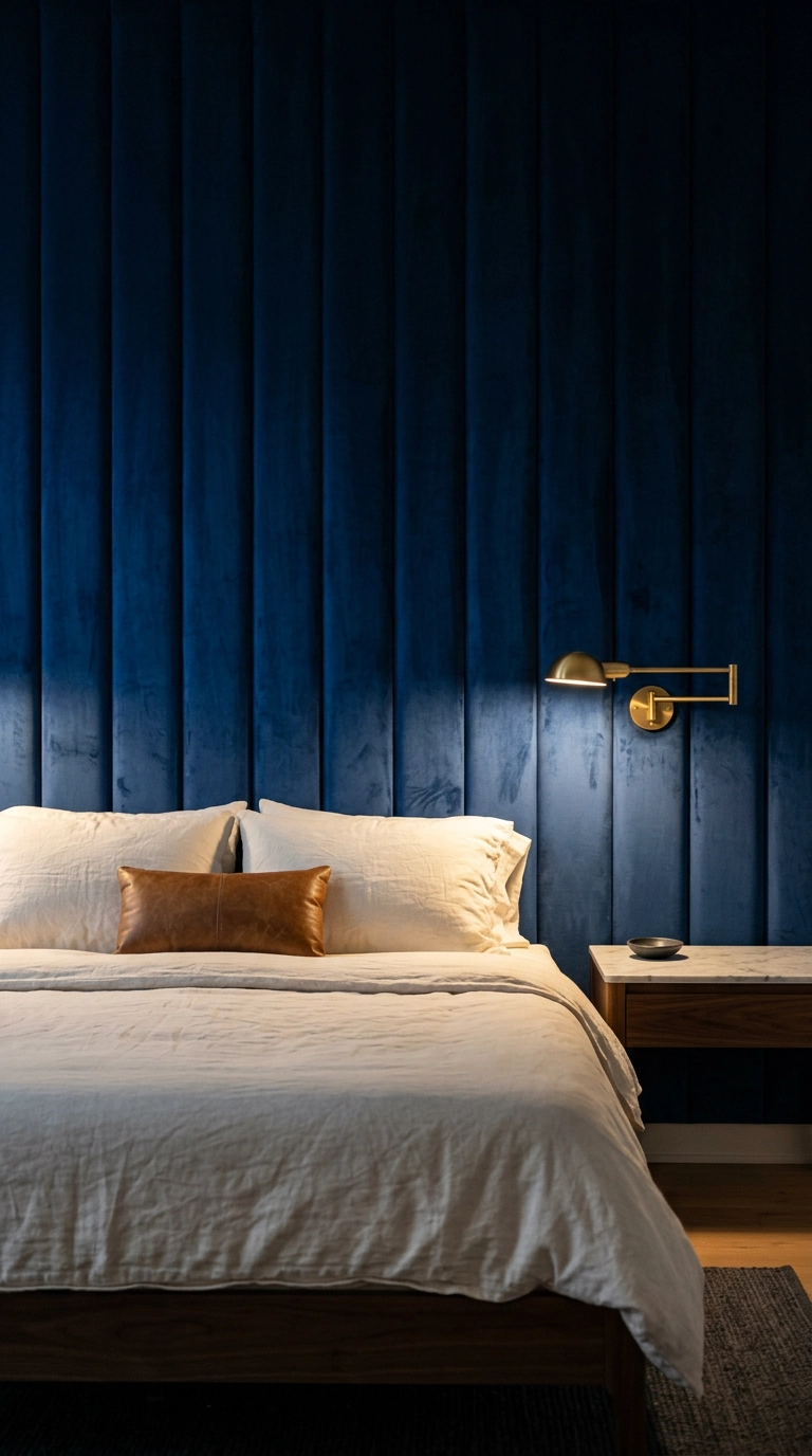
Velvet on a wall sounds excessive until you see what the pile does – it holds light differently at every angle, so one cobalt reads sapphire where the sconce hits and near-navy in the corners. Build it as batting and fabric stapled over half-inch plywood panels, then hang them on a French cleat, which means the whole wall lifts off later and leaves two screw holes. Renters, that’s your loophole.
22. Sea-Glass Aqua Polished Plaster in a Reading Nook
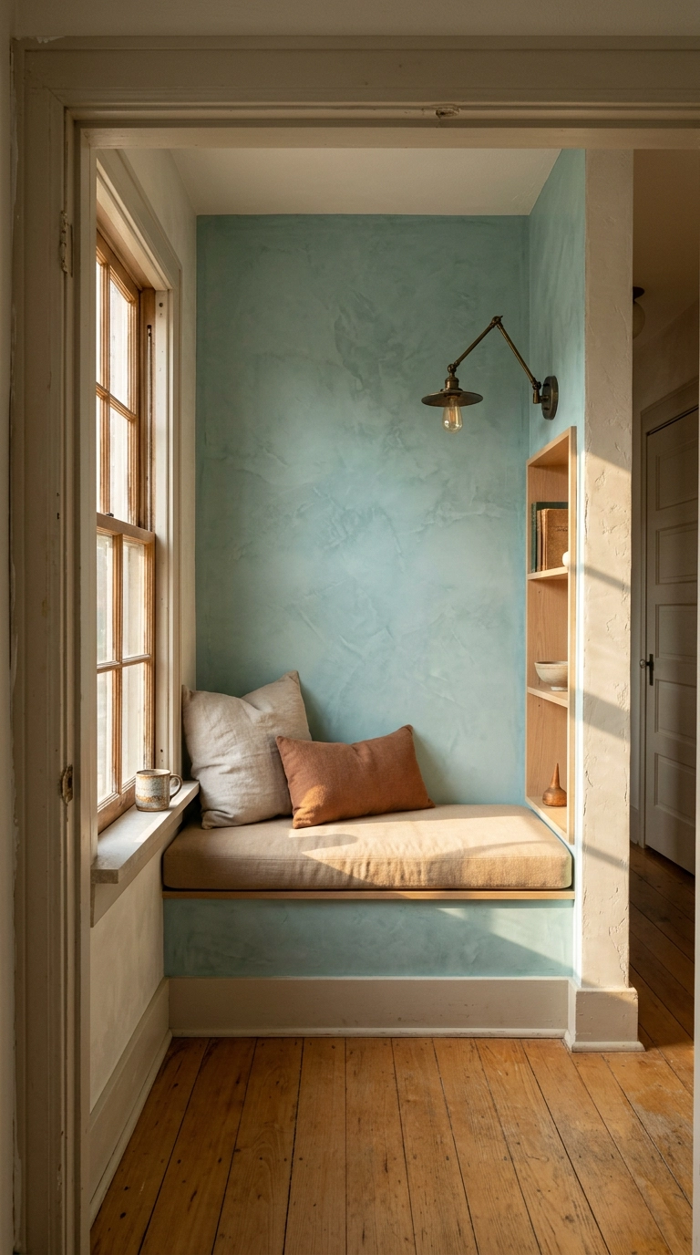
Polished plaster is the finish to reach for when you want depth plus a little sheen, which limewash cannot give you. Roman clay goes on in two thin coats with a stainless trowel, then you burnish the second coat with the trowel edge once it’s tacky – that burnishing is what creates the marbled movement and the soft glow when light rakes across it. Around $150 to $200 in premixed clay for one wall, and it’s genuinely forgiving because every stroke mark is part of the look.
23. Three-Tone Blue Hill Mural in a Playroom
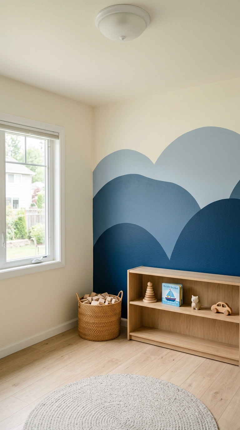
Ending on the one that gets saved the most: three overlapping arcs, three tester pots, about $45 and an afternoon. Trace the curves with a pencil on a string or a dinner plate for the smaller crests, keep the tallest hill under two-thirds of the wall height so the ceiling still breathes, and paint everything matte so the shapes read as flat graphic bands instead of glossy stripes.
Picking Your Blue and Actually Committing
If there’s one thing I hope you take from this list, it’s that the finish matters as much as the shade. The same navy is a velvet cave in dead-flat matte behind a sofa and a jewel box in high-gloss lacquer in a windowless powder room, and neither of those is the same wall as indigo grasscloth or blue-grey limewash sponged back over old brick. Pick the finish for the room’s job first, then go find the blue that suits its light.
What I’m seeing most in 2026 is people moving away from the flat one-coat feature wall toward walls you’d want to touch – troweled Roman clay, fluted and slatted wood, upholstered panels, colorwashed ombré. The near-black inky blues are still everywhere, and honestly Farrow & Ball has a lot to answer for there; Hague Blue and Railings have been quietly repainting American stairwells for a decade now. Nate Berkus has been putting deep saturated blue against warm wood and unlacquered brass for years, and that pairing is still the most reliable way I know to keep blue from going cold.
My real advice: buy three tester pots, paint big swatches on poster board, and move them around the room for two full days before you commit. Blue is the single most light-sensitive color on the fan deck, and the shade that looked perfect in the store at 4 p.m. can turn on you by breakfast. When you do pick one, I’d love to see it – and if you want more of this kind of thing, sign up for my weekly newsletter, where I send one room breakdown, one honest budget, and one shade I’m currently obsessed with every Friday.


