
23+ Stunning Blue Dining Room Decor Ideas that Feel Fresh and Timeless in 2026

I’ll admit it, blue was the color I used to talk clients out of, mostly because I’d seen too many dining rooms painted that flat builder-grade periwinkle from 2004. Then I drenched a client’s north-facing dining room in a deep inky blue, hung one brass picture light over the sideboard, and watched her actually gasp. Blue is the rare color that can go moody or breezy, formal or farmhouse, and dining rooms are where it earns its keep, because you mostly use them at night when saturated color looks its best.
Blue Dining Room Decor Ideas
1. Color-Drench the Whole Room in a Deep Inky Blue
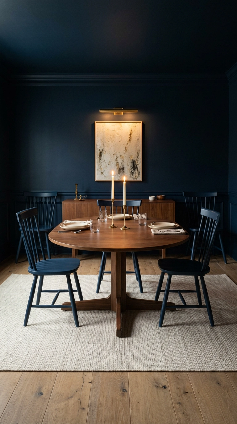
Color drenching just means painting the walls, trim, and ceiling the same shade so your eye never hits a stopping point, and it makes a small dining room feel like a deliberate jewel box instead of a cramped one. Farrow & Ball Hague Blue is the shade I reach for most, and it looks completely different at noon than it does over dinner, which is the whole point. Budget on two coats plus primer and a full weekend, and use an eggshell or matte finish so the walls absorb light instead of bouncing it around.
2. Swap in Blue Velvet Dining Chairs and Call It a Day
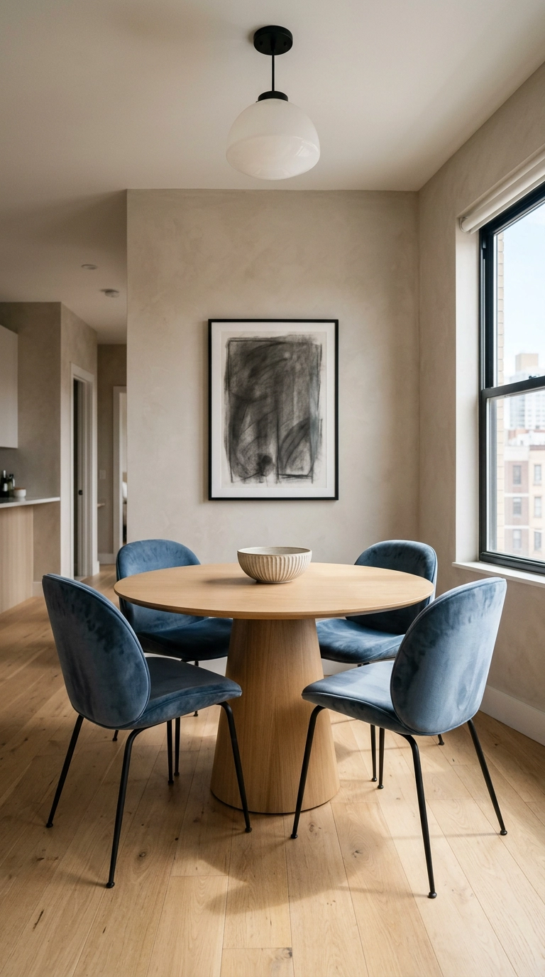
If you rent or you’re just commitment-shy, the chairs do the work of a paint job with none of the drywall drama. Velvet reads richer than linen in artificial light because the pile catches the glow at different angles, so a mid-tone sapphire looks expensive under a dinner lamp. Look for performance velvet if you have kids, and keep the table and floor warm-toned wood so the blue lands as intentional rather than cold.
3. Try a Two-Tone Wall with Blue Below the Chair Rail
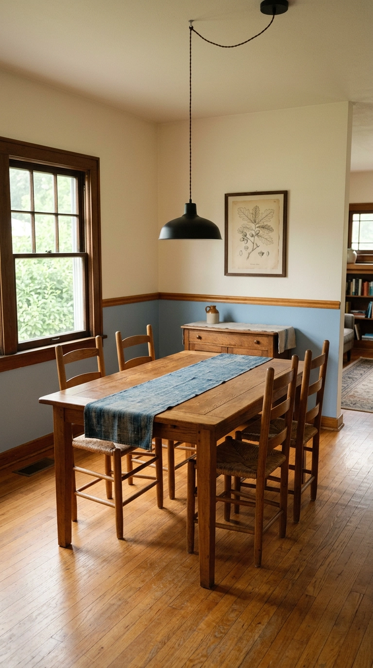
Splitting the wall horizontally gives you blue without the room going dark, and putting the darker color on the bottom visually anchors the space so the ceiling floats higher. The rule I follow is to break at about one-third of the wall height, roughly 32 to 36 inches, which also happens to hide chair scuffs. A pack of chair rail molding and a caulk gun runs cheap, and renters can fake the line with a slim peel-and-stick trim strip.
4. Ground the Table on a Faded Blue Vintage Persian Rug
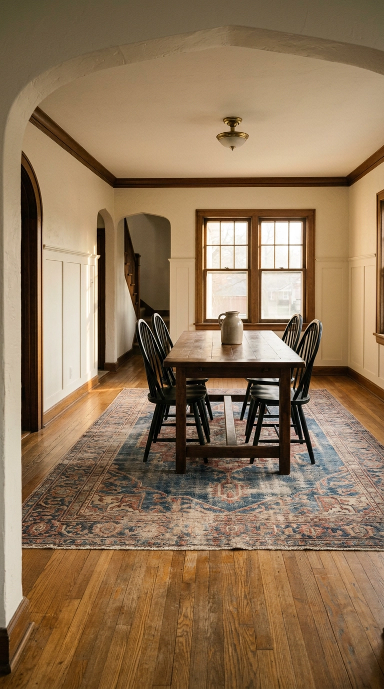
A worn blue rug does something new paint cannot, it brings age into the room so the space reads collected instead of catalog-ordered. Size it so all four legs of every chair stay on the rug even when pulled out, which usually means going at least 24 inches wider than the table on every side. Vintage-look machine-woven versions have gotten genuinely good, so this is a couple hundred dollars rather than a couple thousand.
5. Hang a Blue and White Chinoiserie Wallpaper on One Wall
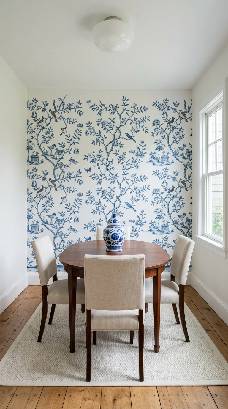
Chinoiserie is the pattern that made blue and white dining rooms a thing in the first place, and one wall of it costs a fraction of papering all four. Keep every other surface quiet, solid chairs, plain rug, one ginger jar, because the paper is already doing the talking. Peel-and-stick versions exist in this print family and come off cleanly, so renters are fully invited.
6. Paint Just the Built-In Hutch a Saturated Blue
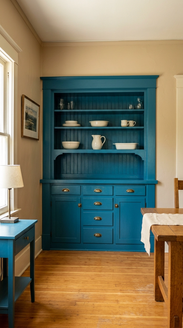
If you have a built-in, that is the cheapest high-impact blue in the house, one quart of paint and a Saturday with the doors off. Painting the case a saturated color while leaving the walls neutral turns the hutch into a piece of furniture rather than architecture that blends away. Satin finish here, not matte, because you will be wiping fingerprints off cabinet doors forever.
7. Layer Soft Powder Blue with Warm Brass and Cane
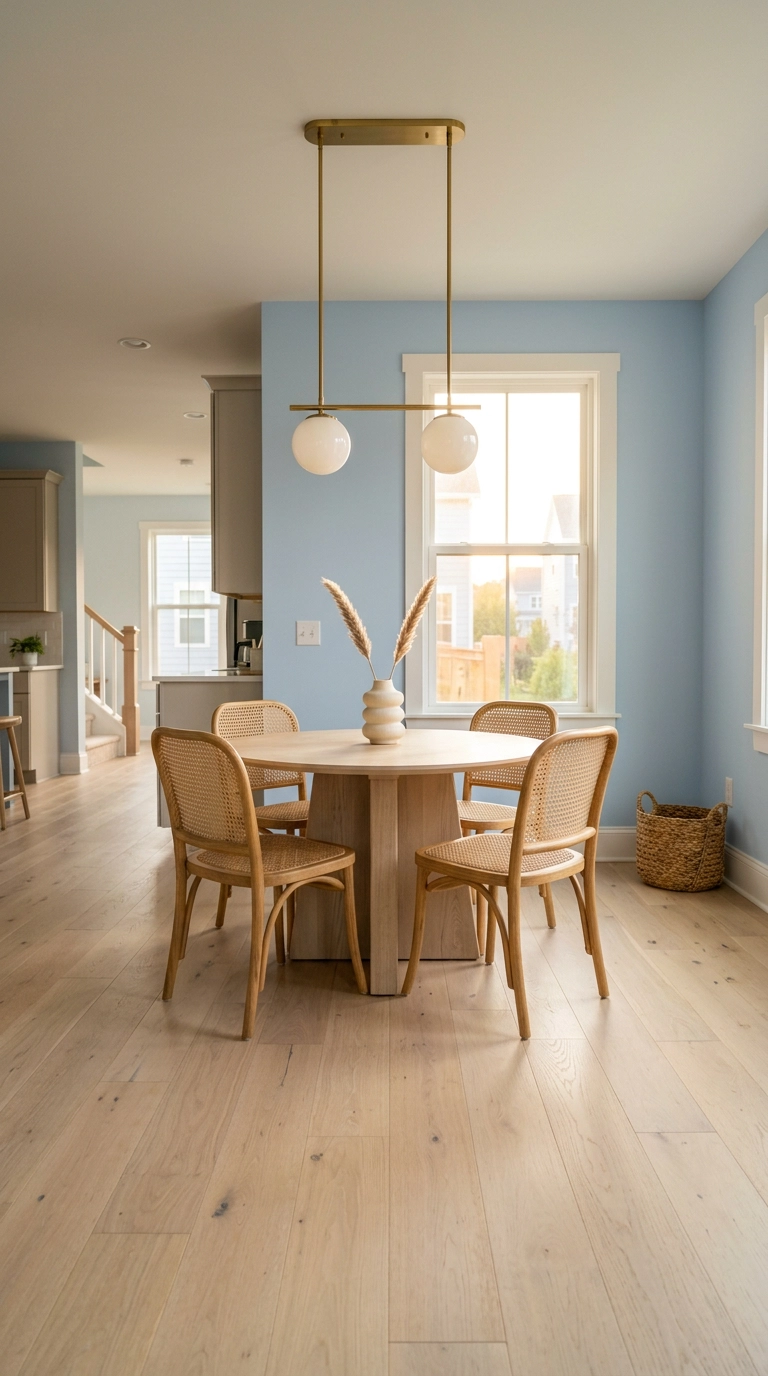
Pale blue can tip icy fast, and the fix is always warmth in the metals and the weave rather than a different blue. Cane, rattan, and unlacquered brass all sit in the orange family, which is directly opposite blue on the color wheel, so they make each other look better. This is my go-to for south-facing rooms that get flooded with light, since the blue stays soft instead of glaring.
8. Build a Board and Batten Wall Molding in Dusty Blue
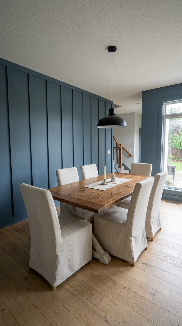
Board and batten just means vertical strips of trim applied over the drywall in a grid, and it adds architecture to the blandest builder box for the price of some pine and construction adhesive. Painting the battens and the wall the same dusty blue keeps it from reading fussy, you get texture and shadow lines without stripes. Plan a full weekend, a miter saw helps, and caulk every seam before you paint or the shadow gaps will haunt you.
9. Stack Blue and White Plates on the Wall Instead of Art
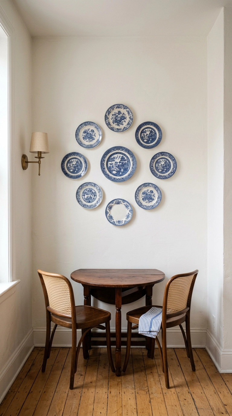
A plate wall is the most thrift-friendly blue idea in this whole list, mismatched blue and white transferware runs a few dollars a piece at estate sales and it reads as heirloom. Group an odd number in a loose oval and vary the plate diameters, because same-size plates in a straight grid look like a hardware display. Adhesive plate hangers hold light ceramic without a single nail hole, which matters if you move a lot.
10. Go Dark Academia with Navy Picture-Frame Molding
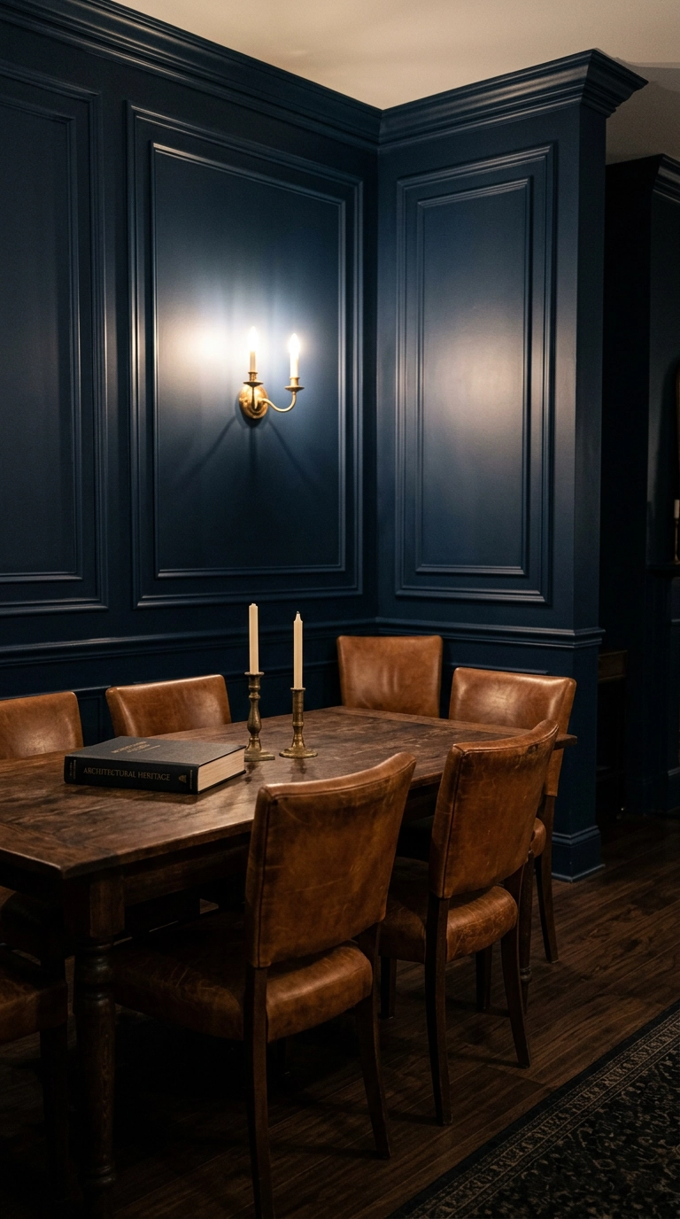
Picture-frame molding is just thin trim applied in rectangles on the wall, and in a deep navy eggshell it makes a plain room feel like it belongs to someone with a library. Pair it with aged cognac leather rather than black, because warm leather keeps the navy from reading corporate. This is the look I would choose for a windowless or north-facing dining room, dark rooms should lean into being dark instead of fighting it.
11. Add a Blue Upholstered Banquette in the Corner
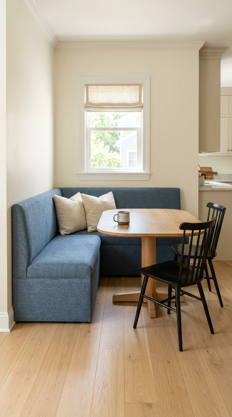
A banquette buys you two extra seats in the same footprint because nobody needs pull-out clearance behind a bench. Build the seat 18 inches high and 20 inches deep, then leave about 12 inches between the seat edge and the table so people can actually slide in. Denim blue performance fabric is the practical pick here since this is the surface that will meet spaghetti night.
12. Paint the Ceiling Sky Blue and Leave the Walls White
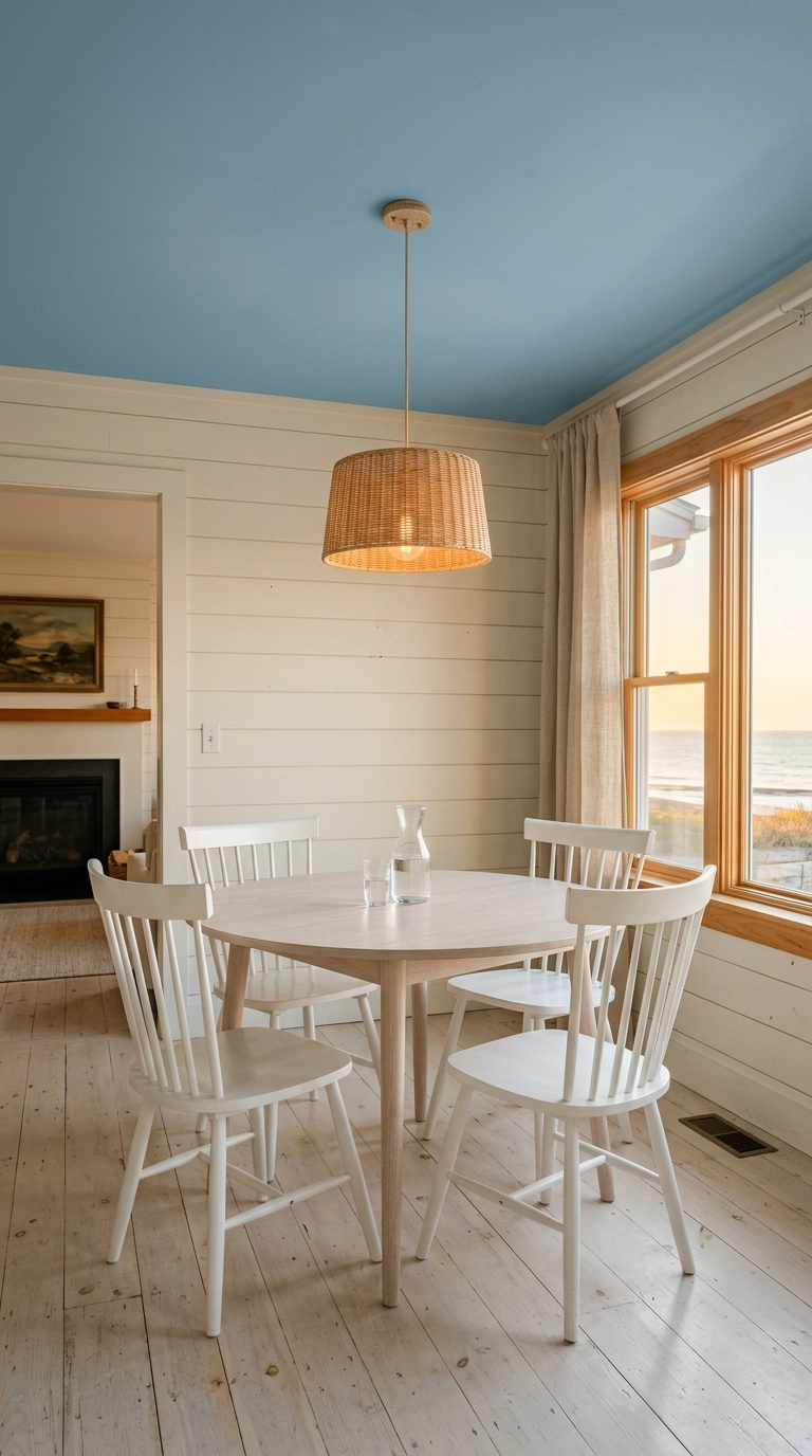
Painting only the ceiling blue is the old porch-ceiling trick brought indoors, and it works because your eye reads a light blue overhead as open sky, so the room feels taller and calmer. Keep it flat finish, never satin, or every roller mark and drywall seam shows up under the pendant. One gallon covers most dining room ceilings and it is a genuine two-hour job with a roller extension pole.
13. Mix Two Blues, One Muddy and One Clear
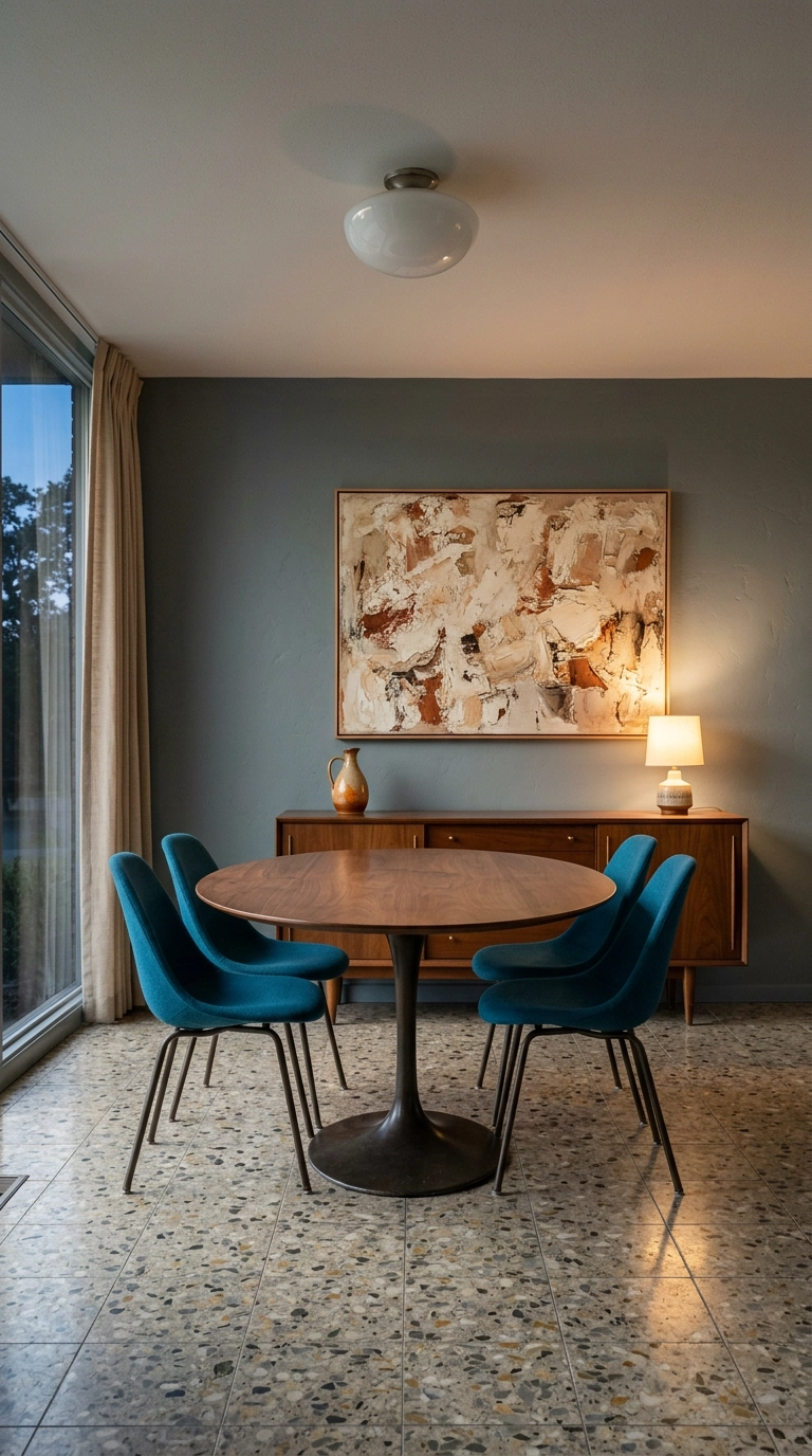
Two blues in one room works when they are clearly different in clarity, one dusty and greyed, one clean and saturated, so they read as a deliberate pair instead of a paint mismatch. The greyed blue belongs on the big surface and the clear one on the small, that way the vivid color stays a punctuation mark. If they look almost the same on a sample board, they are too close, push them further apart.
14. Hang Long Indigo Linen Curtains Close to the Ceiling
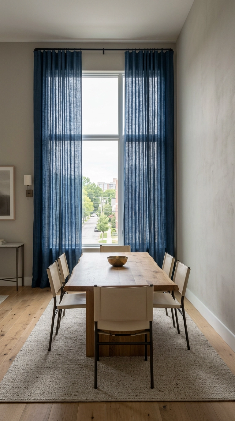
Curtains are where most people undersell blue, a pair of long indigo linen panels adds more color than a whole wall of art. Mount the rod within a few inches of the ceiling and let the panels break just at the floor, because the eye follows the vertical line and reads the ceiling as higher than it is. Buy the panels about 2.5 times your window width so they still look full when closed.
15. Try a Limewashed Blue Plaster Wall for Cloudy Texture
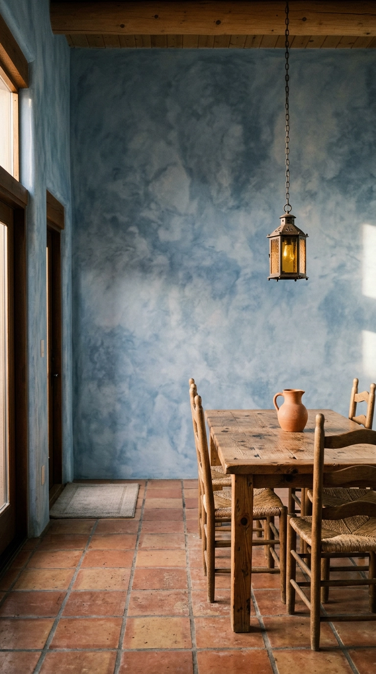
Limewash gives you a cloudy, uneven finish that shifts as the light moves across it, so a flat drywall box suddenly has depth without any trim work. Apply it with a wide brush in loose crosshatch strokes and stop before it looks even, evenness is the failure mode here. Side light is what makes it sing, so this belongs on a wall that sits perpendicular to your window rather than facing it.
16. Style the Sideboard with Three Blue Glass Vessels
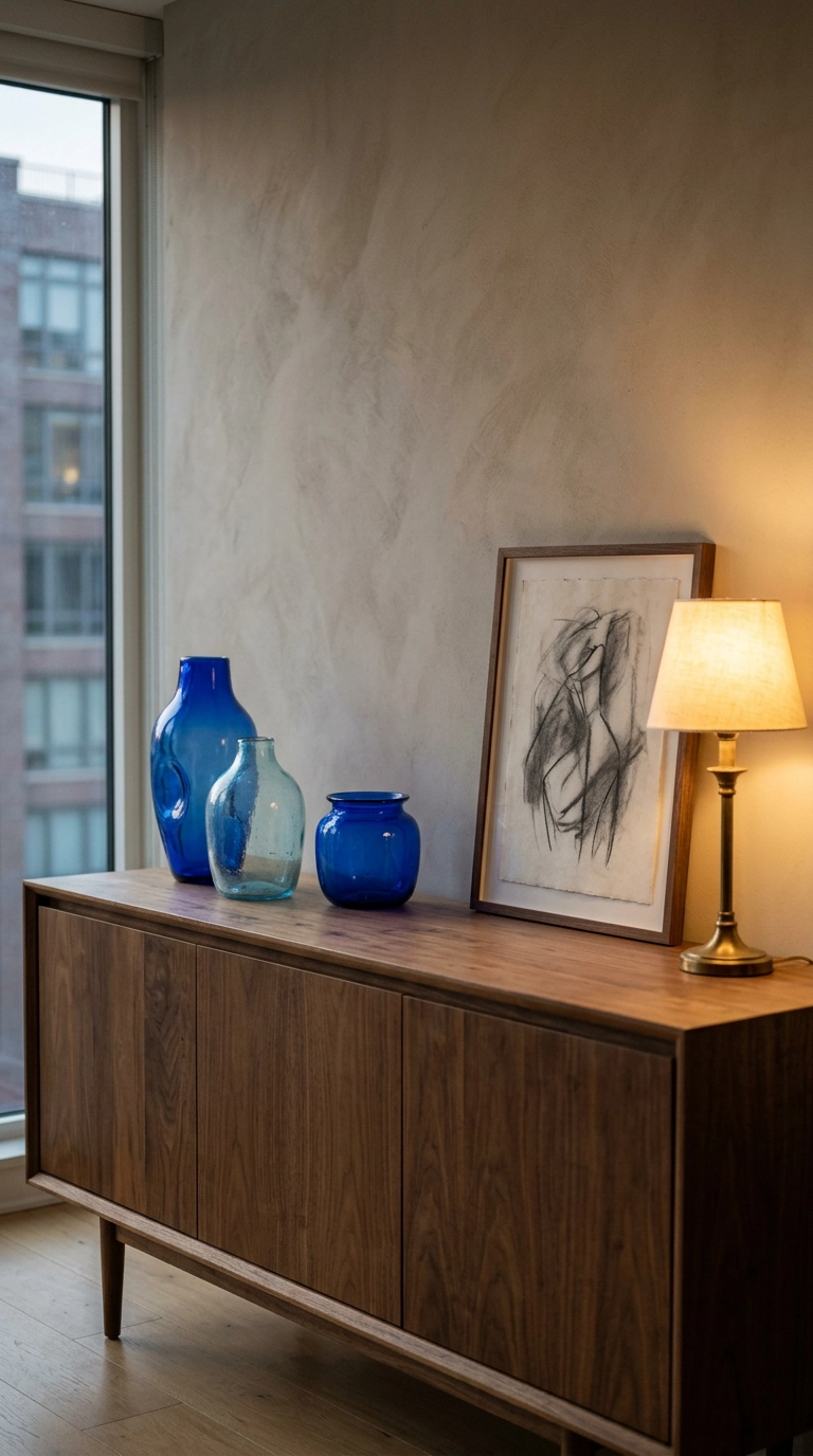
Glass is the easiest way to get blue into a room because it changes with the light instead of sitting there flat, and it costs nothing if you shop thrift shelves. Use three pieces at clearly different heights and leave real space between them, odd numbers read as composed because your eye cannot split them into pairs. Keep the rest of the sideboard bare, one lamp and one leaning artwork is the whole recipe.
17. Pair Navy with Warm Terracotta Instead of White
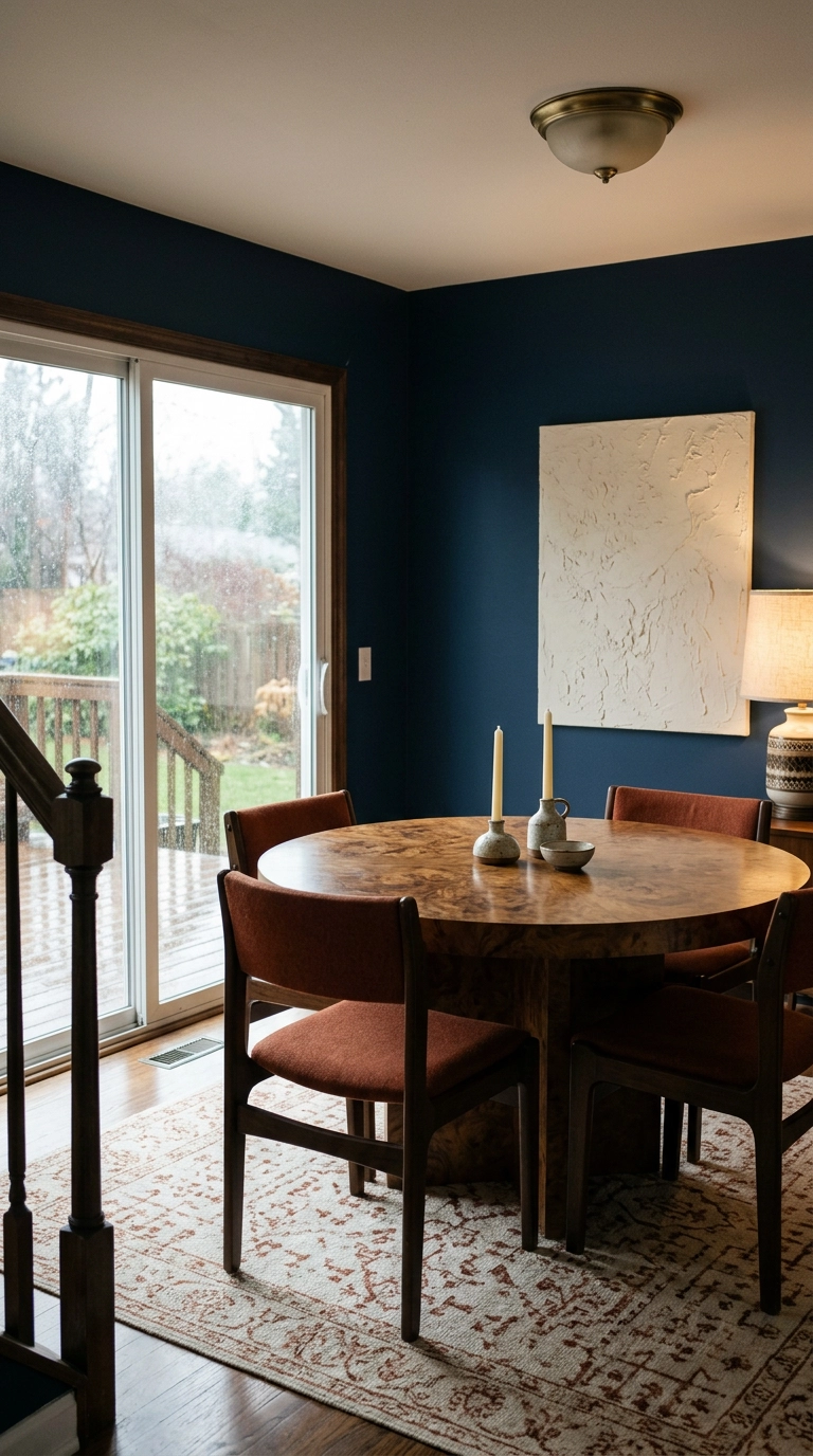
Everyone reaches for navy and white, and it is fine, but navy with a warm terracotta rust is the pairing that makes people stop and ask who did your house. Rust sits opposite blue on the color wheel so the contrast is built in, and it carries heat that white simply does not. Two upholstered chairs or a rug in that rust tone is enough, this is a seasoning not a second main color.
18. Install a Blue Zellige Tile Wainscot Behind the Table
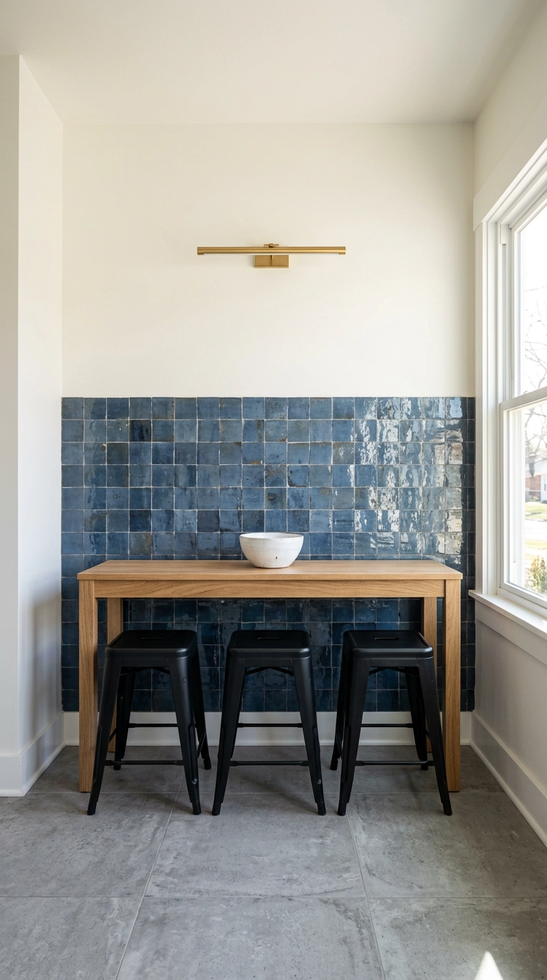
Zellige is handmade clay tile with uneven edges and pooling glaze, which means every piece catches light differently and a flat wall gets alive. Running it only to about 36 inches keeps the cost sane and gives you a wipeable surface exactly where chair backs and small hands do damage. This is a splurge per square foot, so a wainscot band is how you get the look without a five-figure quote.
19. Slipcover Mismatched Chairs in One Blue Linen
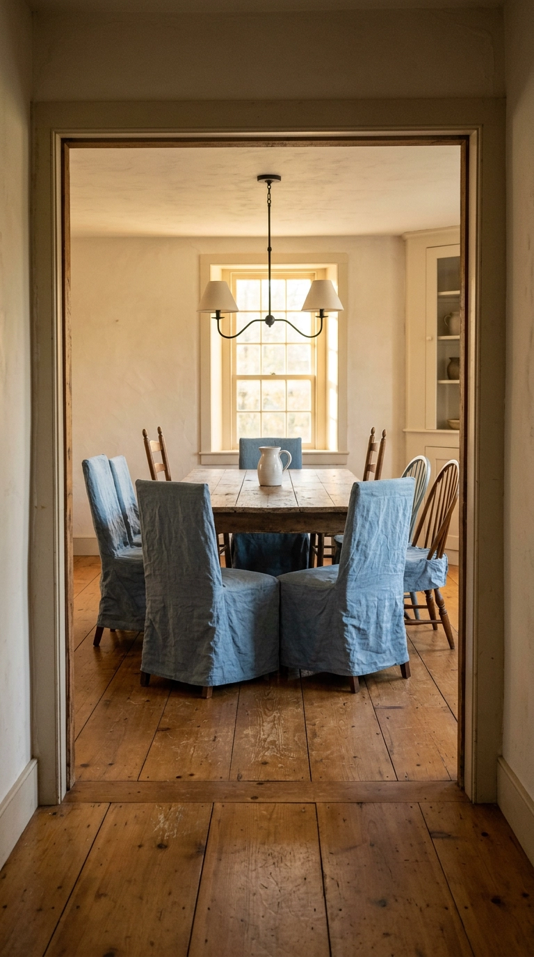
Mismatched chairs collected over years look chaotic until you unify them, and a set of slipcovers in one chambray blue linen does that in an afternoon with zero tools. The trick is that your eye reads color and fabric before it reads silhouette, so different chair shapes stop competing. Washed linen only, it is meant to look rumpled, which conveniently means you never have to iron it.
20. Anchor a Small Nook with a Blue Painted Half Wall of Beadboard
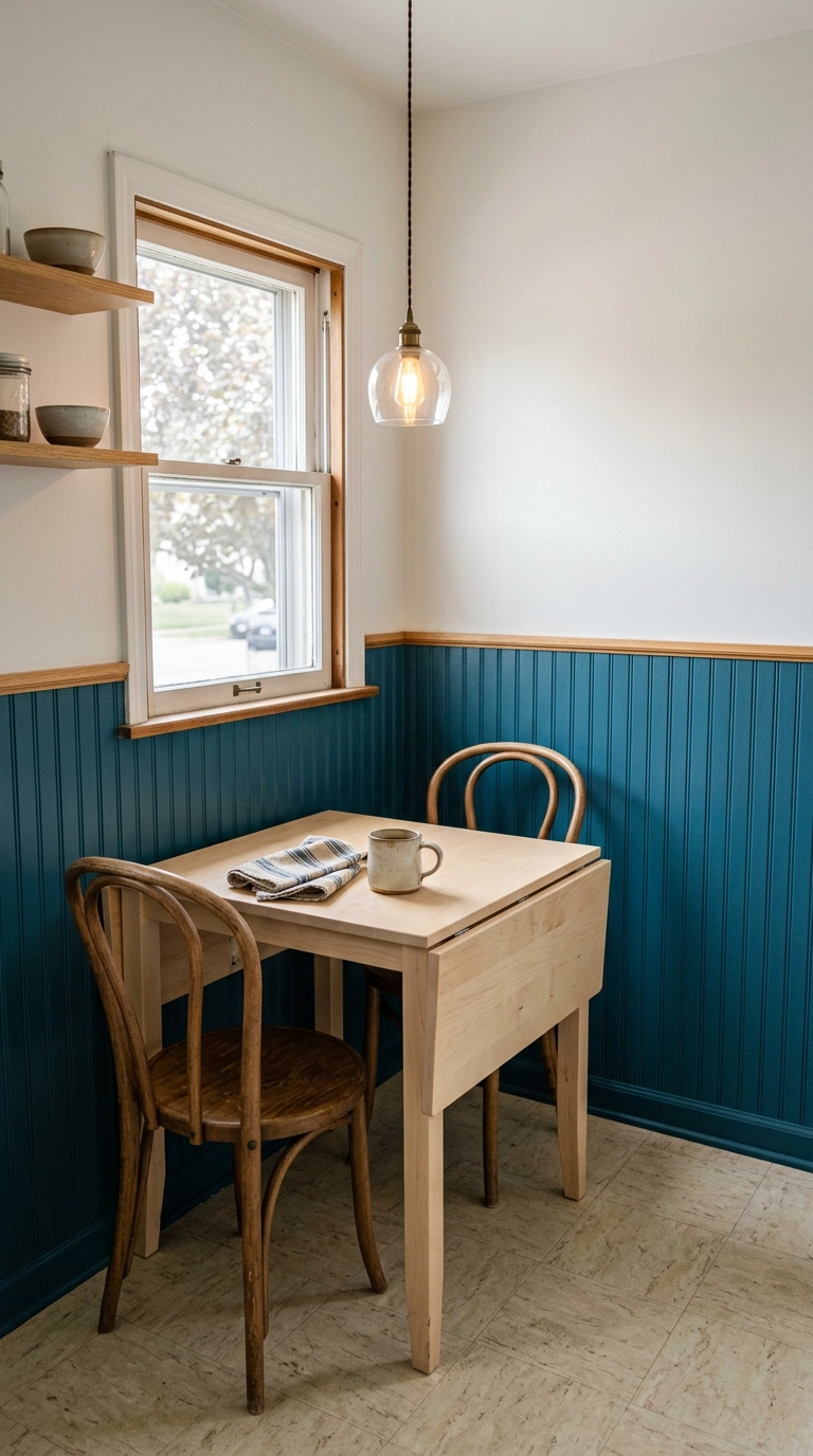
Small nooks handle strong color better than big rooms do, because there is less of the surface to overwhelm you. Beadboard panels come in 4 by 8 foot sheets you can cut to height and glue up, so a nook takes one sheet and one length of cap rail. Teal in satin wipes clean, which matters in a spot that doubles as a kitchen surface most mornings.
21. Let One Oversized Blue Abstract Canvas Run the Room
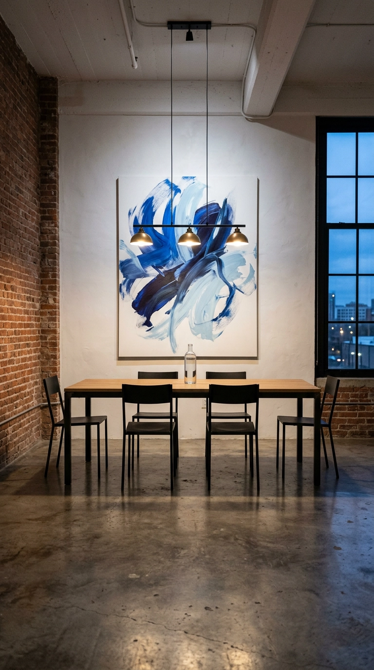
One enormous piece of blue art beats five small ones, and in a dining room the wall opposite the entry is where it earns the most, since that is the first sightline anyone gets walking in. Go bigger than feels comfortable, roughly two-thirds the width of your table, and hang the center at about 58 inches from the floor. A stretched canvas is light enough to lean on a console instead of hanging if you cannot drill.
22. Use Blue Striped Ticking on Seat Cushions Only
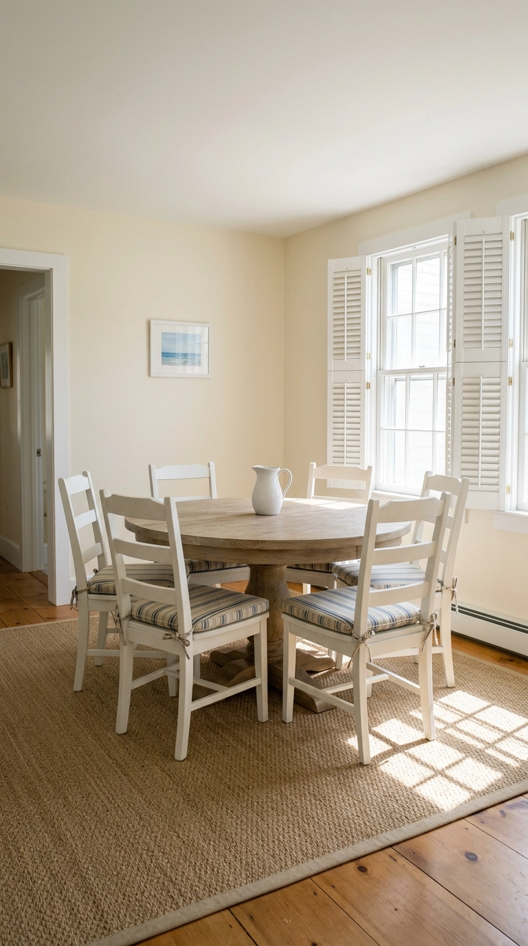
Ticking stripe is the workhorse blue pattern, cheap by the yard and impossible to date, and putting it only on seat cushions keeps one pattern as the hero. Tie-on cushions are a beginner sewing project or a twenty-minute online order, and they wash, which no upholstered dining chair ever truly does. Keep the walls and rug solid here, stripes plus a patterned rug is where this look falls apart.
23. Finish with a Blue Lacquered Ceiling Above a Dark Room
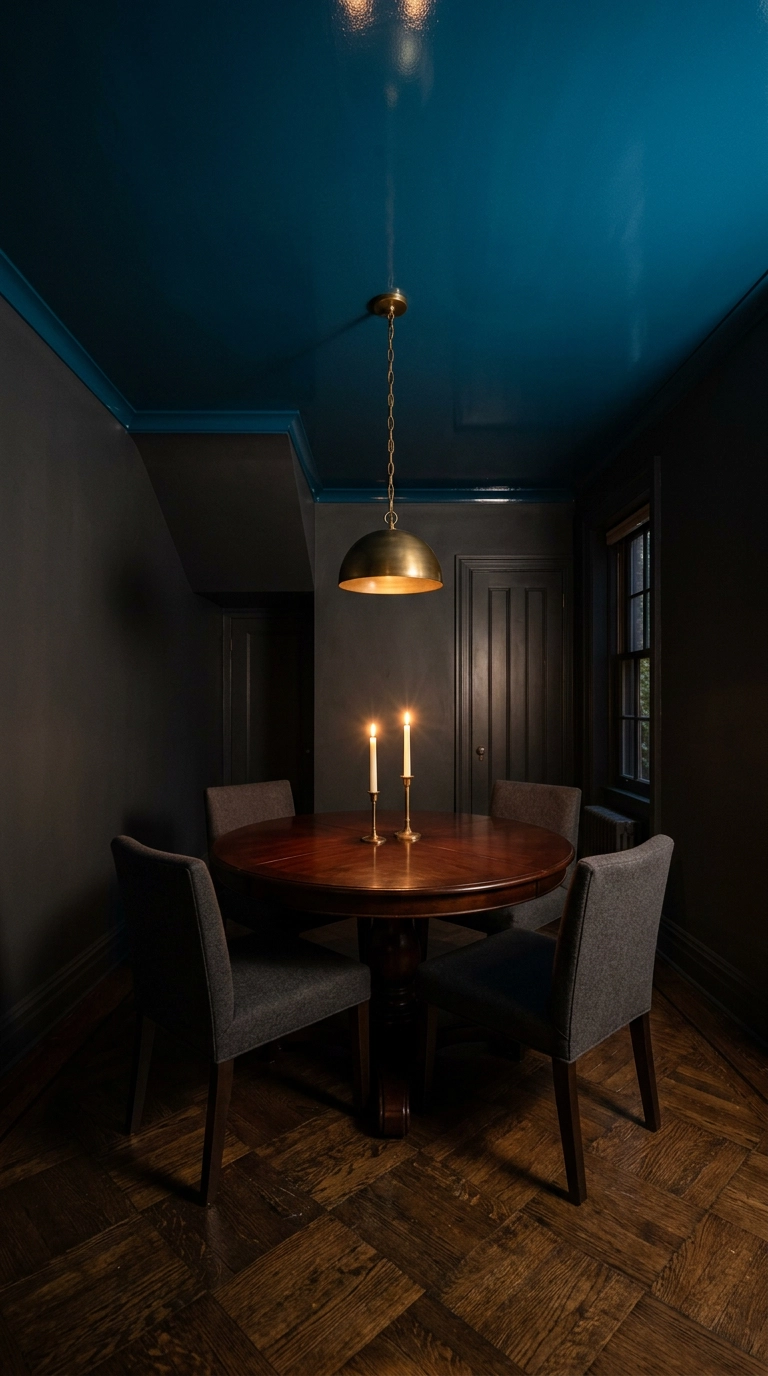
A lacquered ceiling is the most theatrical thing you can do to a dining room, and blue gloss overhead bounces candlelight around like a dark mirror. It is a real splurge and worth hiring out, because gloss shows every imperfection and needs multiple thin sprayed coats to look like glass. Save it for a small dining room you only use at night, which is exactly where it pays off most.
Before You Pick Up a Paint Sample
If you take one thing from this list, let it be that blue behaves differently in your room than it does on a screen. The inky color-drenched room and the sky blue ceiling are technically the same family, and they produce completely opposite feelings. Tape a big sample to the wall and look at it after dinner, because that is when you will actually be in there.
What I keep seeing right now is the shift away from grey-blue toward saturated, slightly greened blues, teal and peacock especially, usually paired with warm wood and unlacquered brass instead of chrome. Farrow & Ball Hague Blue has been the quiet star of that shift for years, and designers like Nate Berkus have long made the case that a dark dining room is a feature rather than a problem. The plate wall and the ticking stripe cushions are the two ideas I recommend most often to people who want the look this weekend for under a hundred dollars.
My honest advice is to start with the reversible stuff. Slipcover the chairs, hang the indigo curtains high, put three blue glass vessels on the sideboard, then decide whether you want to commit to the walls. If you want more of this, ideas I am testing in real client rooms plus the paint colors that actually worked, sign up for my weekly newsletter and I will send it straight to your inbox.


