23+ Beautiful Wall Trim Decor Ideas that Add Instant Character in 2026

I’ll be straight with you – trim is the cheapest way I know to make a builder-grade box look like it was designed on purpose. I’ve spent more weekends than I’d like to admit with a miter saw in my garage and a caulk gun in my back pocket, and the payoff never gets old, because a wall with molding catches light and throws shadow in a way flat drywall simply can’t. Some of these wall trim decor ideas are a Saturday and eighty dollars of primed MDF, others really do deserve a finish carpenter, and I’ll tell you honestly which is which.
Wall Trim Decor Ideas
1. Classic Picture Frame Molding Behind the Sofa
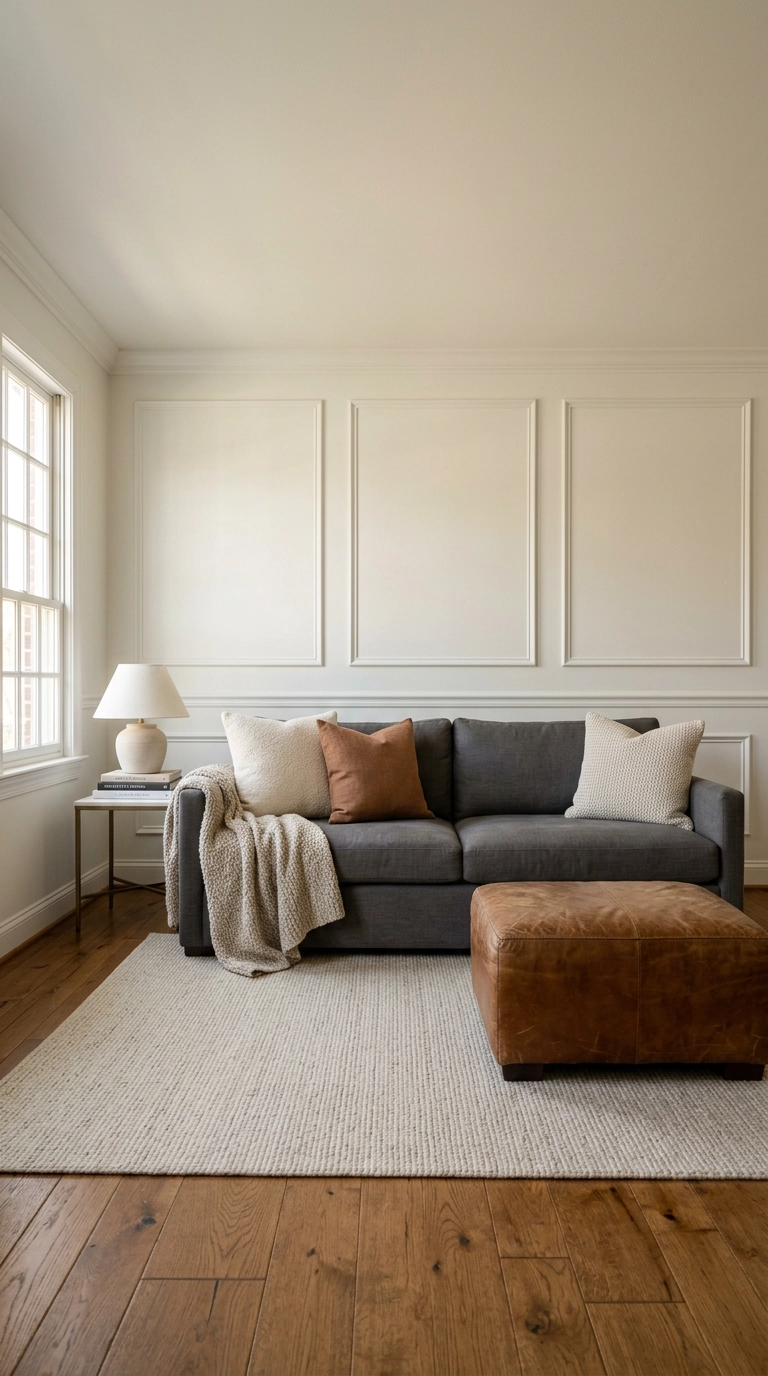
This is the idea I start almost every client with, because it’s forgiving and it photographs beautifully. Lay out your rectangles so the gap to the baseboard, the ceiling, and between each frame is the same number – I use 5 inches on standard 8-foot walls – and suddenly the wall looks architect-drawn instead of guessed.
2. Full-Wall Board and Batten in a Deep Green
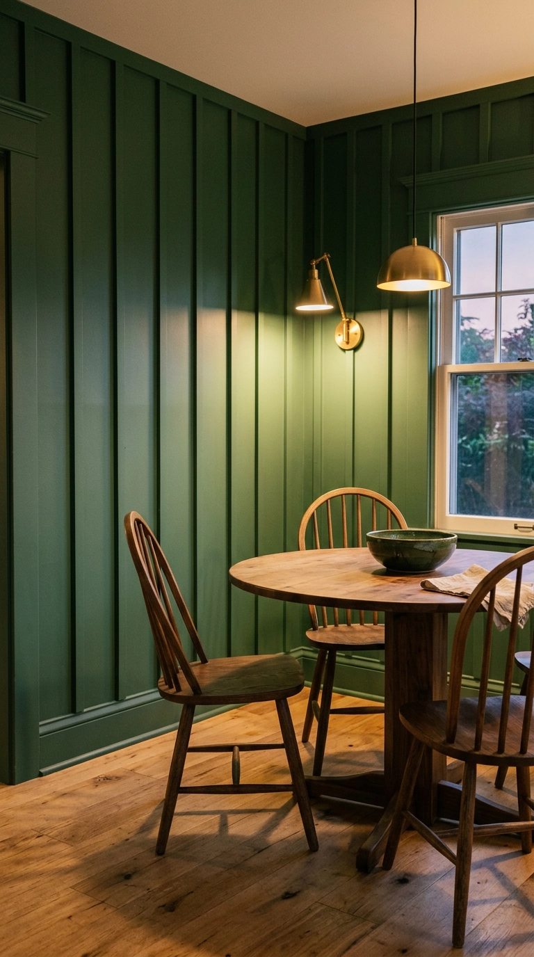
Running the battens all the way to the ceiling instead of stopping at chair height makes a room feel taller, not shorter – the eye follows the vertical lines up and reads the ceiling as further away. Color drenching it, meaning wall, battens, and baseboard all in one shade, erases the visual breaks that would otherwise chop the room into pieces.
3. Chair Rail with Two-Tone Paint in an Entryway
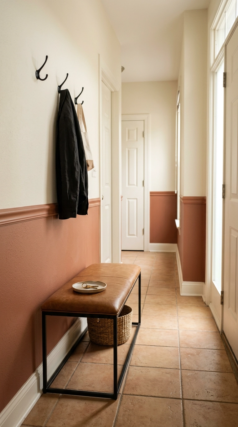
Chair rail is the one trim people get wrong most often, and it’s always the height. The old 32-inch rule was invented for dining chairs; I put it at one third of the wall height, so roughly 32 to 36 inches on an 8-foot wall and higher on a 9-foot one, and it instantly stops looking like a rental hallway.
4. Slatted White Oak Wall Behind a Bed
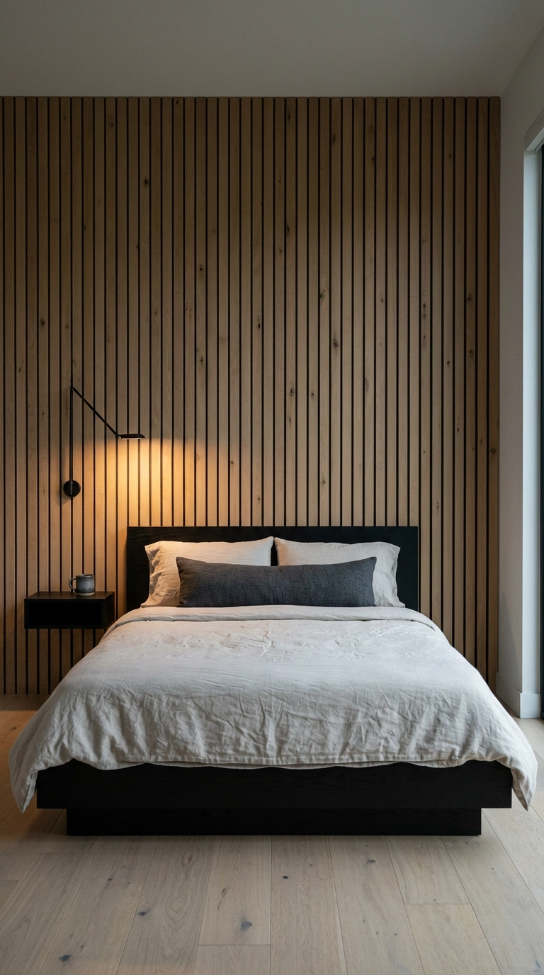
Slat walls are technically trim, just modern trim, and they’re the warmest way to break up a big blank bedroom wall. Buy pre-made slat panels if you want it done in an afternoon, or rip your own from poplar and stain it if you want the spacing exactly right.
5. Half-Wall Wainscoting in a Powder Room
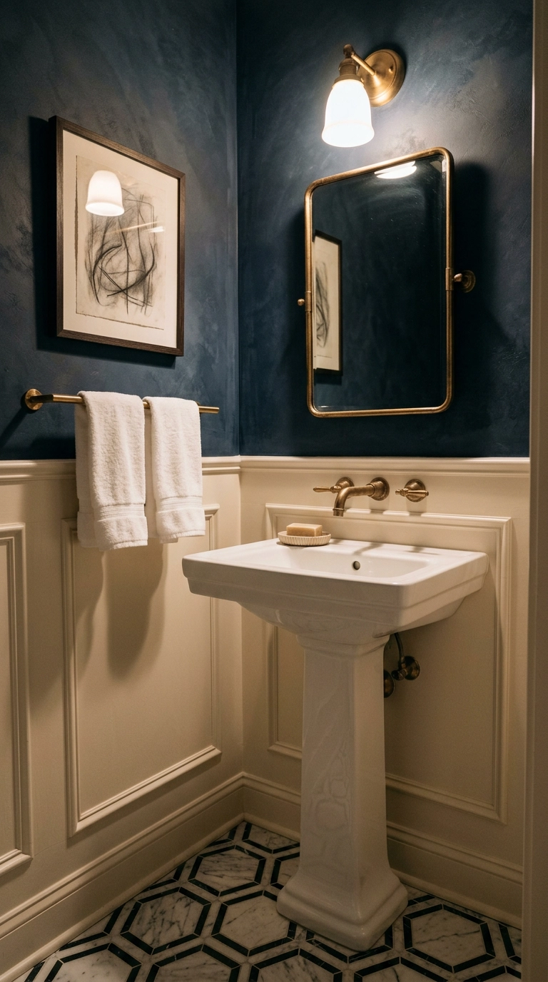
A powder room is the lowest-stakes place in the house to go dramatic, and wainscoting on the bottom half gives you a hard line to switch colors at. Cap it at 36 to 42 inches – in a tiny room I go higher than I would elsewhere, because the taller the paneling, the more the room reads as intentional rather than half-finished.
6. Grid Molding Painted the Same Color as the Wall
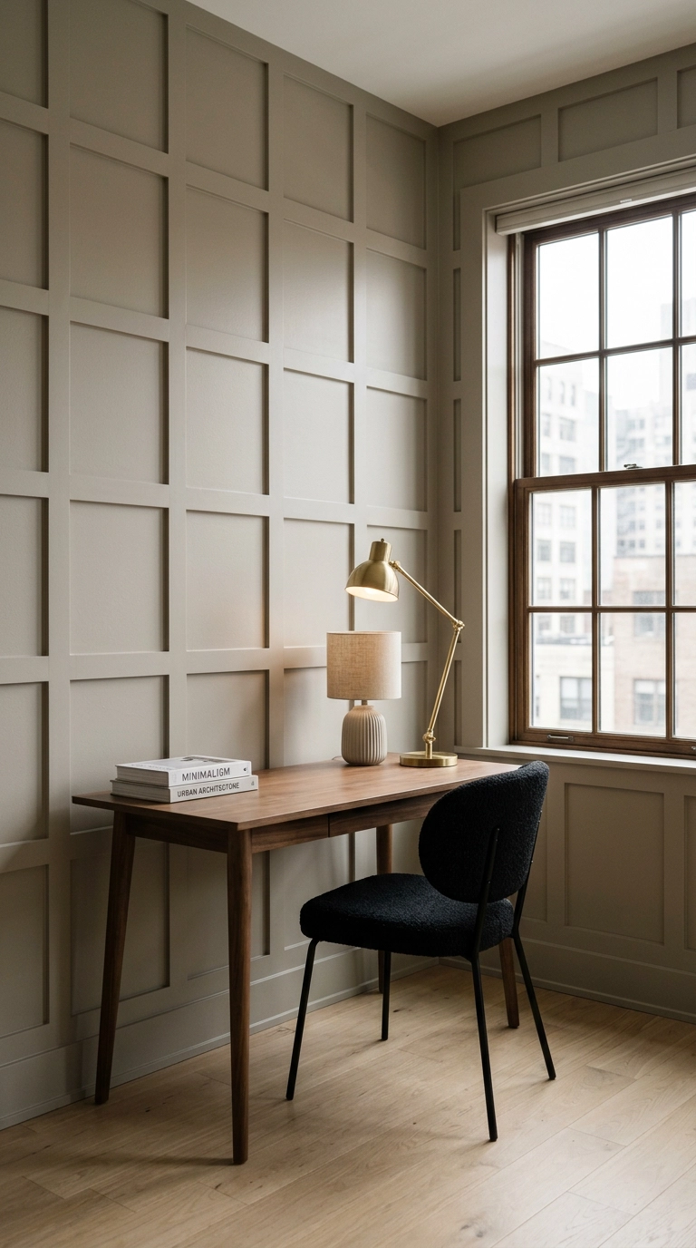
Painting the trim and the wall the exact same color is the move that separates the good version of this from the Pinterest-fail version. Contrast trim shows every wobbly caulk line, but color-matched trim turns the whole wall into pure light and shadow, which is far more forgiving and looks more expensive.
7. Picture Rail Molding with Hanging Art
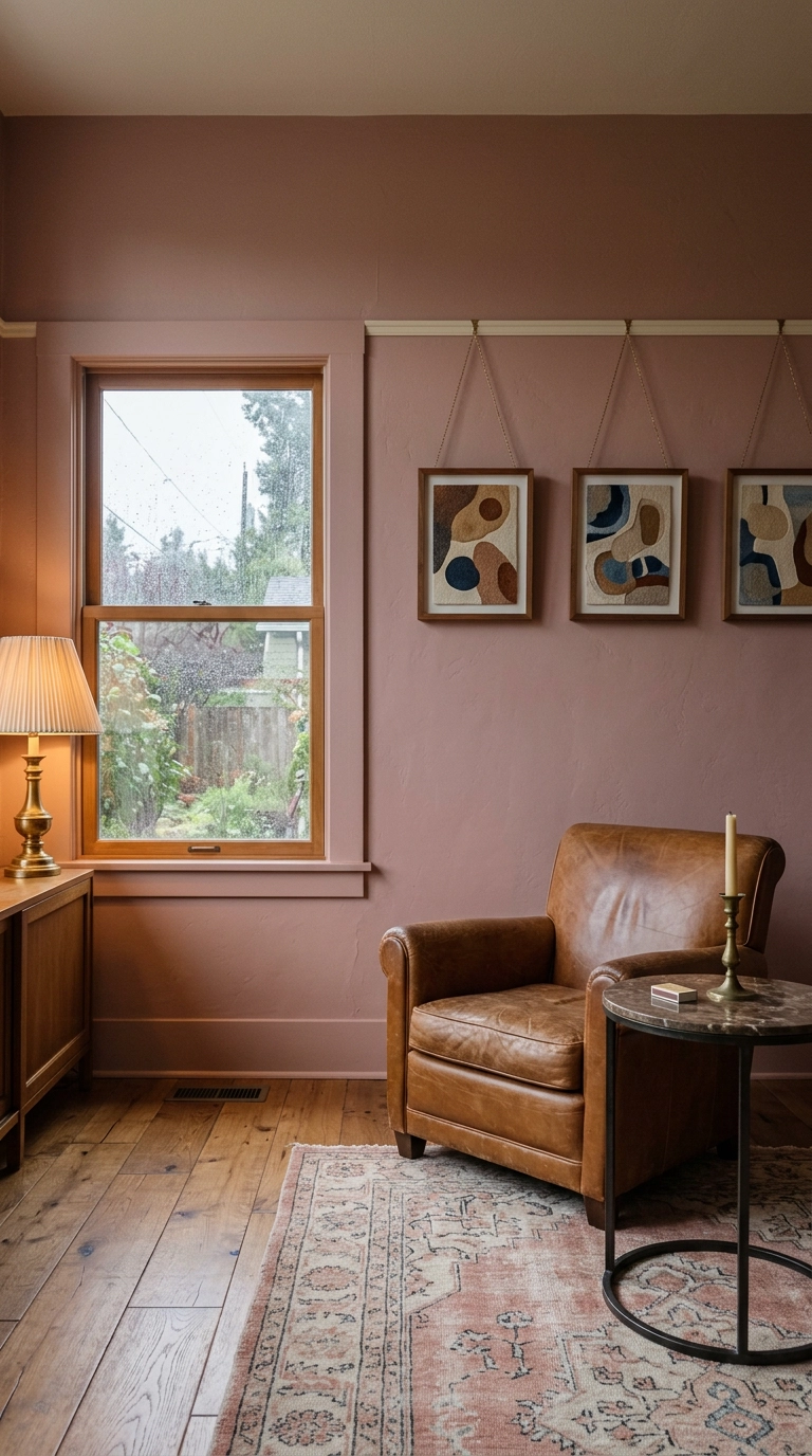
Picture rail is trim that does a job – it lets you hang and rearrange art forever without putting another hole in the wall. It’s also the single most renter-friendly molding here, because it’s one thin strip you can patch with a dab of spackle when you move out.
8. Beadboard Wainscoting in a Mudroom
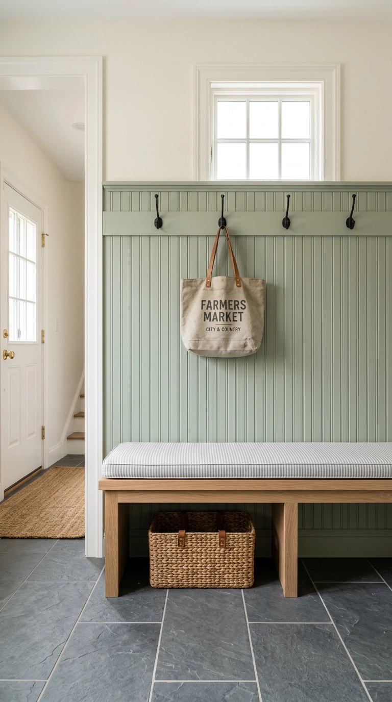
Beadboard gets dismissed as dated, but in a mudroom it earns its keep – the vertical grooves hide scuffs and boot marks that flat drywall would show in a week. Buy it in 4×8 sheets rather than individual planks and your install time drops by half.
9. Oversized Crown Molding in a Low-Ceiling Living Room
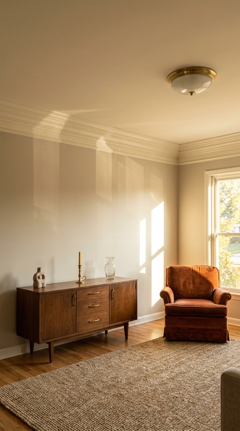
Everybody assumes low ceilings mean skinny crown, and it’s backwards. A generous 5 to 6 inch crown reads as architecture; a 2-inch strip reads as an apology, and it makes the ceiling look lower by drawing a hard little line right where you don’t want one.
10. Applied Panel Molding on a Stairway Wall
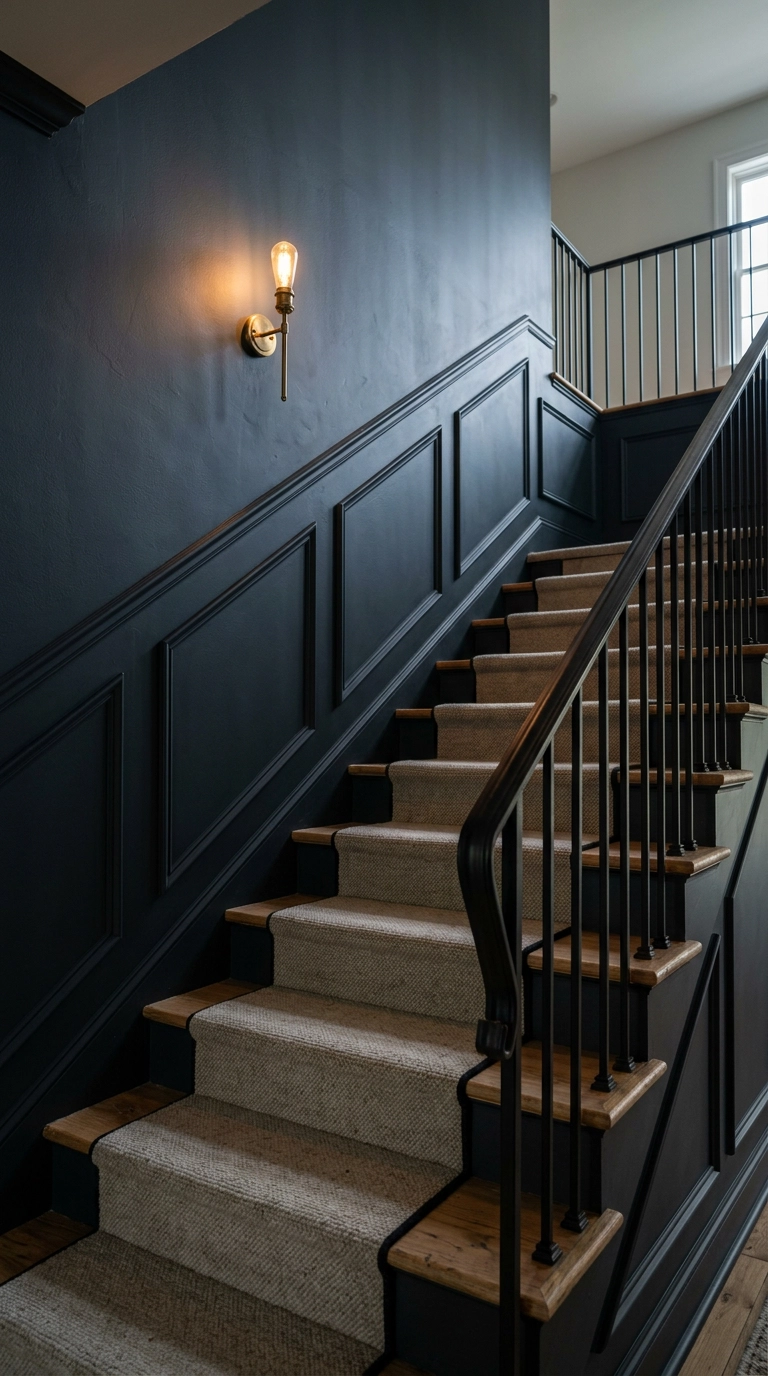
Stair walls are the hardest trim layout in any house, because your boxes have to march up on the diagonal while staying square. The trick is to set the top and bottom edges of each box parallel to the stair stringer, not to the floor, and keep the vertical spacing between boxes identical.
11. Plate Rail Shelf Ledge Above Wainscoting
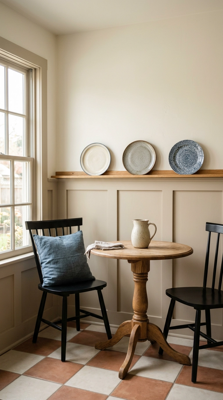
A plate rail is a chair rail with ambition – add a small shelf and a lip and the trim becomes usable display space. Keep it around 60 inches high in a dining area so leaned plates sit above head height and nobody catches an elbow on them.
12. Fluted Trim Panels Flanking a Fireplace
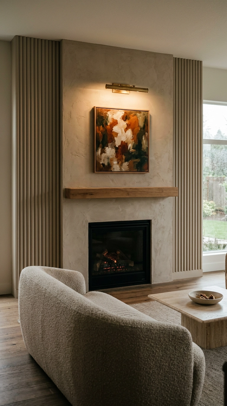
Fluted trim is the softest millwork option out there, because the rounded profile catches a gradient of light instead of a hard edge. Around a fireplace it does something clever – the vertical ribbing pulls your eye up the chimney breast and makes a squat firebox feel taller.
13. Simple Batten Grid in a Nursery, Painted Warm White
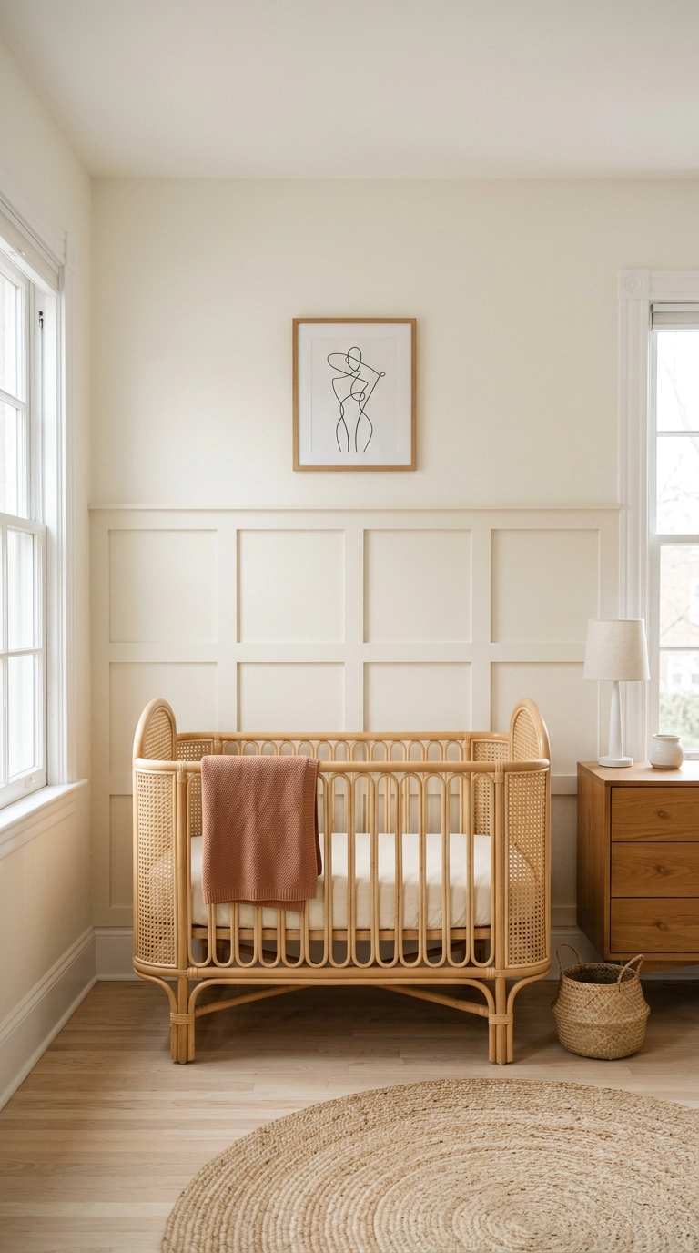
A nursery is where I’d argue for the plainest trim in the house, because the room will change five times before the kid turns ten and a neutral grid survives all of it. Keep the rectangles wide rather than tall and the wall feels calmer, which matters at 3 a.m.
14. Shiplap Wall Turned Sideways, Painted Charcoal
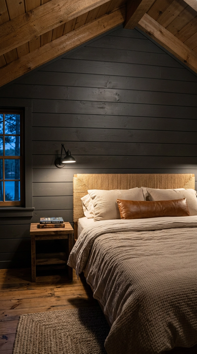
Shiplap got overexposed, but painted a dark matte color it stops reading farmhouse entirely and becomes texture instead. The shadow lines between boards do the work a solid dark wall can’t, which is keeping the color from going flat and cave-like.
15. Double Picture Frame Molding for a Tall Dining Wall
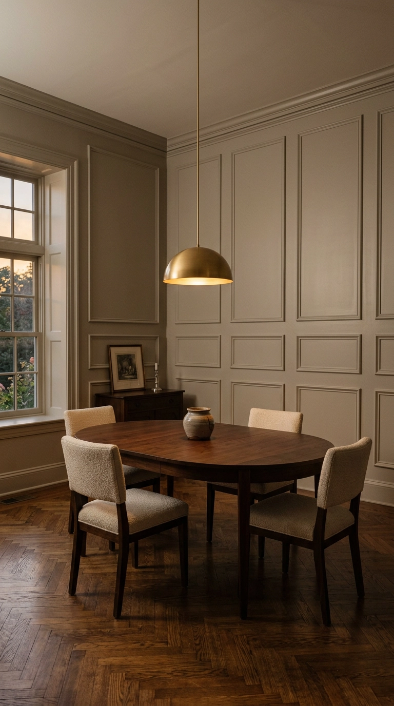
On a wall taller than nine feet, one row of frames looks stranded, floating in the middle of nowhere. Two rows fixes it, but only if the top row is noticeably taller than the bottom – a rough two-thirds to one-third split reads as intentional, while equal rows read as a mistake.
16. Peel-and-Stick Trim Molding for Renters
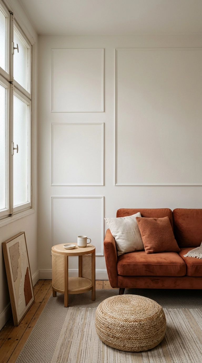
Yes, you can do this in a rental. Thin flexible polystyrene molding goes up with removable mounting adhesive or a heavy-duty double-sided tape, and it comes down at move-out with a hair dryer and some patience.
17. Slim Vertical Battens in a Hallway, Full Height
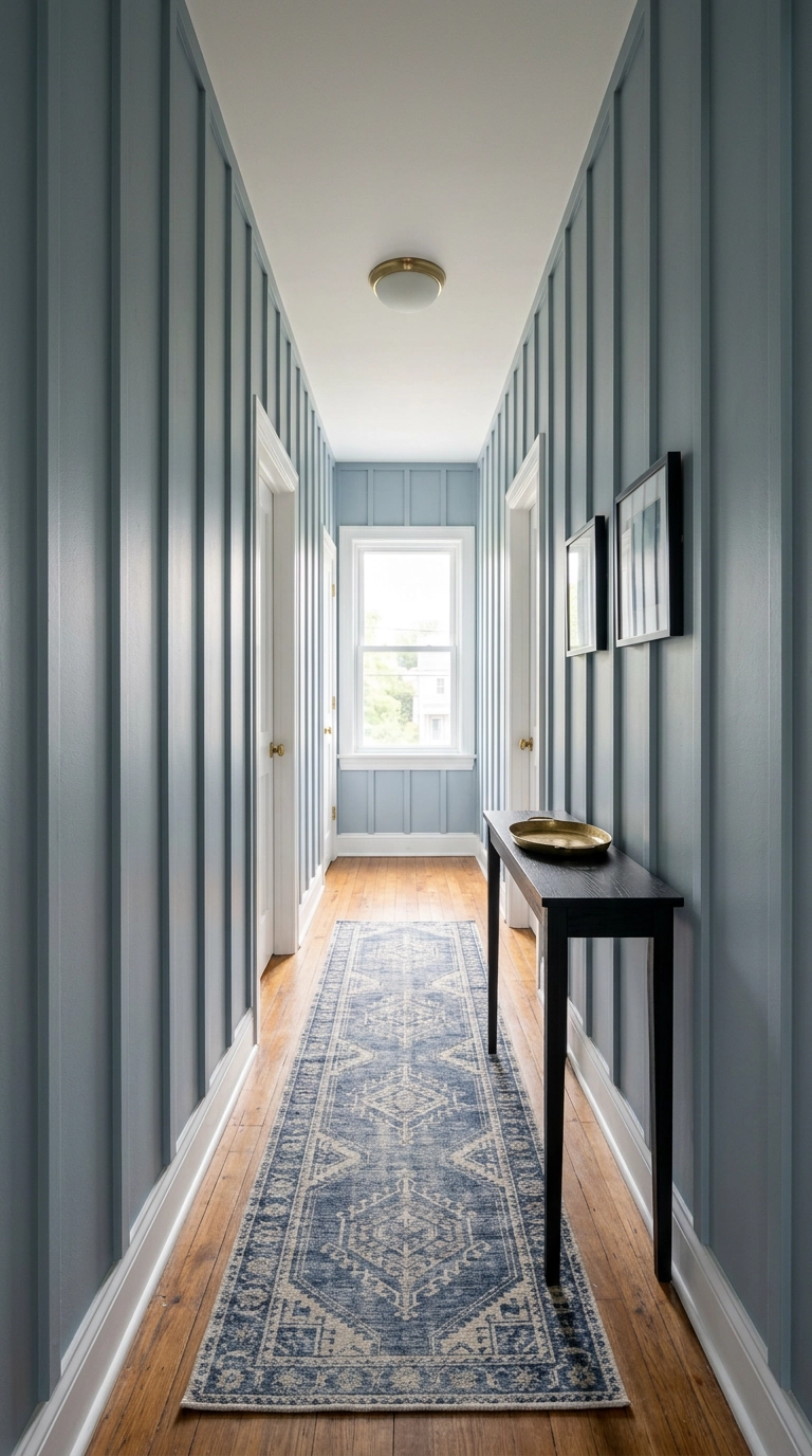
Hallways are dead space begging for trim, and vertical battens are the cheapest possible fix because you skip the horizontal rails entirely. Spacing them 10 to 14 inches apart gives you rhythm without the wall looking like a picket fence.
18. Arched Molding Detail Above a Console
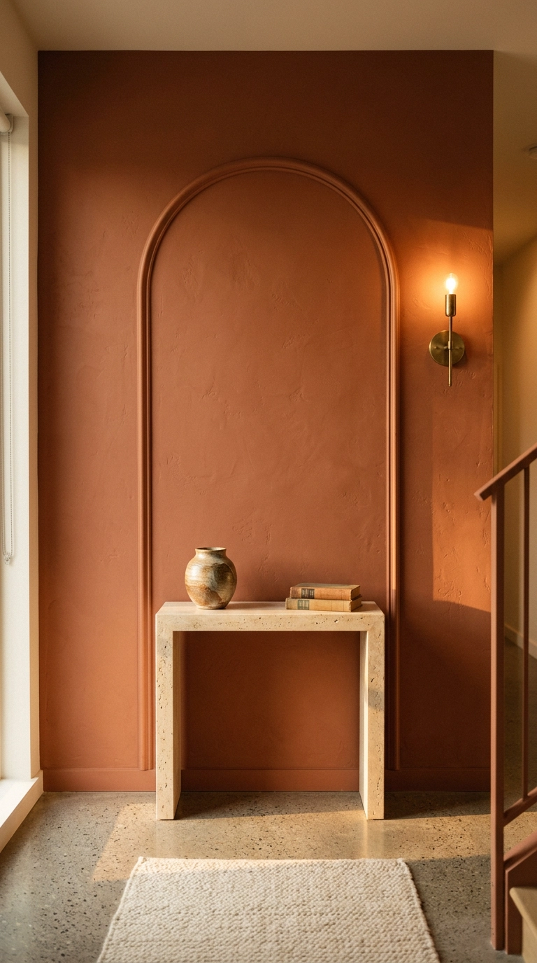
An arch is the most-requested trim shape of the last two years and the easiest way to break up all those right angles. Flexible pre-curved molding comes in standard radii, so you’re really just cutting two straight legs and popping the curve on top.
19. Wide Baseboards Swapped In for Builder-Grade
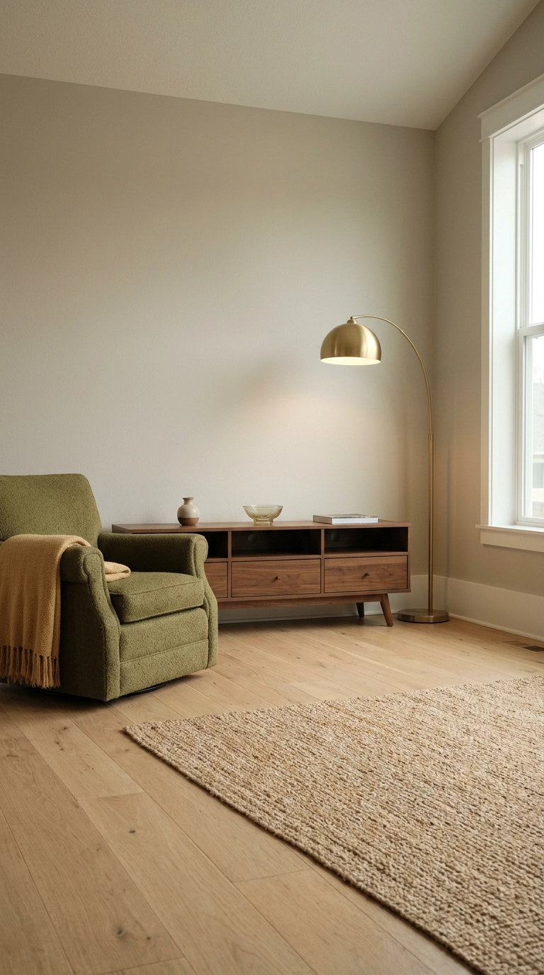
Nobody photographs baseboards, and yet swapping 3-inch builder stock for 6 or 7-inch flat stock changes a room more than most people expect. Taller base makes the ceiling read higher because it gives the wall a proper visual foundation to sit on.
20. Trim Carried Across the Ceiling for a Fifth Wall
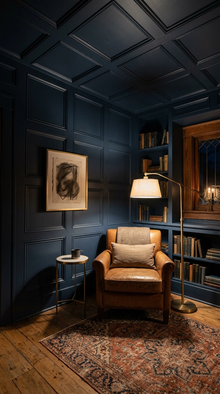
Running molding onto the ceiling is the single most dramatic thing on this list, and it works because it removes the seam where wall stops and ceiling starts. The room stops having a lid and starts feeling like a jewel box.
21. Two-Tone Trim, Dark Molding on a Pale Wall
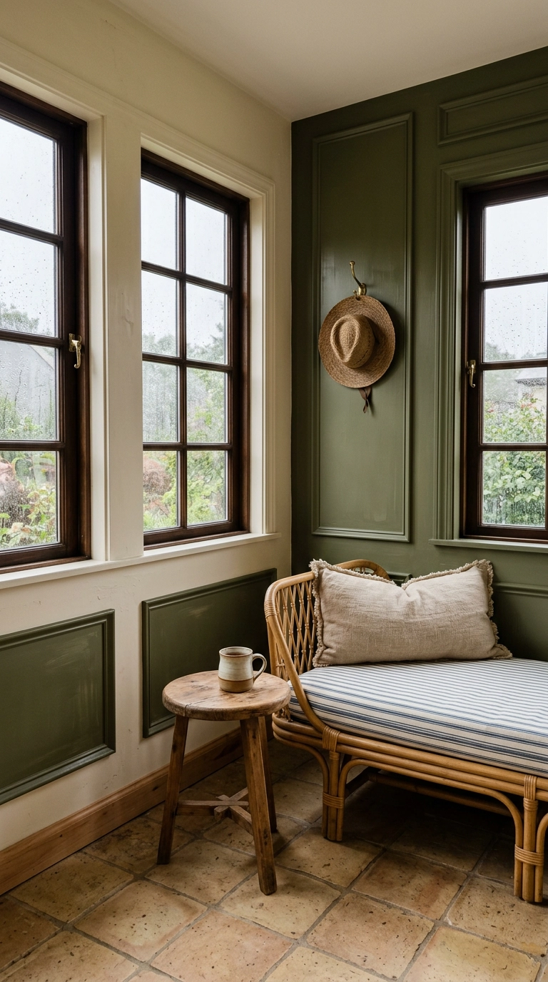
I spend most of this article telling you to paint the trim and wall the same color, so here’s the exception. Contrast trim works when the molding shape itself is the star and the wall behind it is deliberately quiet – it turns the boxes into graphic outlines rather than shadow play.
22. Full Paneled Wall with an Integrated Door
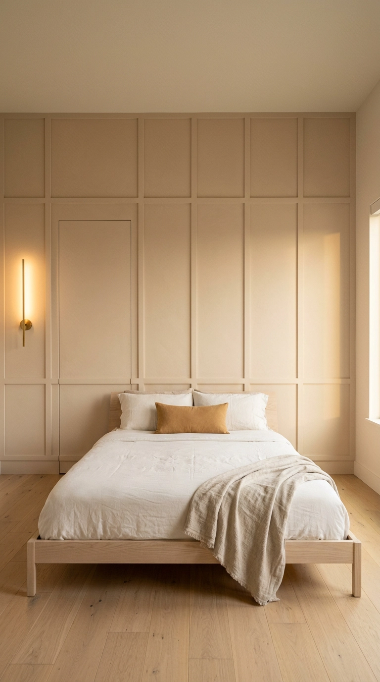
This is the finale, and it’s also the one I’d genuinely hire out. Letting the panel grid absorb a closet or bathroom door makes the wall read as one unbroken piece of architecture, and it’s the detail that makes people stop scrolling.
Before You Pick Up the Miter Saw
If you take one thing from all of this, let it be the color-matching rule. The grid molding office and the board and batten dining room both work for the same quiet reason – wall, trim, and baseboard in one shade, one sheen, so the whole surface becomes light and shadow instead of a paint job with edges. It’s also the most forgiving choice for a first-timer, because nothing announces a slightly imperfect caulk line like contrast trim under a sconce.
What I’m seeing everywhere heading into 2026 is trim getting softer and quieter. Fluted panels around fireplaces, arches over consoles, and full-height battens in colors like Farrow & Ball Green Smoke or a chalky mushroom greige have pushed out the crisp white contrast look that dominated a few years back. Even the color-drenched moment that Kelly Wearstler and Studio McGee both leaned into is really just this idea in disguise: pick one shade, commit to it on every surface, and let the millwork profiles carry the interest. Start small if you’re nervous – a picture rail or a taller baseboard is a two-hour afternoon.
Be honest with yourself about the compound miters, though. Crown molding and that hidden paneled door are worth paying a finish carpenter for, and there’s no shame in spending your weekend on picture frame molding behind the sofa instead. If you want more projects like these, plus the paint shades and layout math I actually use on client jobs, come sign up for my weekly newsletter – I send one email, no clutter, just the good stuff.