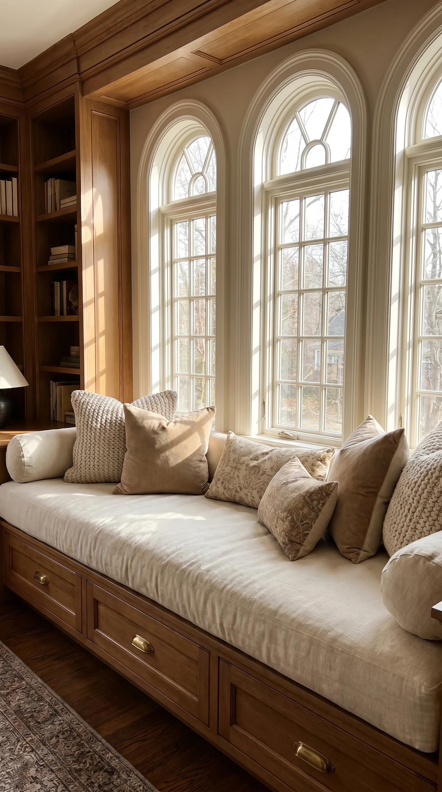
23+ Stunning Navy Living Room Decor Ideas that Feel Rich and Easy in 2026

I’ll admit it — navy was the color I used to talk clients out of. I had it filed under “safe blue for men’s ties,” and then I painted a client’s north-facing living room in a deep inky navy and stood there feeling like an idiot, because the room had never looked better. Navy does something white can’t: it absorbs the flat grey light instead of fighting it, and suddenly the wood tones and brass in the room have something to push against. I’ve used it about forty ways since, from a twenty-dollar pillow swap to a full color-drenched library, and below are the versions that actually work in real American living rooms.
Navy Living Room Decor Ideas
1. A Navy Velvet Sofa as the Whole Room’s Anchor
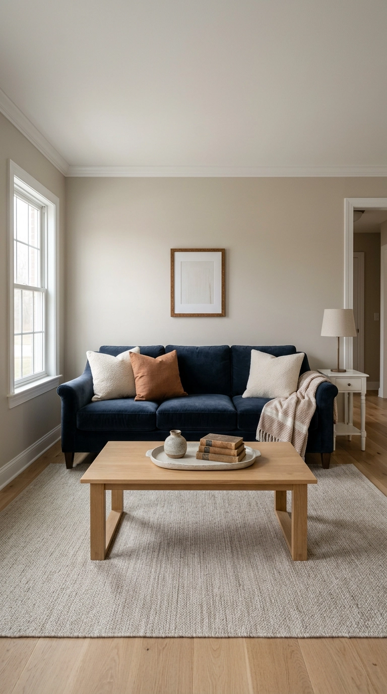
If you only do one navy thing, make it the sofa. Velvet is the reason — the pile catches light differently across every cushion, so a navy velvet sofa reads as five shades of blue instead of one flat block, which is exactly what keeps a dark piece from looking like a hole in the room.
2. The Twenty-Minute Navy Pillow and Throw Swap
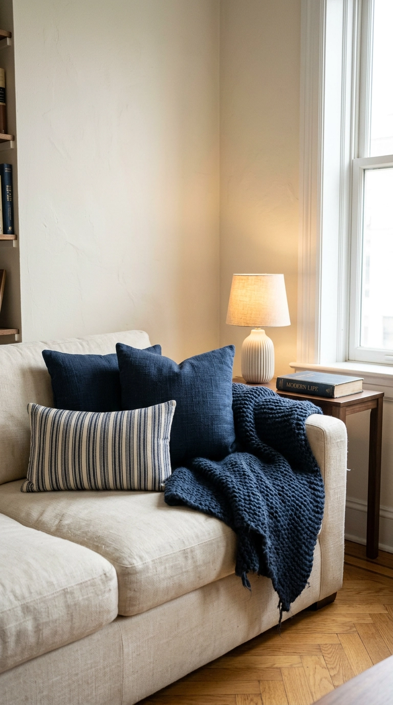
Not everyone is ready to commit a sofa to navy, and honestly you don’t have to. Three navy textiles — two pillows and a throw — are enough to make a neutral room read as intentionally navy, and the whole thing costs less than dinner out.
3. Color-Drenched Navy Walls, Trim, and Ceiling
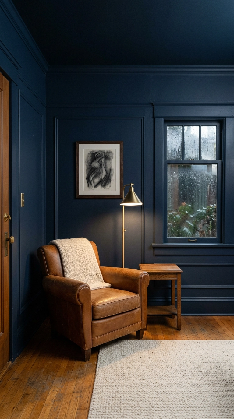
Color drenching means painting the walls, trim, and ceiling all one shade — and it is the single best thing you can do to a small, choppy living room. The reason it works: your eye reads the visual breaks between white trim and dark wall as edges, and edges tell your brain where the room stops. Erase them and the corners dissolve.
4. Navy Board and Batten Wall Molding Behind the Sofa
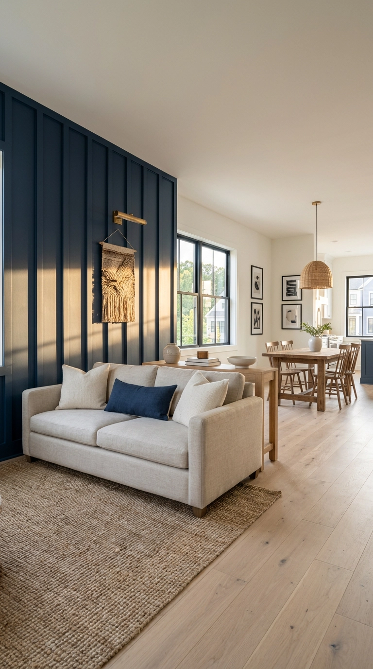
Board and batten is vertical wood strips applied over drywall in even intervals, and in navy it gives you architecture in a room that has none. The raking light across the battens is the whole point — you get shadow lines that change through the day, so the wall never looks flat.
5. Navy and Brass, the Pairing That Never Misses
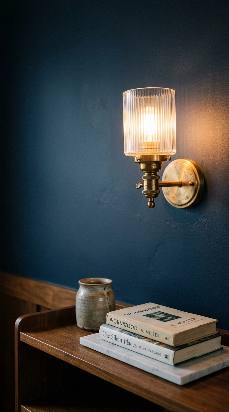
Navy is a cool color, which means it needs a warm metal or it goes cold and corporate fast. Brass is the fix, and unlacquered brass specifically — it develops patina, so it warms further over time instead of staying showroom-shiny.
6. Navy Built-In Bookshelves Flanking the Fireplace
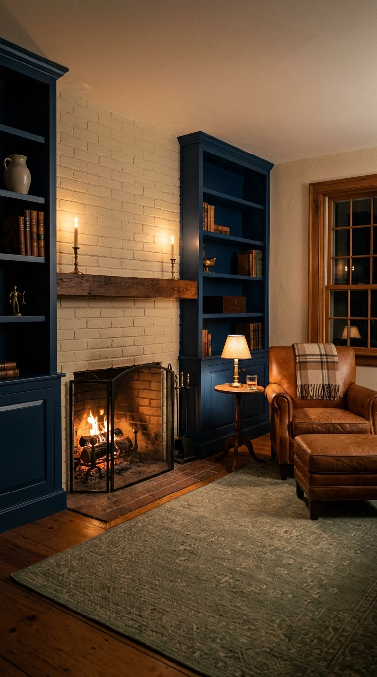
Painting the inside of built-ins navy makes the shelves recede and the objects on them come forward — it’s the same reason gallery walls are painted dark behind the art. If your shelves currently look cluttered, this alone will fix half the problem.
7. Navy Grasscloth Wallpaper for Texture Without Flatness
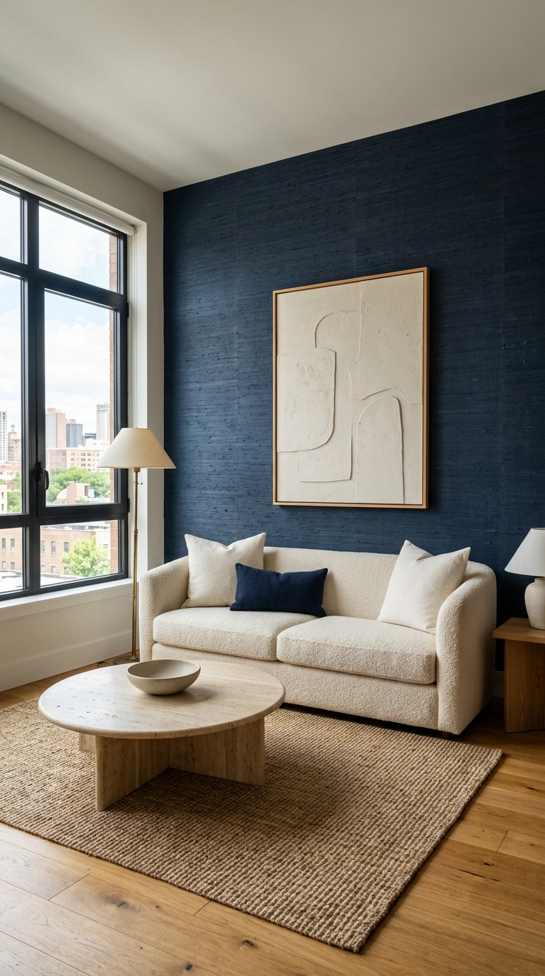
Grasscloth is woven natural fiber paper, and in navy it gives you depth that flat paint physically can’t — the fibers catch light in tiny irregular lines, so the wall shifts as you move past it. It’s my go-to when a client wants navy but the room is bright and paint would look too solid.
8. Navy Curtains Hung High and Wide
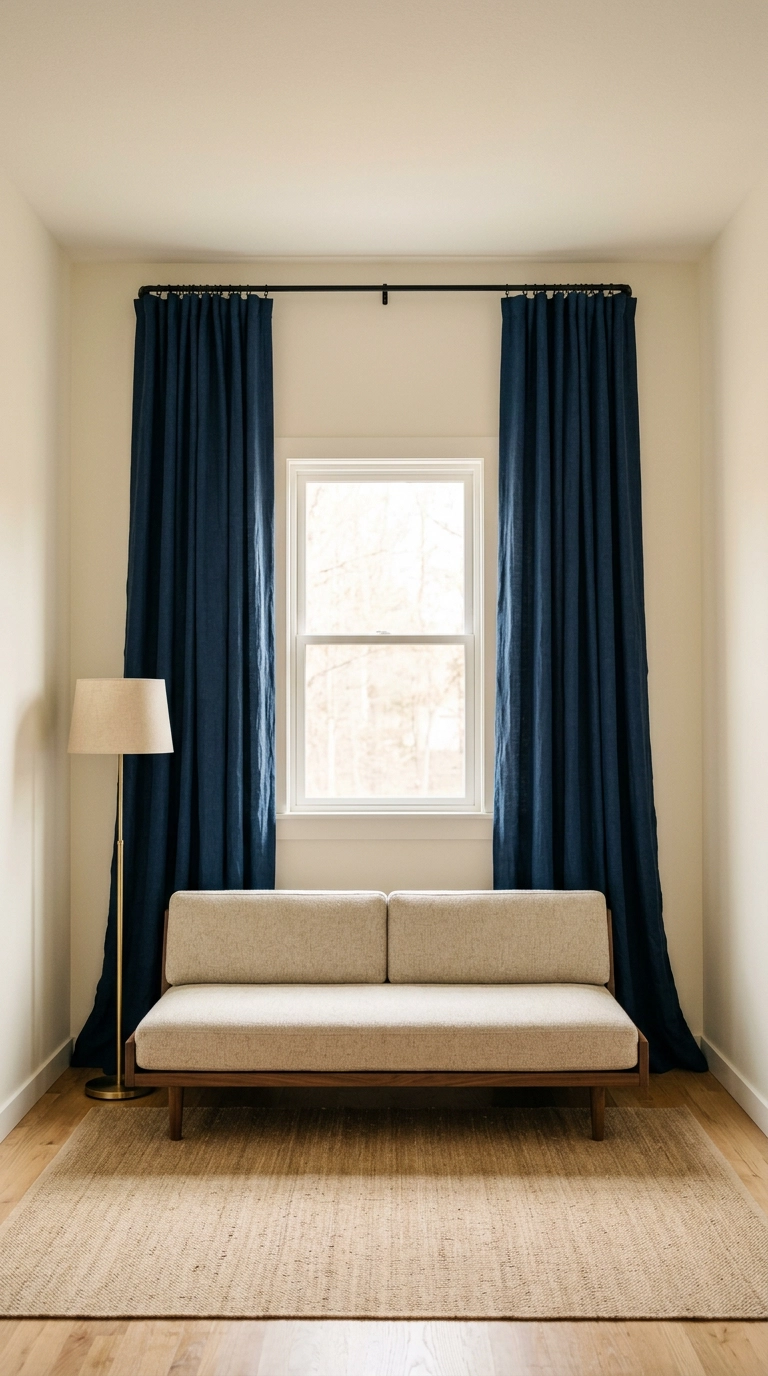
Mount the rod 4 to 6 inches below the ceiling and extend it 8 to 10 inches past each side of the window frame. Your eye reads the top of the fabric as the top of the window, so hanging high makes the window look taller and the ceiling higher — the single cheapest trick in the business.
9. Navy and Camel Leather, the Grown-Up Combination
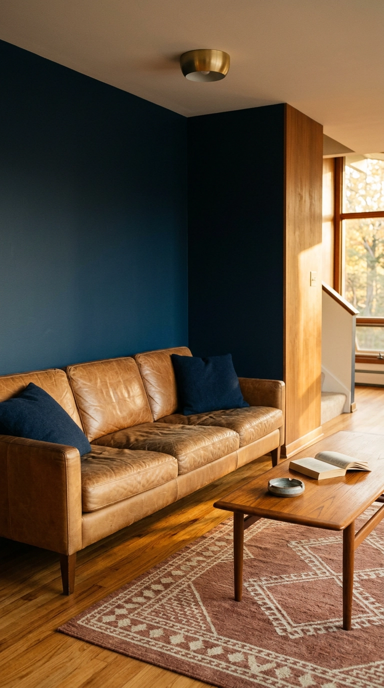
Camel leather against navy is the most reliable pairing I know, and it’s about temperature: the orange-brown of the leather sits opposite blue on the color wheel, so each one makes the other look richer. It’s why every men’s tailoring shop and half of Ralph Lauren’s interiors run this exact combo.
10. A Single Navy Accent Chair in an Otherwise Neutral Room
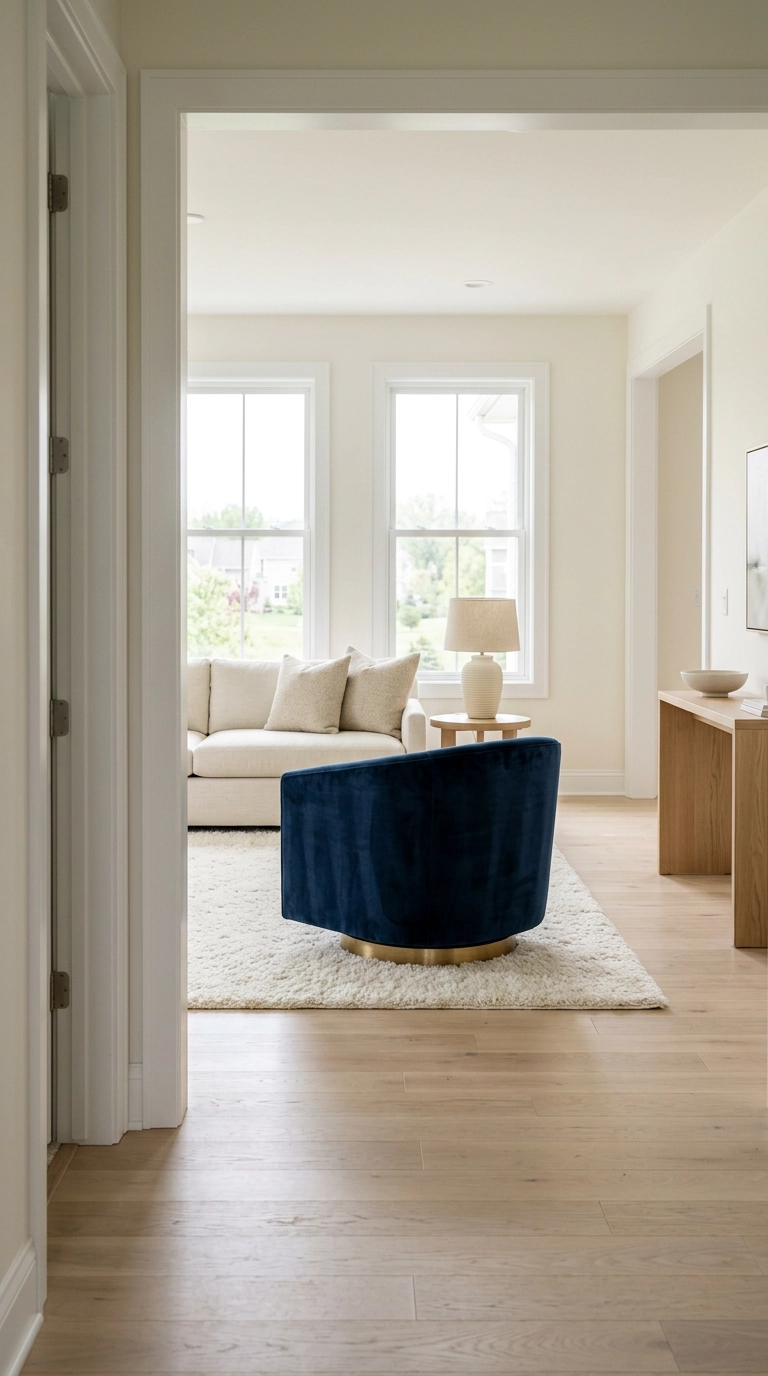
One saturated chair in a pale room is the lowest-risk way to use navy, and the reason it works is visual weight — a dark object in a light room pulls your eye immediately, so it acts as a focal point without you having to build a whole scheme around it.
11. Navy Picture-Frame Molding for Quiet Formality
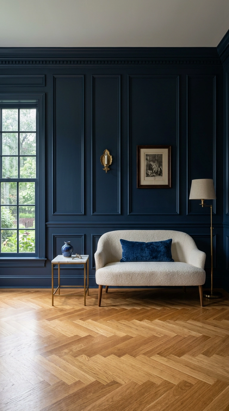
Picture-frame molding is thin trim applied in rectangles directly on the wall, and painted the same navy as the wall behind it you get shadow and shape without any color contrast. It reads as old-house architecture even in a 1990s build.
12. Navy Plus Warm Terracotta for a Room That Isn’t Cold
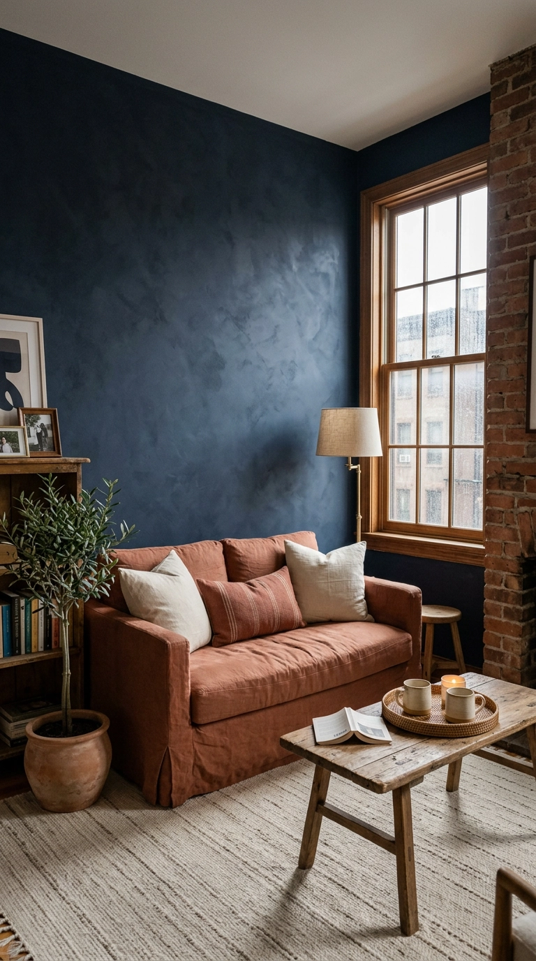
Terracotta is navy’s warmest friend. If your navy room feels chilly no matter how many lamps you turn on, the problem isn’t light level, it’s that every other color in the room is also cool — one warm earth tone fixes it instantly.
13. A Navy Vertical Slat Wood Wall for Modern Texture
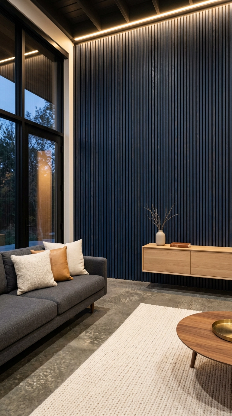
Slat walls are everywhere in warm oak, which is exactly why a navy-stained version stands out. Use stain rather than paint so the grain still shows through — that grain is the only thing keeping the wall from looking like plastic panelling.
14. Navy Coastal Grandmillennial with Ticking Stripe
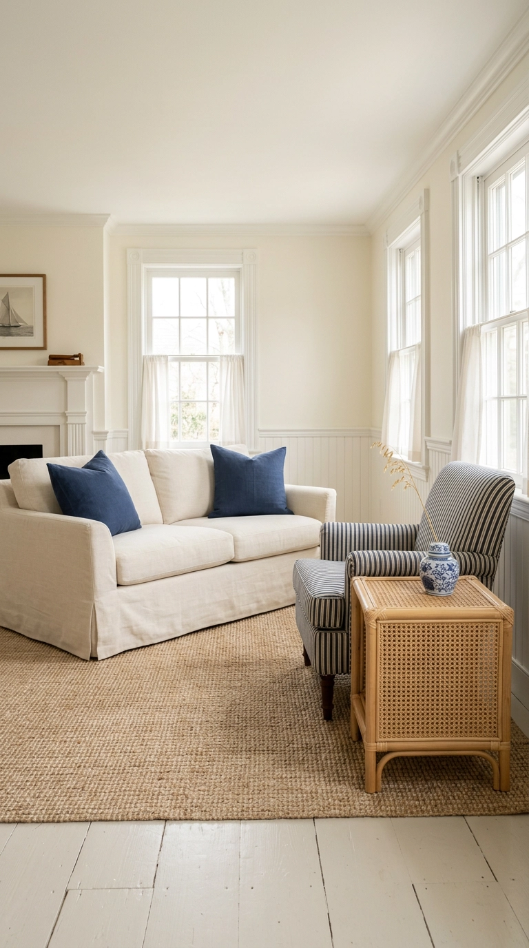
This is navy at its brightest and most classic — think of it as the opposite of the moody library look. Ticking stripe is that narrow woven mattress-style stripe, and it’s the one pattern I let carry a whole room because the repeat is small enough to read as texture from across the space.
15. A Navy Area Rug to Ground a Pale Room
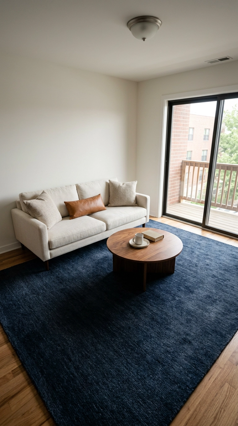
Dark floors ground a room, and a navy rug fakes them for a fraction of the cost. This is the move for anyone stuck with pale builder-grade LVP flooring they can’t change.
16. Navy Fireplace Surround as an Unexpected Focal Point
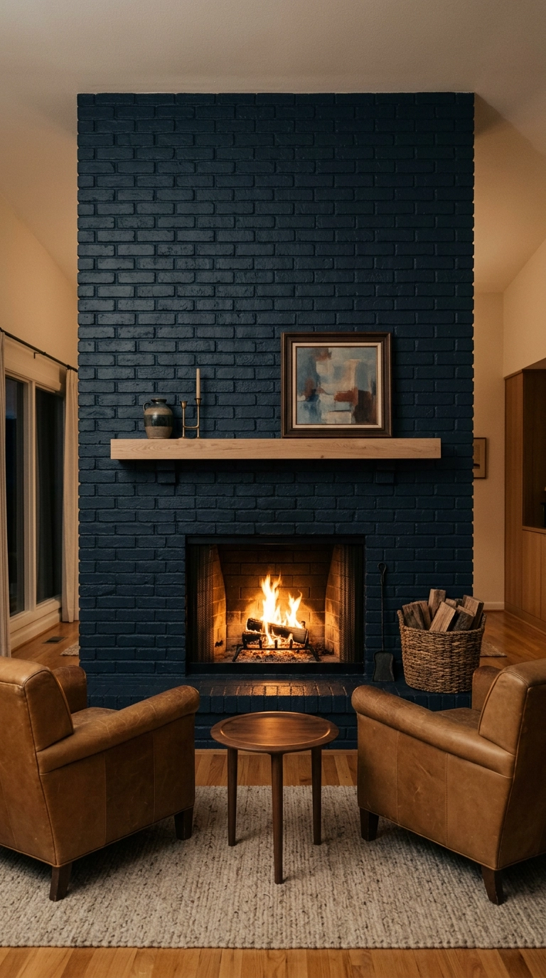
Painting dated brick navy instead of the default white is my favorite quiet rebellion. White painted brick has been done to death, and navy keeps the texture visible while making the fireplace read as intentional architecture rather than a leftover from 1962.
17. Navy Bookshelf Backing on Existing Open Shelving
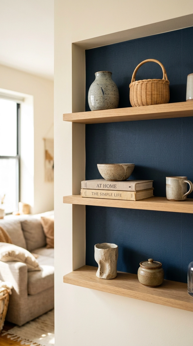
If you already have shelves, lining just the back panels in navy costs almost nothing and makes everything you own look better displayed. Dark backing creates contrast behind pale objects, the same principle museums use.
18. Navy Sectional for a Family Room That Takes Abuse
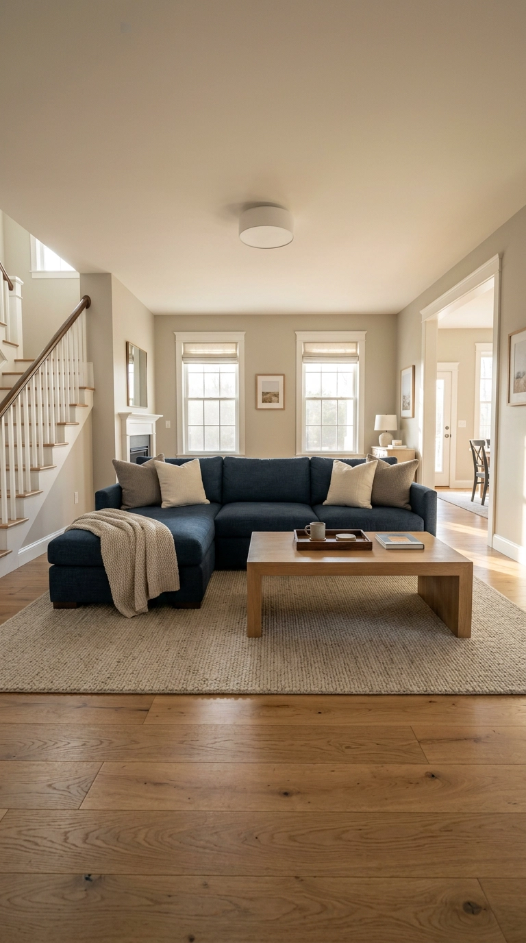
Navy hides everything. If you have kids, dogs, or a red wine habit, a navy performance-fabric sectional is the genuinely practical choice, and it’s why I specify it constantly for family rooms.
19. Navy and Soft Blush for a Warmer, Softer Scheme
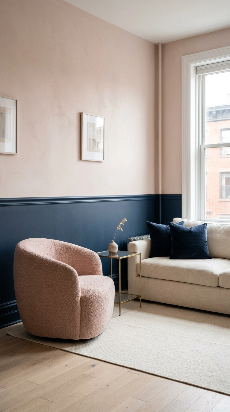
Navy and blush sounds like a nursery until you see it in adult proportions — deep navy on the bottom two-thirds, soft blush above, split by a picture rail. The dark base grounds the room and the blush keeps it from turning severe.
20. A Navy Gallery Wall on a Navy Wall
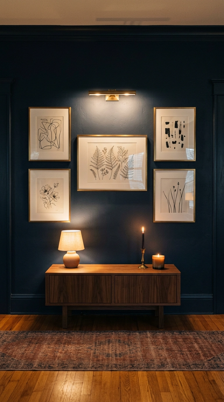
Art on a navy wall beats art on a white wall, and the reason is contrast control — white walls make every frame edge scream, while navy lets the artwork itself carry the composition. Brass frames on navy is about as good as it gets.
21. Navy Ceiling Only, Walls Left Pale
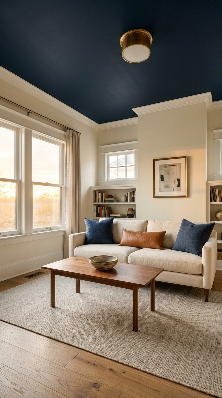
A navy ceiling in a room with pale walls makes the ceiling feel like a canopy rather than a lid, and it’s a great compromise if you love navy but the room is too small for dark walls. It works best with 9 ft ceilings or taller.
22. Navy Media Console Wall to Hide the TV Problem
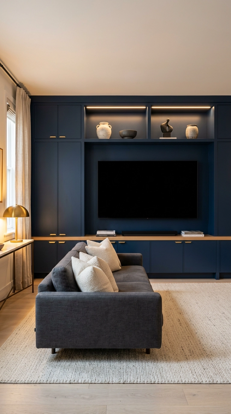
Here’s the trick nobody tells you: a black TV screen on a white wall is a black rectangle you can’t stop looking at. Put it against navy cabinetry and it visually disappears, because the value difference between the screen and the wall almost vanishes.
23. The Full Navy Snug, Lamplight Only
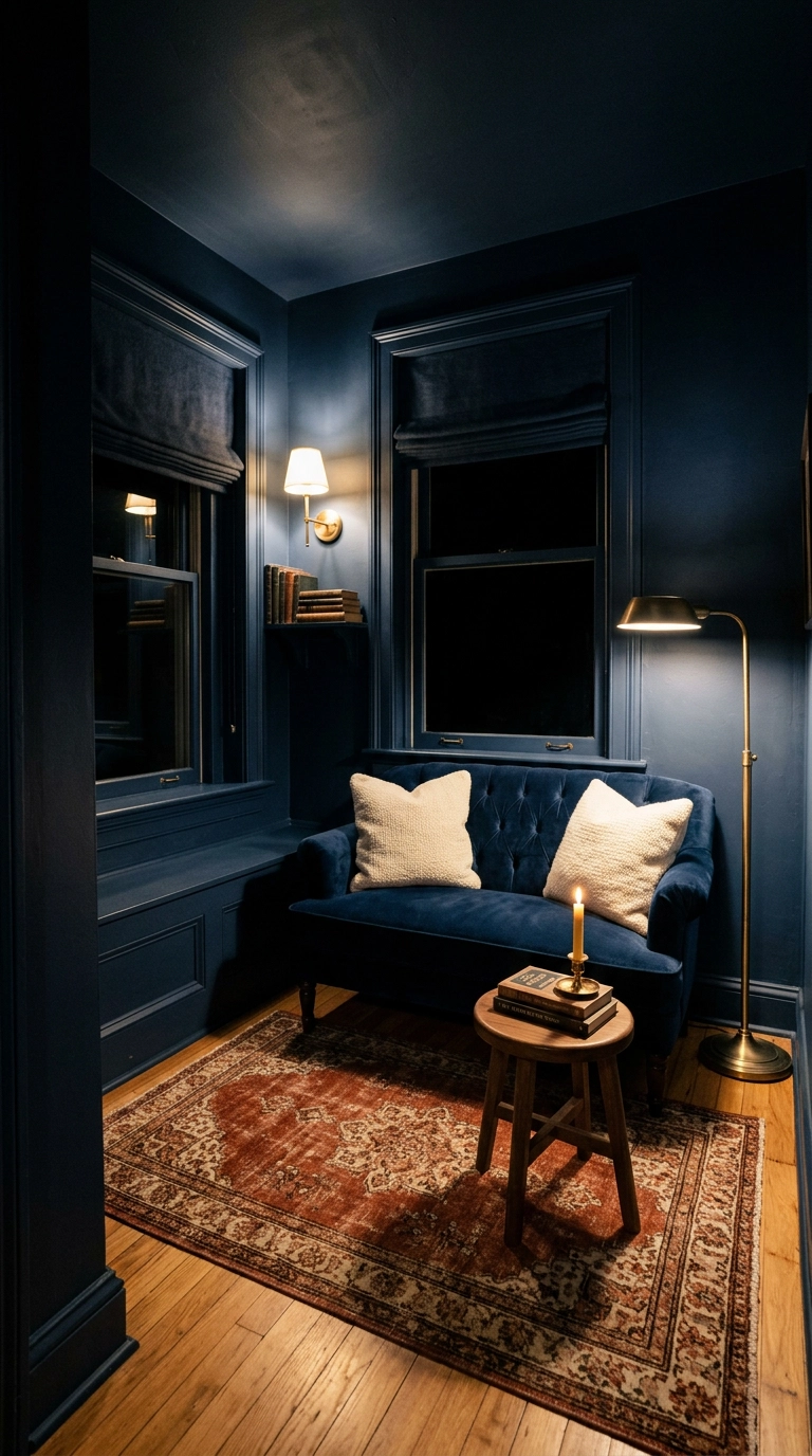
This is the one I’d do in my own house. A small dark room lit by two lamps instead of an overhead fixture stops being a small dark room and becomes a snug — the shadow in the corners is a feature, because you can’t perceive the boundaries, so the space feels infinite.
Why I Keep Coming Back to Navy
After all these years I still think navy is the most forgiving dark color there is. Black can go harsh, charcoal can go flat, forest green demands the right wood tones — but navy sits happily next to camel leather, brass, terracotta, blush, and plain old oak without a fight. The color-drenched navy snug is still the idea I recommend most when someone has a small awkward room they’ve written off, and the twenty-minute pillow-and-throw swap is the one I recommend when someone just wants to test the water before committing a gallon of paint.
What I’m seeing gain real traction right now is the navy media wall, mostly because everyone finally admitted they’re tired of staring at a black rectangle over a white fireplace. Navy grasscloth is having a genuine revival too, and the navy-plus-blush combination has quietly grown up from nursery palette to something I’d put in a client’s formal sitting room. Farrow & Ball’s Hague Blue continues to be the shade everyone screenshots, and Ralph Lauren has been proving the navy-and-camel-leather case for about four decades now — that one isn’t a trend, it’s just correct.
My honest advice: pick one navy idea from this list that matches your actual budget and your actual light, do that one thing properly, and live with it for a month before adding anything else. Rooms built one good decision at a time always look better than rooms built in a single panicked weekend. If you want more of this in your inbox, sign up for my weekly newsletter — I send one real project breakdown every week, no filler, and you can tell me what room you’re stuck on.