
22+ Family Picture Wall Decor Ideas that Look Effortlessly Gorgeous in 2026

I have hung more family photo walls than I can count, and I’ll tell you the honest truth right now – almost every one that goes wrong goes wrong for the same two reasons. It was hung too high, and the frames didn’t agree with each other. Fix those two things and even a stack of drugstore prints starts looking like something a designer signed off on. So let’s walk through the layouts, the hanging math, and the cheap paths that actually hold up, because nobody needs to spend nine hundred dollars at a custom frame shop to look at their own kids.
Family Picture Wall Decor Ideas
1. The Nine-Frame Grid Above the Sofa
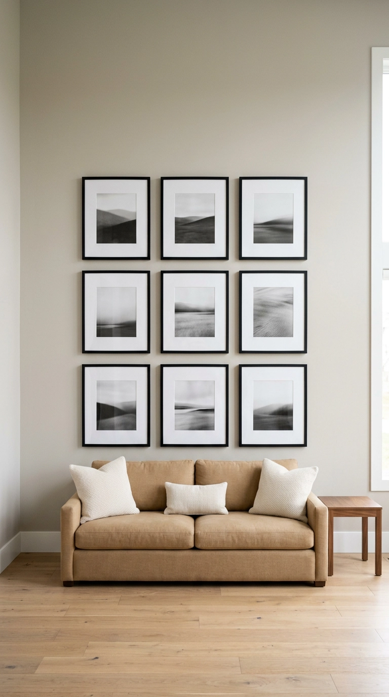
If you want one layout that never looks like an accident, it’s the grid. Nine identical frames, three across and three down, with a consistent 2 to 3 inches of wall between them – that repetition does all the work, so your photos can be wildly different in mood and the wall still reads calm.
2. Convert Everything to Black and White to Unify a Mismatched Pile
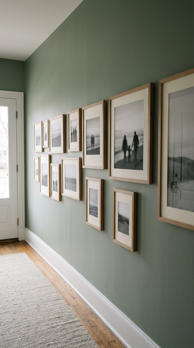
This is my favorite rescue trick and it costs almost nothing. You’ve got a snapshot from 1998 with yellow-green kitchen lighting, a phone photo with a bright blue pool, and a studio portrait on a grey backdrop – reprint them all in black and white and suddenly they’re a set.
3. Salon-Style Cluster That Grows Outward From One Anchor
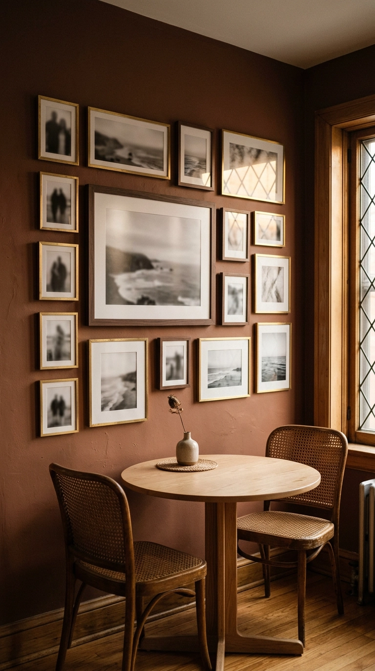
Salon style looks free-form but it isn’t. Start with your biggest piece slightly off-center, then build outward, keeping the gaps between frames identical even as the frame sizes change – that even spacing is the invisible grid holding the whole thing together.
4. Follow the Staircase Angle With a Diagonal Run
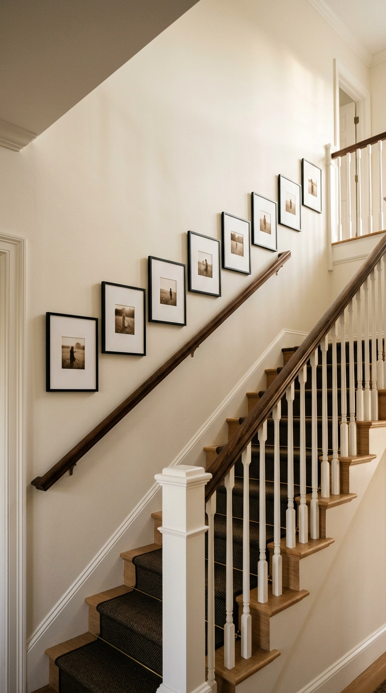
Stair walls have one rule and it’s non-negotiable – the arrangement has to follow the slope of the stairs, not the level of the floor. Measure 57 to 60 inches straight up from the front edge of each tread and mark that point, then hang each frame center on that line so the whole run climbs at the same pitch as the rail.
5. The Single-Row Picture Ledge for People Who Refuse to Commit
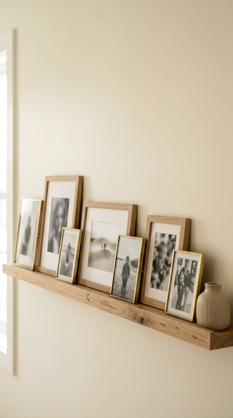
A picture ledge is two screws total instead of eighteen nail holes, which makes it the best possible answer for renters and for anyone whose photo collection changes every few months. Mount one long ledge at about 60 inches and lean the frames instead of hanging them.
6. One Oversized Portrait Instead of Twenty Small Ones
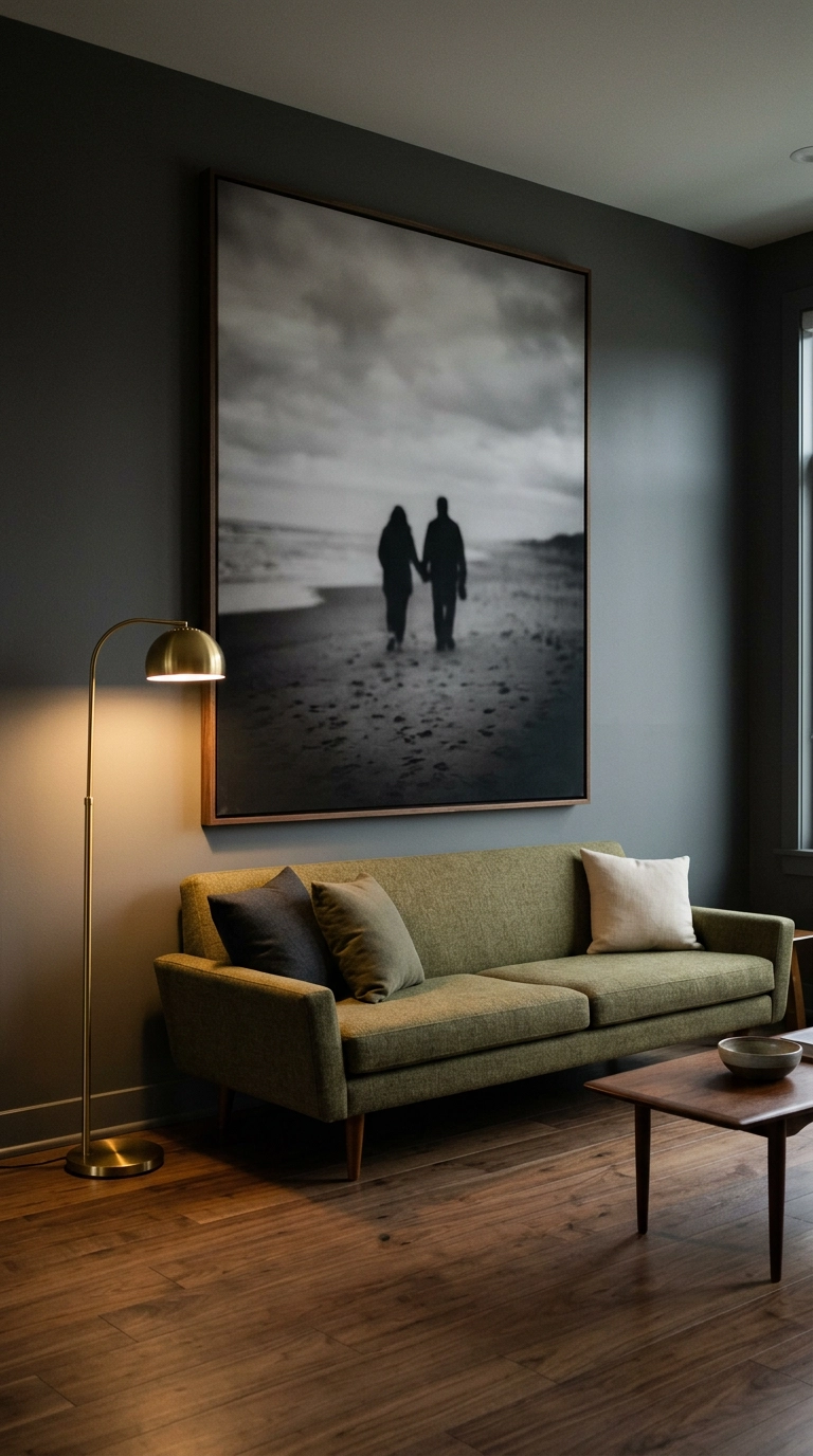
Sometimes the most confident move is one enormous photo and nothing else. Go big or it looks timid – over a standard sofa I want the print at roughly two-thirds the sofa width, so a 7-foot sofa wants something around 50 to 56 inches wide.
7. Cut Paper Templates and Tape Them Up First
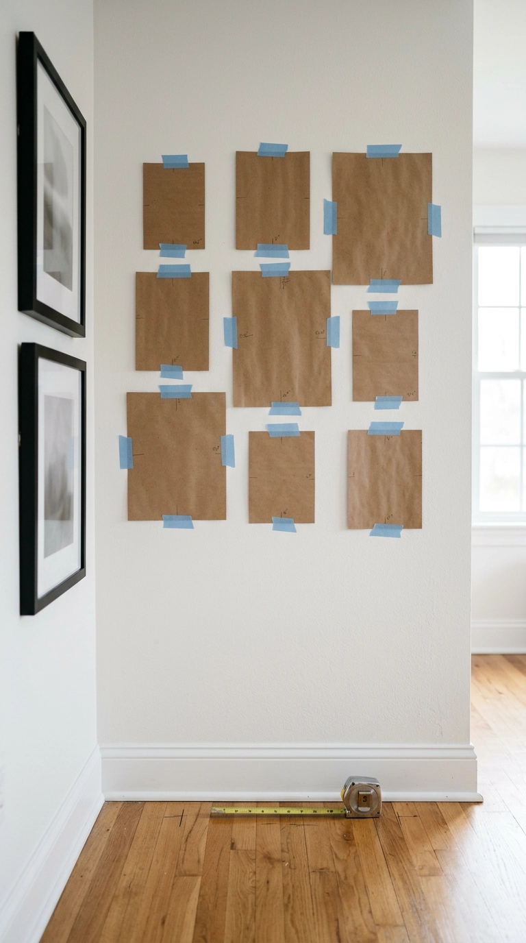
Please do this. Trace each frame onto kraft paper or a grocery bag, cut it out, mark where the hanger sits, and tape the whole set to the wall with painter’s tape. Live with it for a day.
8. Uniform IKEA Frames, Zero Custom Framing
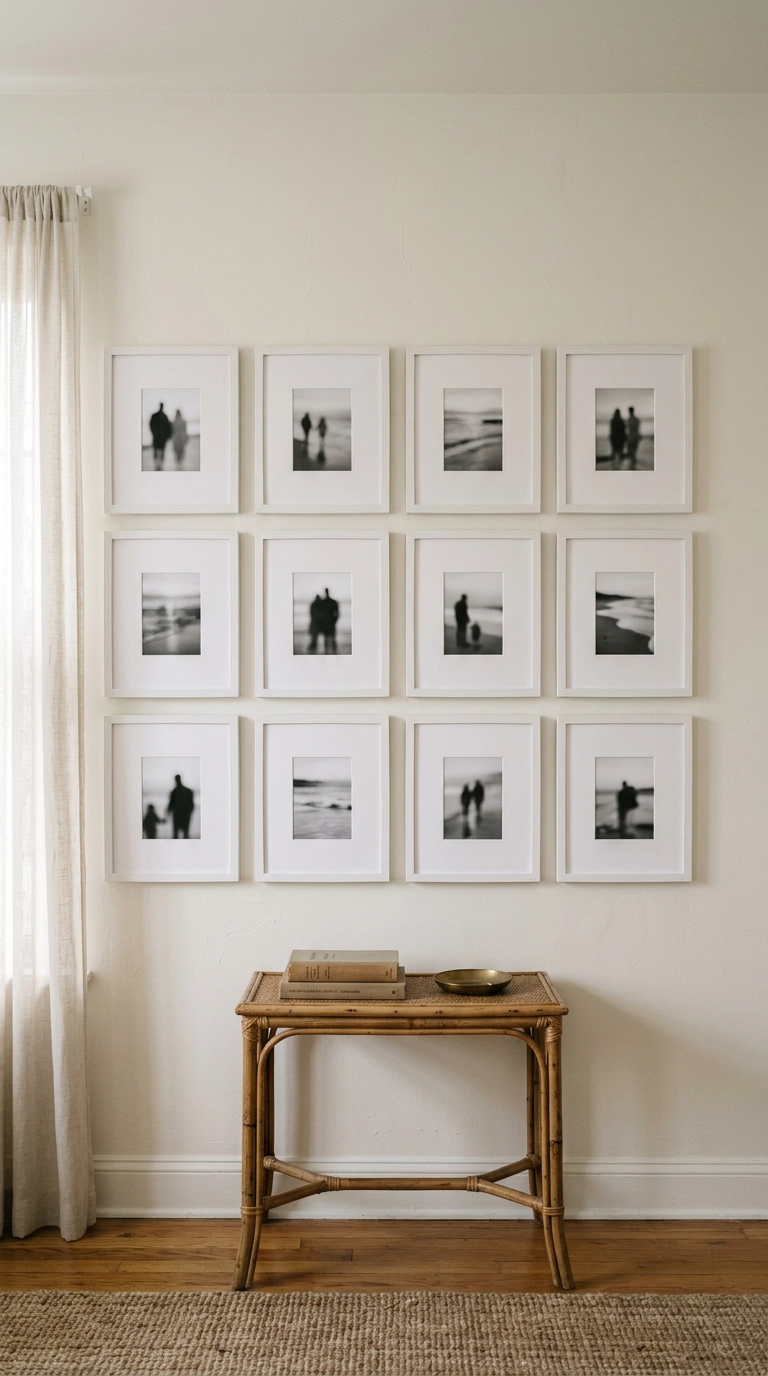
Here’s the honest math on framing. Custom framing a single 8×10 with a mat can easily run over a hundred dollars, so a twelve-frame wall done custom is a car payment. Twelve identical big-box frames with the mats already cut is often under a hundred and fifty dollars total.
9. Wide Mats Are the Cheapest Luxury You Can Buy
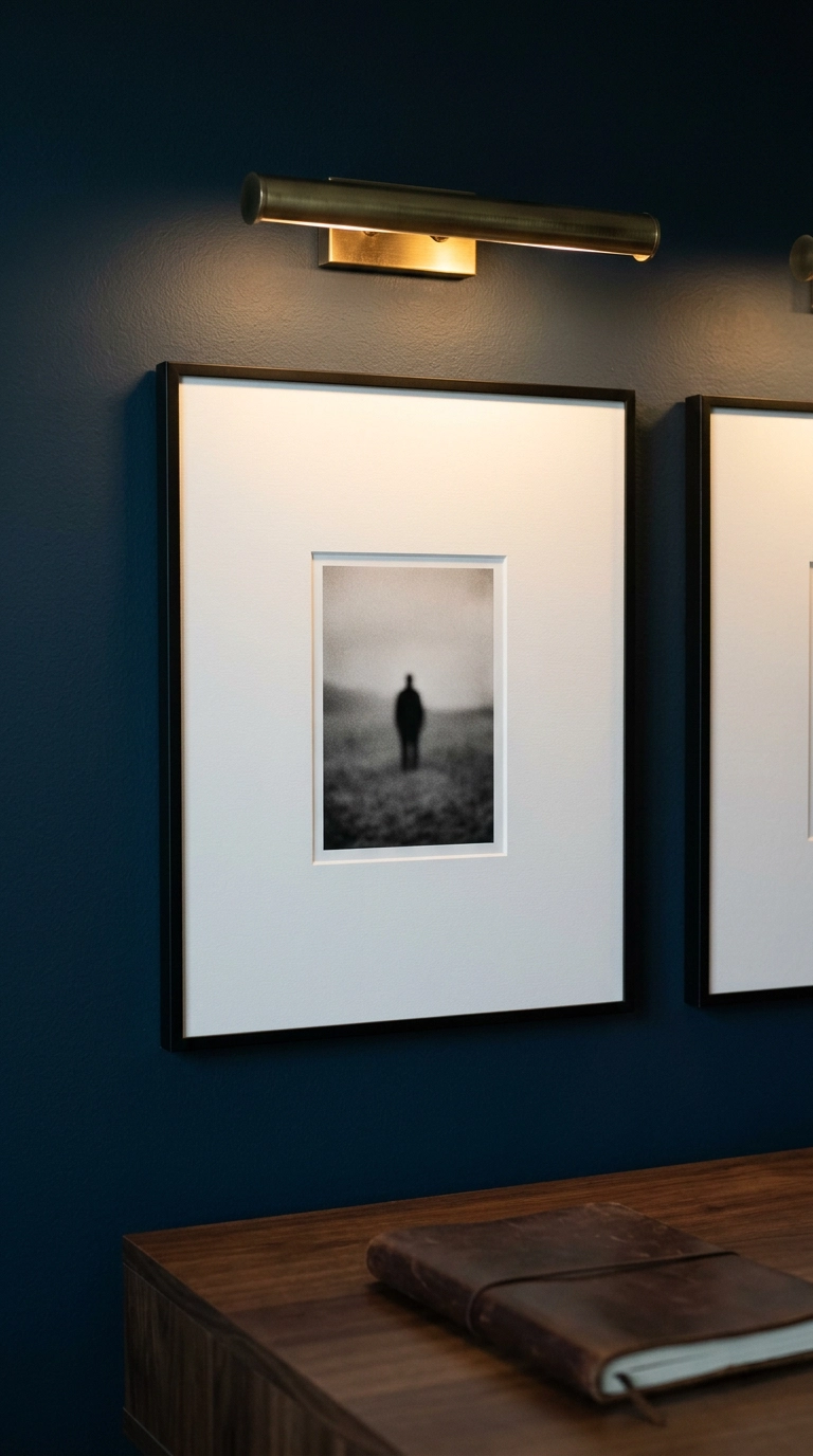
Take a five-dollar print, drop it inside a 3 to 4 inch white mat, and it starts reading as gallery work. The mat creates negative space – empty breathing room – around the image, and your eye interprets that breathing room as importance.
10. Mixed Frame Finishes Held Together by One Repeated Tone

You do not have to buy a matching set. Mixed finishes look collected rather than ordered, which is exactly the point in an older home. But mixes need a repeating element or they fall apart.
11. Picture-Hanging Strips for a Damage-Free Rental Wall
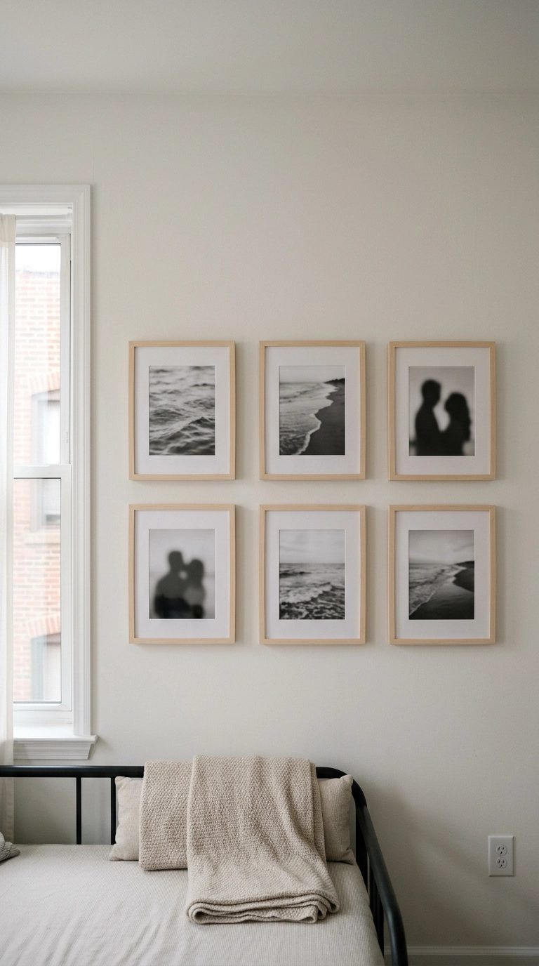
Adhesive picture-hanging strips are the renter’s whole toolkit, and they genuinely work if you respect the weight limit and use lightweight frames – think thin-profile wood or plastic-glazed frames rather than heavy glass and metal.
12. The Long Hallway Double Row
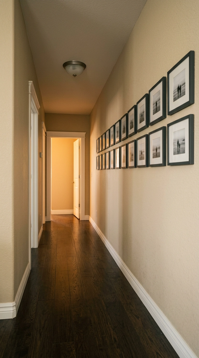
Hallways are the most underused wall real estate in an American house, and they’re perfect for photos because you view them from a few feet away – small images actually make sense here in a way they never do above a sofa.
13. Lean, Don’t Hang: The Console Table Arrangement
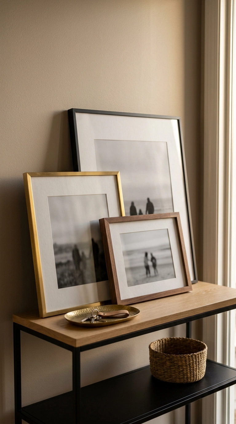
Zero holes, zero measuring, and it looks deliberately casual. Lean a large frame against the wall on a console or a low bookshelf, then layer one or two smaller frames in front at an angle.
14. Picture Rail Molding With Hanging Cords
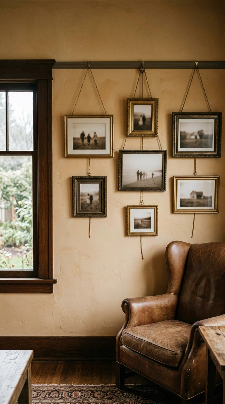
If you live in an older home with picture rail already installed, use it. If you don’t, a single painted strip of wood mounted 12 to 18 inches below the ceiling gives you the same thing – and then all your frames hang from cords off that one rail.
15. Two-Story Stairwell Wall Built as a Vertical Column
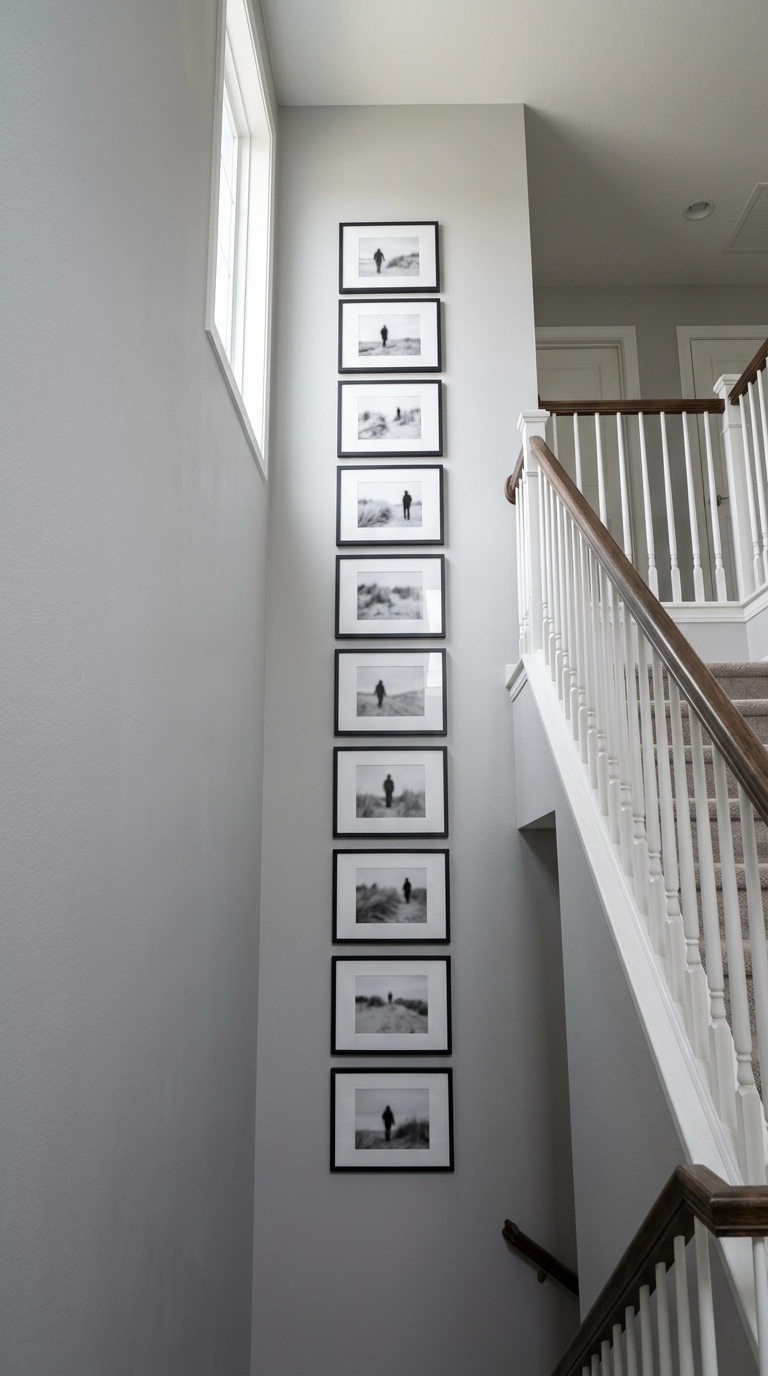
Double-height stairwells intimidate people into hanging one lonely picture at normal height, which just emphasizes how much blank wall is left. Go vertical instead – a narrow column of frames that climbs 8 or 10 feet up draws the eye upward and makes the height feel intentional.
16. A Digital Frame That Doesn’t Look Like a Tablet
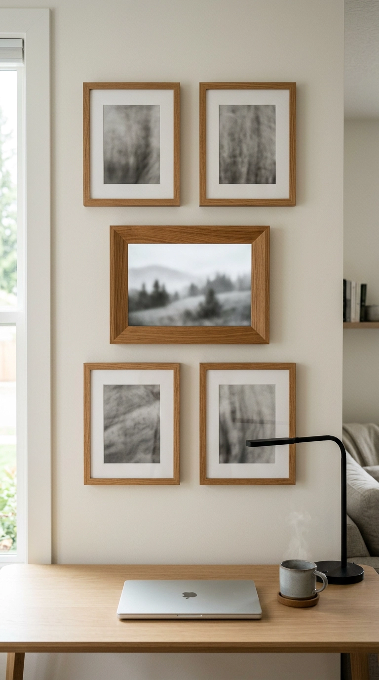
Digital frames get a bad reputation because most of them look like a leftover tablet propped on a shelf. The fix is buying one with a matte anti-glare screen and a real wood surround, then hanging it inside a group of matching wood frames so it disappears into the arrangement.
17. Two Big Frames Over a Console Instead of Twelve Small Ones
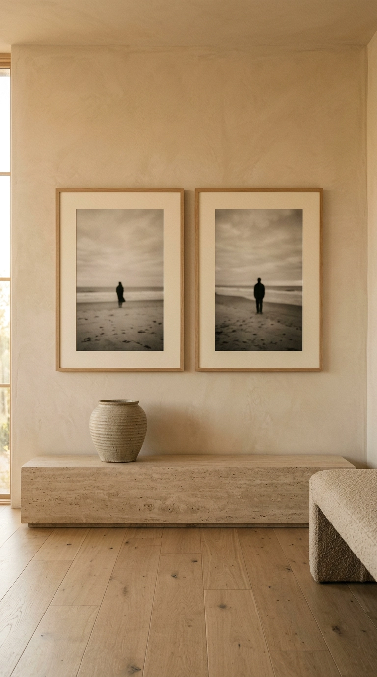
Not every family wall needs to be a mosaic. Two oversized frames, side by side, is a quieter and frankly more modern look – and it’s dramatically less work to hang straight.
18. Sepia and Warm-Tone Prints for an Older Home
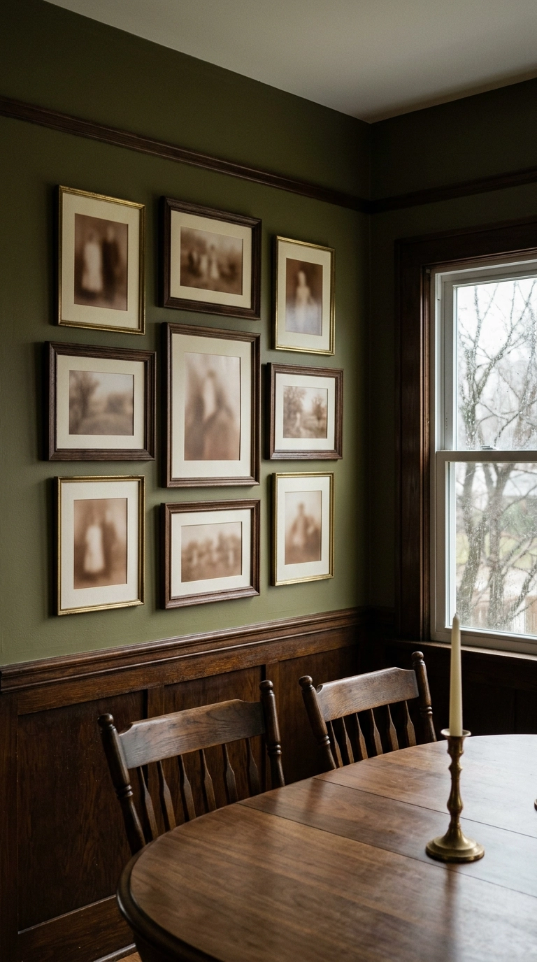
Straight black and white can feel a little clinical against old wood trim and warm plaster. Sepia or a soft warm-tone conversion picks up the ambers already in the room, so the wall settles in instead of standing out.
19. Skip the Glass Entirely in a Kid’s Room
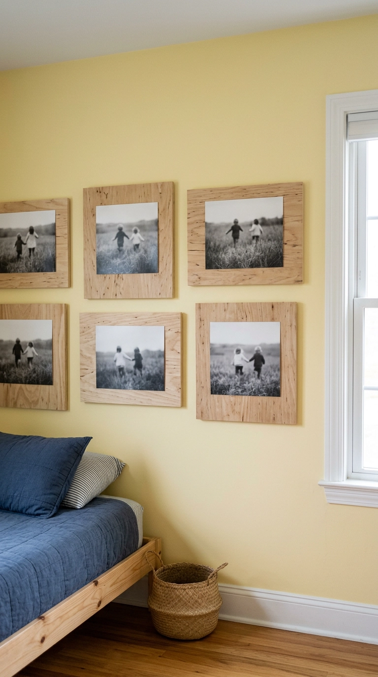
Never hang glass over a bed or a crib. That’s not a style opinion, it’s the one hard rule I give every client with kids, and it rules out most of what’s on the shelf at the craft store.
20. Paint the Frames the Exact Color of the Wall
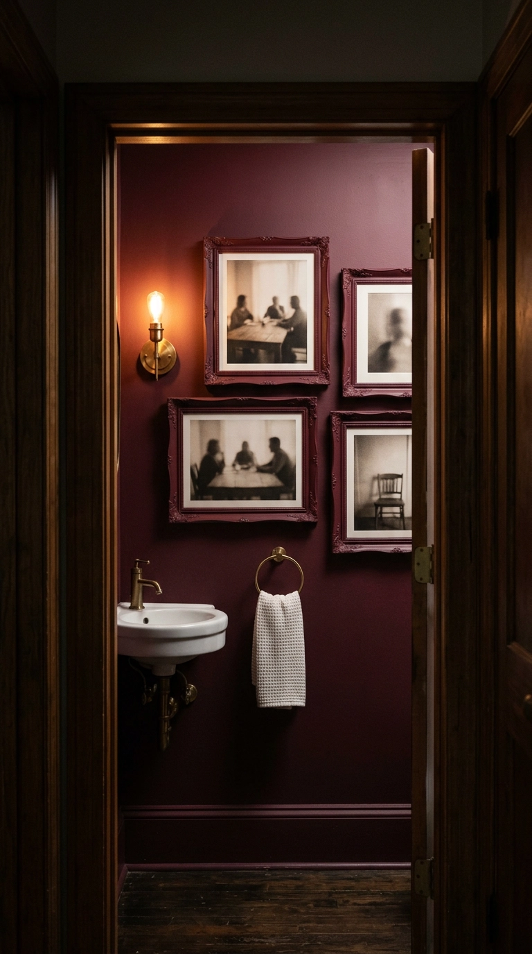
This is the cheapest designer move in the whole article. Buy five mismatched frames at a thrift store for a couple of dollars each, pull the glass, and give them two light coats of matte spray paint in the same shade as your wall.
21. Wrap the Frames Around a Doorway Instead of Avoiding It
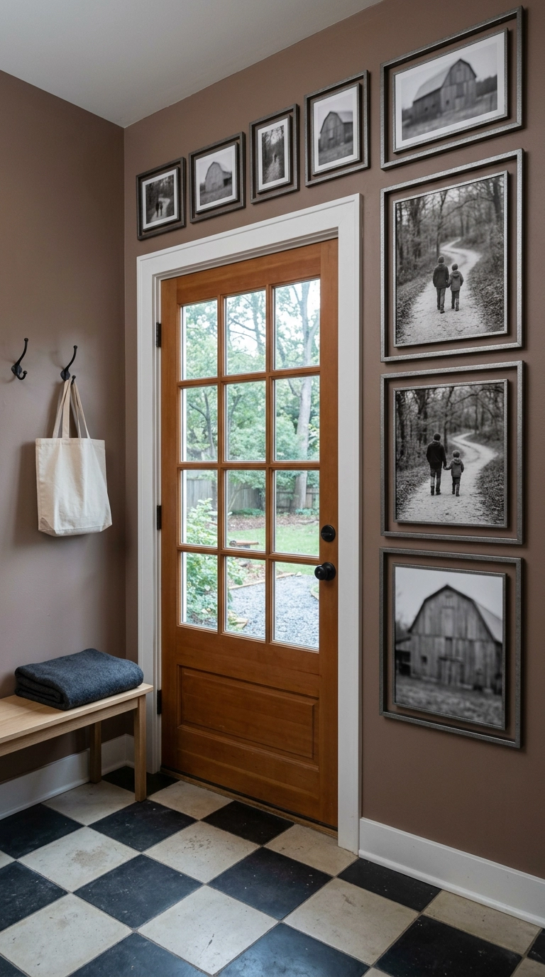
Most people treat a door opening as the thing that ruins a wall. I treat it as the frame that organizes one. Run three frames up one side of the casing and step the rest across the header, holding a steady 3 to 4 inches of clearance off the trim the whole way around.
22. Leave One Frame Deliberately Empty
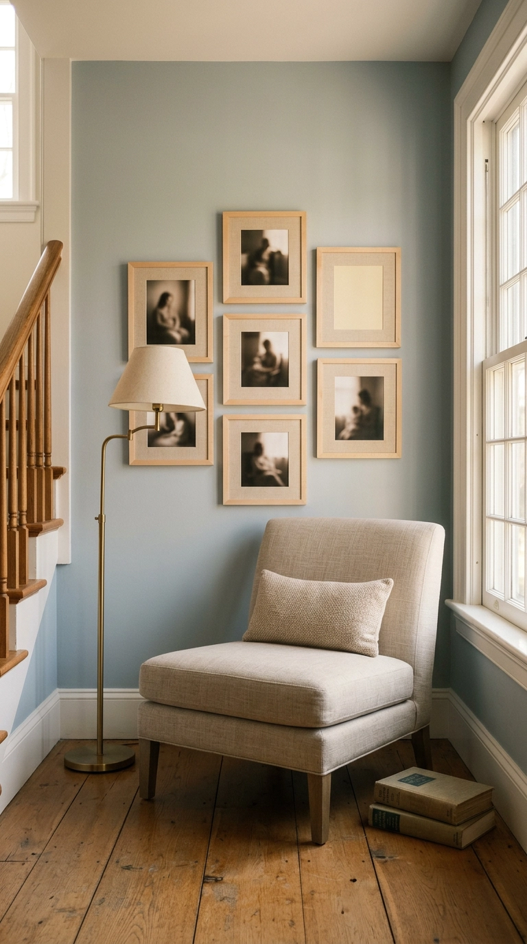
End the wall with one frame that has a mat and nothing in it. I know how that sounds, but it is the single detail people ask me about most, and it costs whatever one extra frame costs.
Where I’d Actually Start
If this whole list feels like a lot, start with two decisions and ignore the rest for now: pick your frame finish and commit to it across every piece, then choose one print finish for every photo. Those two choices do more for how a picture wall reads than the layout does. A mismatched jumble of frames with glossy drugstore prints will look busy no matter how carefully you space it, while eleven identical oak frames holding matte prints look intentional even if your arrangement is imperfect.
The mistake I made on my own stairway wall was hanging first and planning second. Cut paper templates, tape them up, and live with them for a couple of days before a single nail goes in. It feels tedious and it saves you a wall full of spackle. Budget honestly, too: frames are the expensive part, not the prints. Eleven decent frames run somewhere between $150 and $400 depending on where you shop, while the prints themselves are usually under $40 for the whole wall from a good lab. If that number stings, build the wall in two phases rather than downgrading the frames.
Above all, remember that this is the rare decorating project where the content matters more than the styling. A slightly crooked grid of photographs you genuinely love beats a perfectly measured one full of pictures you chose because they matched the palette. Print the ones that make you stop on the stairs. If you’d like more room-by-room walkthroughs like this, along with the specific frames, labs, and paint colors I actually use, join my newsletter and I’ll send new ideas straight to your inbox.


