
23+ Stunning Shiplap Fireplace Decor Ideas that Look Custom and Cost Less in 2026

I have installed, styled, and occasionally ripped back out more shiplap fireplaces than I care to admit, and here is what I have learned: the boards are the easy part, the proportions are what make or break it. A shiplap fireplace can read builder-grade farmhouse leftover or genuinely architectural, and the difference usually comes down to board width, where you stop the boards, and whether the mantel has enough visual weight to hold its own. One quick note before we dive in, because I would rather be the annoying designer than the reason your insurance adjuster gets a call: clearance between a firebox and any combustible material varies by unit, so always follow your manufacturer’s spec and your local code, use non-combustible surround material where it is required, and confirm the whole plan with an inspector or a licensed pro before a single board goes up.
Shiplap Fireplace Decor Ideas
1. Floor-to-Ceiling White Shiplap with a Chunky Reclaimed Beam Mantel
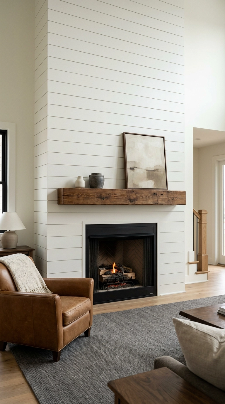
This is the shiplap fireplace everyone screenshots, and for good reason. Running the boards all the way to the ceiling instead of stopping at 6 or 7 feet draws the eye up and makes an 8-foot ceiling feel closer to 9, because there is no horizontal break telling your brain where the wall ends.
2. Vertical Shiplap in Soft Greige for a Taller-Looking Room
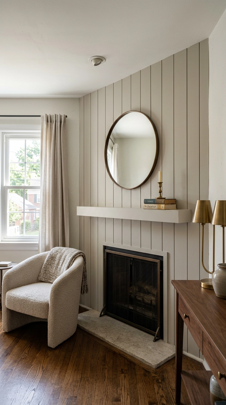
Turning the boards vertical is the single cheapest trick I know for a room with an 8-foot ceiling. Your eye follows the lines up, and the room reads taller without you touching a stud.
3. Half-Wall Shiplap with a Deep Mantel and Painted Drywall Above
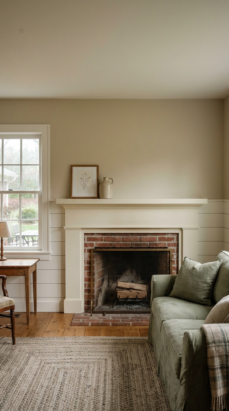
Not every fireplace needs boards to the ceiling. Stopping the shiplap at mantel height gives you a clean horizontal line and leaves the upper wall free for art, which is a gift if you like to swap things seasonally.
4. Color-Drenched Shiplap in Deep Green
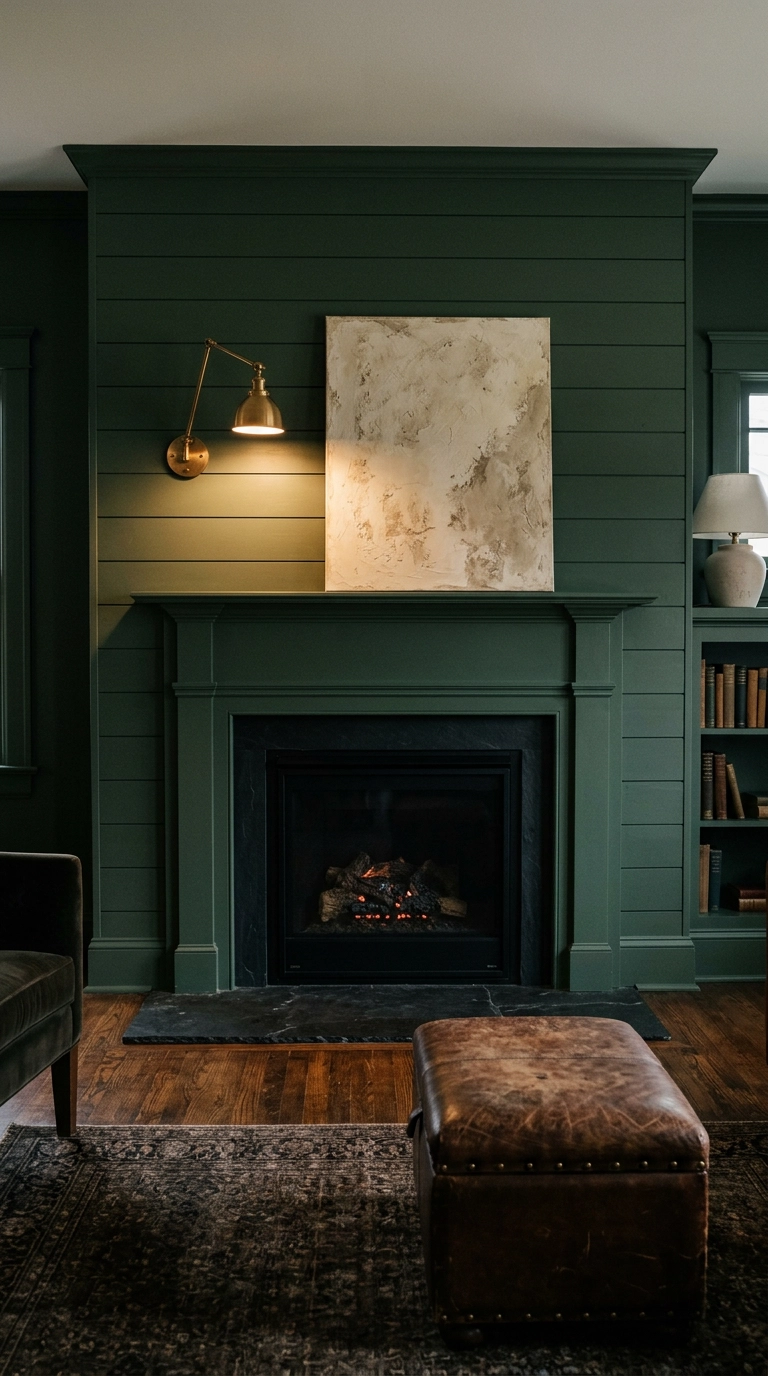
Color drenching just means painting the boards, the mantel, and the trim all the same shade so there are no visual breaks. On a shiplap fireplace it is transformative, because the gaps between boards become texture instead of stripes.
5. Wide 8-Inch Boards with a Tight Reveal for a Quieter Look
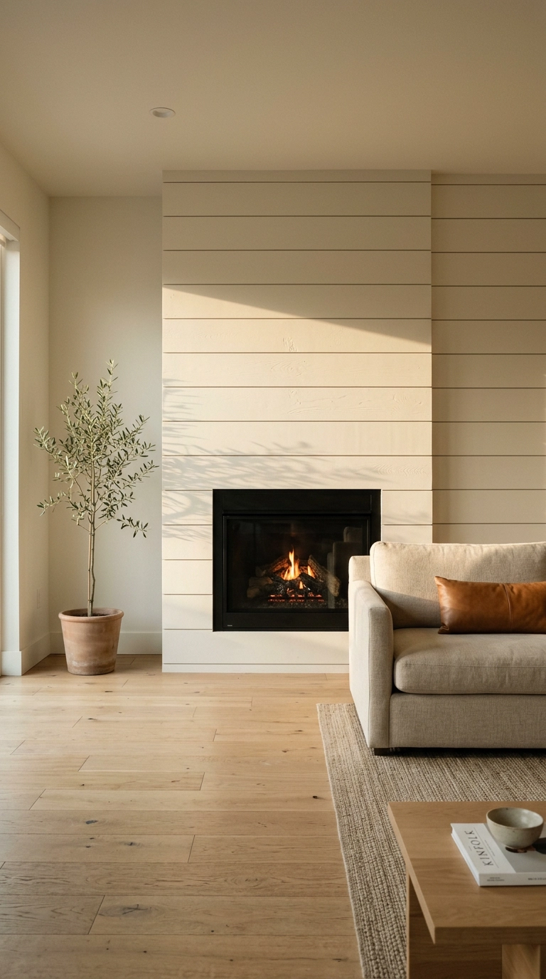
Board width is the detail nobody talks about and it changes everything. Standard shiplap is around 5.5 inches with a quarter-inch gap, which gives you that busy striped farmhouse look. Go to 8-inch boards with an eighth-inch reveal and the wall calms right down.
6. Stained Shiplap in Warm Walnut Instead of Paint
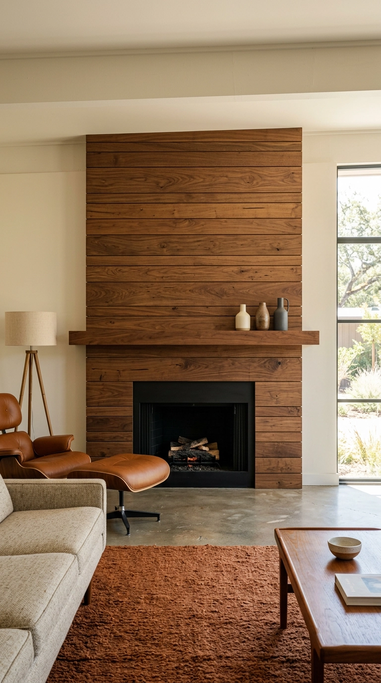
Everyone paints shiplap white by reflex. Stain it instead and you get a completely different animal, warmer and considerably more mid-century.
7. Shiplap Wrapping a Corner Fireplace
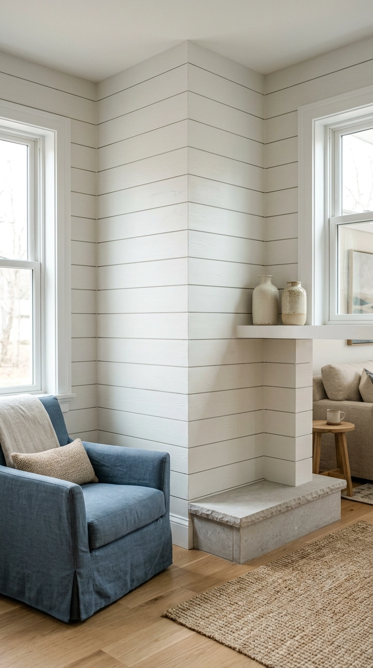
Corner fireplaces are awkward, and cladding just the angled face makes them look more awkward. Wrap the boards around both adjoining walls instead and the whole corner reads as one intentional architectural moment.
8. Asymmetric Mantel Styling with a Tall Anchor on One Side
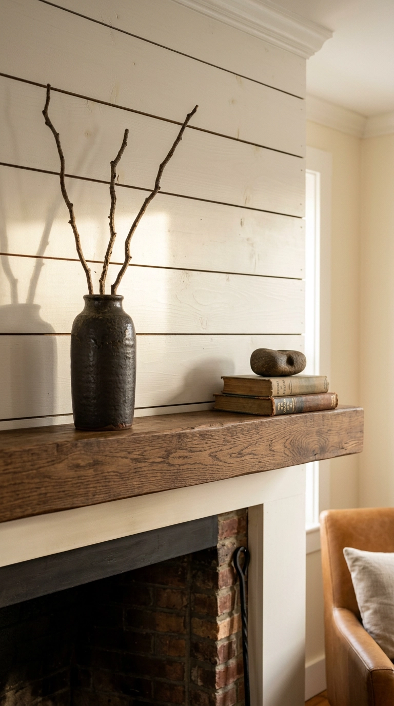
Stop centering everything. A mantel styled dead symmetrically reads static, while an asymmetric grouping gives your eye somewhere to travel.
9. TV Above the Mantel, Mounted at the Right Height
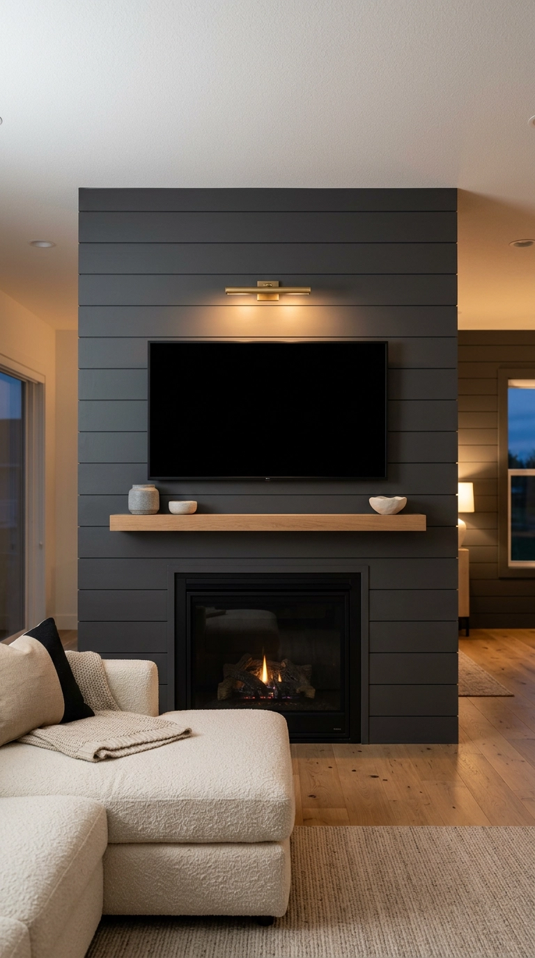
Here is the height math nobody gives you. Seated eye level in a standard sofa is about 42 inches, and the center of the screen should land within roughly 15 degrees of that. In practice that means the bottom of the TV sits about 4 to 6 inches above the mantel, not floating a foot up near the ceiling.
10. Layered Art Leaned Against the Boards
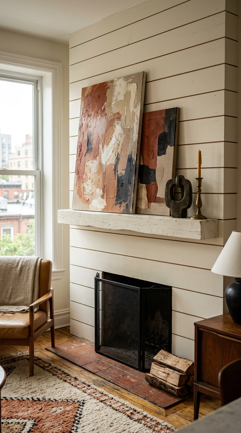
Leaning art instead of hanging it is my favorite renter-friendly move, and on shiplap it works even better because the boards give the frames something textural to sit against.
11. Shiplap Above, Non-Combustible Stone Surround Below
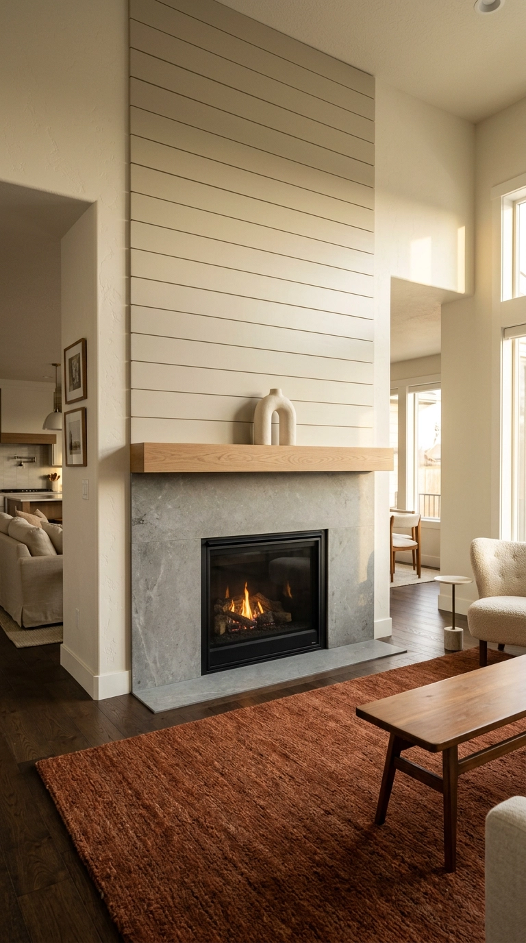
This is the detail that keeps a shiplap fireplace both beautiful and legal. Wood boards are combustible, so most units require a non-combustible material immediately around the firebox opening, with the exact dimension set by the manufacturer and your local code.
12. Peel-and-Stick Faux Shiplap Panels for Renters
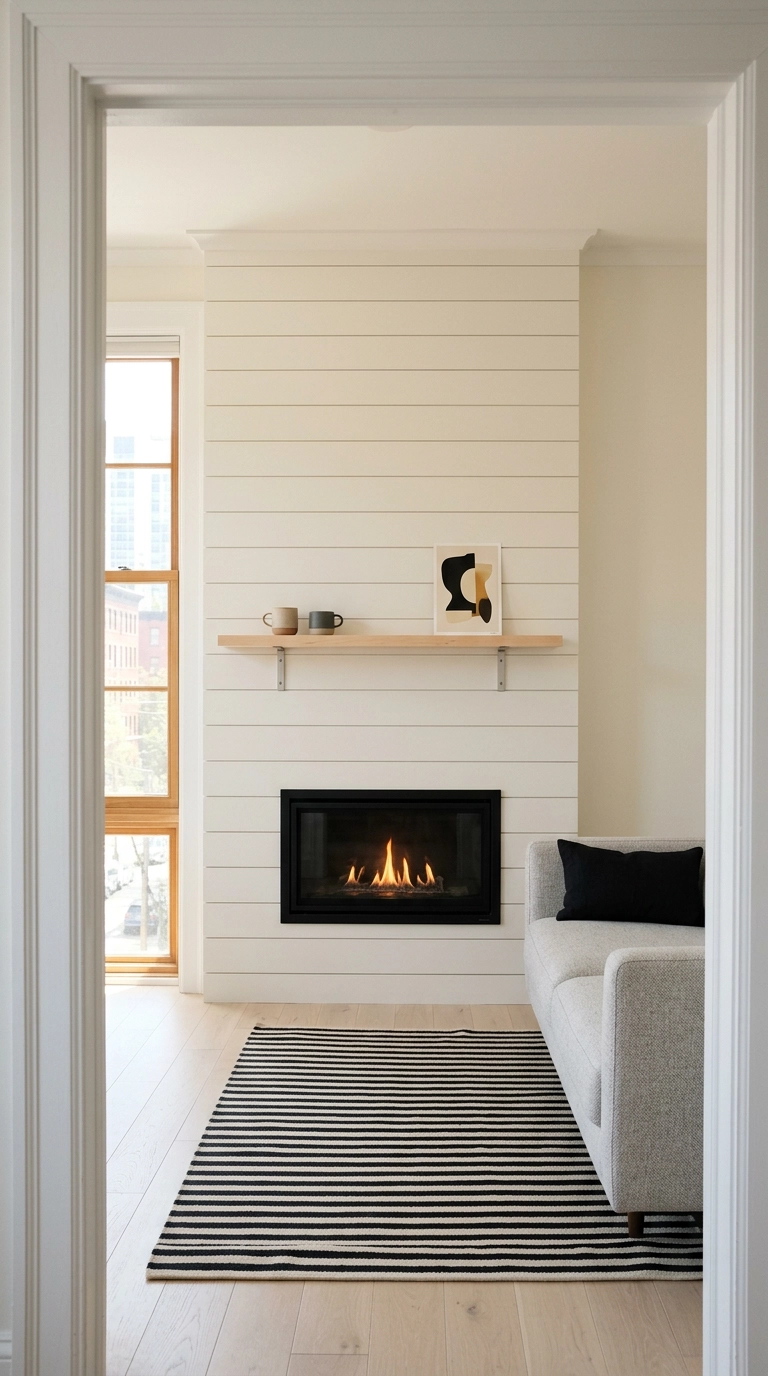
If you rent, you are not out of the game. Peel-and-stick shiplap panels go up over drywall with no nails, and the good ones come off with a heat gun and patience instead of a security deposit dispute.
13. Flanking Built-Ins Painted the Exact Same Shade as the Boards
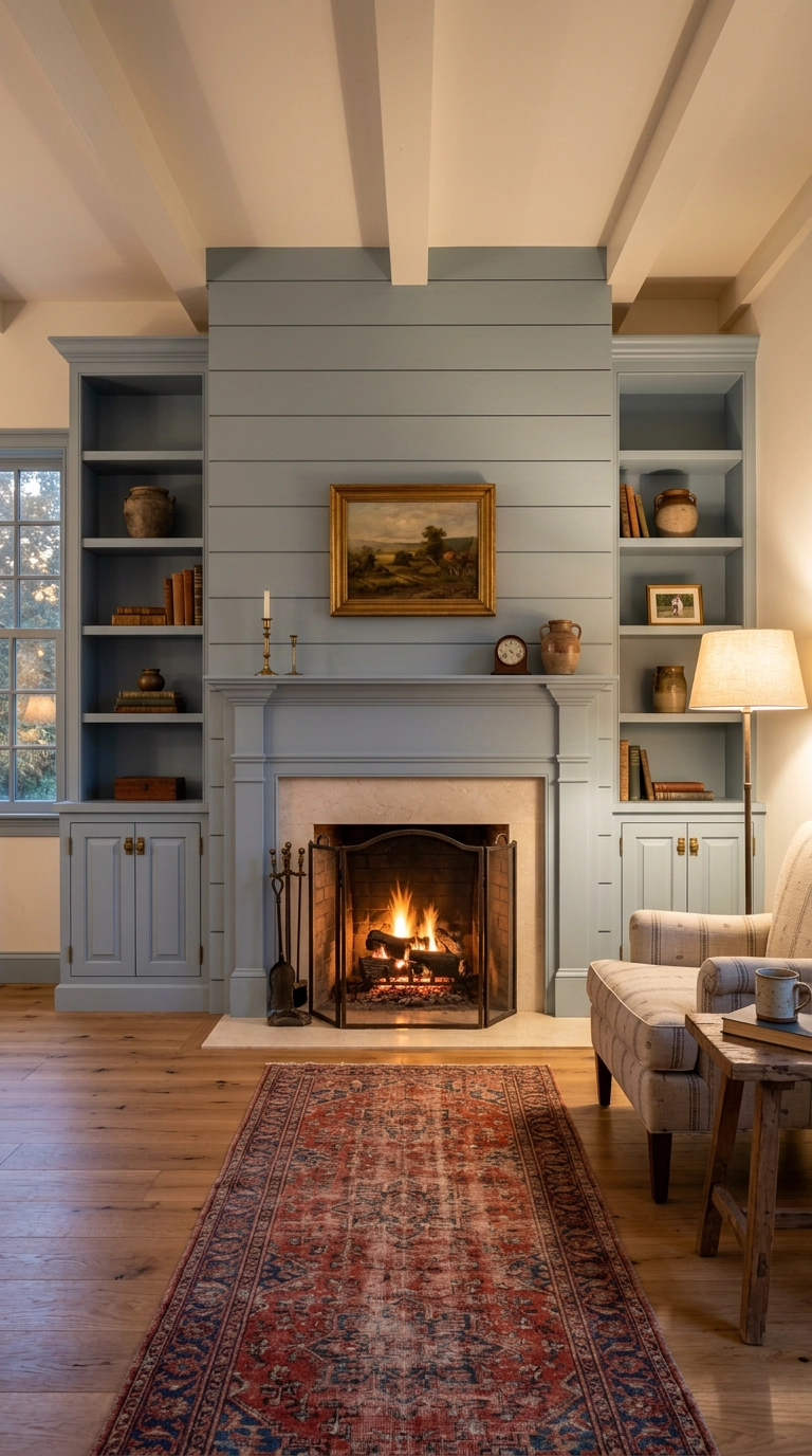
The mistake I see constantly is white built-ins against a colored shiplap wall, or the reverse. Paint the cabinetry and the boards the exact same shade in the same sheen and the whole wall reads as one custom piece rather than three separate projects.
14. One Oversized Arched Mirror Instead of a Gallery of Small Frames
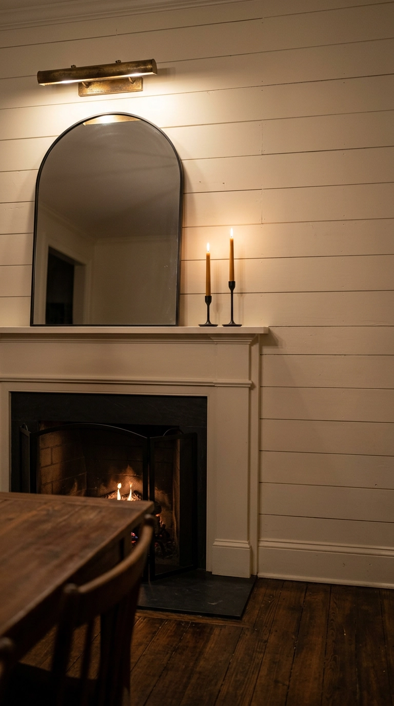
Small frames scattered above a mantel fight the horizontal lines of the boards and end up looking like clutter. One oversized mirror does the opposite, it gives the eye a single place to land and bounces whatever light you have back into the room.
15. A Shiplap Fireplace in the Bedroom, Kept Soft and Low-Contrast
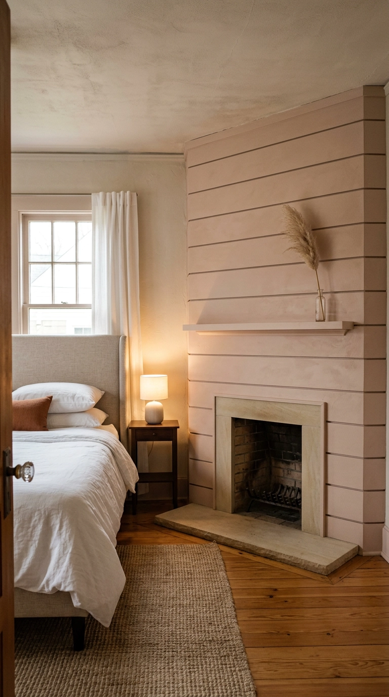
Bedroom fireplaces get treated like living room fireplaces, and they should not be. You are lying down looking at this wall, so drop the contrast, skip the black surround, and let the boards nearly match the wall color.
16. Black Shiplap for a Genuinely Dramatic Focal Wall
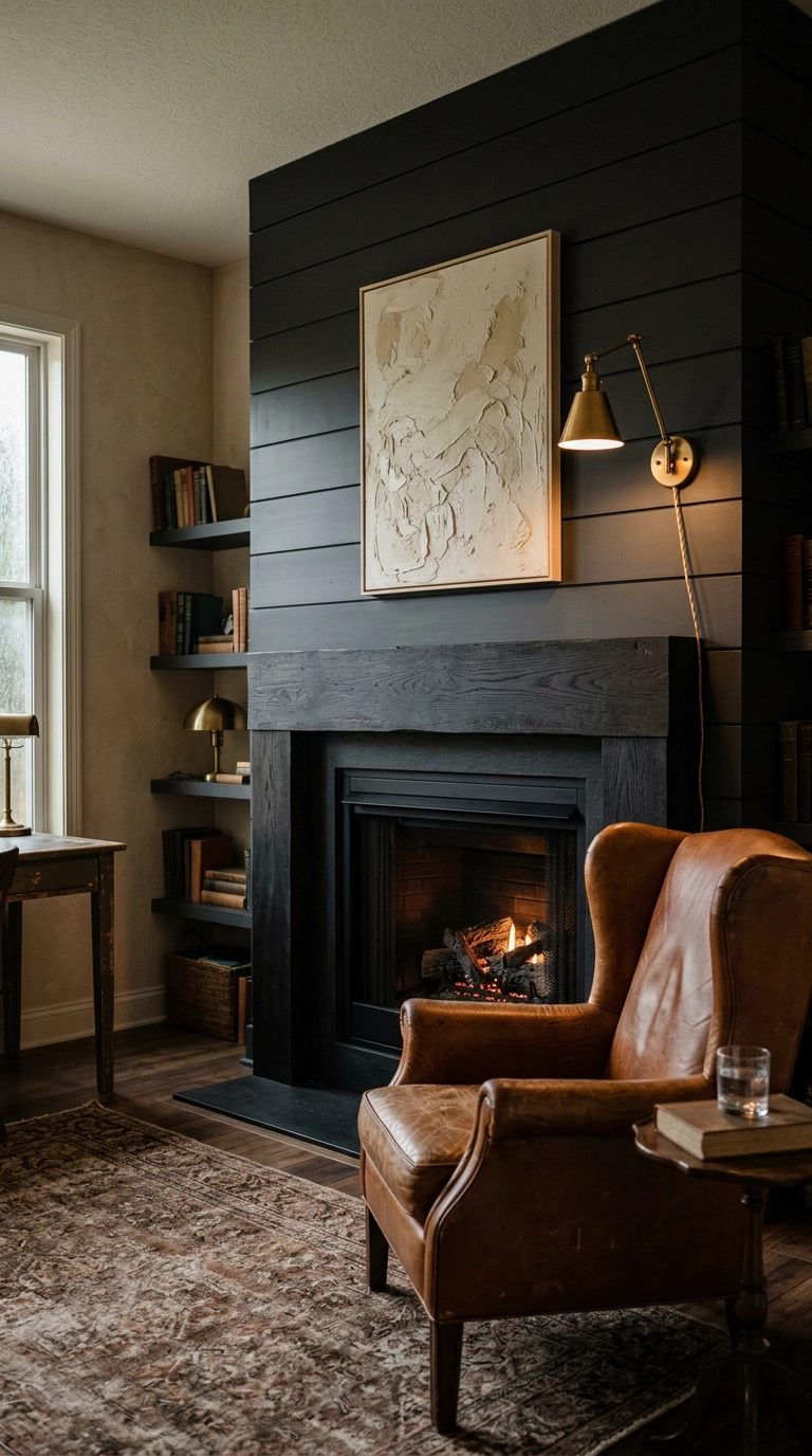
Black shiplap is the fastest way to make a fireplace feel like it was always there. The matte finish is non-negotiable, though, because a satin or semi-gloss black turns every board gap into a glare line and the whole wall looks like plastic.
17. Shiplap Carried Onto the Chimney Breast Only, With Contrast Walls
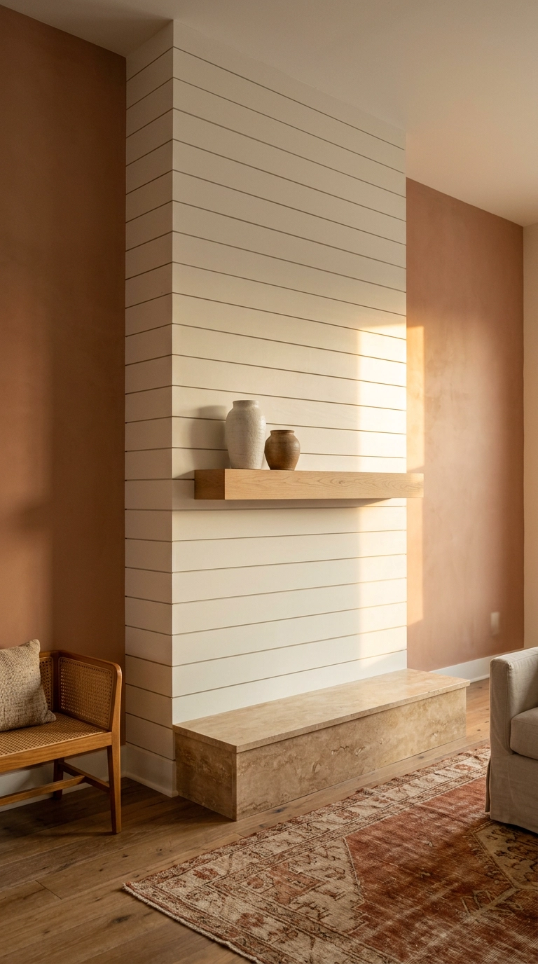
If your chimney breast projects out from the wall, clad only that. Boards on the projection and smooth paint on the flanking walls emphasizes the depth you already have, and the fireplace reads as a built architectural column instead of a decorated flat wall.
18. A Raised Hearth Bench That Doubles as Extra Seating
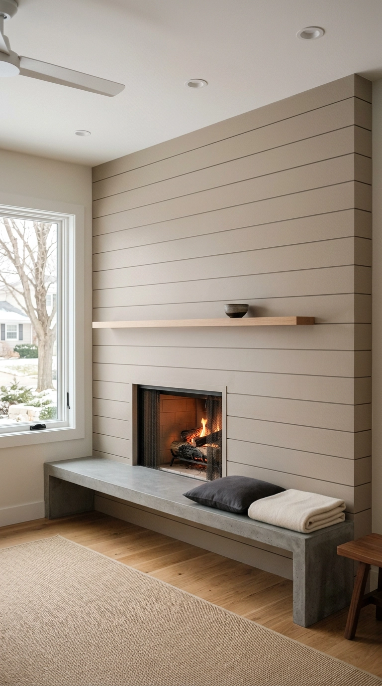
Extending the hearth into a bench is the smartest square-footage trick on this list. You get seating for two more people without adding a single piece of furniture, and because the bench is attached and low, the floor still reads open.
19. Diagonal Boards Set at 45 Degrees for 70s-Revival Movement
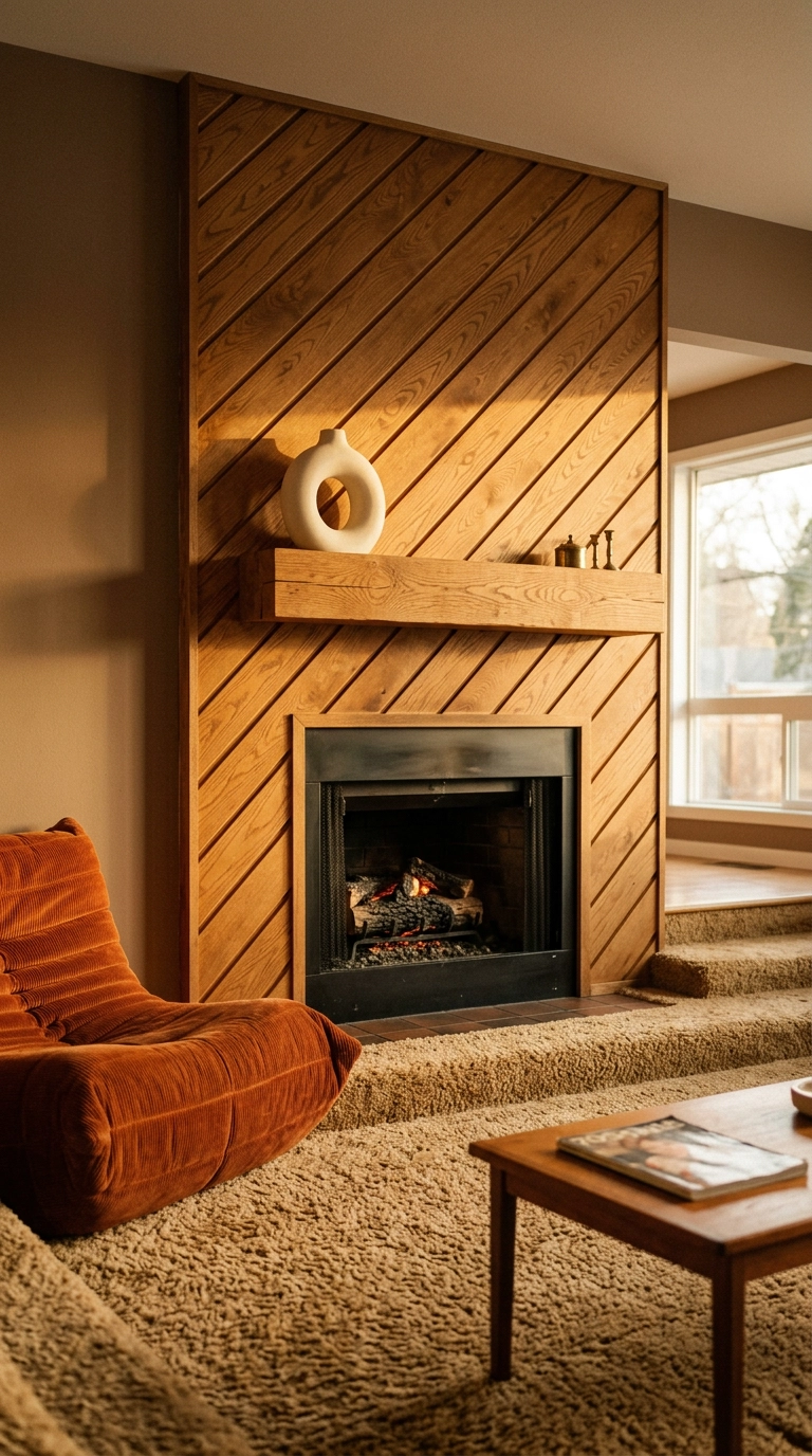
Running the boards on a 45 is the most underused version of this look, and it is straight out of the 1970s in the best possible way. Diagonal lines add movement, which is exactly what a flat fireplace wall usually lacks.
20. Shiplap With a Deep Recessed Wood Storage Alcove
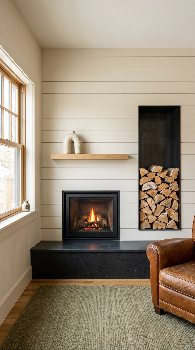
A recessed log niche does two jobs at once. It solves the where-do-I-put-the-firewood problem, and the dark void of the opening gives your eye a place to rest against all that board texture.
21. Micro-Shiplap in a Small Space, Painted Wall-Color for Texture Only
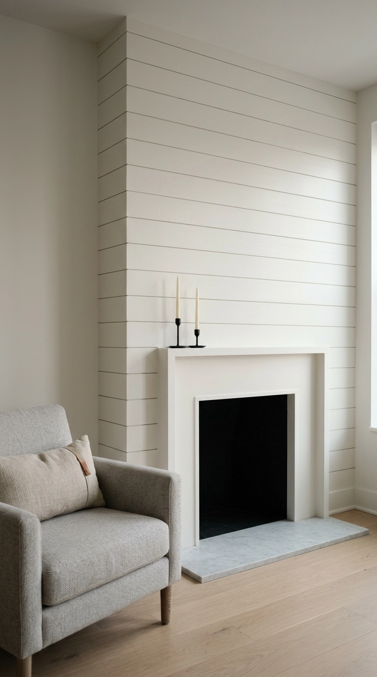
In a genuinely small room, contrast eats space. Clad the fireplace in narrow 3-inch boards and paint them the exact same color and sheen as the walls, and you get texture that only shows up in raking light instead of a hard focal point shrinking the room.
22. Cedar Shiplap on a Covered Patio Fireplace
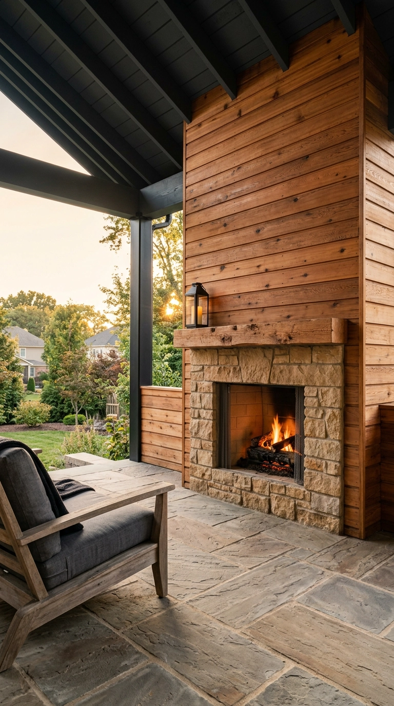
Shiplap does not have to stay indoors, but the material has to change. Use western red cedar or cypress, never primed MDF or pine, because anything else cups and rots through one humid summer.
Before You Pick Up the Nail Gun
Here is what I want you to take away from all of this. Shiplap earned its bad reputation from one specific version of it, the stark white horizontal boards slapped edge to edge on every wall of a 2015 flip. The material was never the problem. What makes a shiplap fireplace look custom in 2026 is the decisions around it, the reveal width, whether the boards run vertical or diagonal, whether you stop at the mantel or carry it to the ceiling, and whether you had the nerve to paint it something other than white.
If you only try three ideas from this list, make them the color-drenched deep green, the chimney-breast-only version with contrasting walls, and the asymmetric mantel styling with a tall anchor on one side. Those are the three my clients photograph the most. The trend I am watching hardest right now is warm stained wood over paint, which is the same shift Joanna Gaines herself made years ago when she moved from white boards toward natural oak and walnut tones. Vertical boards in muted earth shades and that raised concrete hearth bench are close behind, and Farrow & Ball shades like Hague Blue and Green Smoke keep showing up on the fireplaces I get tagged in.
Start small if you are nervous. Restyle your existing mantel this weekend using the rule of three and the asymmetry trick, live with it, then decide whether you want to touch the boards at all. If you want more of this, ideas like these plus my paint picks and the shortcuts I only share with my list, sign up for my weekly newsletter. It is one email, no fluff, and you can tell me what room you are stuck on.


