
23+ Timeless Blue and White Decor Ideas that Look Collected, Not Coastal in 2026

Blue and white is the oldest decorating trick in the book – Chinese potters were painting cobalt on porcelain in the 1300s, the Dutch spent two centuries trying to copy them, and we’ve been arranging the results on mantels ever since. The problem is that most modern blue and white rooms land in one of two ditches: nautical gift shop or hotel bathroom. I’ve pulled a lot of rooms out of both, and the fix is almost always the same – get the specific blue and the specific white right first, then let one good pattern do the talking. Here are 23 ideas that run through the whole house, and not a single anchor among them.
Blue and White Decor Ideas
1. Decide Your Blue’s Temperature Before You Buy Anything
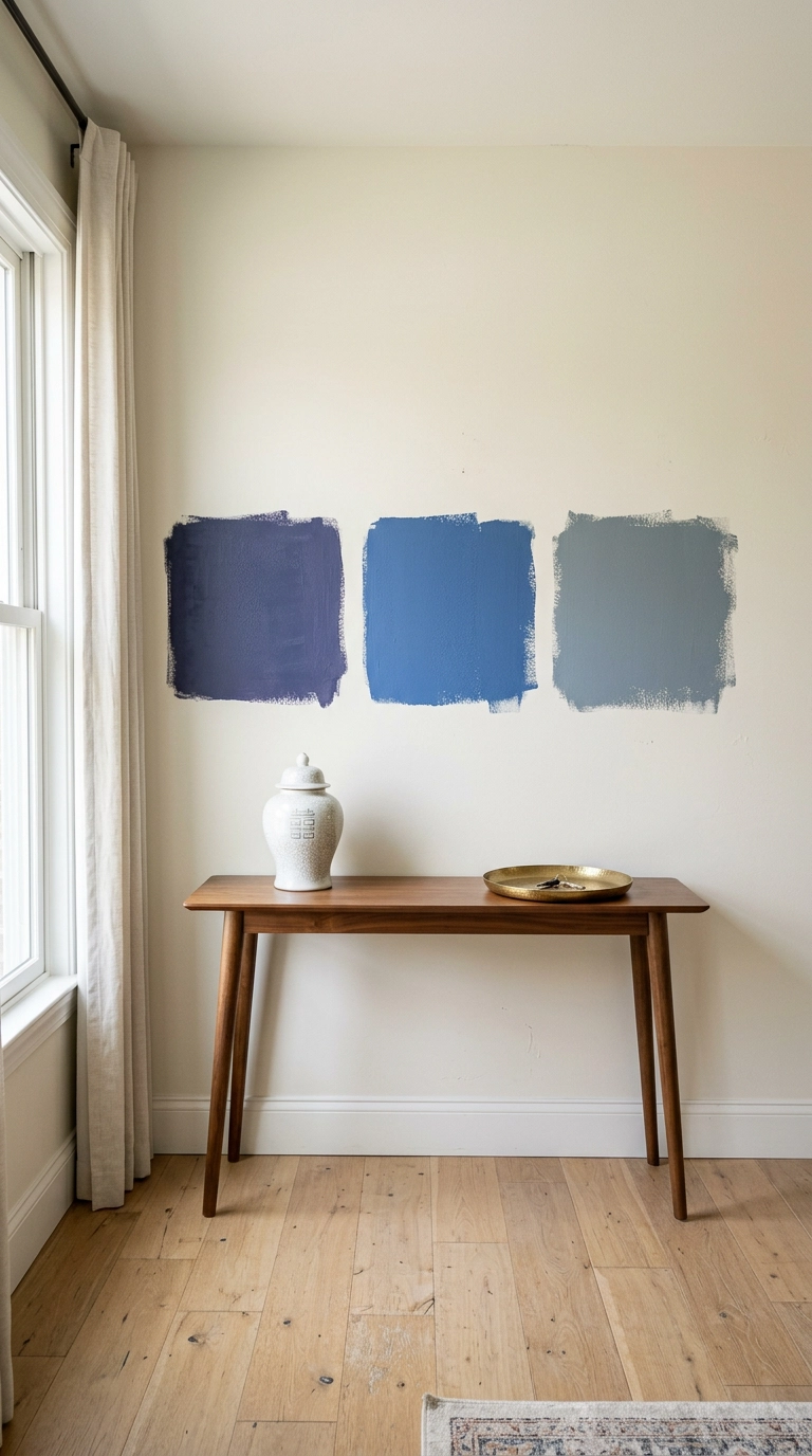
Every blue leans warm or cool, and this one decision governs the whole scheme. Warm blues have red or violet in them and read soft and old – think indigo, denim, faded delft. Cool blues have green or grey and read crisp and modern.
2. Never Pair a Warm Blue With a Cool White
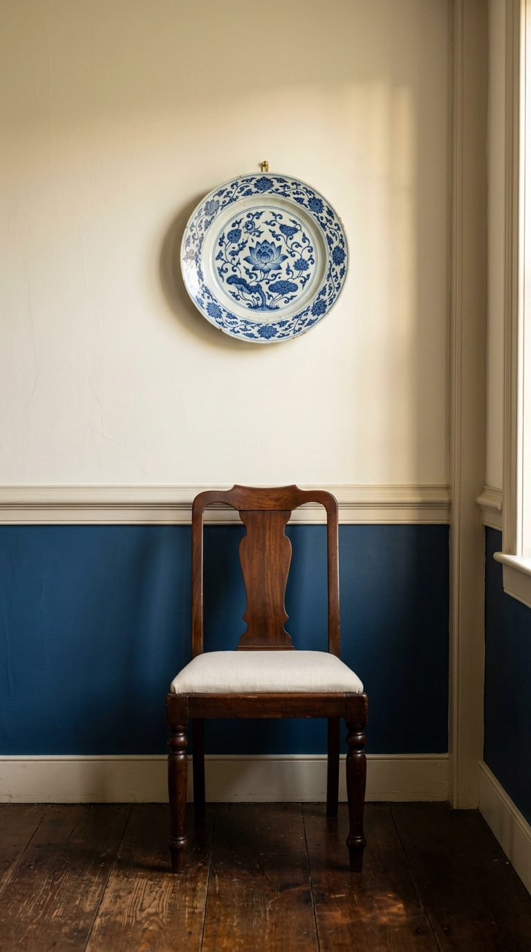
This is the single most common blue and white failure I get called in to fix. A bright optic white with blue undertones sitting next to a warm indigo makes the blue look grubby and slightly grey, like laundry that didn’t quite come clean.
3. Start a Ginger Jar Collection With Exactly Three
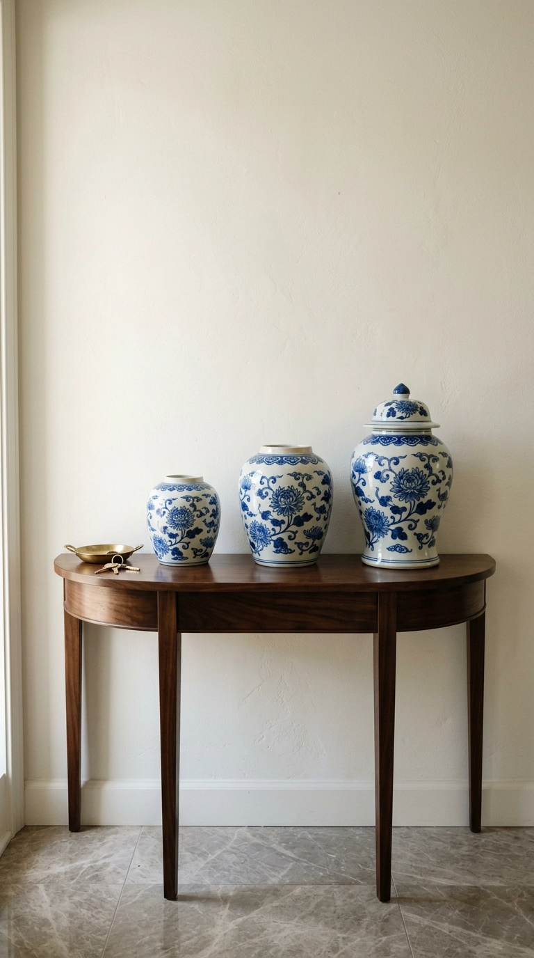
The ginger jar is the workhorse of this whole aesthetic, and the reason is scale – a single jar has enough visual weight to hold a console on its own. Three in graduated heights reads as a collection rather than a purchase.
4. Swap Your Throw Pillows for One Indigo Block Print
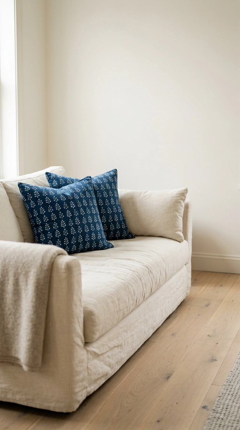
If you want the whole look for under $100, this is where to spend it. Indian hand-blocked indigo cotton has slight registration wobble and ink bleed at the edges, which is exactly what makes it read handmade instead of digitally printed.
5. Hang a Single Delft Plate Where You’d Expect Art
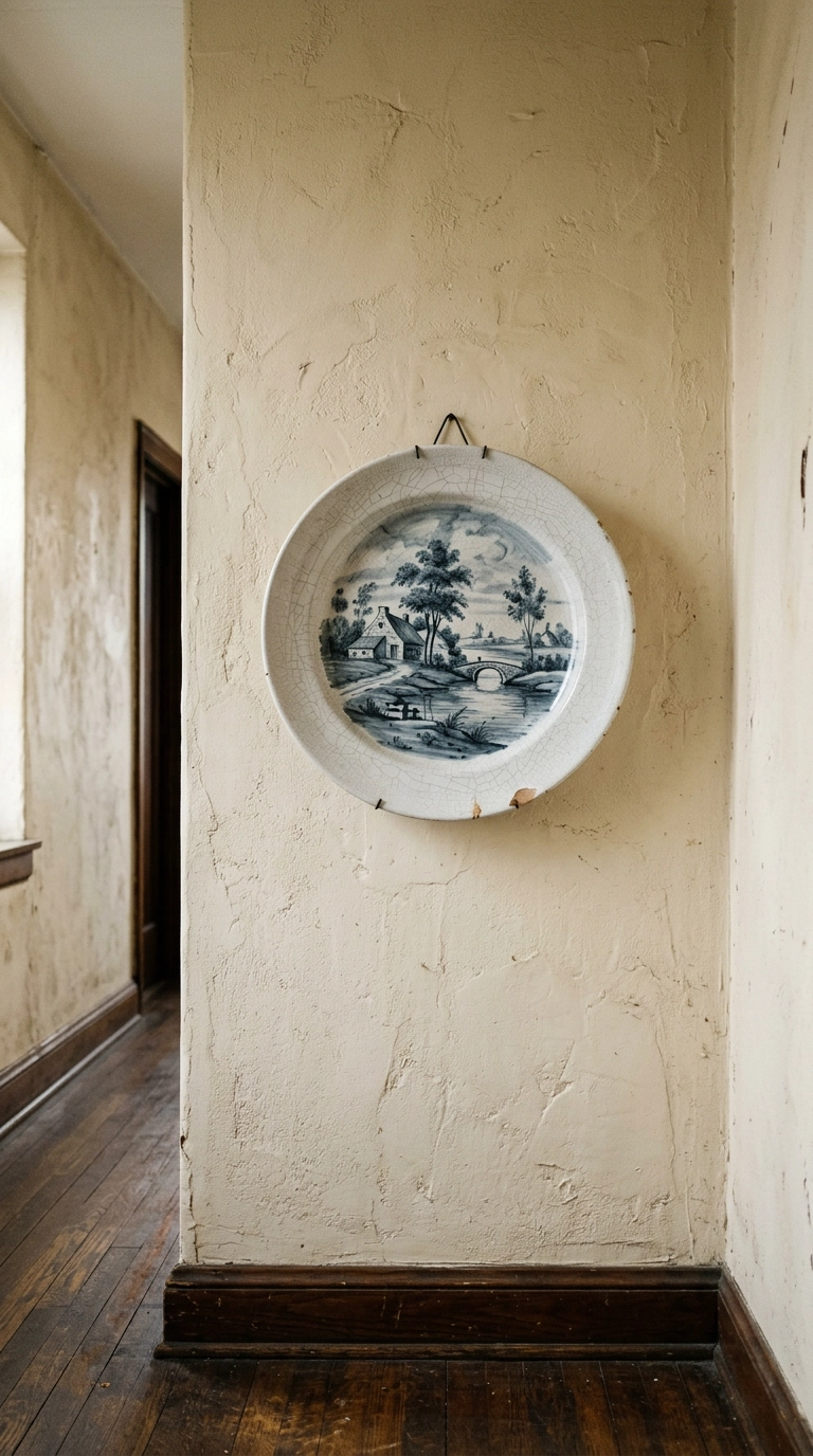
Delft is the Dutch attempt to copy Chinese porcelain, and the copy has its own charm – the blue is greyer, softer, and often a bit wobbly in the painting. One large charger alone on a wall has more presence than a whole plate arrangement.
6. Give Renters a Peel-and-Stick Chinoiserie Wall
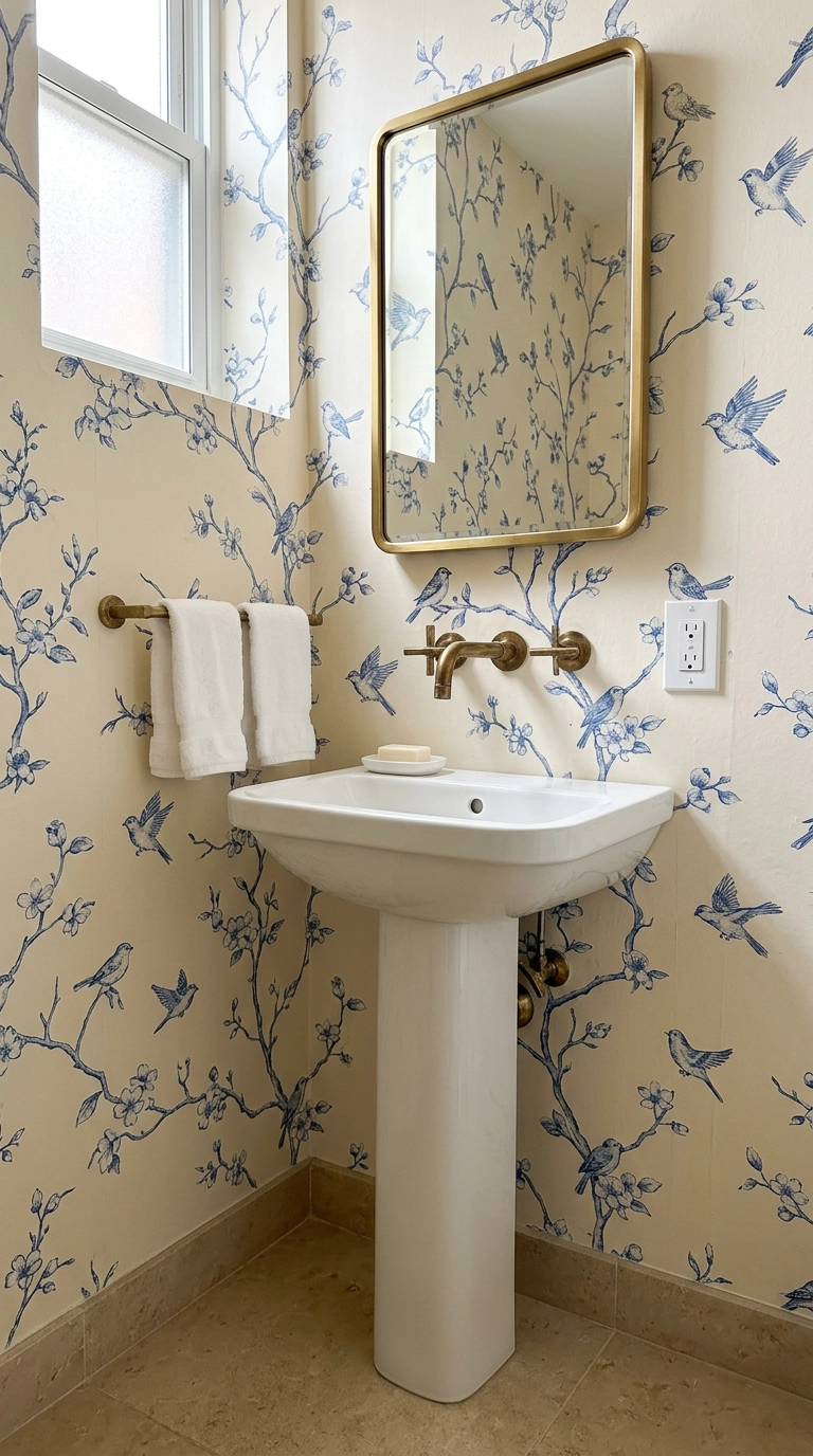
Hand-painted chinoiserie panels cost more than most cars, but the peel-and-stick versions have gotten genuinely good in the last few years – the trick is choosing one with an irregular, painterly repeat rather than a tight geometric one.
7. Use Ticking Stripe as Your Quiet Pattern
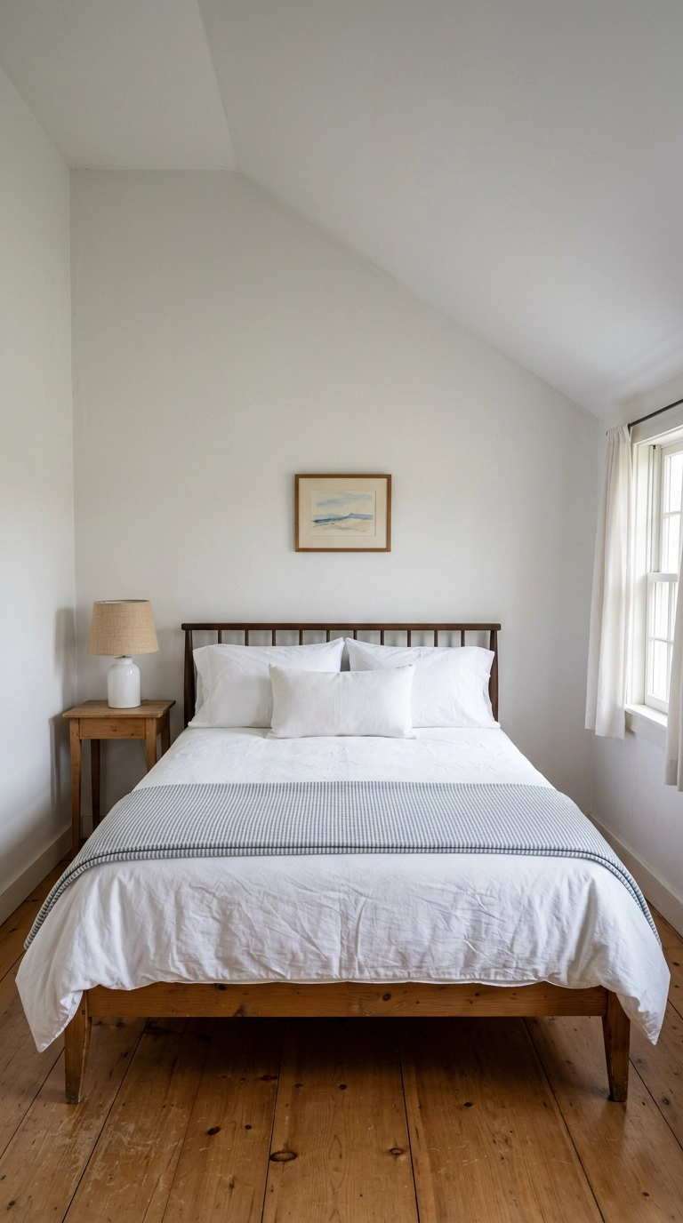
Every blue and white room needs a pattern that doesn’t demand attention, and ticking stripe is the best one there is. It reads as texture from across the room and only resolves into a stripe up close, so it never competes with your porcelain.
8. Put One Bold Blue Inside the Cabinets Instead of On Them
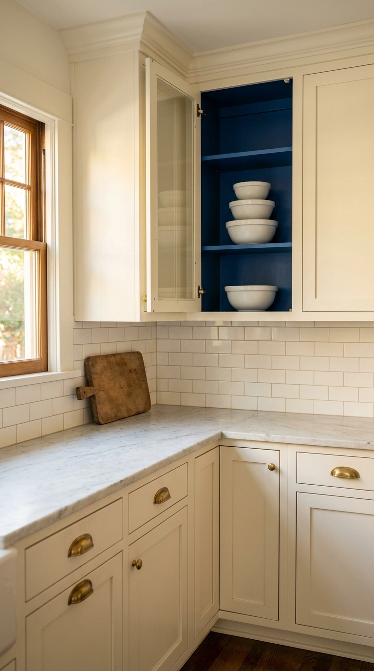
Painting the inside back of a glass-front cabinet is the highest-drama, lowest-risk blue move in the house. You get one saturated hit of color framed like a picture, and if you hate it in a year it’s a quart of paint and an afternoon to undo.
9. Hang One Big Vintage Blue Rug and Skip the Rest
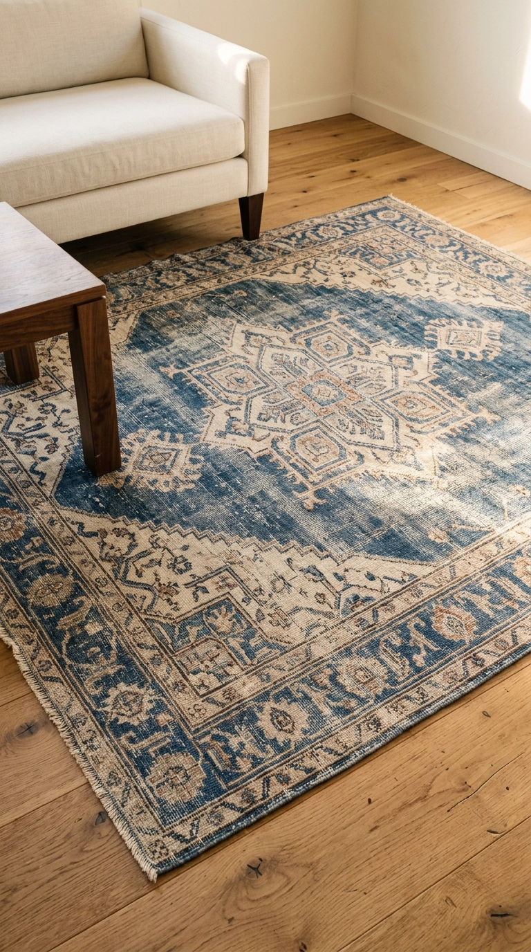
A genuinely old blue rug does something no new one manages: the vegetable-dyed indigo has fades and abrashes – those horizontal bands where the dye lot changed – and your eye reads that irregularity as depth rather than pattern.
10. Choose Stripes and Checks Over Florals in Modern Rooms
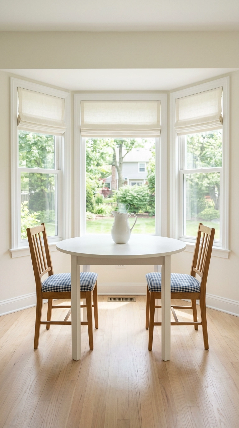
Blue and white florals read distinctly grandmillennial, which is great if that’s your goal and a problem if your furniture is contemporary. Geometrics – gingham, ticking, small checks – bridge modern and traditional without picking a side.
11. Warm the Whole Scheme With Rattan and Aged Brass
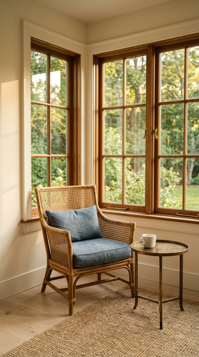
Blue and white alone is a cold pairing – it’s two thirds of a winter palette. Every good version of this scheme has a third element doing the warming, and it’s almost always a natural fiber or an unlacquered metal.
12. Group Blue and White Porcelain on a Mantel in Odd Numbers
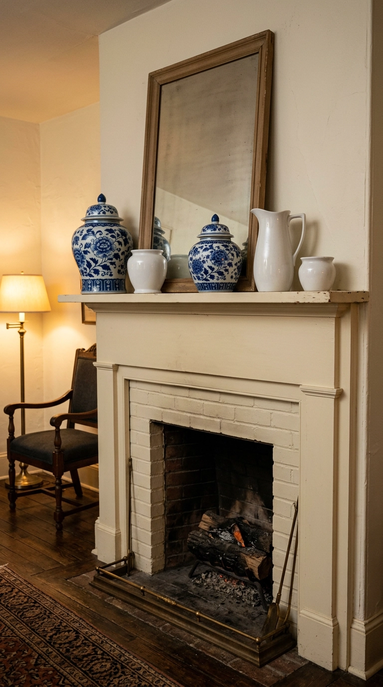
A mantel is where blue and white either sings or turns into a shop display. The difference is restraint: five pieces at varied heights with real gaps between them, not eleven crowded shoulder to shoulder.
13. Fix a Cold North-Facing Room With a Warmer Blue
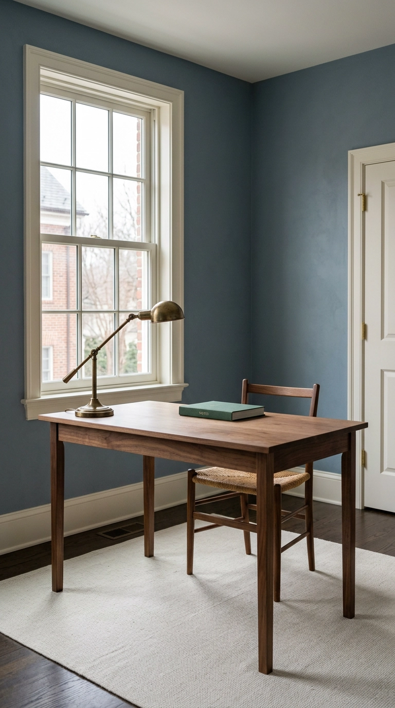
North-facing rooms get cool grey-blue light all day, which strips the warmth out of any blue you put on the wall. A cool blue in a north room goes flat and slightly institutional by about 3pm, and no lamp fixes it.
14. Skirt a Bathroom Sink in Blue and White Instead of Tiling
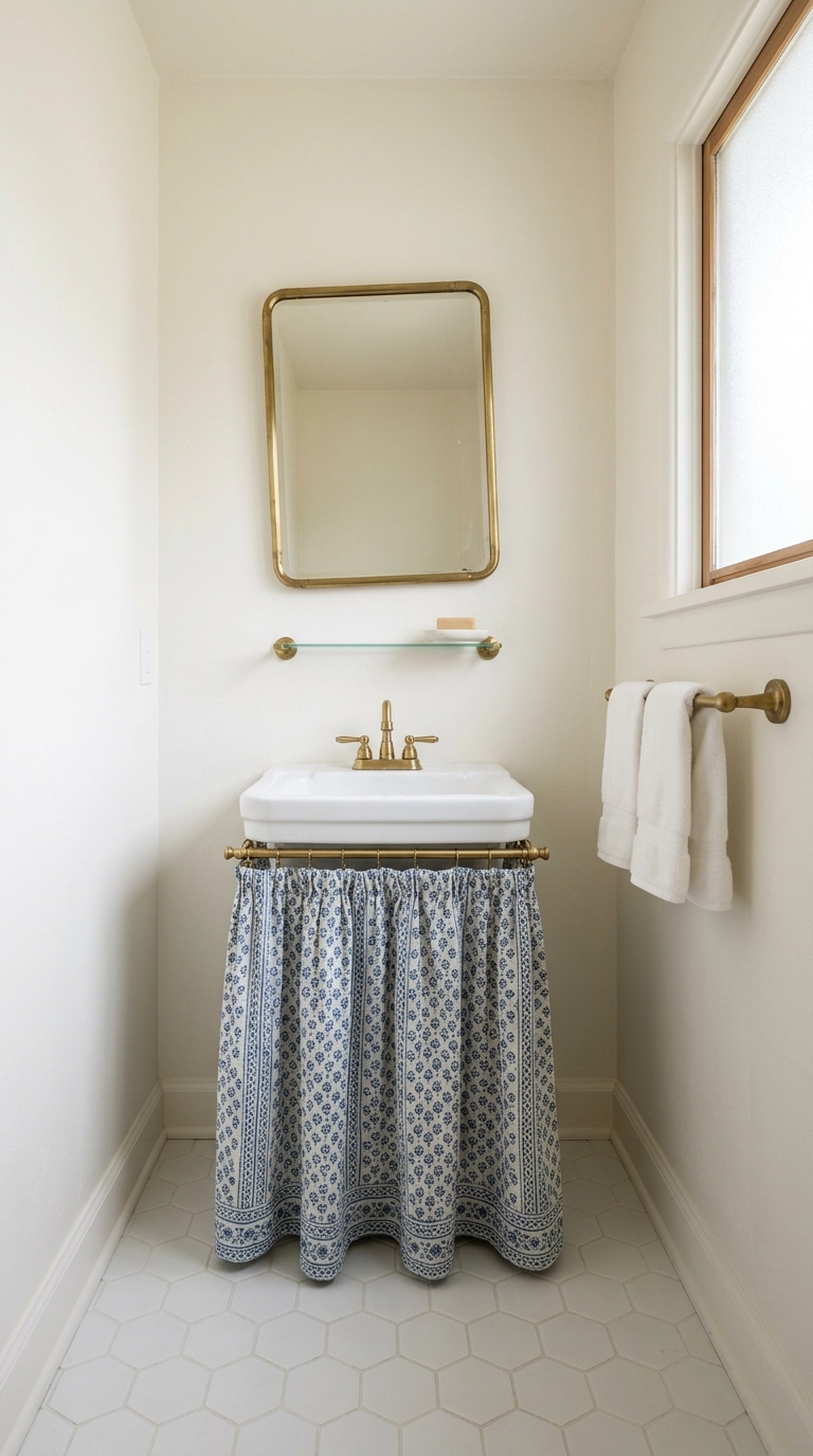
A skirted sink is the anti-hotel-bathroom move. It brings softness and pattern into a room made entirely of hard surfaces, and it hides the plumbing and the cleaning supplies while you’re at it.
15. Run Blue and White Through Every Room, One Object at a Time
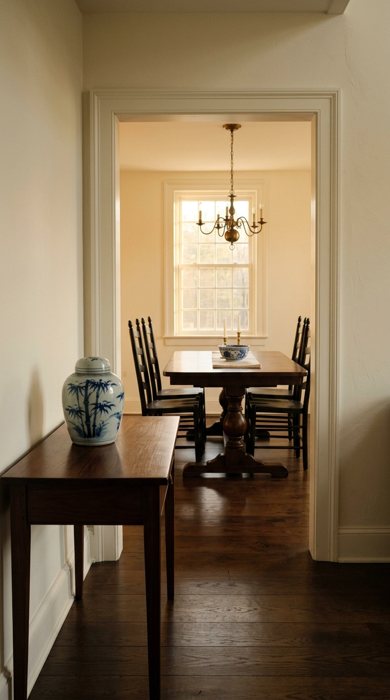
The reason blue and white works as a whole-house scheme is that it acts like a neutral once you commit to it. A single jar in the entry, a bowl on the dining table, a lamp base in the den – the repetition is what ties disconnected rooms together.
16. Convert a Porcelain Jar Into a Lamp Base
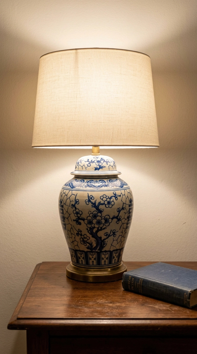
A porcelain lamp is the piece that makes a room look like it was decorated by someone with a point of view. It gives you the pattern at eye level, where you actually see it, rather than down on a console.
17. Paint the Ceiling a Pale Blue and Leave the Walls White
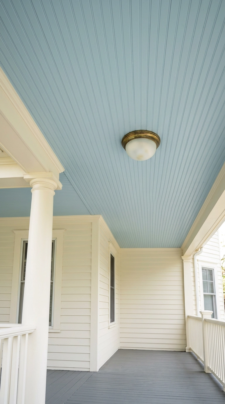
Haint blue porch ceilings come out of the American South, where the pale blue was meant to look like sky, and the effect genuinely works – it makes a low covered ceiling recede. Indoors it does the same thing to a boxy room.
18. Layer Two Blues Instead of Blue Against White Everywhere
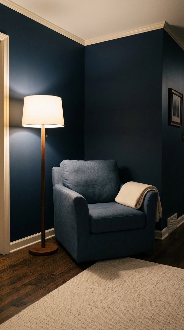
Straight blue-against-white everywhere is what gives these rooms that graphic, slightly hard quality. Introducing a second blue at a different value softens the whole thing and adds the depth a two-color scheme can’t reach.
19. Hang a Plate Wall, But Only With One Motif Family
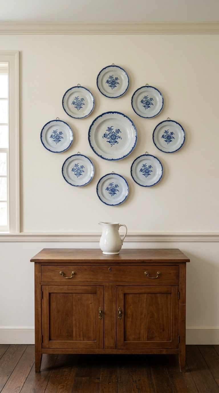
Plate walls are having a real revival and most of them fail for one reason: too many unrelated motifs. Pick one family – all floral sprays, or all landscape scenes, or all geometric rim patterns – and the group holds together even with mismatched sizes.
20. Slipcover a Sofa in White and Put the Blue Everywhere Else
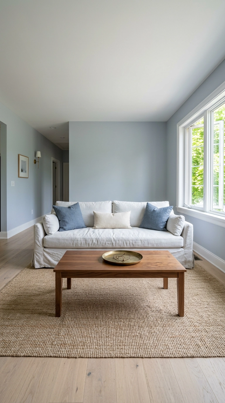
A white slipcovered sofa is the most practical piece of furniture I recommend, which surprises people. It comes off and goes in the washing machine, which is more than your grey performance-fabric sectional can say.
21. Color Drench a Small Room in One Deep Blue
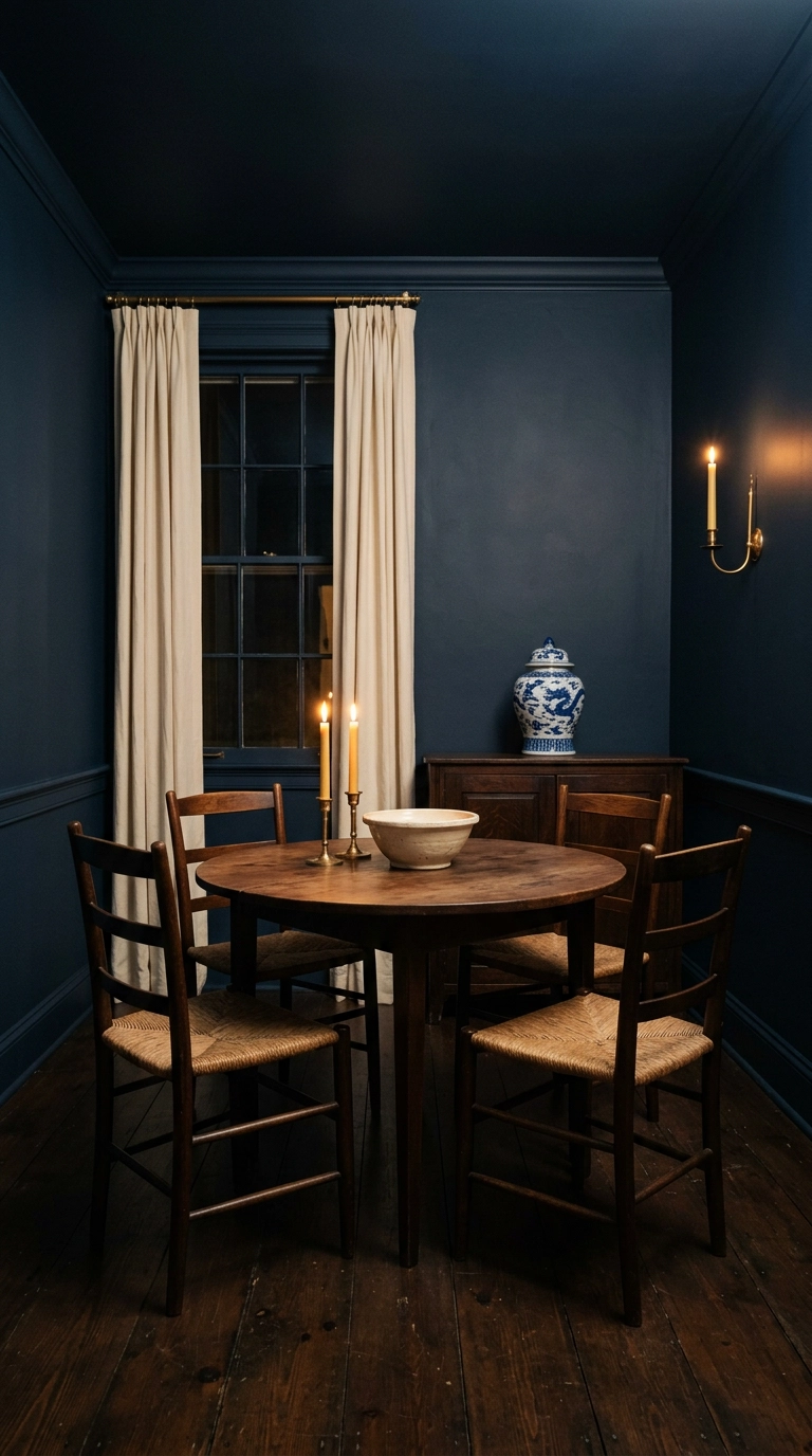
Color drenching means painting walls, trim, and ceiling the same shade, and it’s counterintuitively the best thing you can do to a small dark room. Erasing the contrast at the edges removes the visual breaks that tell your eye where the box ends.
22. Tile a Backsplash in Hand-Painted Blue and White
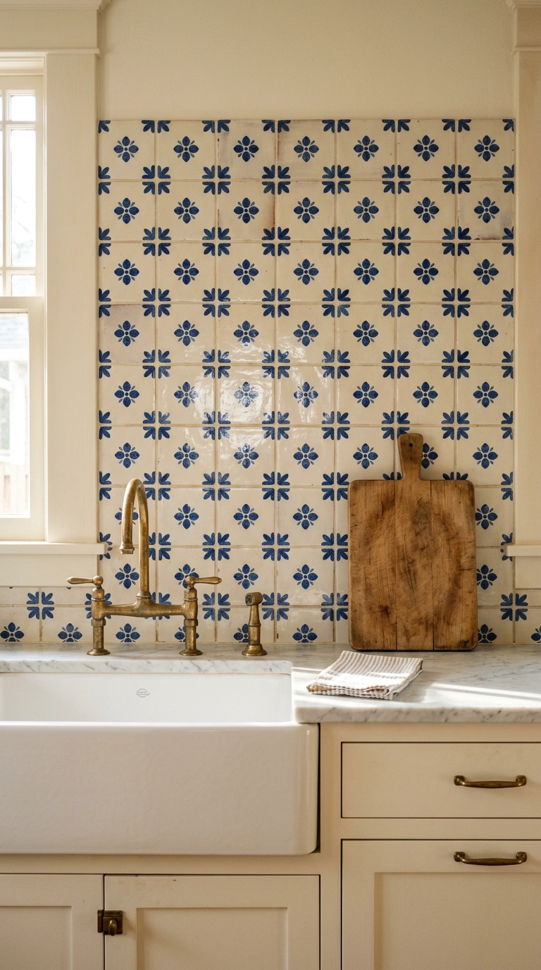
This is a real commitment and it’s the idea that most transforms a kitchen. Hand-painted tile has glaze pooling and slight variation between pieces, which is why it looks like Portugal and machine-printed tile looks like a big-box store.
23. Commit to One Chinoiserie Wall in the Dining Room
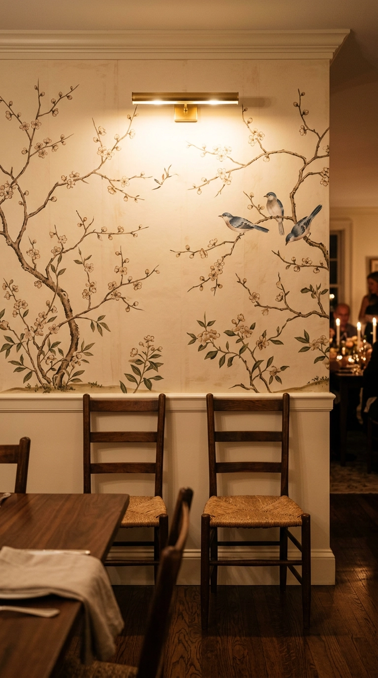
If you do one big thing from this list, do this. A chinoiserie wall in a dining room is the whole 400-year history of blue and white compressed into one surface, and it’s the room to gamble in because you’re only in it at night with the lights low.
Where I’d Start
If this list feels like a lot, do three things this month: paint big blue swatches on the actual wall before you buy anything, hold your white against your blue in daylight to check the temperature, and buy three ginger jars in graduated heights. That’s under $150 and one Saturday, and it solves the two failures I see constantly – the wrong blue and a cold white that makes it look dirty.
What’s shifted is that blue and white finally shook off the seaside association it picked up in the 2010s. The rooms getting saved now lean into the porcelain history instead – Mark D. Sikes has built an entire career on blue and white as an American classic rather than a beach house default, and Farrow & Ball’s Hague Blue keeps turning up in drenched dining rooms for the same reason. The other real change is restraint: one hero pattern per room, everything else plain, which is why the ticking stripe and slipcovered sofa ideas outperform the maximalist versions people were pinning five years ago.
Pick the one that matches your lease and your nerve – the block-print sink skirt and peel-and-stick powder room if you’re renting, the color-drenched dining room if the walls are yours, or just a warmer bulb and three jars if you want a different room by tonight. If this was useful, sign up for my weekly newsletter and I’ll keep sending the paint names, porcelain sources, and flea market finds I’m using in real client homes.


