
23+ Turquoise Living Room Decor Ideas that are Easy and Gorgeous in 2026

Turquoise is having a quiet renaissance, and honestly? I’m here for it. It’s the rare color that can feel as calm as a spa at 7 a.m. and as lively as a beach day by noon, and after a decade of styling client rooms I’ve learned exactly where it thrives — and where it turns into a 2010s time capsule. This roundup runs the full spectrum, from a full turquoise velvet sofa to a $30 pillow swap, so wherever you land on the courage scale, there’s a version of this color with your name on it.
Turquoise Living Room Decor Ideas
1. The Turquoise Velvet Sofa — a Statement Only Some Rooms Should Make
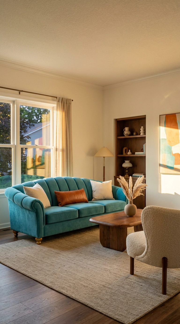
Let’s get the scariest one out of the way first. A turquoise velvet sofa is a splurge — think $2,000 and up for something that’ll actually last a decade — and it’s not for every room. Do it if your floors, walls, and rug are all fairly neutral and the sofa can float in the room instead of being wedged against a wall. Skip it if you’re in a tiny studio or your living room already has three loud patterns fighting each other.
2. The 20-Minute Turquoise Pillow Swap
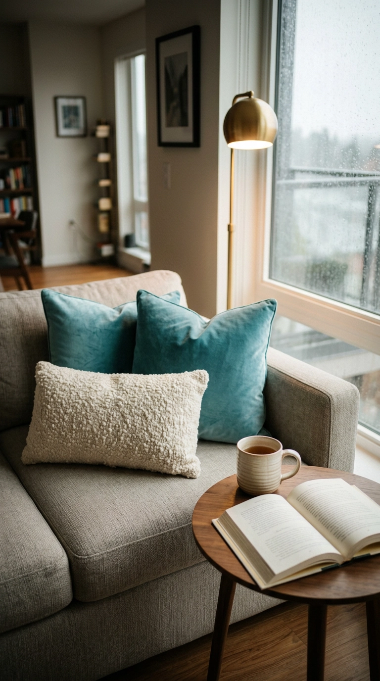
The fastest way to test-drive turquoise without committing to anything permanent is the pillow swap. Two 20-inch velvet squares in a mid-tone turquoise plus one neutral lumbar will run you $30 to $60 at any big-box store, and it’s the cheapest way to find out if you actually like living with the color.
3. Warm Walnut and Turquoise — the Pairing I Reach For First
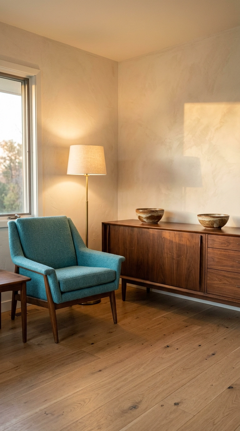
Turquoise is a cool color with a green undertone, which means it can slip into chilly territory fast. Walnut is the fix. Its reddish-brown warmth sits directly opposite turquoise on the temperature scale, so the two cancel each other’s extremes out and the room lands somewhere balanced.
4. White Walls, Sand Textures, and Turquoise as the Only Saturated Color
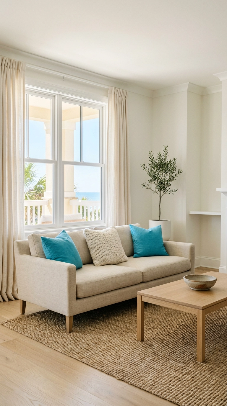
This is the foolproof version of turquoise decorating, and it’s why so many coastal interiors use it. White and sand are quiet enough that the turquoise reads as intentional rather than loud, like a single exclamation point in an otherwise hushed sentence.
5. Turquoise and Coral — the Complementary Combo That Needs a Ratio
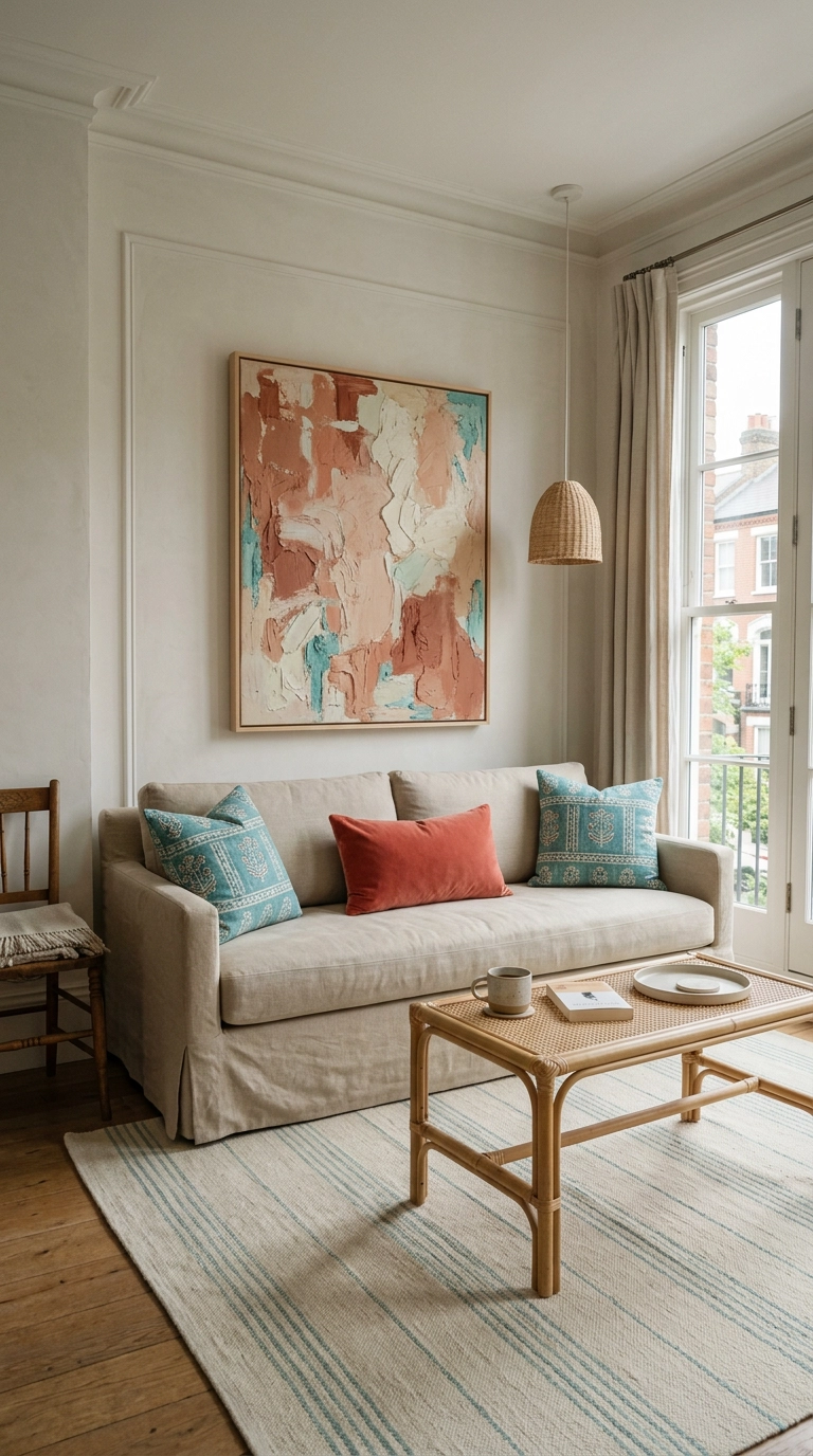
Turquoise and coral are near-opposites on the color wheel, which is exactly why they sing — and exactly why they can go beach-souvenir-shop if you let them run equal. My rule is roughly 70/30: turquoise leads, coral is the supporting act in one or two small doses.
6. Deep Navy and Turquoise for a Grown-Up, Moody Room
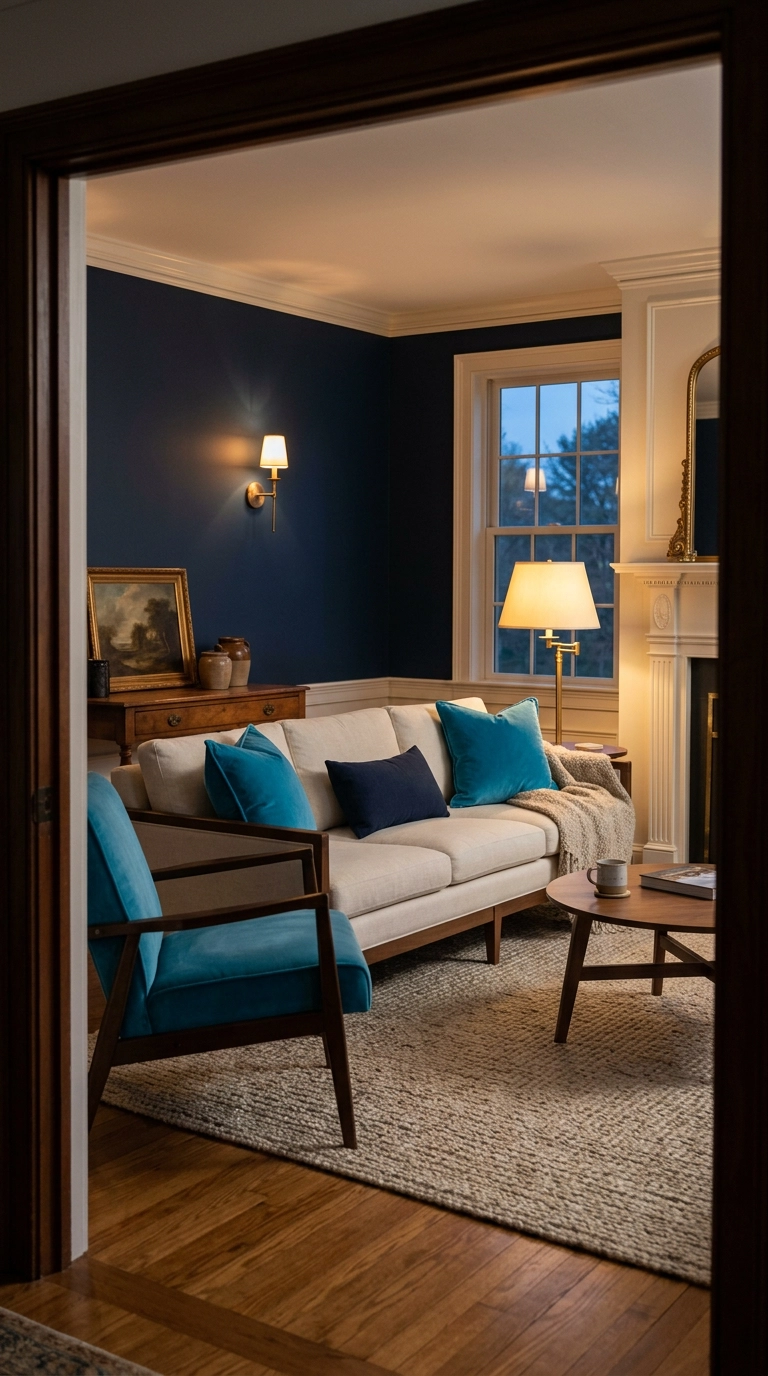
Navy and turquoise are cousins — both blue-family — so they harmonize automatically without any color theory homework. The difference in value does the work: navy is deep and heavy, turquoise is bright and light, and that contrast keeps the room from going flat.
7. Choose Brass Over Chrome — a Metal Swap You Can Do Tonight
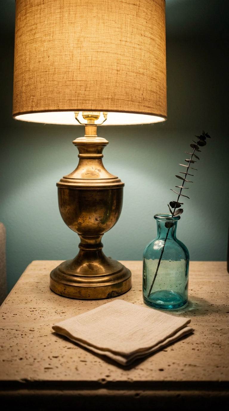
Here’s a rule I’d tattoo on my arm: cool color, warm metal. Turquoise plus chrome or brushed nickel reads clinical, like a dentist’s waiting room with better furniture. Turquoise plus brass reads like a designer did it.
8. A Single Turquoise Accent Wall (and Where to Put It)
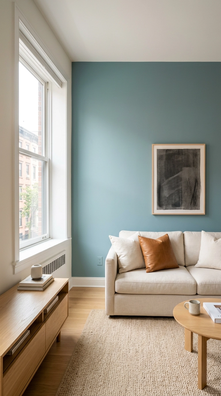
Paint the wall your sofa sits against, not the wall you face from the sofa. Behind the sofa, the color frames your main furniture piece and you see it every time you walk in. On the facing wall it just stares at you while you watch TV.
9. Renter-Safe Turquoise with Peel-and-Stick Wallpaper
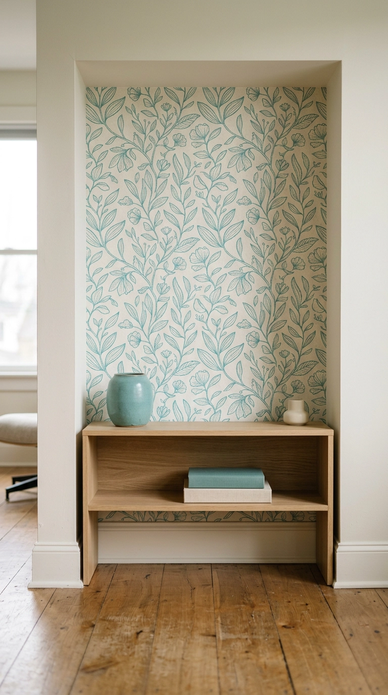
Peel-and-stick has gotten genuinely good, and turquoise is one of the best colors for it because the pattern carries the color without a single drop of paint. My placement trick: put it inside an alcove, a bookcase back, or the wall of a built-in, where the edges are hidden and the seams don’t have to be perfect.
10. Turquoise Wall Art That Doesn’t Scream “Beach Towel”
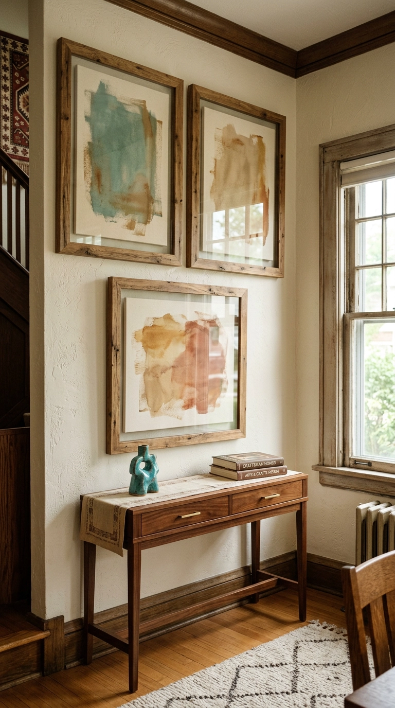
The reason turquoise art goes beach-towel is the subject matter: sailboats, seashells, palm trees. The fix is abstraction. A wash of turquoise paint on canvas reads as sophisticated precisely because it isn’t trying to depict anything.
11. A Hand-Knotted Turquoise Rug — Go One Size Bigger Than You Think
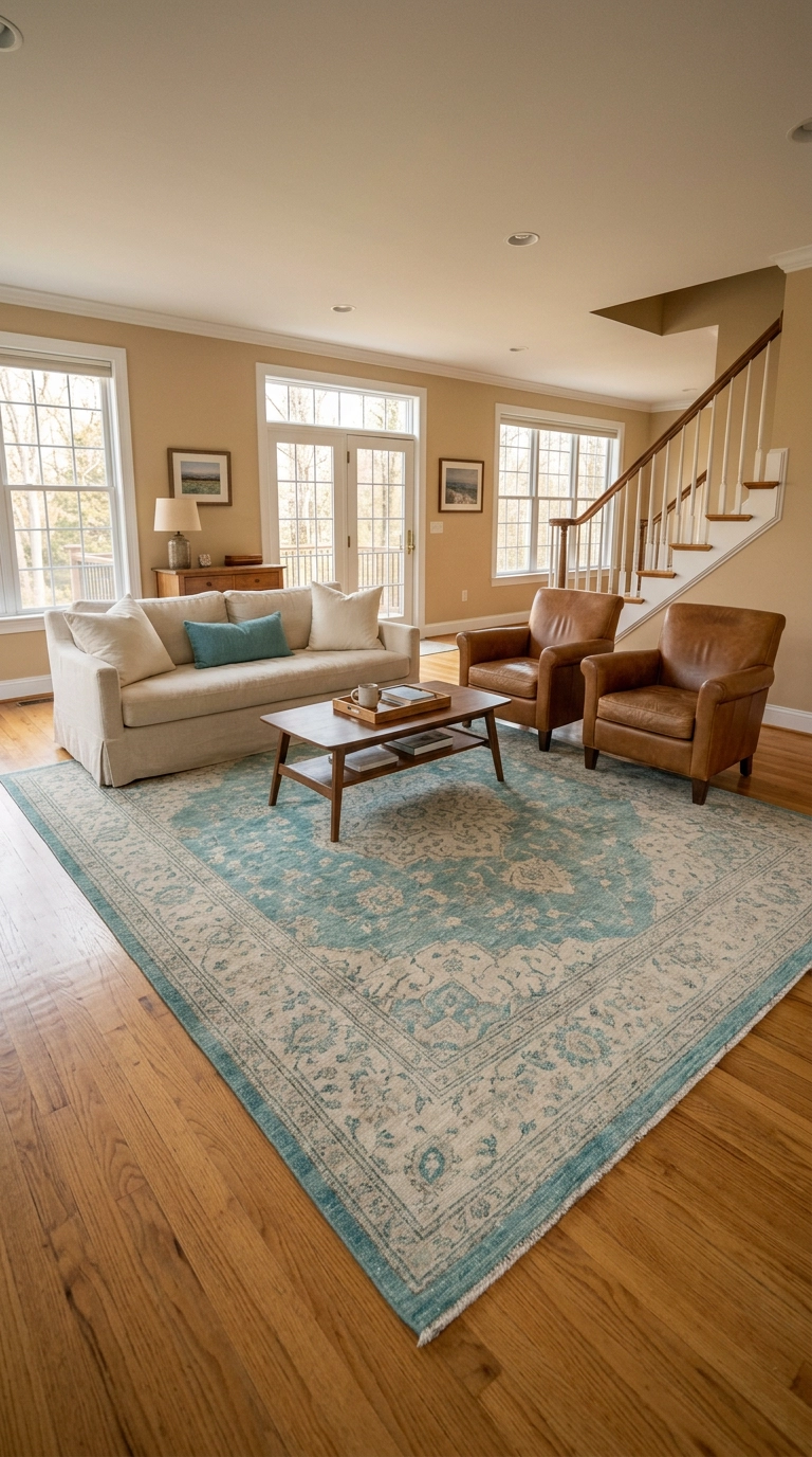
This is splurge number two and the one I’d argue for hardest. A hand-knotted or vintage-style wool rug in a faded turquoise runs $600 to $2,000 for an 8×10, and it does something a machine-made polypropylene rug can’t: the wool takes dye unevenly, so the color has depth and looks aged instead of flat.
12. Thrifted Ceramics and Glass — the $8 Way to Try Turquoise
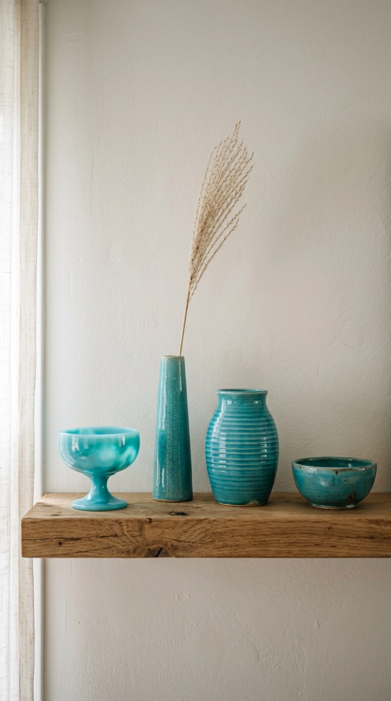
Goodwill is genuinely the best store for turquoise, because the color was everywhere in mid-century production and again in the early 2000s, and both eras’ pieces now live on the same thrift shelves. I’ve built entire vignettes for under $25 — a ribbed ceramic vase for $6, a milk-glass style compote for $8, a bud vase for $4.
13. One Patterned Turquoise Textile — Never Three
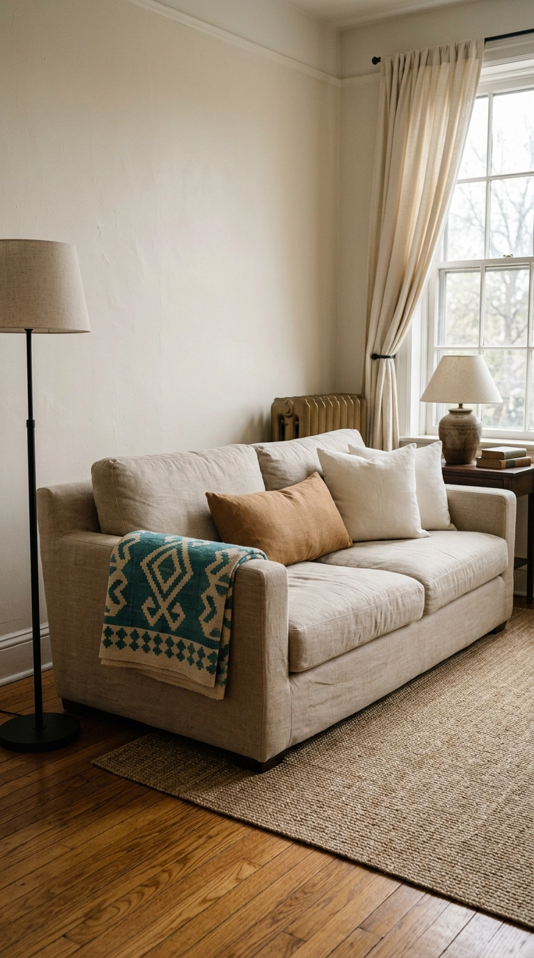
Pattern is where turquoise rooms go sideways. A block-print pillow, an ikat rug, and a paisley curtain in the same blue-green all fight for the same job, and the room ends up looking busy without looking designed.
14. Painted Furniture: One Turquoise Piece, Sanded Down to Vintage
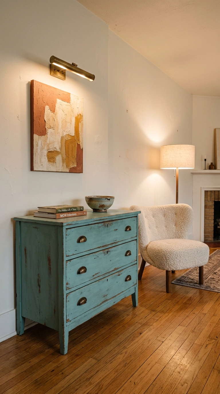
A thrift-store dresser is a weekend project that pays off for a decade. Sand lightly, prime with shellac-based primer so the wood tannins don’t bleed through, and paint in a dusty turquoise — not bright — because the worn, matte finish is what keeps it from reading 2010s Pinterest-craft.
15. Turquoise Curtains, Hung High and Wide
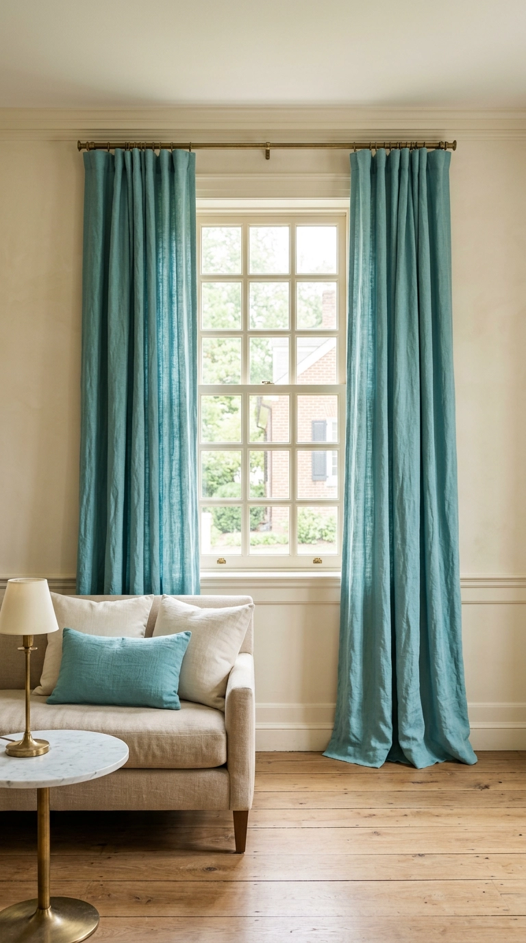
Curtains are the sneakiest way to get a lot of turquoise into a room without committing a single piece of furniture to it. Mount the rod two to four inches below the ceiling and extend it eight to twelve inches past the window on each side — the eye reads the whole rectangle as the window, so the ceilings feel taller and the window looks twice as wide.
16. Get the Bulb Temperature Right, or the Turquoise Turns Gray
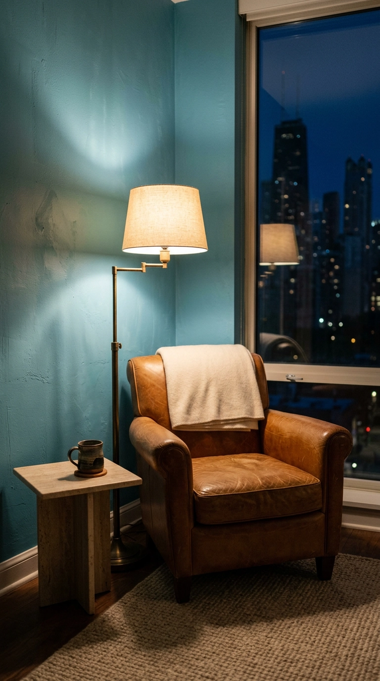
Nobody talks about this and it ruins more turquoise rooms than bad furniture. Turquoise is a cool blue-green, and under cool 4000K–5000K bulbs it goes flat, gray, and slightly institutional. Under warm 2700K bulbs it warms into something rich and jewel-like.
17. How Much Turquoise Is Too Much? The 60-30-10 Answer
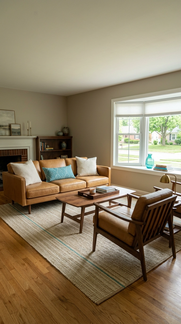
The honest answer: turquoise is a saturated color, so it hits harder per square foot than a neutral does. The old 60-30-10 rule works well here — 60 percent dominant neutral, 30 percent secondary tone like walnut or camel, 10 percent turquoise.
18. Color-Drench the Whole Room in Deep Turquoise
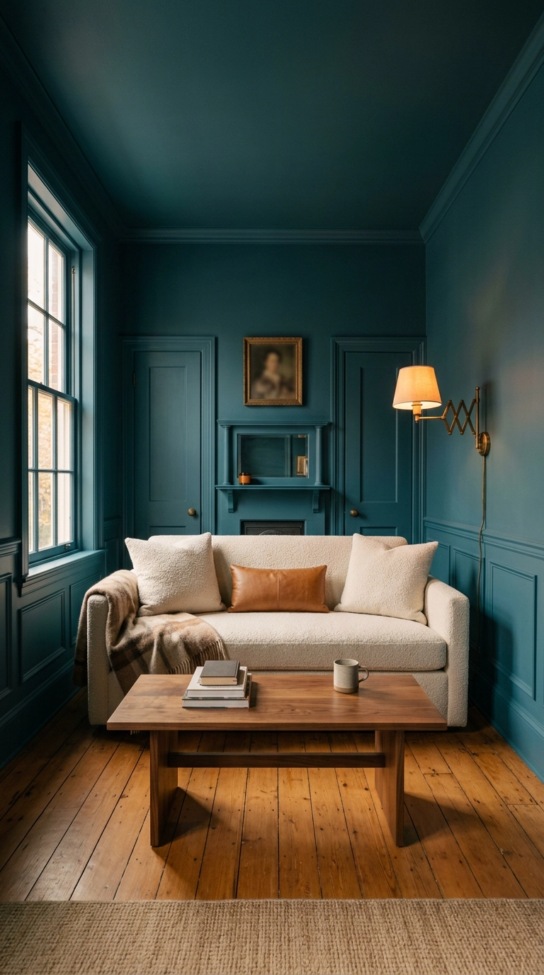
This is turquoise as the dominant color rather than the accent, and it’s my favorite use of it. Color drenching means walls, trim, and ceiling all in the same shade — no white ceiling, no contrasting baseboards — which erases the visual breaks that chop a small room into pieces.
19. Keeping Turquoise Out of 2010s Territory
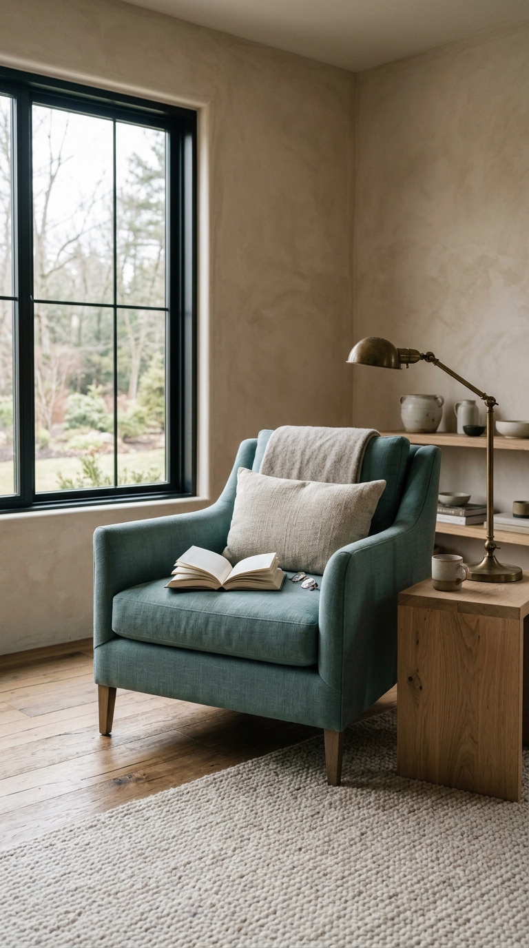
Turquoise got a bad reputation because of how it was used around 2012: bright aqua paired with gray, chevron everything, and a canvas print with a cursive word on it. The color was never the problem.
20. Small Living Rooms: Put the Turquoise Up High
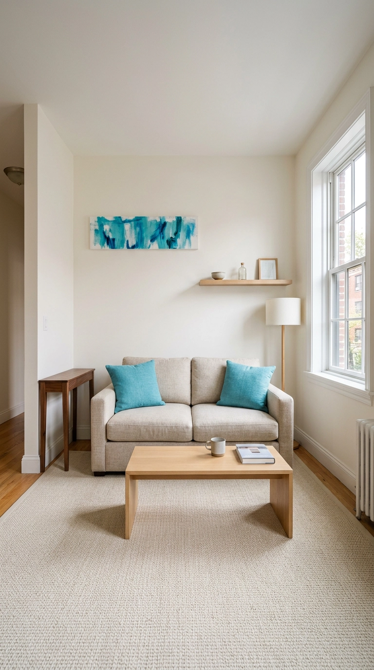
In a room under about 150 square feet, big turquoise furniture eats the space. The move is to keep the floor plane and the lower half of the walls light, then put your color up high — art above the sofa, a shelf vignette, curtains near the ceiling.
21. Open-Plan Homes: Use Turquoise to Draw the Room’s Edges
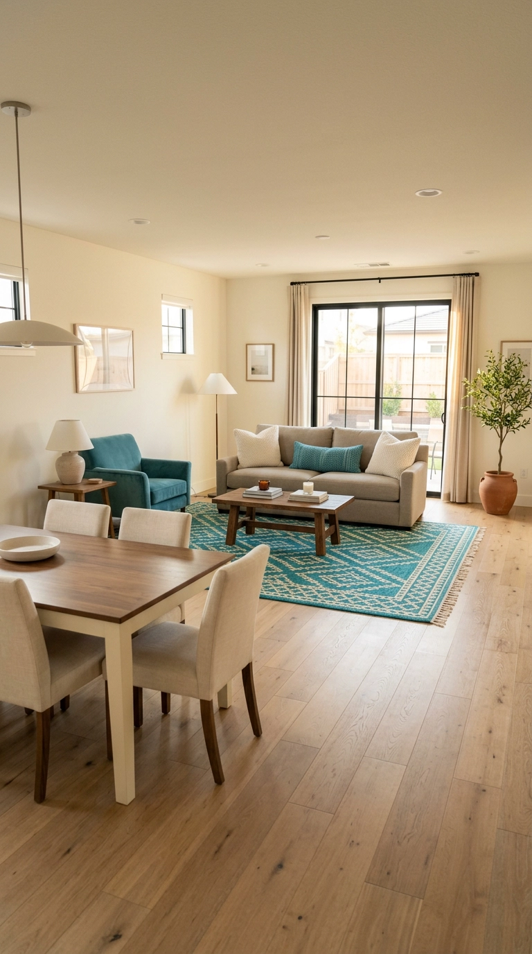
Open-plan rooms have no walls to tell you where the living room ends, so color can do that job. Confine turquoise to the seating zone — the rug, one chair, the pillows — and leave the dining and kitchen zones neutral. The color boundary reads as a room boundary.
22. The Free Version: Rearrange What You Already Own
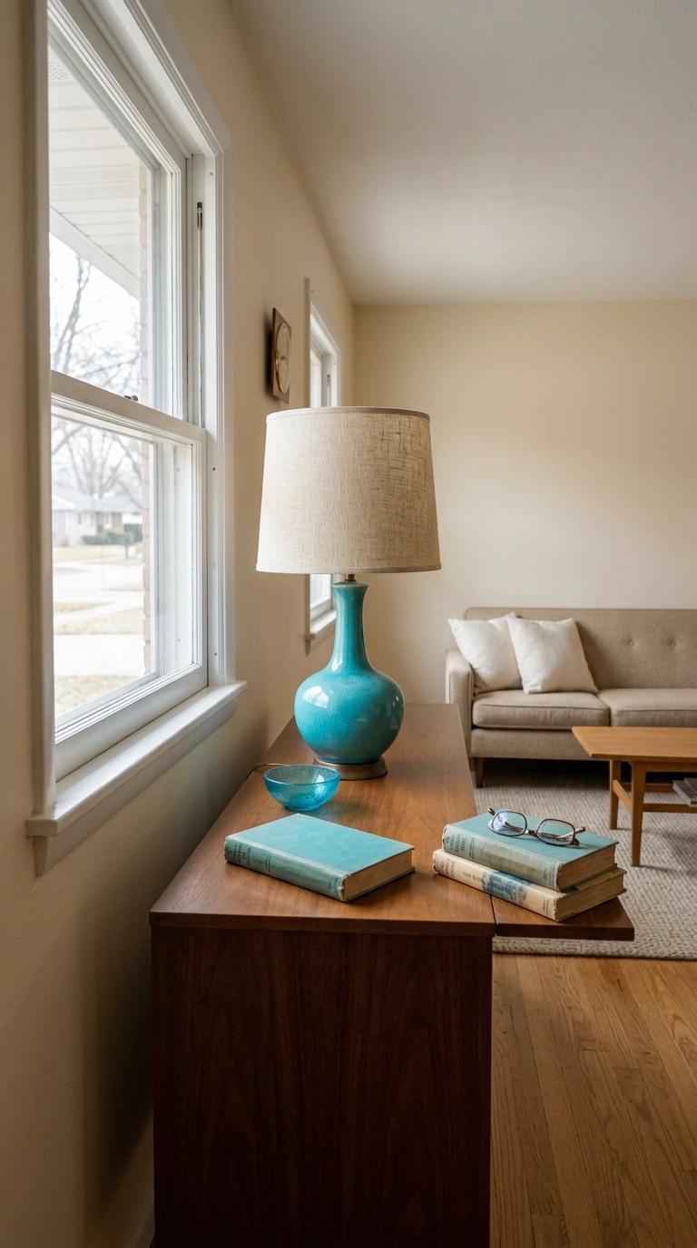
Before you spend anything, walk your house and collect every turquoise object you own — a vase in the bedroom, a bowl in the kitchen, a book on a shelf. Most people have more than they realize, just scattered one item per room where none of it registers.
23. Paint the Ceiling Turquoise and Leave Everything Else Alone
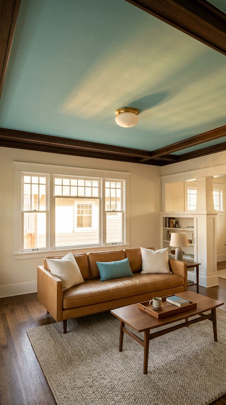
Here’s the one nobody expects. Leave your walls alone and paint only the ceiling a soft turquoise. It reads like a sliver of sky, it surprises everyone who walks in, and because you never look directly at a ceiling for long, it’s a bold move that somehow never gets tiring.
Living With a Little Blue-Green
If you take one thing from this list, let it be that turquoise rewards restraint far more than enthusiasm. The rooms I’ve loved most weren’t the ones drenched in it — they were the ones where a single dusty turquoise armchair sat against warm limewash plaster, or where a faded wool rug pulled a whole neutral room together. The color has enough personality that it doesn’t need help.
What’s shifted in 2026 is the tone. We’ve moved away from the bright pool-water aqua of a decade ago toward deeper, dustier, teal-leaning shades that sit comfortably next to clay, camel, and unfinished oak. You can see the same instinct in the way designers like Kelly Wearstler use saturated blue-greens as sculptural moments rather than wall-to-wall commitments, and in how many paint brands have quietly pushed their teals toward the muted end of the range. Pair any of it with warm brass instead of chrome and warm 2700K bulbs instead of cool ones, and the color does the rest.
My honest advice: start with the free version. Gather the turquoise you already own onto one console, live with it a week, and see whether you want more. If you do, the pillow swap is thirty dollars and the ceiling is a Saturday. If you want more ideas like these landing in your inbox every week — plus the palettes and paint shades I’m actually specifying for clients — sign up for my weekly newsletter and come decorate with me.


