
23+ Gorgeous Purple Living Room Decor Ideas that Look Expensive in 2026

I’ll admit it — purple scared me for years. My first attempt was a lilac guest room in 2012 that came out looking like a bottle of grape cough syrup, and I swore off the whole color family. But somewhere between discovering Farrow & Ball Brinjal and watching plum velvet take over every design fair I attended, I fell hard. Purple is the most misunderstood color in a living room: get the undertone right and it reads as rich, moody, and expensive, not girly or loud. These are the 23 ways I actually use it in real American homes.
Purple Living Room Decor Ideas
1. Color-Drenched Aubergine Walls, Trim, and Ceiling
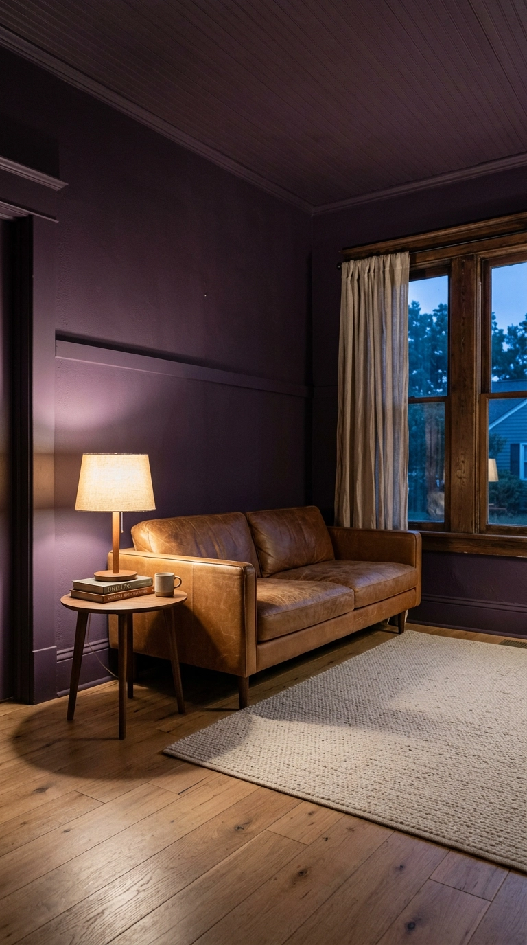
Color drenching just means painting the walls, trim, and ceiling the same shade so your eye never hits a hard stop. In a deep purple like Farrow & Ball Brinjal or Benjamin Moore Shadow, it turns a boxy room into something that feels like a jewelry box instead of a painted cube.
2. A Plum Velvet Sofa as the Only Bold Move
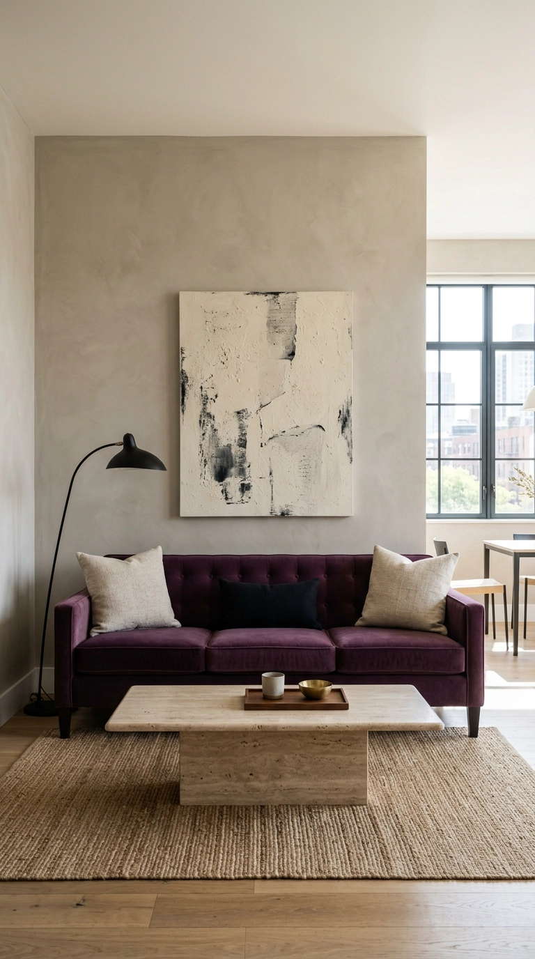
If you only do one purple thing, make it the sofa. Velvet is what sells it — the pile catches light differently across the seat, so a single plum sofa reads as five shades of purple depending on where you stand.
3. Lilac Walls with Warm Wood to Keep It Grown-Up
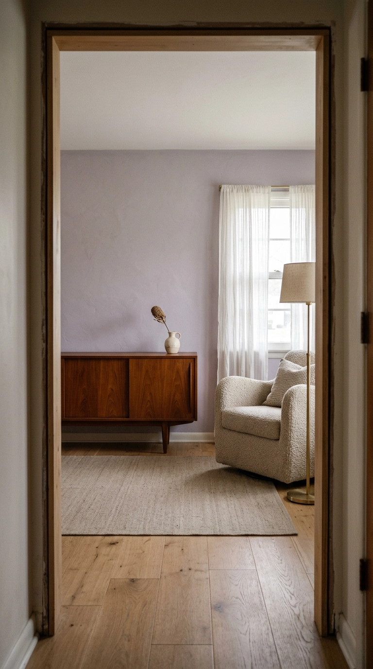
Lilac gets accused of being a nursery color, and it earns that reputation when you pair it with white and chrome. The fix is warm wood — teak, walnut, or honey oak — which pulls the pink out and lets the grey undertone read as sophisticated.
4. Peel-and-Stick Grasscloth Wallpaper in Muted Violet
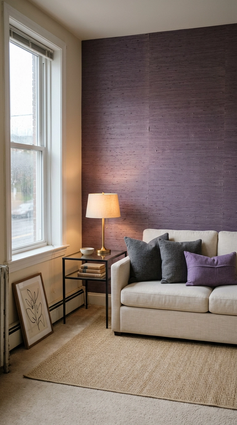
Renters, this is your purple. Peel-and-stick grasscloth in a muted violet gives you texture and color on one wall and comes off cleanly when your lease ends — no primer, no security deposit anxiety.
5. Purple and Olive Green as an Unexpected Pair
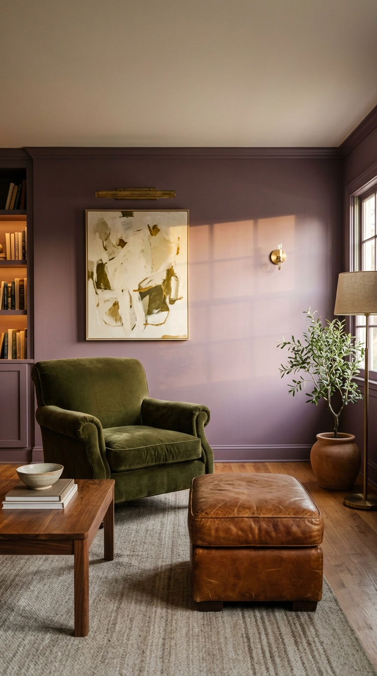
Purple and olive sit near-opposite each other on the color wheel, so they sharpen each other instead of muddying. It’s the combination I reach for when a client says they want purple but not romantic.
6. Mauve Board and Batten Wall Molding
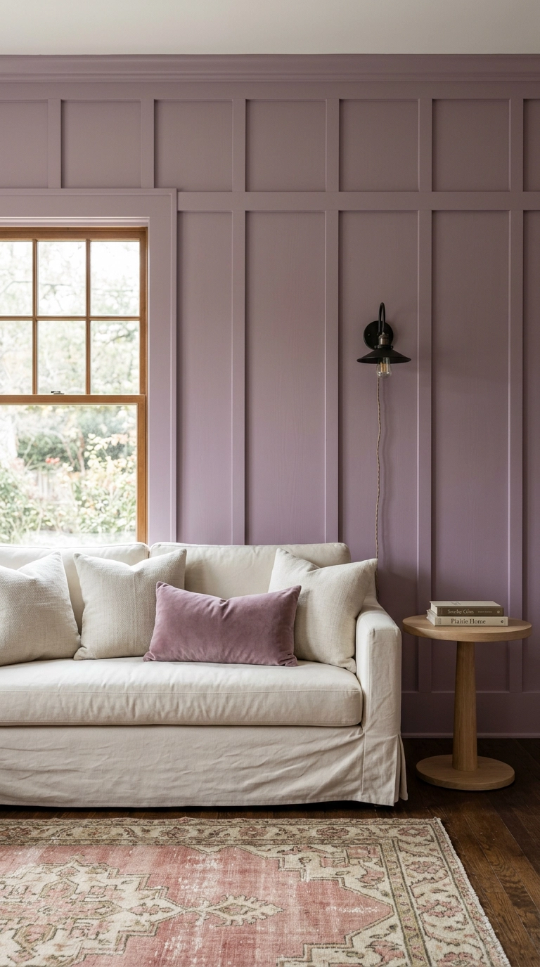
Board and batten is just vertical wood strips applied over drywall and painted, and it adds architecture to rooms that were built without any. In mauve it goes soft and slightly historic rather than farmhouse.
7. One Oversized Purple Abstract Canvas Over a Neutral Sofa
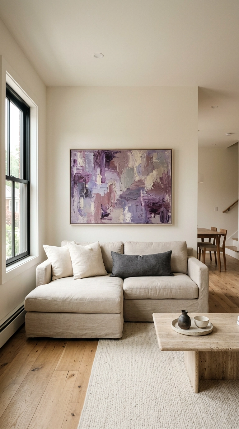
The cheapest way to commit to purple is to not commit at all — hang one big abstract in violet and plum over a neutral sofa and let it be the whole story. Big art in a soft palette also happens to be the easiest thing to change your mind about later.
8. Deep Purple Built-In Bookshelves Painted the Same Shade as the Wall
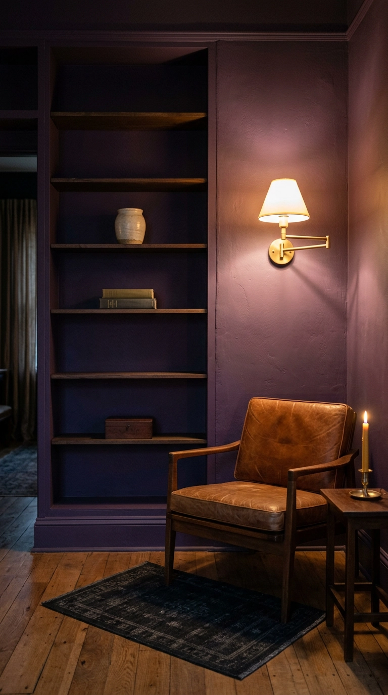
Painting built-ins the same color as the wall behind them makes the whole thing recede and read as one architectural mass instead of a piece of furniture stuck to the wall. In a deep grape purple, it feels like a library in a very good old house.
9. Lavender Linen Curtains Hung High and Wide
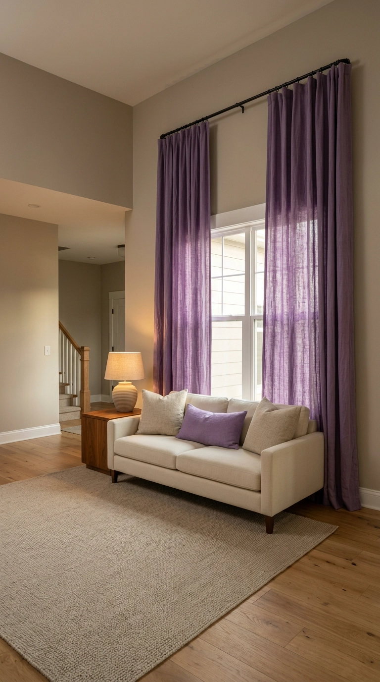
Mount the rod within a few inches of the ceiling and let it extend 8 to 12 inches past the window on each side. Your eye reads the full height of the fabric as the height of the window, so the ceilings feel taller and the window looks twice as wide.
10. A Vintage Persian Rug with Purple Undertones
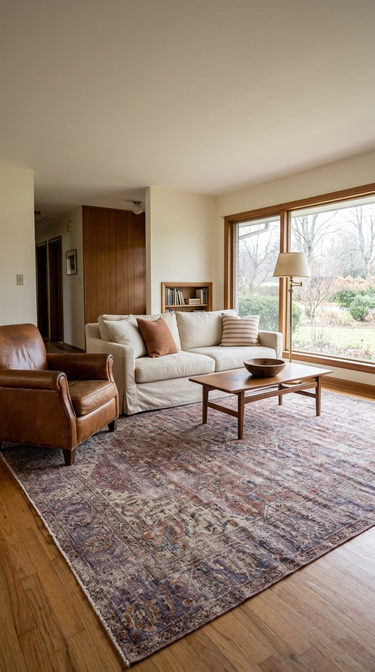
A faded antique Persian is the sneakiest purple in the business. The dyes have softened into muted plum and aubergine, so you get color without a single bold move — and nobody can tell you it clashes, because it’s been working for a hundred years.
11. A Painted Brick Fireplace in Muted Periwinkle
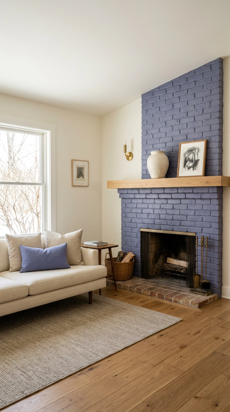
A dated orange-brick fireplace is the best possible canvas for purple, because the brick texture keeps the color from ever looking flat. Periwinkle — that soft blue-leaning purple — is gentler than a plum and plays well with existing wood floors.
12. A Leaning Art Ledge in Plum and Ochre
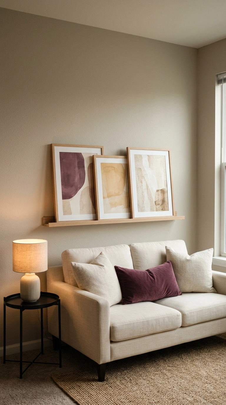
One ledge and two anchors gets you a rotating gallery with no nail holes per frame. Lean the art in overlapping layers instead of hanging it — it reads as intentional and casual at once, and you can swap prints in about four minutes.
13. Mixed Purple Pillows on a Charcoal Sofa
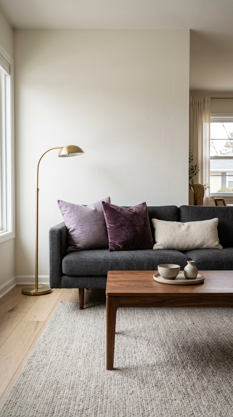
The 20-minute version of this whole article. Three pillows on a charcoal sofa, two of them purple in different shades and different fabrics, and you have a purple living room by dinnertime.
14. Purple Ombre Ceiling in a Small Room
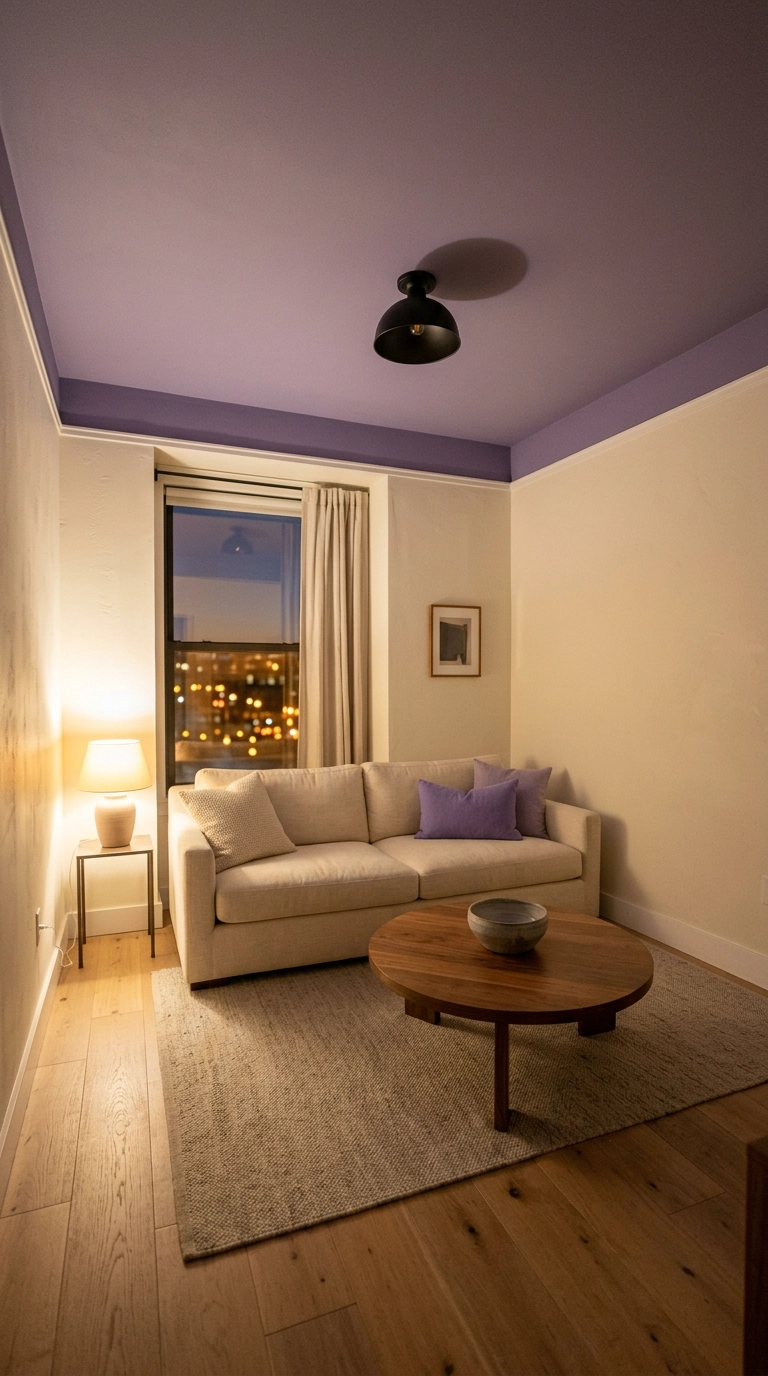
Nobody looks up, which is exactly why a violet ceiling is such a good surprise. It’s also the lowest-risk place to test a purple you’re unsure about, because you see it in your peripheral vision rather than head-on all day.
15. Grandmillennial Wisteria Floral Wallpaper
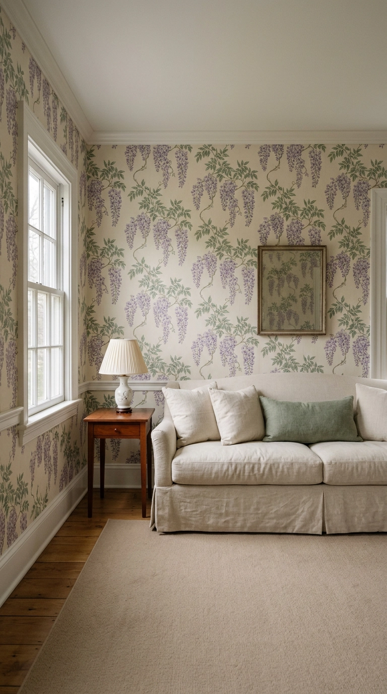
Grandmillennial style took purple florals from your grandmother’s parlor to design magazine covers, and honestly her version was right all along. A wisteria print in soft purple and sage gives you pattern, color, and instant age in a room built in 2004.
16. A 70s Retro Purple Modular Sofa
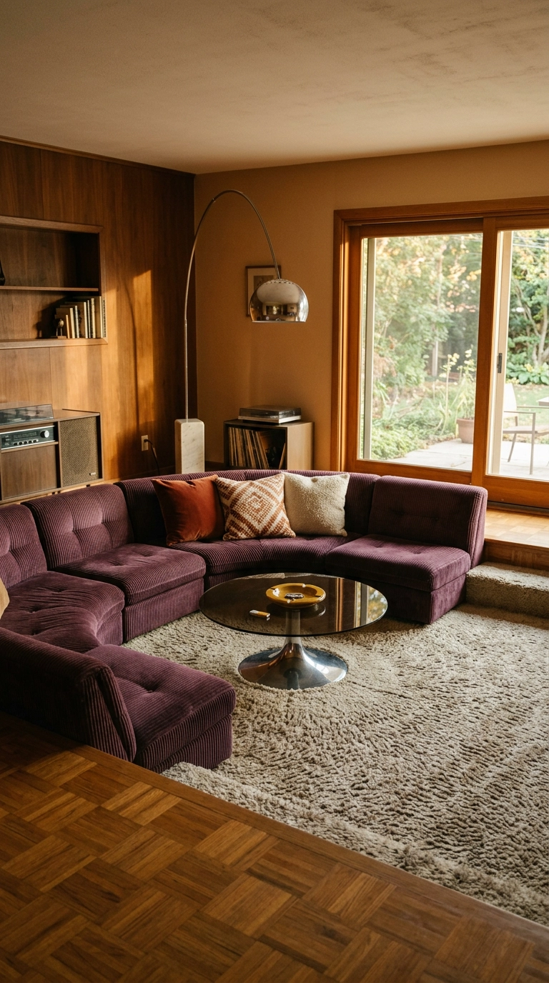
The 70s revival is fully here, and purple corduroy is its natural conclusion. A low curved modular in mulberry does something a straight sofa can’t — it softens the room’s corners and pulls people into conversation.
17. Amethyst Glass and Brass on a Styled Coffee Table
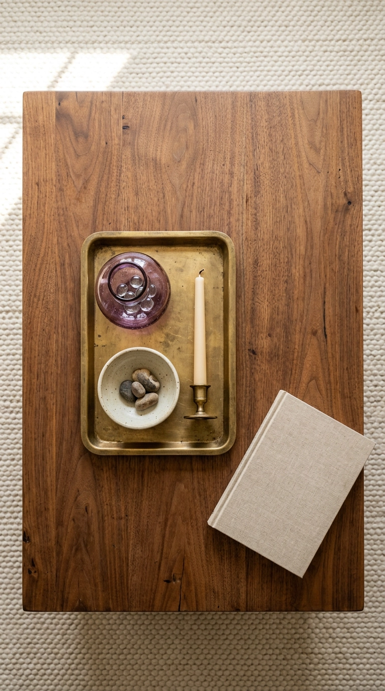
Amethyst glass is purple you can move around. Light passes through it, so a single vessel throws a faint violet shadow across the table on a sunny afternoon — a detail nobody plans for and everybody notices.
18. A Dark Academia Reading Corner in Eggplant
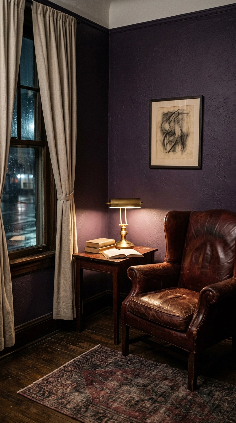
Eggplant walls plus one good lamp turns a dead corner into the best seat in the house. Deep purple absorbs light instead of bouncing it, which is why the pool of lamplight around the chair feels so contained and private.
19. Heather Purple Limewash Plaster Walls
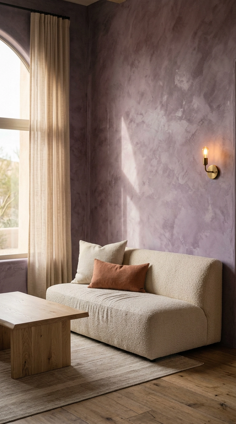
Limewash is a mineral paint that dries unevenly on purpose, so a heather purple wall shifts from grey to violet as the light moves across it during the day. Flat paint can’t do this, and photos never fully capture it.
20. Purple Toile or Ticking Stripe on a Single Accent Chair
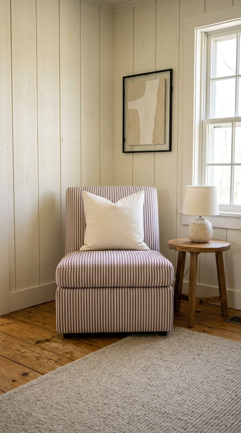
One patterned chair is enough purple for people who don’t want a purple room. A fine ticking stripe reads almost as a solid from across the room and only reveals itself up close, which makes it wear better than a big print.
21. Swap Your Lampshades for Pleated Purple Ones
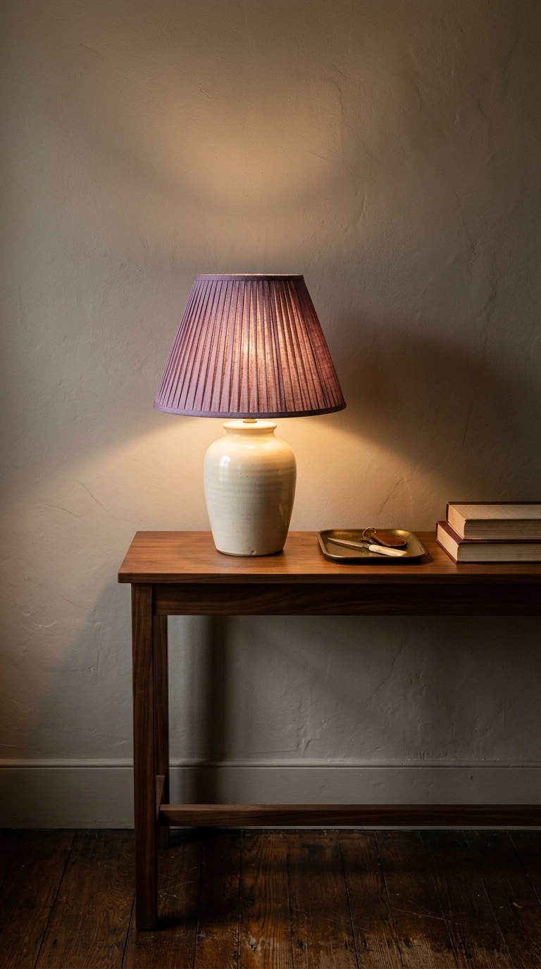
Pleated shades came roaring back and they are the single cheapest way to inject purple. A grape or aubergine shade also casts warm colored light onto the wall behind it at night, which a white shade never does.
22. Two-Tone Walls with a Purple Lower Third
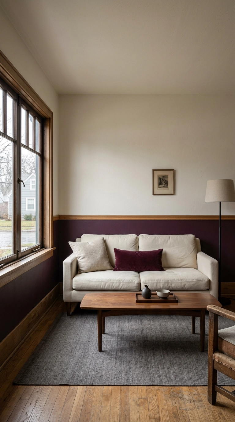
Painting the bottom third of the wall a deep wine purple below a chair rail grounds the room the way a dark rug does, without taking any light from the upper walls. It’s the compromise for anyone who wants deep purple but has one small north-facing window.
23. Orchid Accents in a Bright Coastal Room
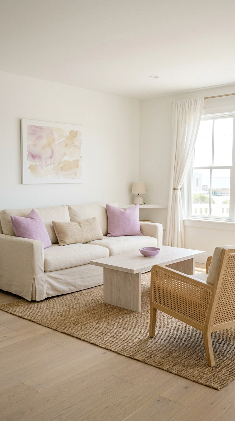
Deep purples die in a bright south-facing room — the light flattens them into grey. Orchid, which is lighter and slightly pink, is the shade that actually holds up in all that sun.
24. A Purple Velvet Ottoman as a Coffee Table Replacement
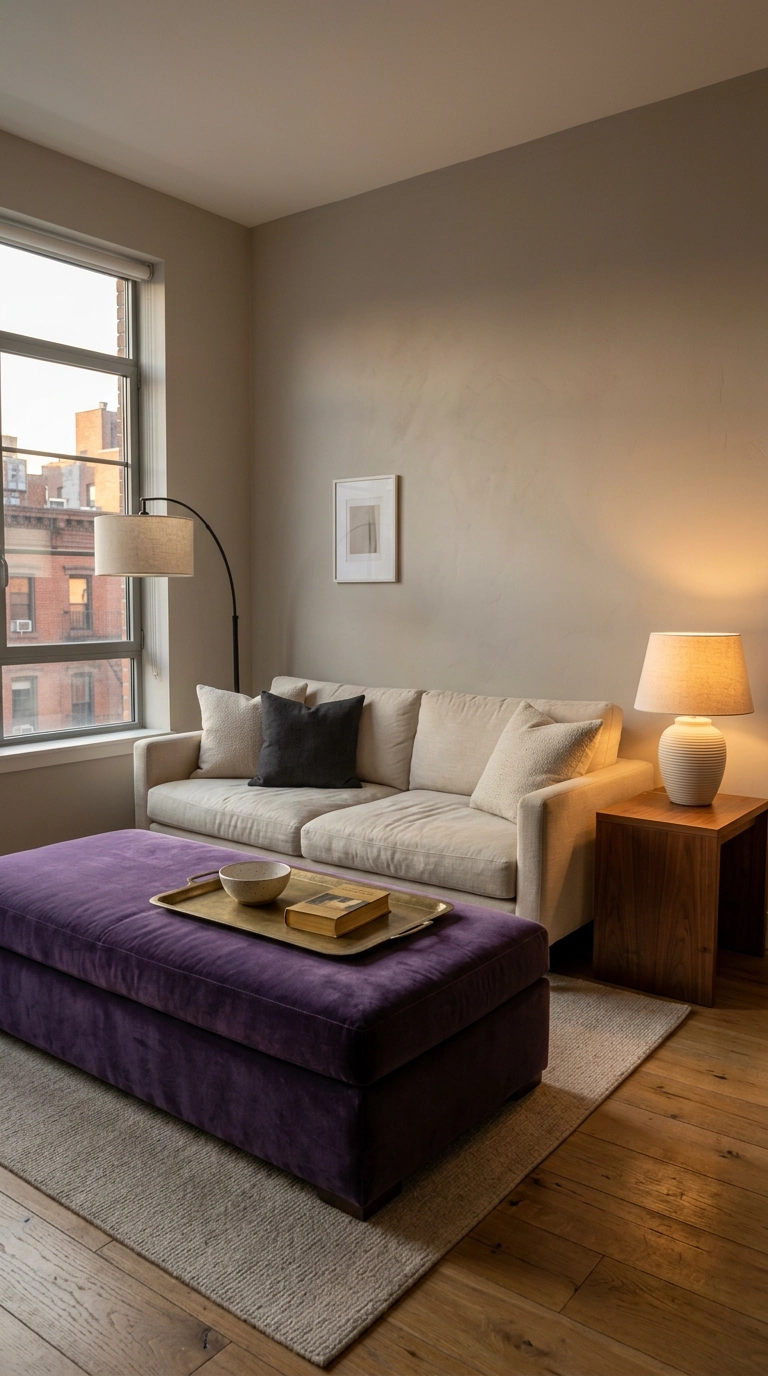
An upholstered ottoman in violet velvet does three jobs — color, coffee table, and extra seating when people show up. In a small apartment that triple duty matters more than a pretty table does.
25. A Full Purple Monochrome Room in Three Tones
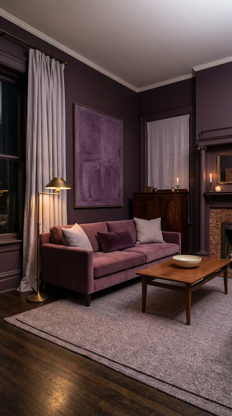
This is the deep end, and it’s the most striking room in this whole list. Pick three tones of one purple — a deep aubergine, a mid mulberry, and a pale heather — and assign them to walls, upholstery, and textiles. Because they share an undertone, the room reads as layered rather than loud.
Why I Keep Coming Back to Purple
Here’s what changed my mind about purple: it’s the only color that can be moody and soft in the same breath. A room drenched in aubergine feels like a study in a very old house, and the exact same hue thinned into heather limewash feels like a Sunday morning. I’ve never gotten that range out of a green or a blue, and after that grape-syrup lilac disaster in 2012, I did not expect to be the one saying it.
If you want the most reliable wins from this list, they’re the plum velvet sofa against greige walls, the color-drenched aubergine room, and the vintage Persian with faded purple in the pile. Deep saturated plums are having a real moment right now — Farrow & Ball’s Brinjal and Pelt keep showing up in the maximalist English interiors flooding my feed, and the 70s revival has designers like Kelly Wearstler pushing mulberry and violet velvet in ways that would have looked unthinkable a decade ago. On the softer end, grandmillennial wisteria florals and pleated grape lampshades are quietly everywhere.
Start smaller than you think. Buy two purple pillows or swap a lampshade, live with it for a week, and see whether you’re reaching for a deeper plum or a paler heather. That’s how I figure out every color decision I make, and it costs almost nothing to be wrong. If you want more of this in your inbox, sign up for my weekly newsletter — I send one room breakdown and a few honest shopping finds every Friday, no fluff.


