
23+ Dreamy Pastel Bedroom Decor Ideas that Look Grown-Up and Gorgeous in 2026

Let me clear something up right away – pastels do not have to look like a nursery. The trick I’ve relied on for years is going muted and dusty instead of candy-sweet, then grounding everything with warm wood, oatmeal linen, brass, and just a whisper of black so the softness has something to push against. Get that balance right and a pastel bedroom reads calm and expensive, not cutesy.
Pastel Bedroom Decor Ideas
1. Color-Drench the Whole Room in Dusty Sage
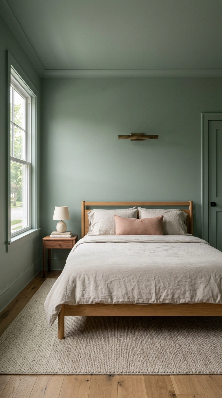
Color drenching just means painting walls, trim, and ceiling the same shade so your eye never hits a hard break. In a pastel that’s the whole game, because a soft green stops looking like a nursery the second it wraps the room instead of sitting in one flat rectangle. Benjamin Moore Saybrook Sage is my go-to here, and I’d spec it in matte on walls, eggshell on trim.
2. Layer Three Weights of Dusty Rose Bedding
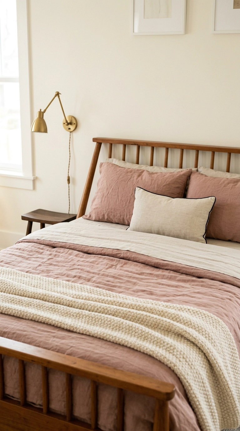
Flat pastel bedding is where the nursery feeling creeps in, and the fix is texture, not more color. I layer three weights on every bed I style – washed linen for the duvet, smooth cotton for the sheet you fold back, and a chunky knit throw across the bottom third. Same soft rose family, three different surfaces, and suddenly it looks styled rather than matched.
3. Upholster a Tall Powder Blue Headboard
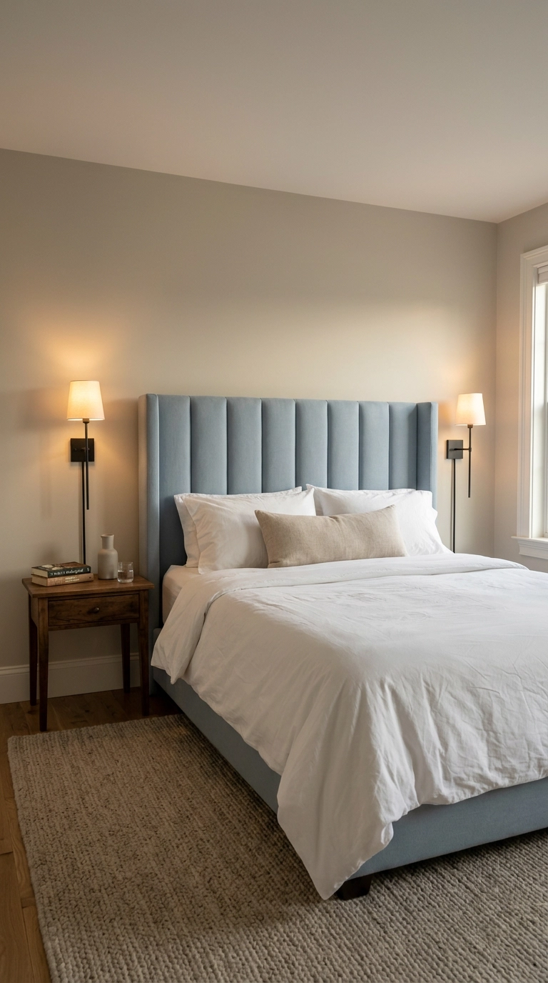
A pastel reads far more sophisticated in upholstery than in paint, because the fabric’s nap absorbs light and mutes the sweetness. Go tall – I aim for 50 to 56 inches from the floor on a queen, which fills the wall properly and makes the ceiling feel higher. Powder blue in a brushed cotton or washed velvet is the shade I reach for most.
4. Paint the Ceiling Butter Yellow and Leave the Walls Alone
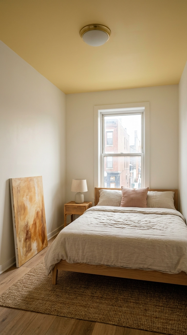
The ceiling is the most underused surface in any bedroom, and butter yellow up there does something lovely – it bounces warm light down onto everything, so the whole room feels sunlit even on a grey day. Farrow & Ball Dayroom Yellow is soft enough not to shout. Keep the walls a warm off-white so the yellow stays the only move.
5. Hang Lilac Linen Curtains High and Wide
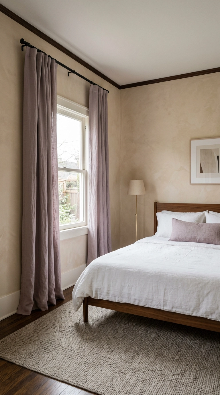
Mount the rod two to four inches below the ceiling and let it extend eight to twelve inches past the window on each side. That one placement rule tricks the eye into reading the whole wall as window, and it makes an 8-foot ceiling feel closer to nine.
6. Build a Clay-Pink Plaster Accent Wall Behind the Bed
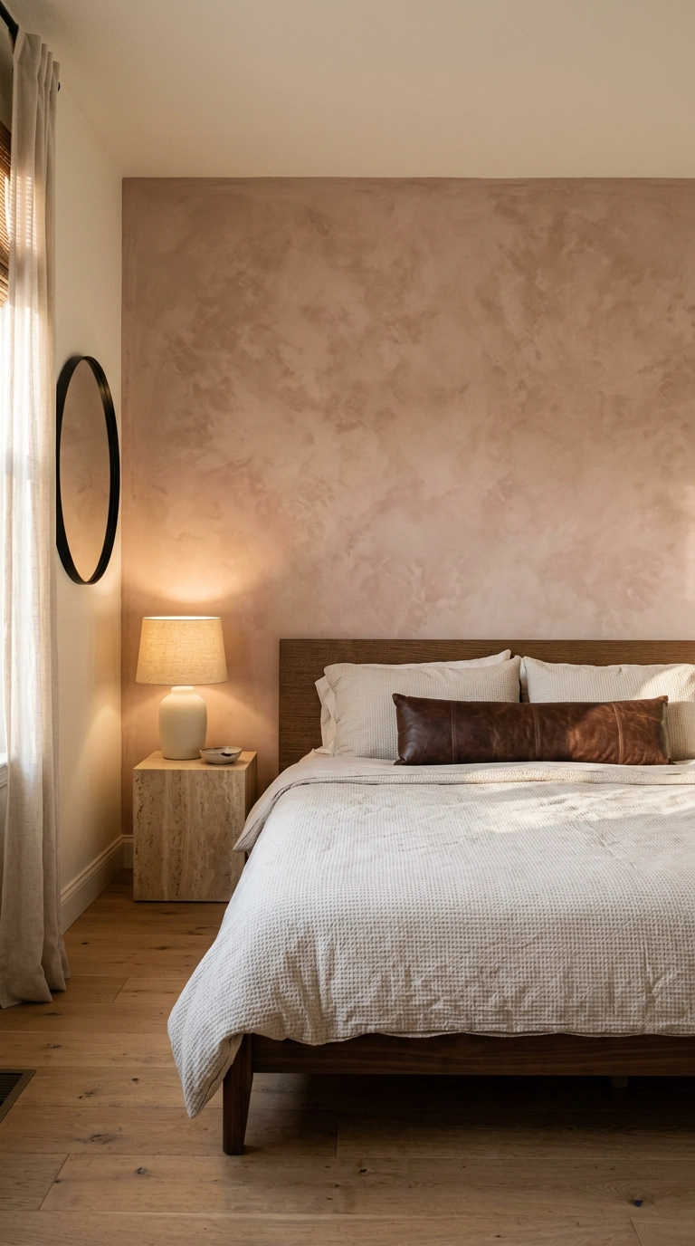
Flat pastel paint is where things go chalky. Limewash solves it because the finish is cloudy and uneven, so the color shifts as the light moves across it instead of sitting there like a swatch. Clay pink is my favorite pastel to plaster – it has enough brown in it to feel earthy rather than sweet.
7. Trade Every Chrome Finish for Unlacquered Brass
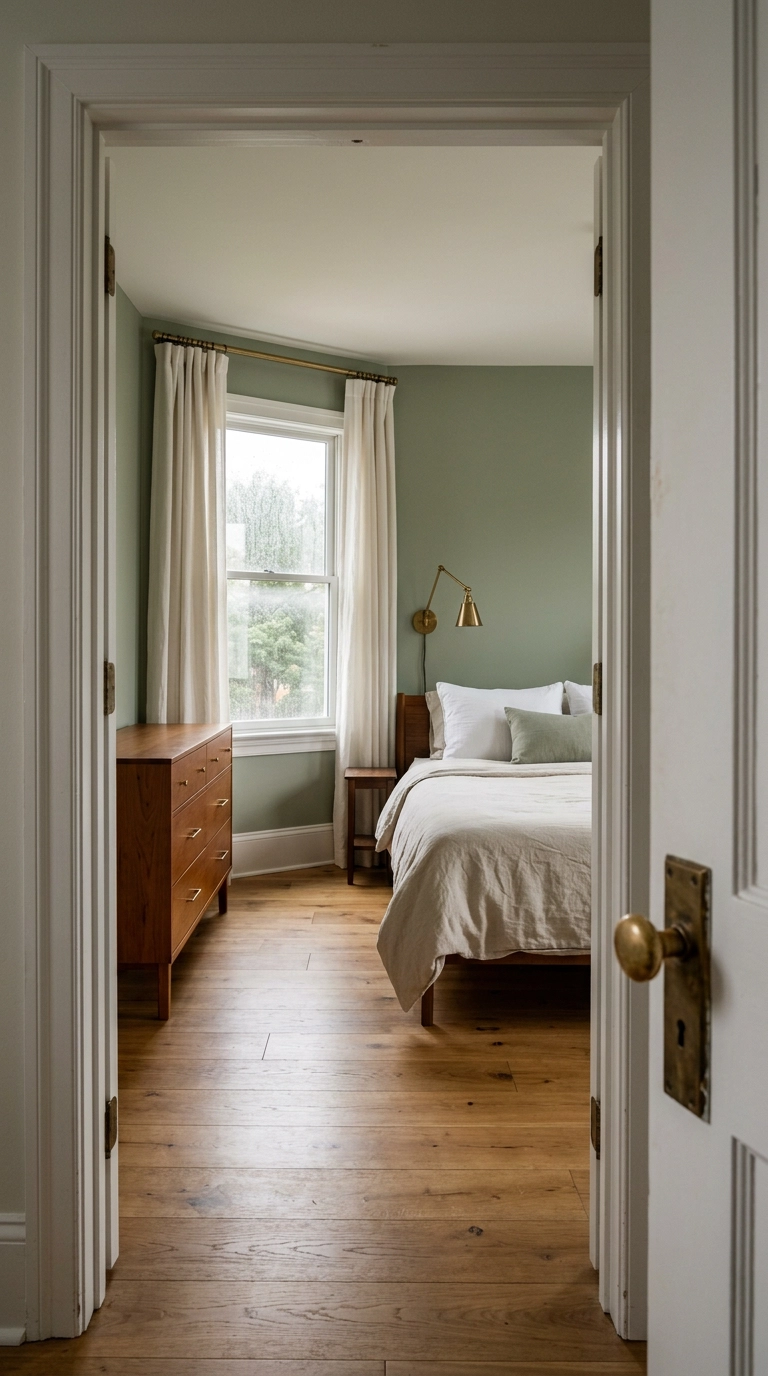
Pastels sit right next to grey on the color wheel, and cool chrome hardware pushes them the rest of the way there. Swapping in unlacquered brass — curtain rod, sconce, door lever, dresser pulls — puts warmth back and stops sage or powder blue from reading dingy.
8. Ground the Softness with a Faded Vintage Rug
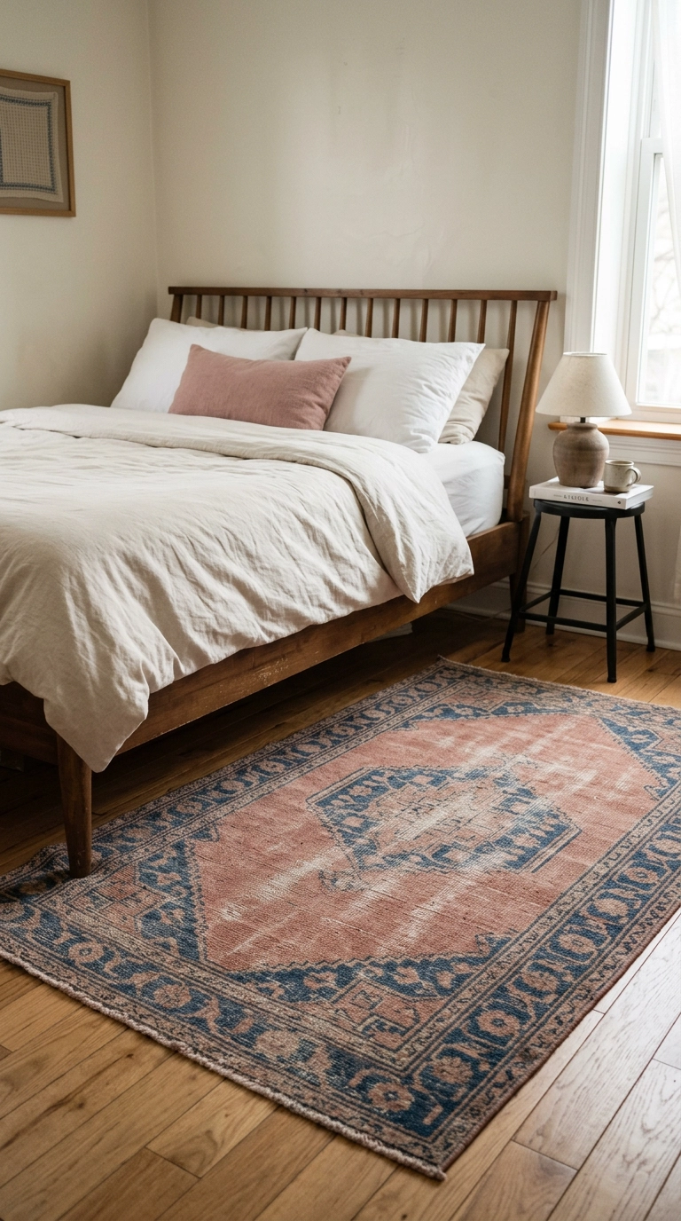
A brand-new pastel rug is the fastest way to make a bedroom look like a gift shop. An old one that’s been walked on for fifty years has the color half sun-bleached out of it, and that softened, slightly muddy palette is what makes pastels look collected instead of bought.
9. Paint Picture-Frame Molding in Powder Blue Below a Chair Rail
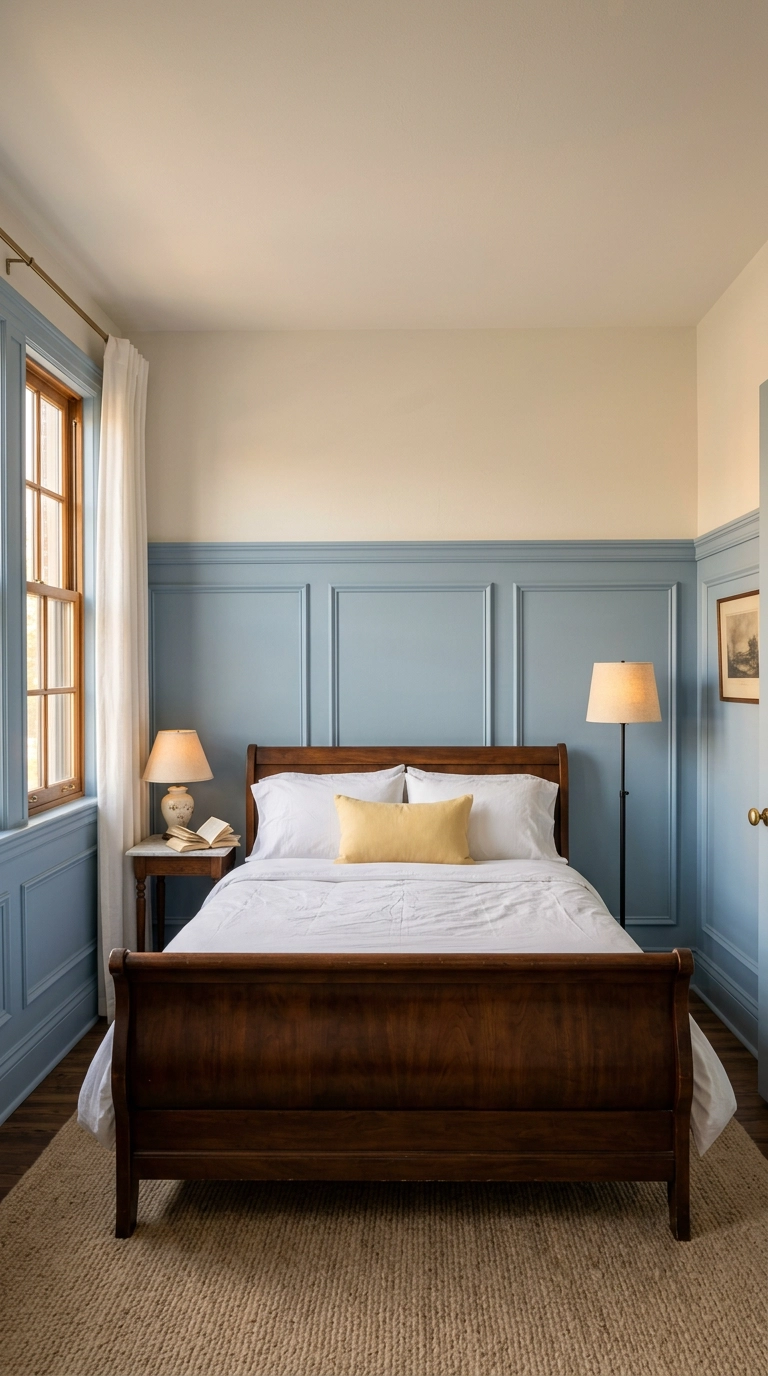
Splitting the wall horizontally gives a pastel somewhere to stop, which is why this reads as architecture rather than a color choice. Run the chair rail at about 32 to 36 inches off the floor, roughly a third of the wall height, and keep the molding rectangles evenly spaced with a consistent gap.
10. Style the Nightstand with a Tonal Trio
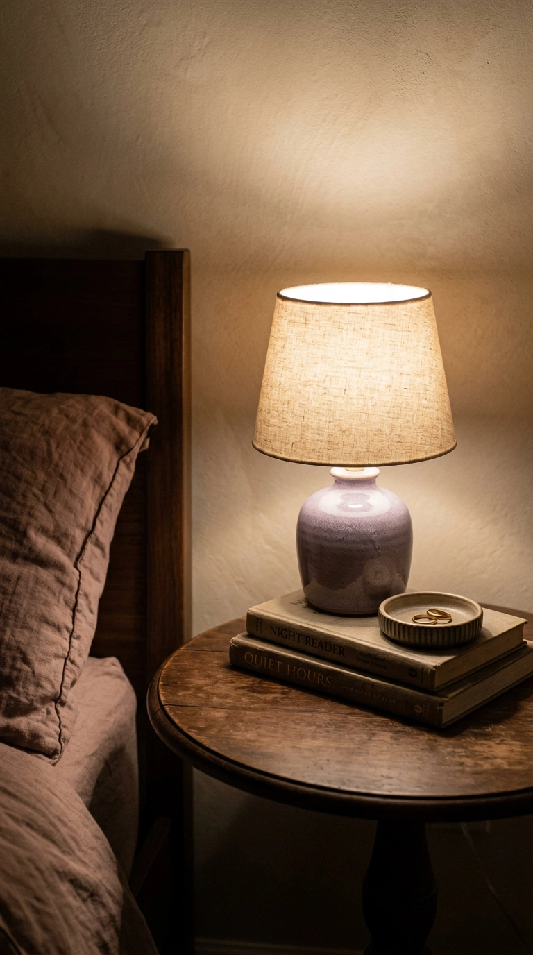
Three objects, three heights, and nothing else. A lamp for height, a low stack of two books for the horizontal, and one small dish for the odd note — odd numbers read better because the eye can’t pair them up and settle, so it keeps moving across the surface.
11. Use Peel-and-Stick Butter Stripes on the Bed Wall
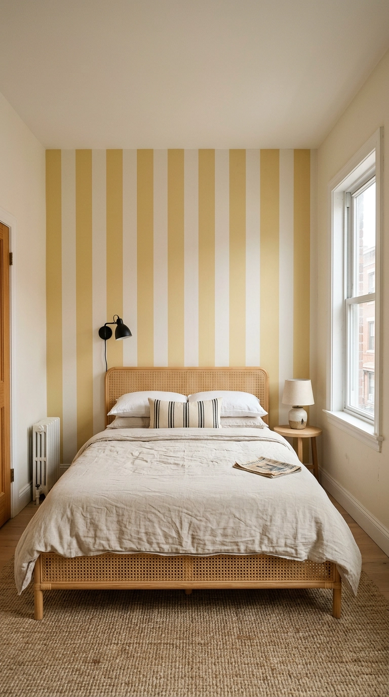
A wide vertical stripe is the one pattern I trust with pastels, because the repeat is simple enough that the color stays quiet. Go broad — eight to twelve inch stripes, not pinstripes — since narrow lines start to vibrate and read juvenile. Butter against a warm bone-white is my favorite pairing for a room with poor natural light.
12. Hang Three Abstract Pastel Washes in Thin Black Frames
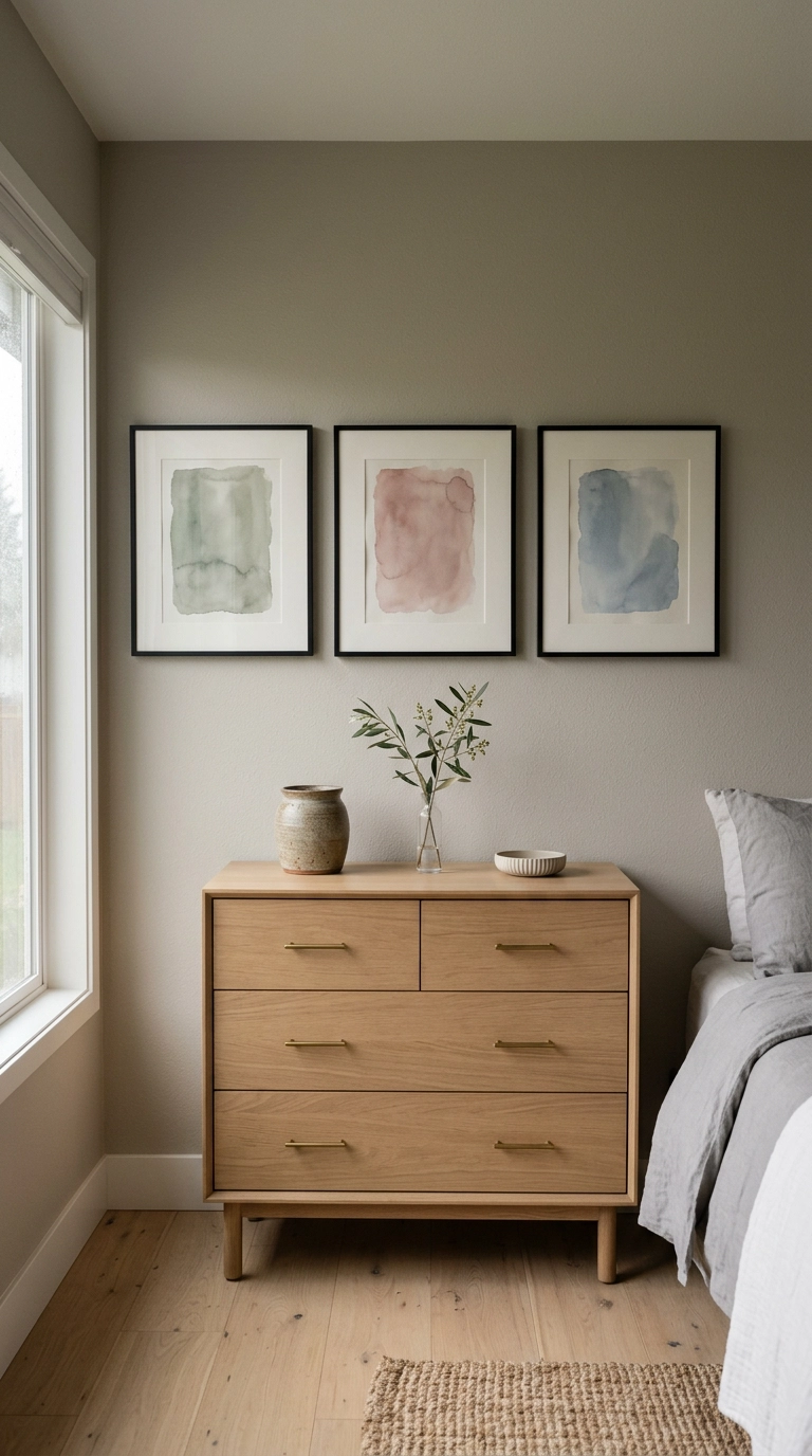
If you don’t want pastel on your walls, put it in the art instead. Three abstract washes in one row give you every shade you’re after — sage, dusty rose, powder blue — at about two percent of the room’s surface area, which is why it never tips sweet. Thin black frames and wide white mats do the grown-up part.
13. Layer a Sage Roman Shade Under Woven Wood Blinds
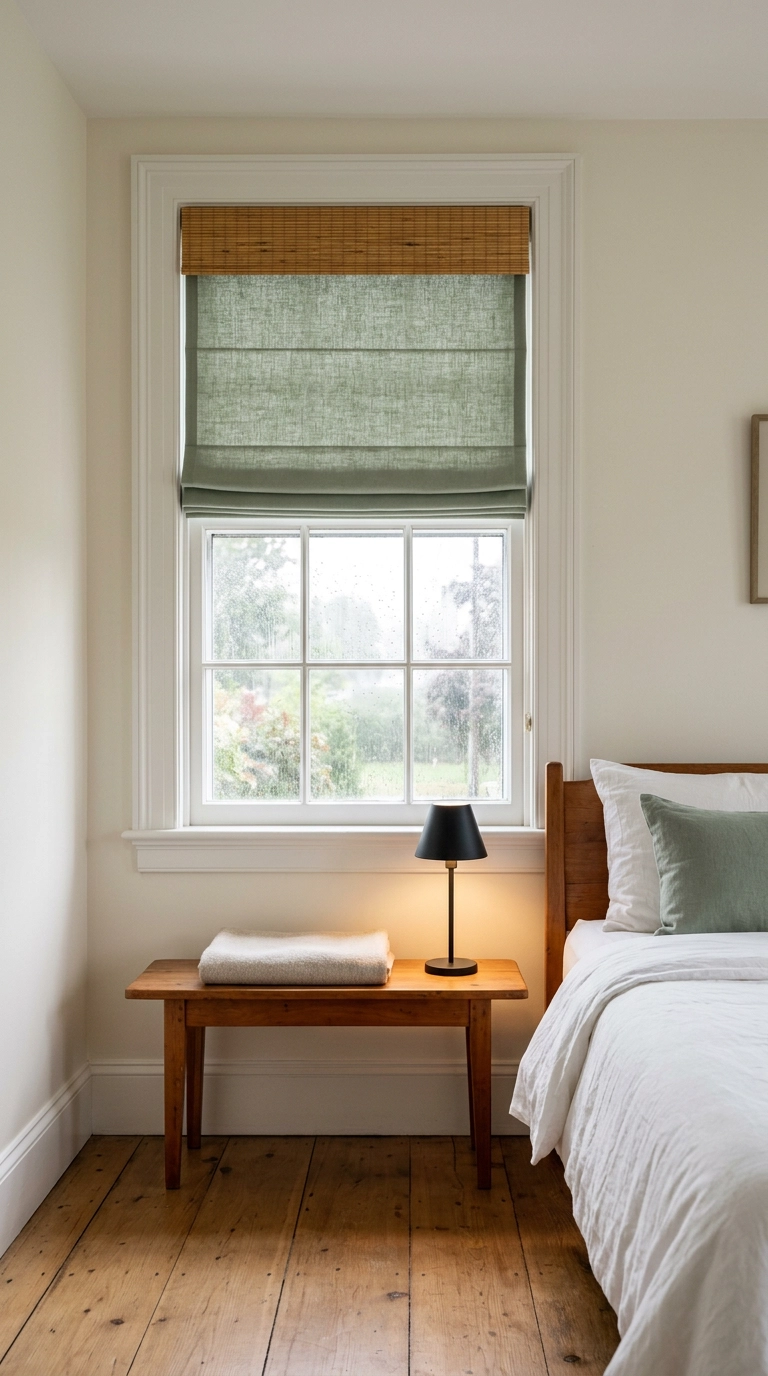
Curtains get all the attention, but a bedroom lives or dies by what happens at 6 a.m. Layering gives you two settings: drop the woven wood blind for filtered light, drop the sage roman shade behind it for real darkness. Ask for a blackout liner when you order the shade, not a light-filtering one.
14. Change the Lampshade Before You Change the Lamp
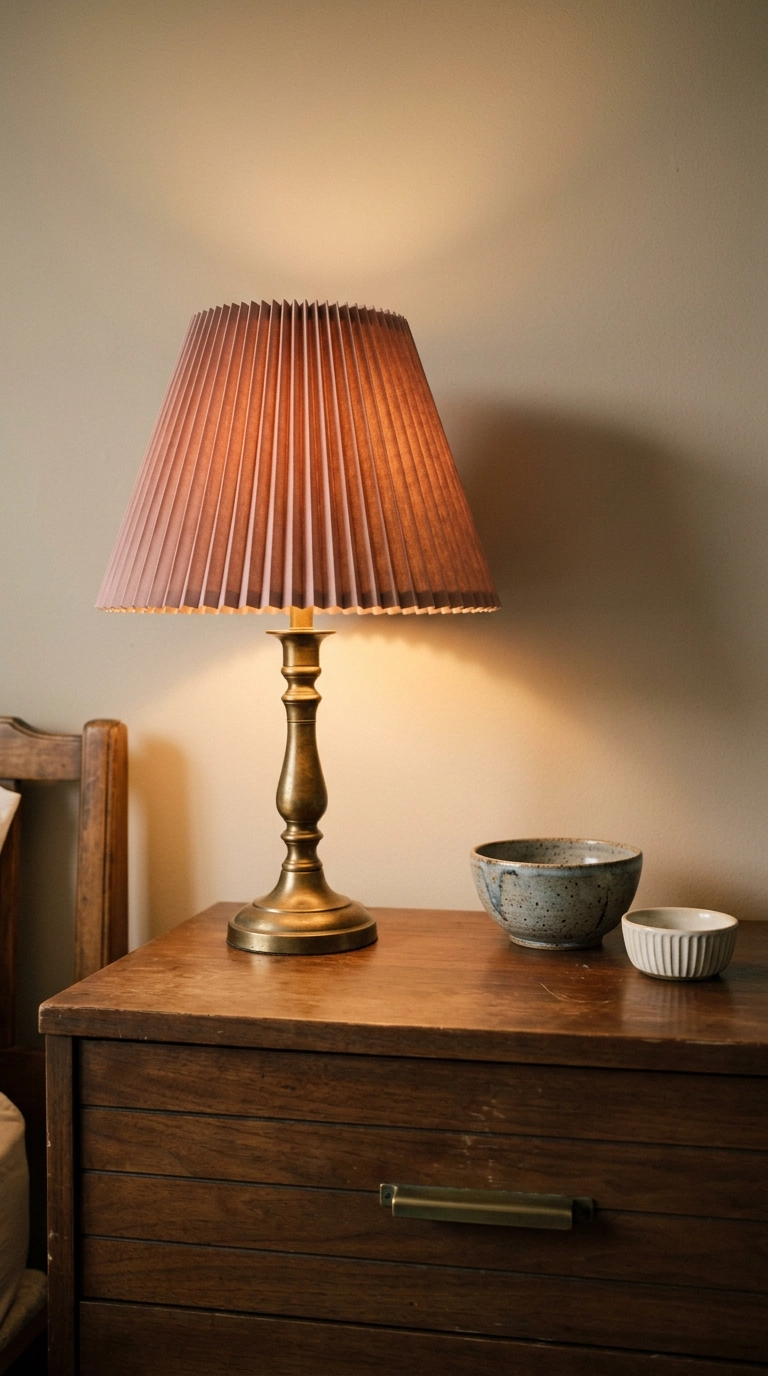
Here’s the cheapest pastel move in this whole article: keep your lamp base and buy a new shade. A pleated shade in dusty rose or butter throws colored light onto the ceiling and walls all evening, which tints the whole room without a drop of paint. Ten minutes, usually under forty dollars.
15. Lean One Oversized Canvas Instead of Hanging Five
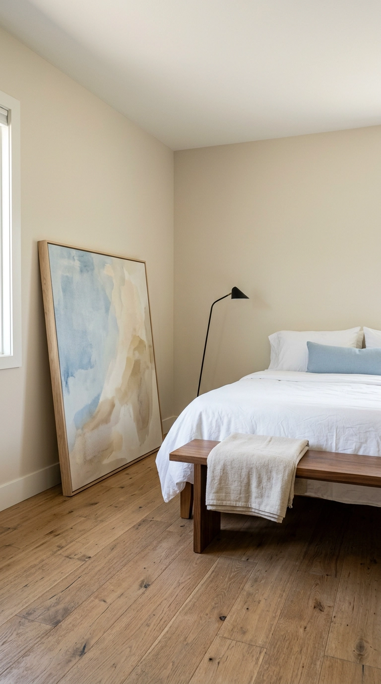
Pastel art has a scale problem. Small soft pieces look like greeting cards, but blow the same colors up to four feet and the wash reads as atmosphere instead of decoration. One big canvas also buys you visual weight, meaning something with enough presence to balance a bed across the room.
16. Paint the Floorboards a Chalky Putty
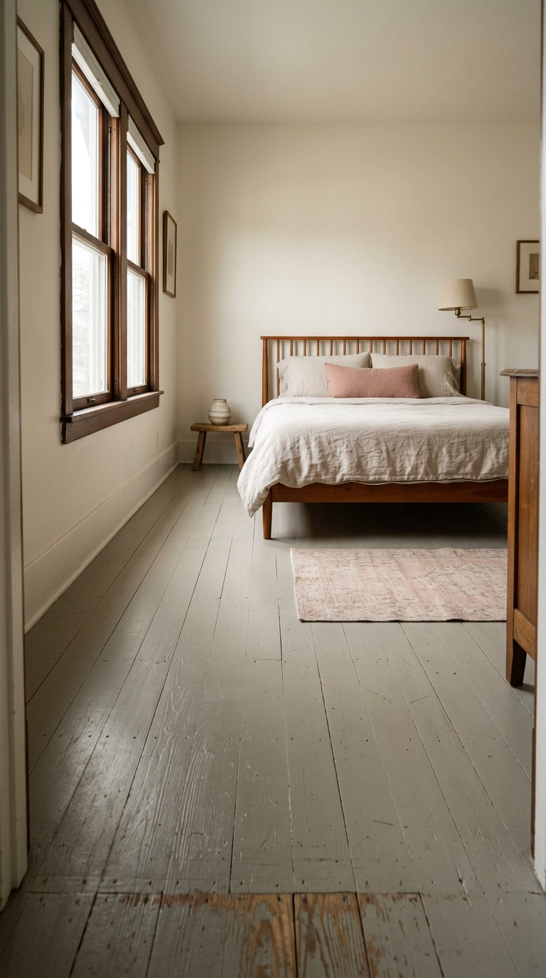
Nobody thinks of the floor as a pastel surface, which is exactly why it works. A chalky putty like Farrow & Ball Shaded White underfoot makes every soft color above it look intentional, and it rescues tired pine you’d otherwise pay thousands to refinish. Use porch and floor enamel, two thin coats, and give it a full week to cure before you drag the bed back.
17. Repaint a Thrifted Dresser in Muted Lilac with Black Hardware
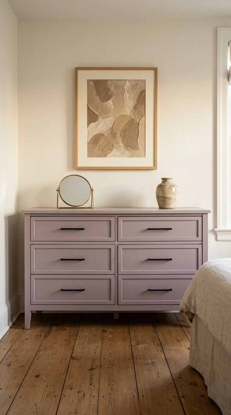
Furniture is where I’d put lilac if you’re nervous about it on walls. A solid-wood thrifted dresser with flat panel drawers takes paint beautifully, and the shade sits at furniture scale — big enough to matter, small enough to redo in a weekend if you hate it. Satin finish, not gloss, since sheen is what makes lilac go plastic.
18. Skirt an Open Closet with Butter Linen on a Tension Rod
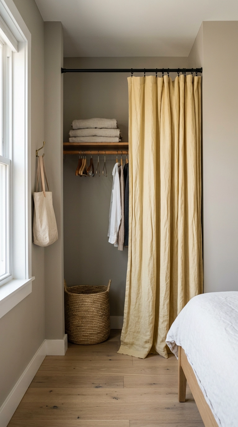
Bifold closet doors are the ugliest thing in most American bedrooms, and a linen panel on a tension rod fixes it for the cost of one curtain. Butter is the shade I pick because it reads as warm light rather than color, so it doesn’t compete with whatever’s already on the walls. No drilling, no landlord conversation, twenty minutes.
19. Free the Nightstands with Brass Swing-Arm Sconces
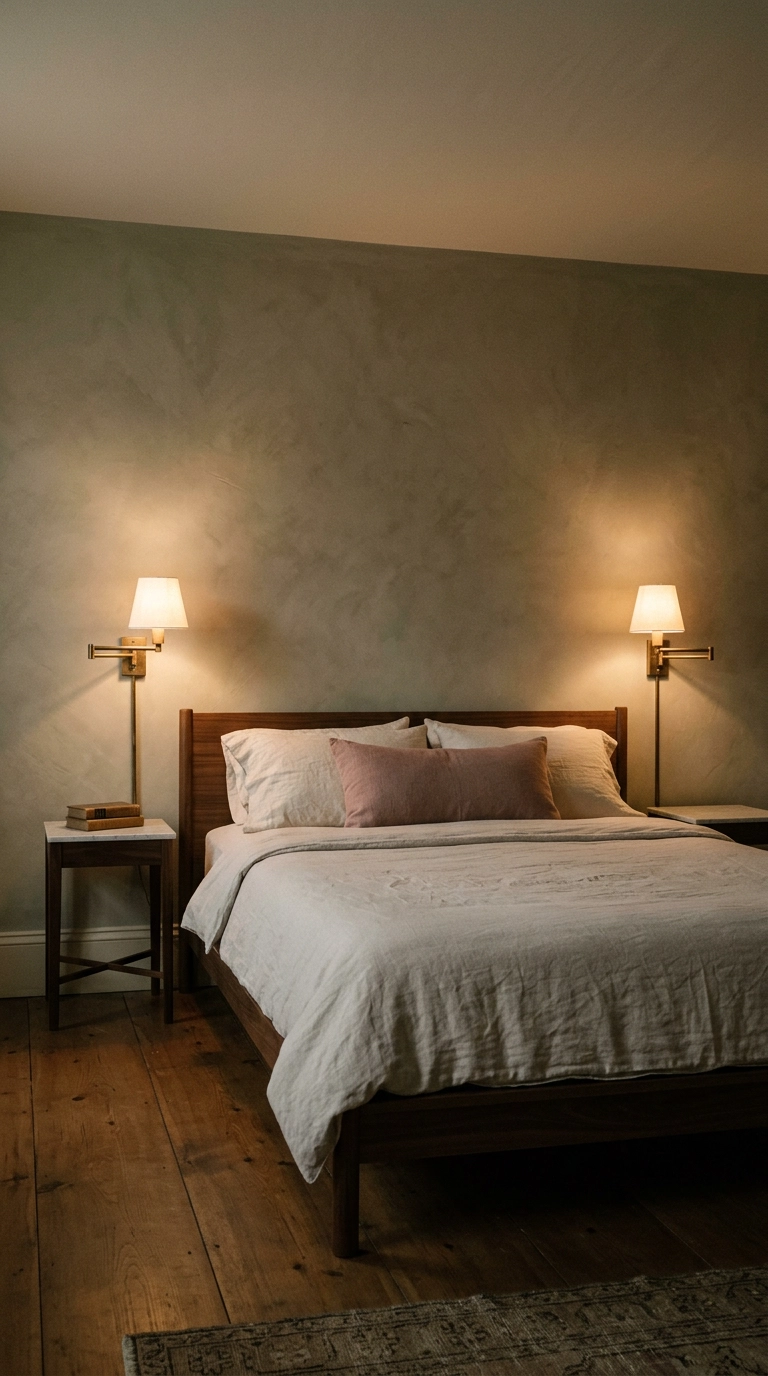
Pastel rooms fall apart when every surface is soft, and metal at eye level is the fix. Two brass swing-arms flanking the bed give you a hard, warm line against all that chalky color, and they clear the nightstand of a lamp so a book and a glass of water actually fit.
20. Anchor the Foot of the Bed with a Dusty Blue Velvet Bench
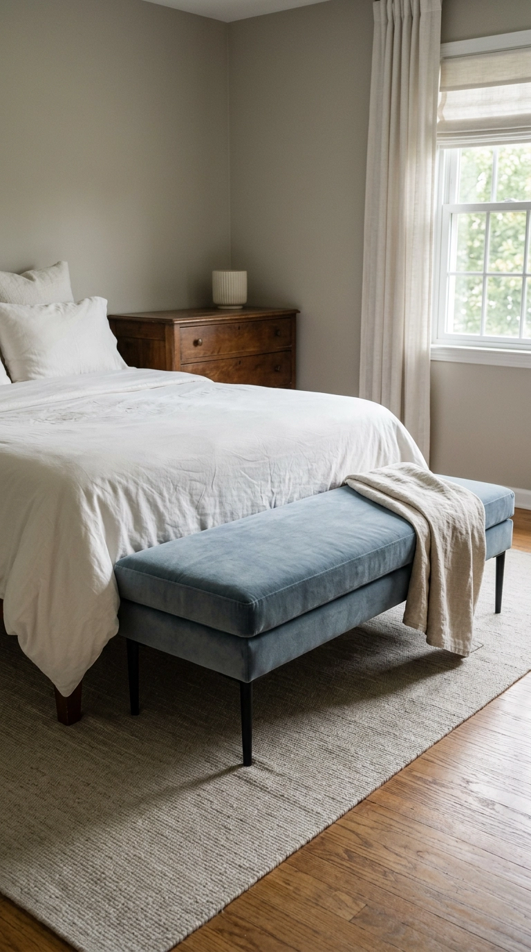
A bed floating in the middle of a room has no bottom edge, and the eye reads that as unfinished. A bench closes the composition, and velvet is the one place I’ll spend real money on pastel because the nap holds two tones — it looks blue-grey in daylight and almost slate at night.
21. Paper the Inside of the Closet in a Small Pastel Print
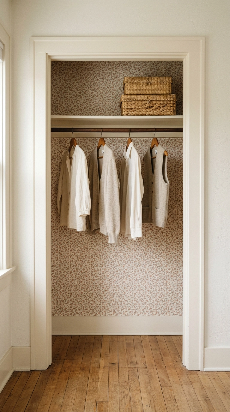
This is my favorite low-stakes place to be brave. Pattern inside a closet gets seen a dozen times a day and never has to hold up a whole room, so you can pick the sweet little print you’d never commit to on four walls. Peel-and-stick, one roll, an hour of work.
22. Finish with a Single Black Object in Every Sightline
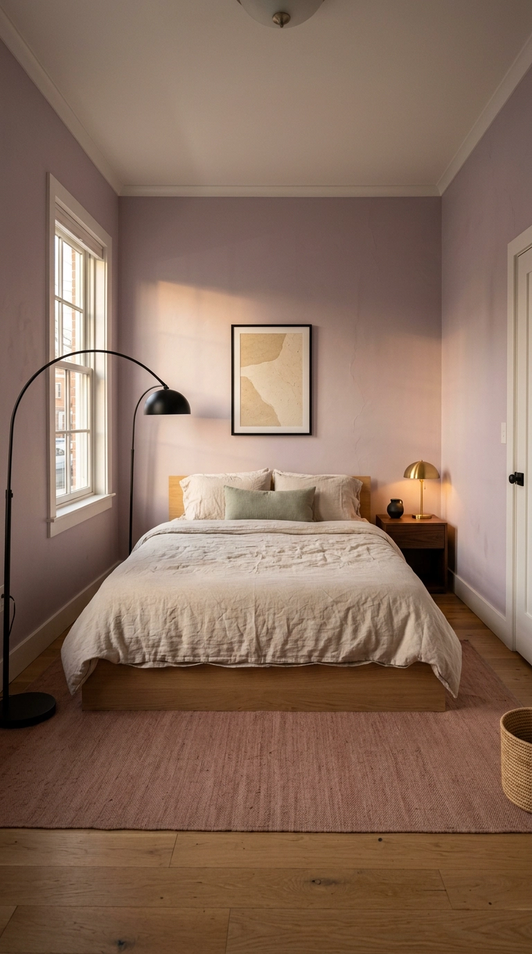
If you take one thing from this list, take this. Pastel rooms read as sweet and unfinished until you add something genuinely dark, and the trick is to keep it small and repeat it — a black frame, a black lamp, a black ceramic on the nightstand. Stand in the doorway, and wherever your eye lands, there should be one dark note within reach.
Before You Pick Up a Paintbrush
If there’s a thread running through all twenty-two of these, it’s restraint. The dusty sage color-drench, the clay-pink plaster wall, the putty floorboards — none of them work because the color is pretty. They work because there’s warm walnut, oatmeal linen, unlacquered brass and a little matte black holding the line so the softness has somewhere to land.
What I’m seeing everywhere in 2026 is this exact shift: pastels moving out of the nursery and into grown-up primary bedrooms, borrowed straight from the muted, chalky end of the Farrow & Ball fan deck rather than the bright end. Designers like Beata Heuman have been proving for years that a soft pink or a powder blue can look witty and expensive instead of sugary, and the pleated dusty rose lampshade — genuinely one of my favorite forty-dollar tricks in this article — is that whole idea in miniature. Start with the cheap swaps. A new lampshade, a butter linen closet curtain, three abstract washes in thin black frames. Then decide whether you want to commit to the ceiling.
And please don’t try to do all twenty-two. Pick three that suit your room’s light and your actual budget, live with them for a month, and see what the room asks for next. If you’d like more ideas like these landing in your inbox — plus the paint shades and product finds I don’t post anywhere else — sign up for my weekly newsletter and I’ll see you there on Sunday morning.


