
23+ Dreamy Bedroom Decor Ideas that are Soft, Easy, and Gorgeous in 2026

Let me start with an unpopular opinion: “dreamy” is not a feeling you decorate your way into, it is a set of very specific physical choices. Every bedroom I have ever styled that people call dreamy is doing the same four things underneath the pretty pictures — diffused low light around 2700K, fabric layered at more than one depth, a color story that stays soft-focus instead of high-contrast, and a room that actually goes dark when you want to sleep. I have chased that combination for clients in everything from a 10×11 Chicago walk-up to a sprawling Texas primary suite, so here are the 23 moves that reliably get you there, with real materials, real measurements, and honest notes on what each one costs you in money and weekends.
Dreamy Bedroom Decor Ideas
1. Layer a Sheer Linen Panel Behind a Blackout Drape on a Double Rod
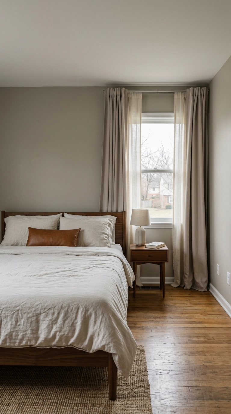
This is the highest-impact thing on the whole list, and it is the reason good hotel rooms feel the way they do. The sheer inner panel turns hard daylight into a soft wash all afternoon, and the outer blackout layer gives you a genuinely dark room at 6 a.m. in June.
2. Mount the Rod 4 to 6 Inches Below the Ceiling and 8 to 10 Inches Past the Frame
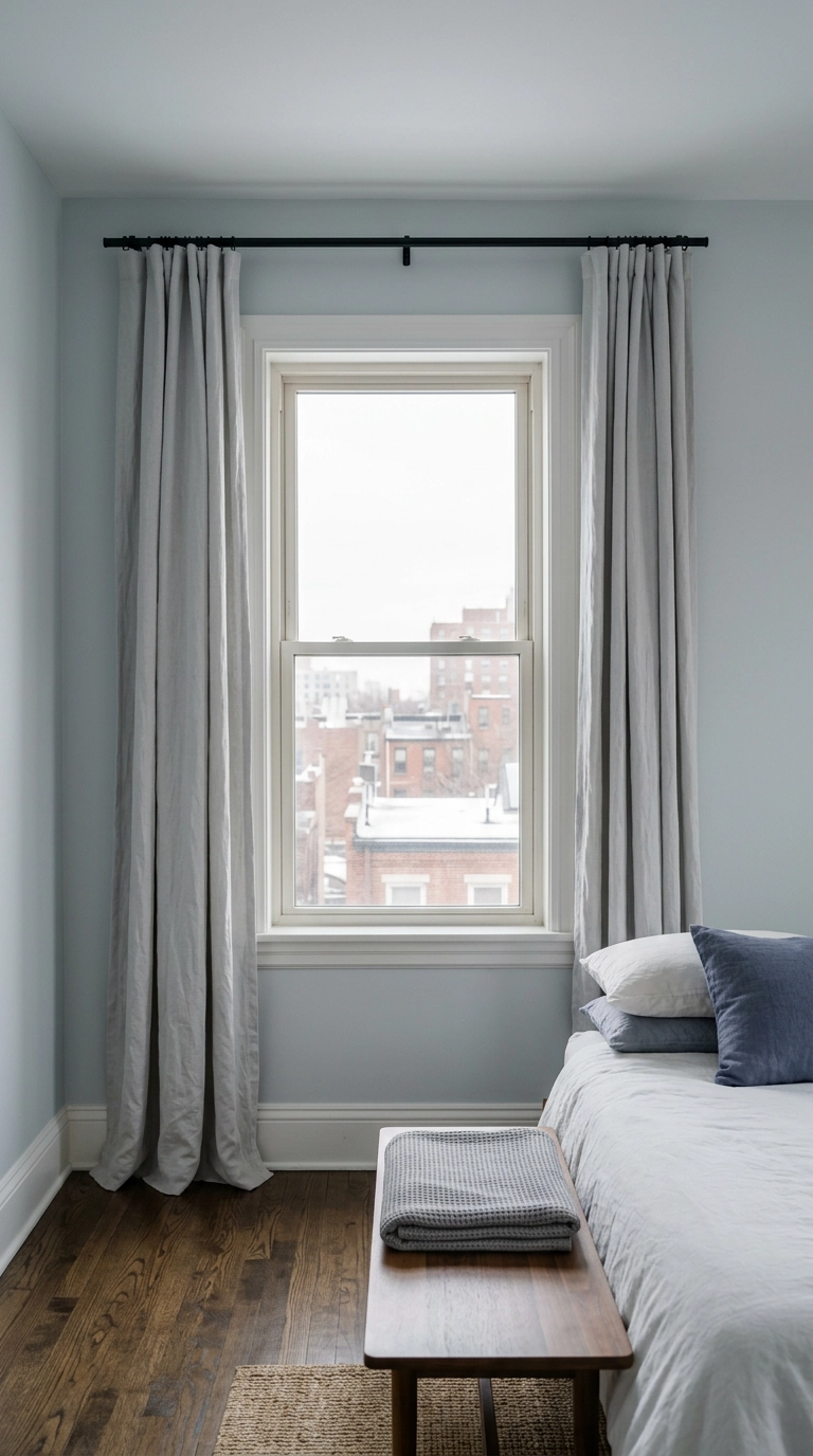
Hanging the rod near the ceiling instead of just above the window makes the wall read as one tall unbroken line, so the ceiling feels several inches higher than it measures. Extending it 8 to 10 inches past each side means the open panels stack on wall, not glass, so you keep all your daylight.
3. Put Every Bulb at 2700K and Get the Overhead on a Dimmer
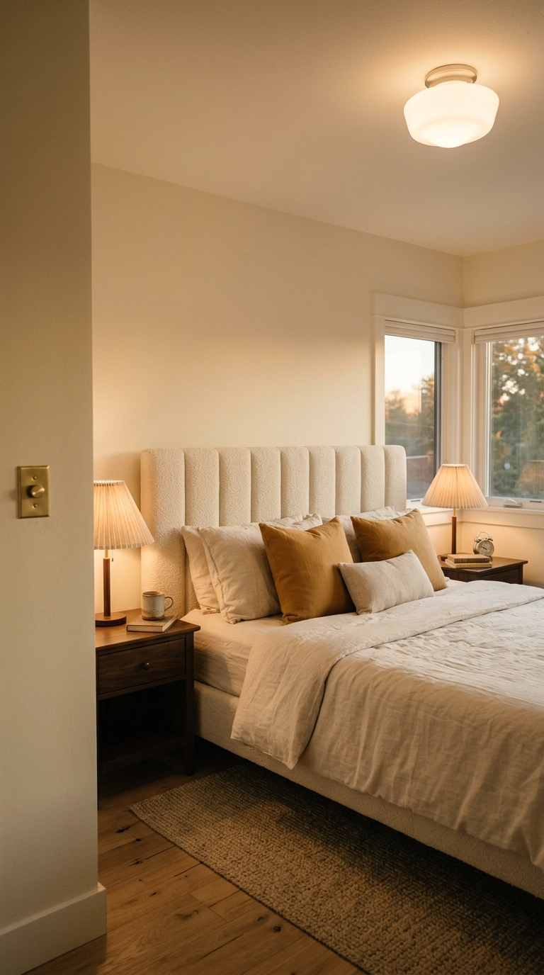
Color temperature is doing more work here than any pillow you will ever buy. Anything at 3000K and above reads as office lighting and kills the effect instantly, so check the box and buy 2700K for the whole room, closet included.
4. Light the Room at Three Heights Instead of One
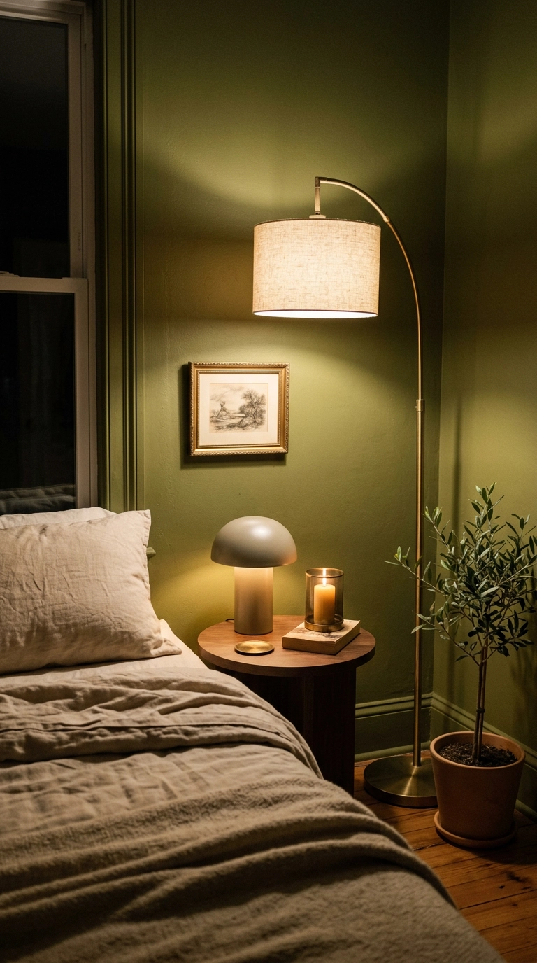
One ceiling light flattens a room. Three sources at roughly ankle, elbow, and eye height give you overlapping pools that the eye reads as depth, and depth is the actual mechanism behind that soft layered look.
5. Switch to a Washed Linen Duvet in Oatmeal and Stop Ironing Forever
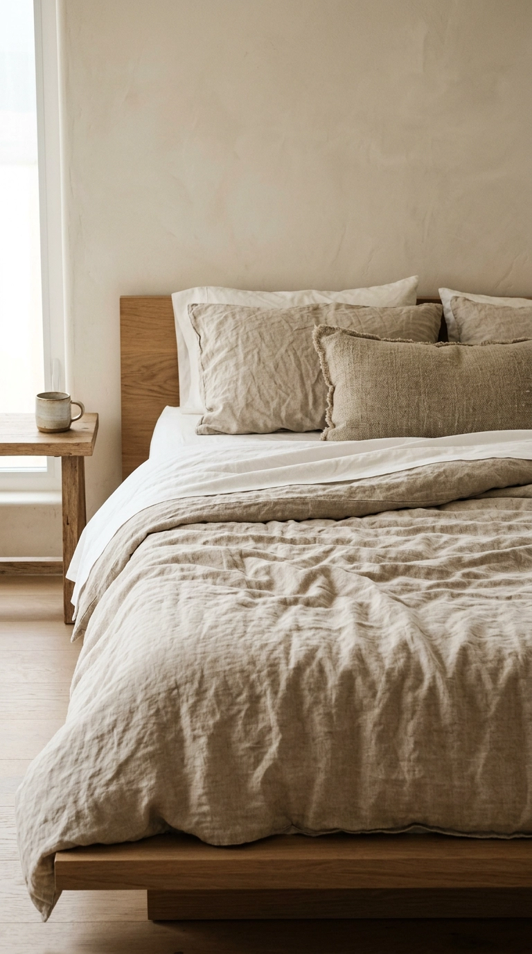
Washed European flax linen photographs soft because it genuinely is soft — it falls in rounded folds instead of the flat planes cotton makes. Oatmeal and flax read warmer than white and hide real life better, which matters if you have kids or a coffee-in-bed habit.
6. Choose Between Percale and Sateen on Purpose, Not by Accident
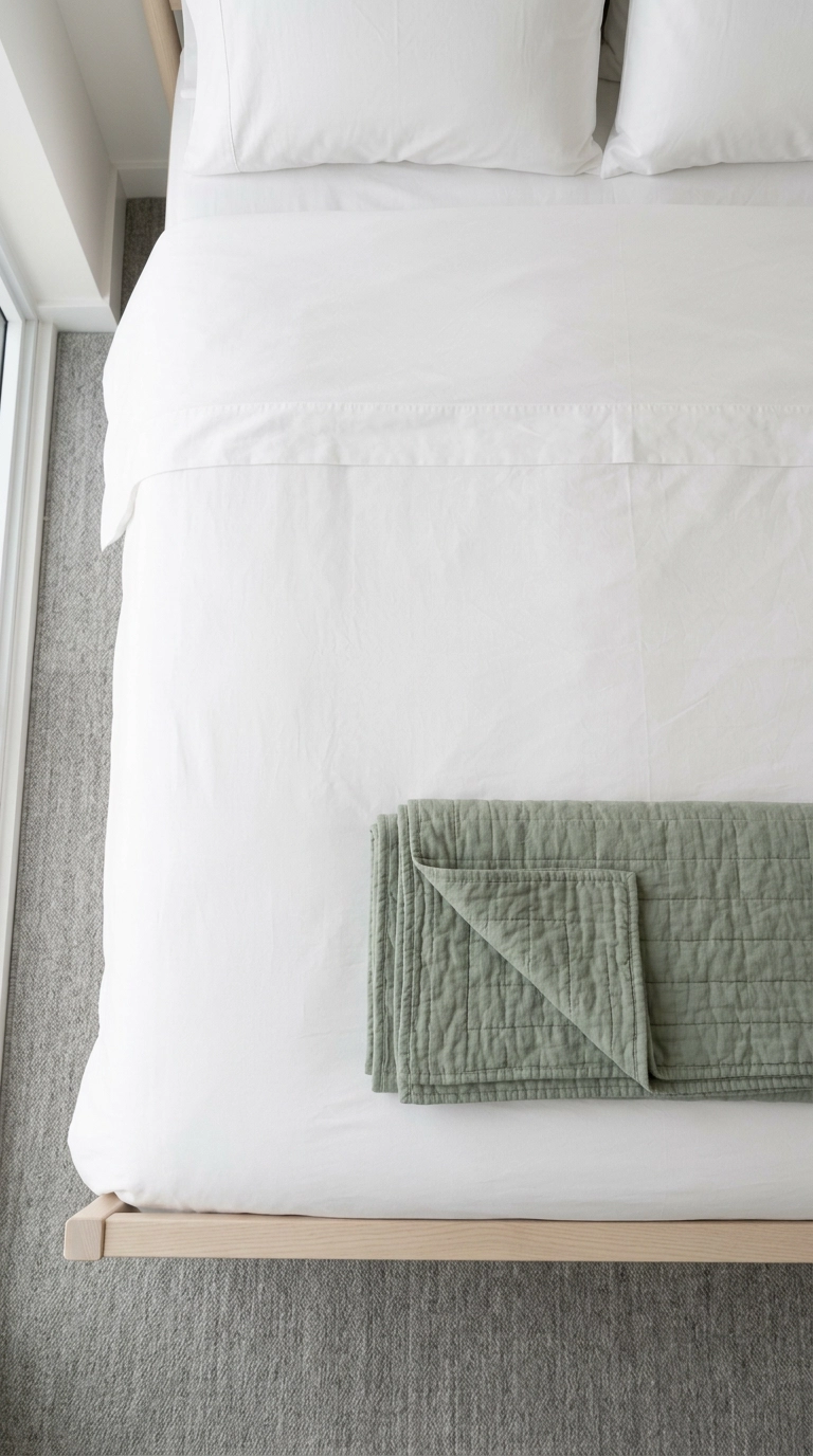
Percale is the matte, cool, crisp one — it looks quiet in photos and sleeps cool, which is the right call for hot sleepers and for warm earthy rooms that need one clean note. Sateen has a faint sheen and drapes closer to the body, better in cool Scandinavian schemes that could use a little glow.
7. Stack Three Different Textures at the Foot of the Bed
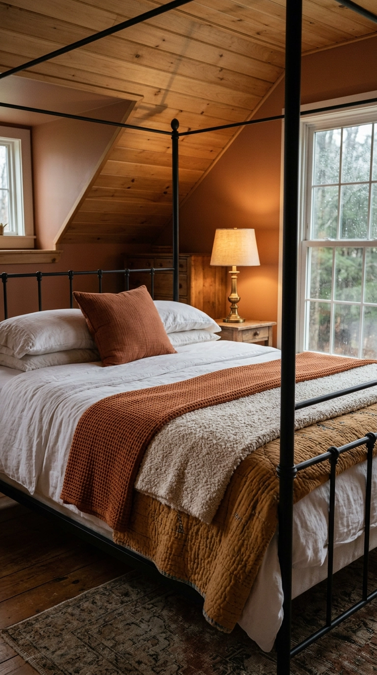
Softness reads to the eye as texture variety, not as more stuff. Three surfaces that catch light differently — a nubby waffle, a fuzzy boucle, a flat quilt — do more than three extra pillows ever will, and they let you keep the pillow count sane.
8. Float a Wool Rug Under the Bed with 24 to 30 Inches Showing on Three Sides
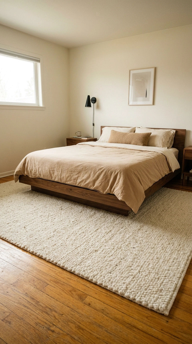
Almost everyone buys the rug one size too small. You want it starting just in front of the nightstands and running 24 to 30 inches past the bed on both sides and the foot, so your feet land on wool at 3 a.m. instead of cold floor.
9. Diffuse the Overhead with a Rice Paper or Fabric Drum Shade
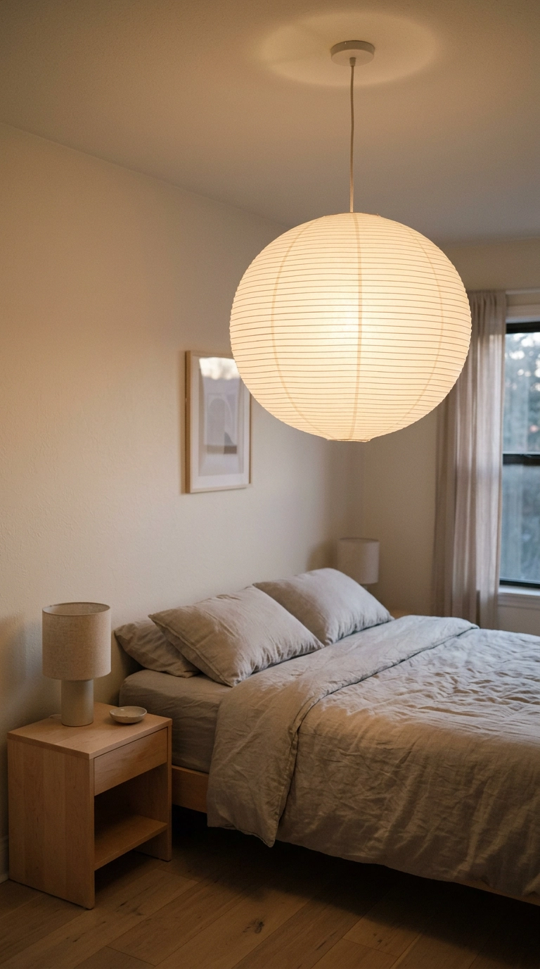
A bare bulb or a clear glass globe throws hard-edged shadows that break the soft-focus effect immediately. Paper and fabric scatter light in every direction, so the ceiling plane glows faintly instead of one bright point burning a hole in the room.
10. Angle a Mirror to Bounce Lamplight, Not Daylight
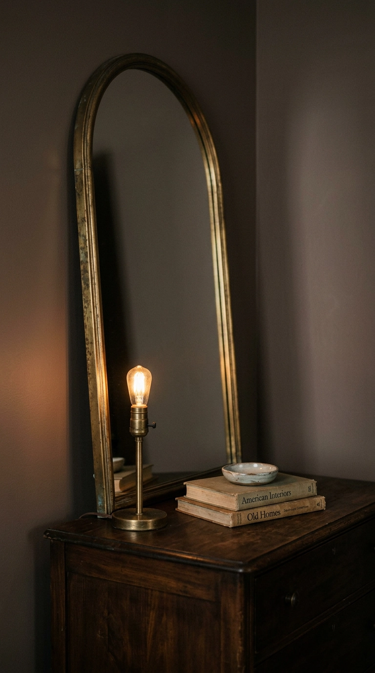
Everyone hangs the mirror opposite the window, which just doubles the harshest light in the room. Put it opposite or adjacent to your warmest lamp instead and it becomes a second soft source at night, which is when you actually want the room to look like this.
11. Wash the Walls in Limewash Instead of Flat Paint
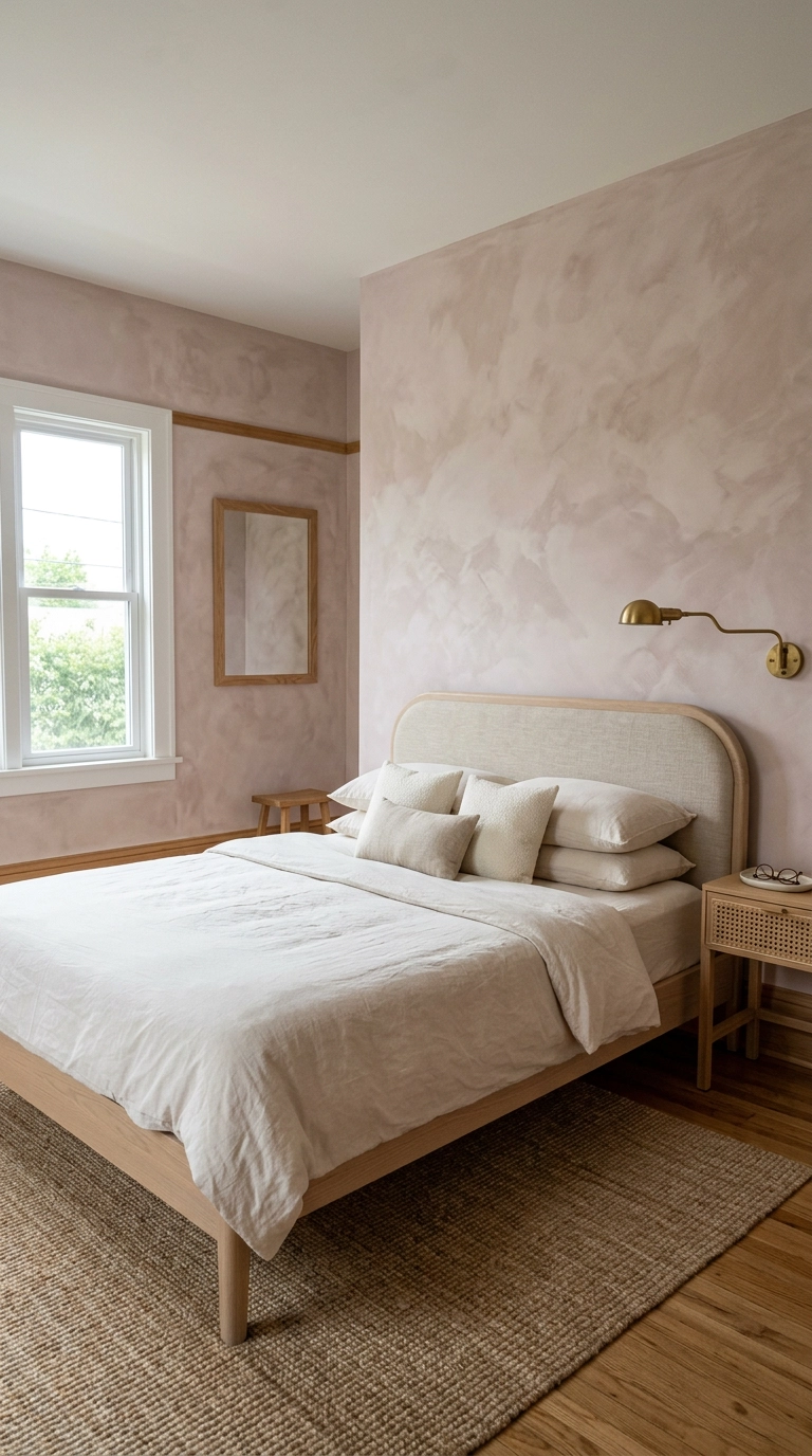
Flat paint gives you one uniform value, and uniform values read as flat. Limewash has cloudy variation built in, so the wall shifts subtly as light moves across it — that slightly out-of-focus quality is exactly what people mean when they say dreamy.
12. Go Cool Scandinavian with Grey-Blue Walls and Pale Ash
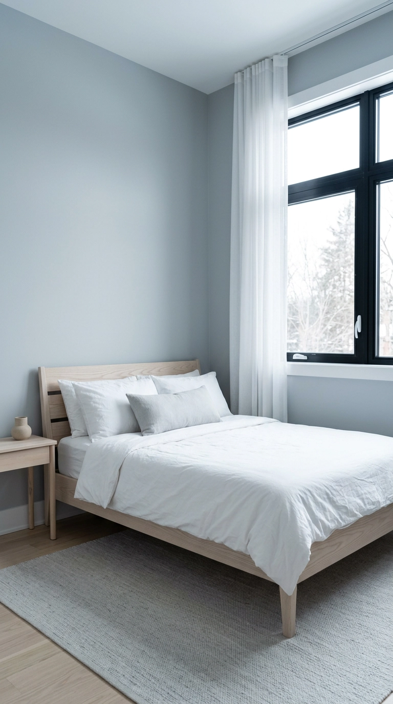
Not every soft bedroom has to be warm and beige. A cool grey-blue with pale ash and white cotton reads calm and clean, and it is the right move in a bright south or west-facing room that already gets plenty of warm light on its own.
13. Build the Warm Earthy Version in Terracotta and Ochre
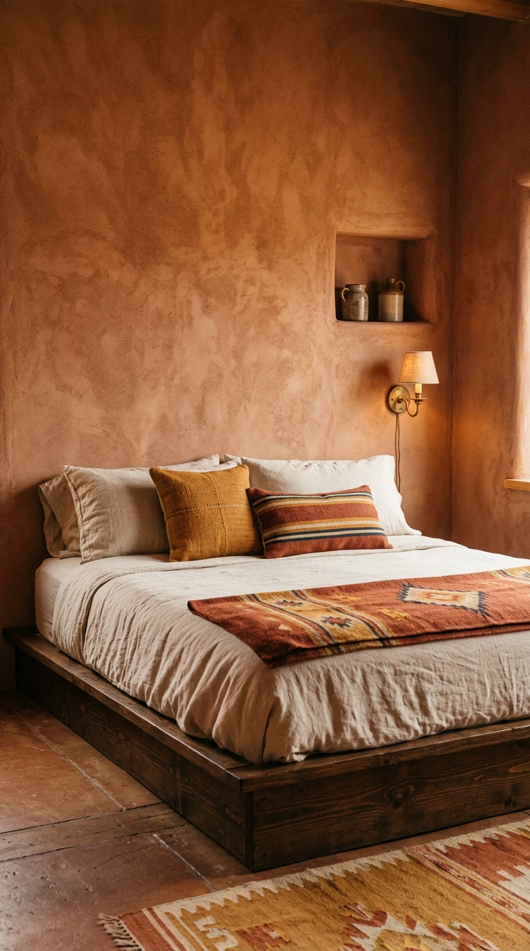
Warm earth tones are the most forgiving palette for a room with mediocre light, because clay and ochre stay rich even under a grey sky. This is where I send clients whose bedroom faces north and whose white walls have gone the color of dishwater.
14. Oversize the Headboard in Boucle and Take It Tall
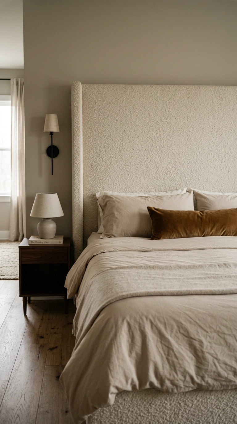
Visual weight — how heavy a thing feels to the eye — is why a short headboard makes a bed look unfinished. Take it to at least 48 inches off the floor, ideally 55 to 60 under 9 foot ceilings, and the bed suddenly anchors the whole wall.
15. Hang Unlined Muslin Panels on a Four-Poster Canopy
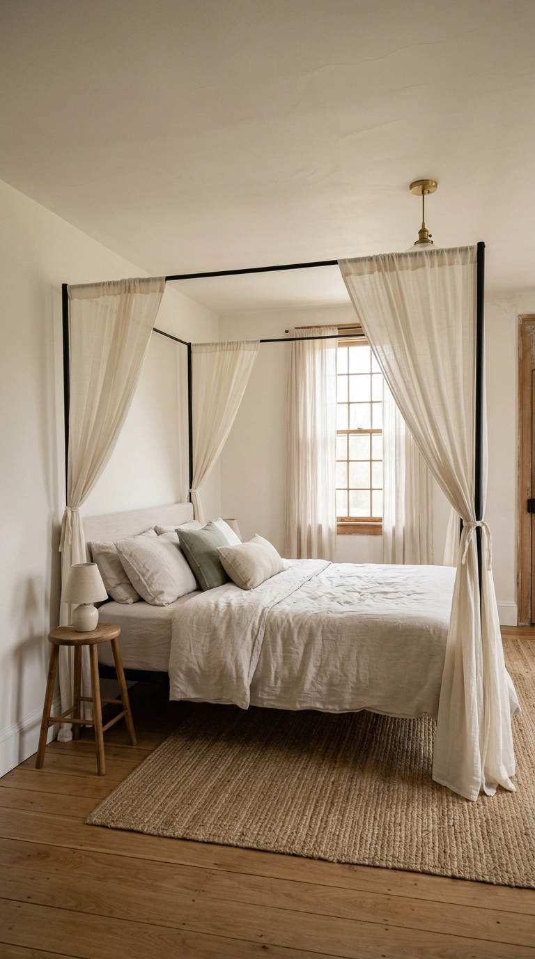
A canopy works because it puts fabric between you and the ceiling, which lowers the perceived ceiling right over the bed and makes the sleeping zone feel enclosed. Use unlined muslin or cotton voile, not heavy velvet — the goal is filtered light, not a fort.
16. Fake the Canopy with a Ceiling-Mounted Drape Halo
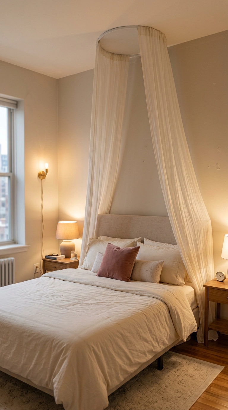
You get the canopy effect from two small ceiling hooks and roughly 8 yards of cotton voile, no special bed frame required. Center the hooks about 18 inches apart above the pillows and let the panels fall to each side of the headboard.
17. Color Drench a Small Room in Deep Plum

Color drenching means walls, trim, and ceiling in one shade, and it works because it erases the visual breaks that chop a small room into pieces. The corners disappear in a dark saturated color, so the room reads as one soft undefined envelope instead of a box.
18. Paint the Ceiling Too and Build a Dark Cocoon
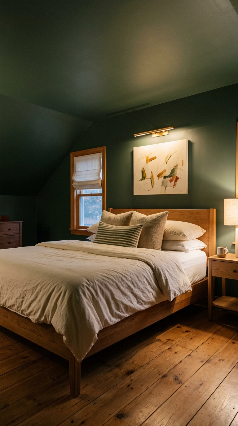
A white ceiling over dark walls acts like a lid and constantly reminds your eye where the room stops. Carry the color up and the boundary blurs, which is why dark rooms with dark ceilings feel enveloping rather than cramped.
19. Do the Airy Pastel Version in Blush, Butter, and Bone
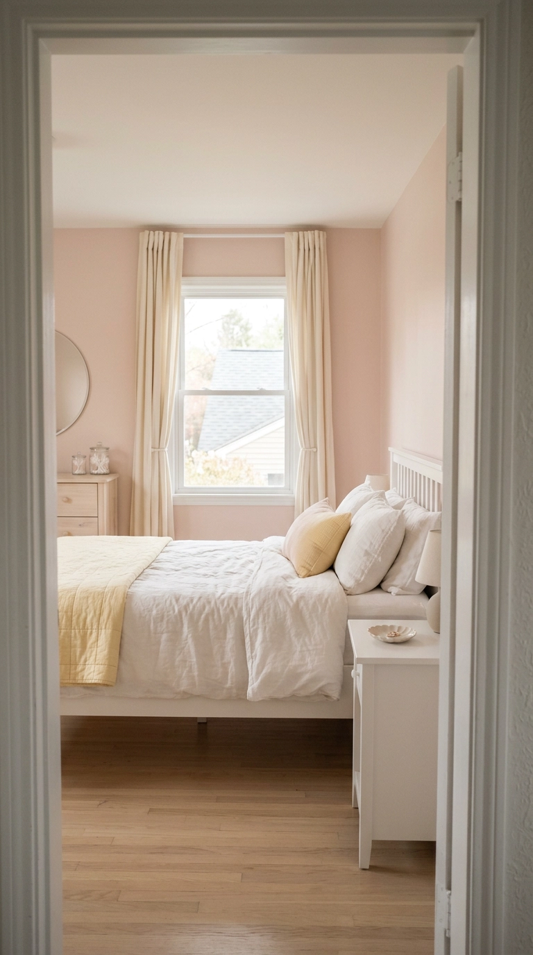
Pastels only look soft when they are muted and close in value to each other. Blush next to butter next to bone works because none of them fights for attention, while blush next to a clean bright white turns pink into a nursery.
20. Mount Swing-Arm Sconces 30 to 36 Inches Above the Mattress
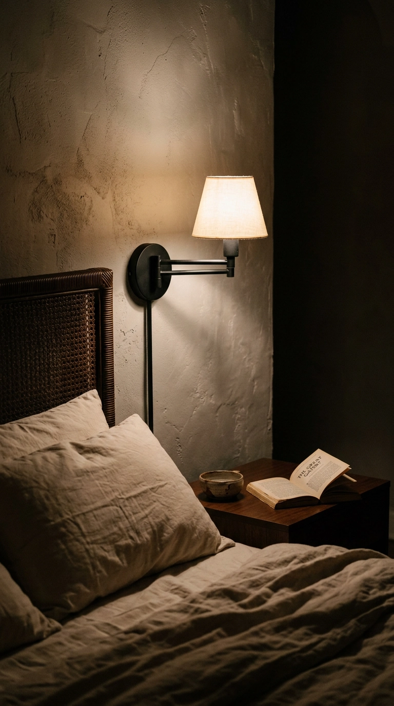
Sconces free the nightstand and put the light where you actually read, and mounting them 30 to 36 inches above the mattress top keeps the glow below eye level so it never glares. Aim the shade slightly down and toward the pillow.
21. Add a Blackout Roller Shade Inside the Window Frame
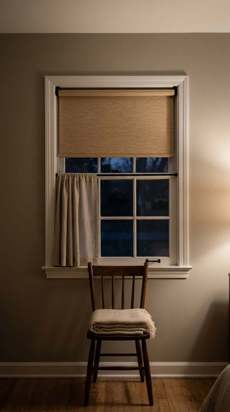
Here is the honest part nobody posts about: curtains alone leak light around every edge, and a room that never gets properly dark will never feel restful no matter how pretty it is. An inside-mount blackout roller behind your panels handles the glass while the fabric handles the softness.
22. Put Peel-and-Stick Grasscloth Behind the Bed
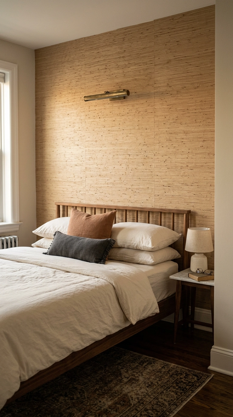
A textured wall behind the bed does what paint cannot: it catches raking lamplight in tiny shadows so the whole surface looks soft rather than sheer. Grasscloth is the classic, but any low-relief woven paper works.
23. End on One Oversized Soft-Focus Abstract Above the Bed
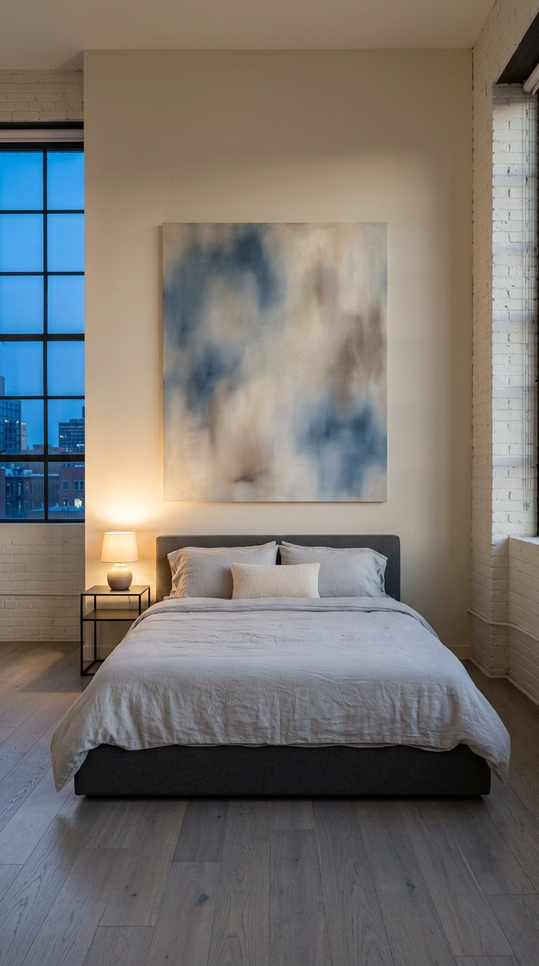
If you take one thing from this list, make it this: a single big blurred-edge canvas above the bed does more than a nine-frame gallery wall, because there is nothing for your eye to snag on right before sleep. Go wide — roughly two thirds of your bed width, so about 40 inches over a queen.
Turning the Lights Down on This One
If you scroll back through all 23, you will notice the ideas that actually change a room are almost boring: the double curtain rod, the 2700K bulbs, the dimmer, the rug that is finally big enough. I have watched clients spend a fortune on bedding and then wonder why the room still felt like a dentist’s office, and it was always the 4000K bulbs in the ceiling fan. Fix the light first, then buy the linen.
What I am seeing most in 2026 is the swing away from the all-white gauzy bedroom toward saturated color-drenched rooms and warm clay plaster — Farrow & Ball’s deeper shades and limewash finishes have been all over the projects I am pinning, and Benjamin Moore White Dove is finally sharing the stage with something that has a pulse. Texture is doing the heavy lifting too, which is very much Nate Berkus territory: his whole signature move is stacking materials rather than colors, and it is exactly why the boucle headboard and the grasscloth wall land the way they do. The dark cocoon bedroom, in particular, keeps showing up in celebrity home tours and I do not think it is going anywhere.
Pick two ideas, not twelve. Swap your bulbs this week, hang the curtains higher next weekend, and give the room a month before you decide what else it needs — rooms tell you what is missing once you stop shouting at them. If you want more of this kind of specific, no-fluff styling advice, come join my weekly newsletter, where I send one real project breakdown, the actual products I used, and what I would do differently. I would love to have you there.


