
28+ Dreamy Blue Nursery Decor Ideas that are Calm and Gorgeous in 2026

I have designed more nurseries than I can count, and blue is still the color parents come back to, mostly because it does something no other shade does quite as well: it lowers the temperature of a room without making it feel cold, as long as you pick the right one. The trap is defaulting to that sweet baby-blue everyone remembers from the eighties, when the good stuff lives in the moodier corners of the fan deck, slate, chambray, inky midnight, a stormy blue-green. So here are 28 blue nursery decor ideas I actually use with clients, every single one built around a bare crib, because a beautiful room is not worth a single compromise on safe sleep.
Blue Nursery Decor Ideas
1. Color-Drench the Whole Room in Slate Blue-Grey
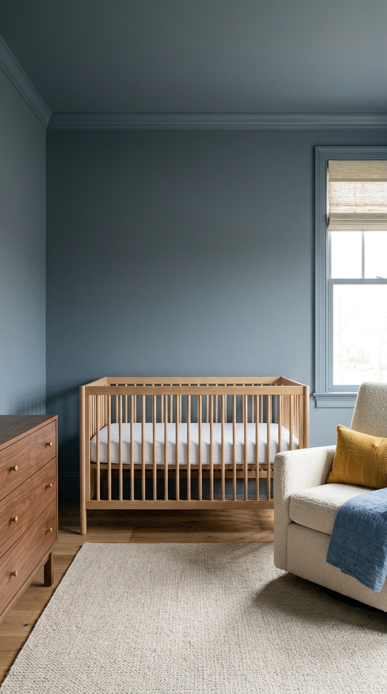
Color drenching means painting the walls, trim, door, and ceiling the same shade, and it is the single fastest way to make a small nursery feel deliberate instead of chopped up. The reason it works is that white trim creates hard visual breaks, and when you erase those breaks your eye keeps traveling and the room reads bigger. Benjamin Moore Van Deusen Blue and Farrow and Ball De Nimes are both slate-leaning blues that stay warm under lamplight instead of turning grey.
2. Paint Two-Thirds of the Wall Chambray with One Crisp Line
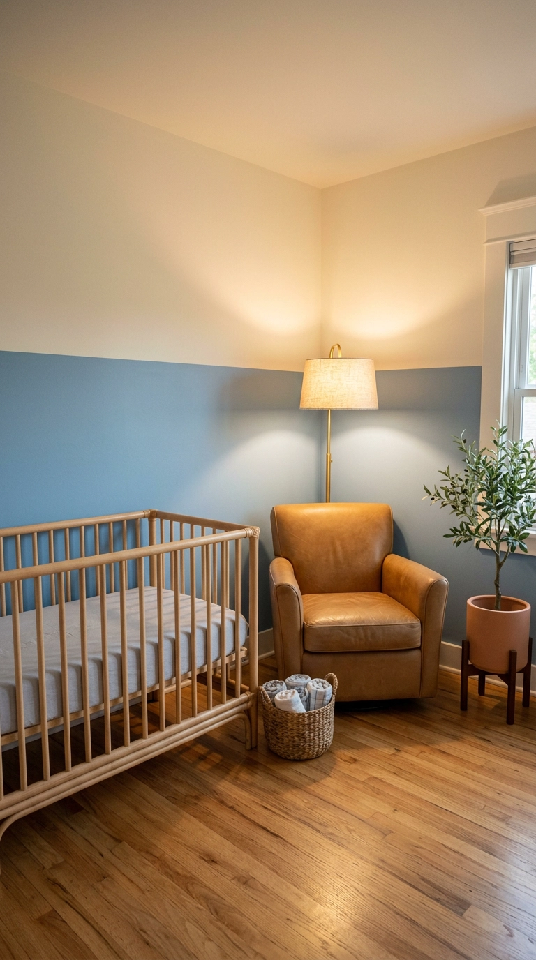
A two-thirds wall gives you the moodiness of a dark room without swallowing the light, and the horizontal line tricks the eye into reading the ceiling as higher. Tape your line at roughly 48 to 54 inches off the floor, measure from the floor rather than the ceiling since floors are more level than ceilings in older homes, and press the tape edge down with a putty knife.
3. Board and Batten in Deep Navy on the Lower Wall
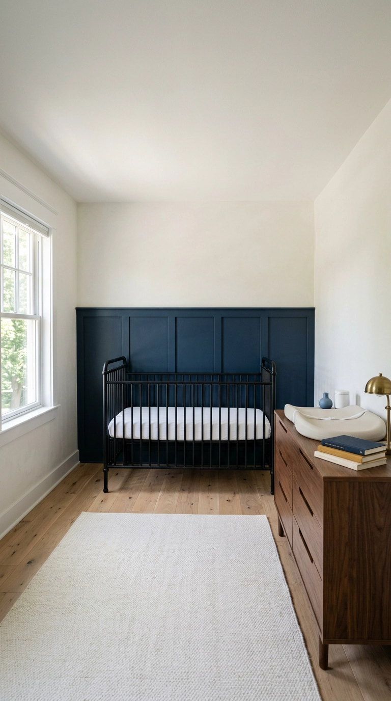
Board and batten is just vertical wood strips over a flat panel, and it earns its keep in a nursery because the cap rail takes every scuff a toddler can deliver at exactly that height. Space your battens 12 to 16 inches apart and cap the whole thing at 36 to 42 inches, then caulk every seam before painting or the joints will telegraph.
4. Picture Frame Molding in Soft French Blue
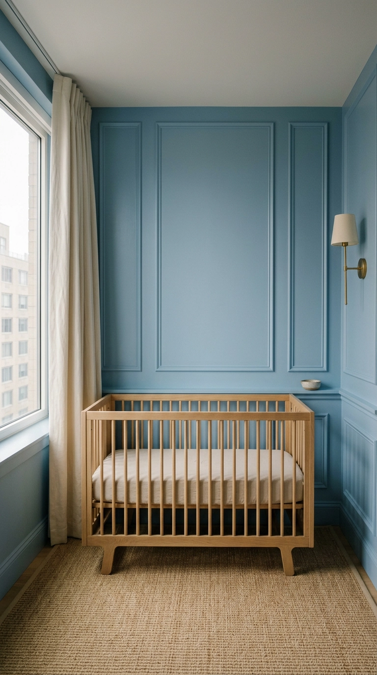
Picture frame molding is thin trim glued and nailed into rectangles on a flat wall, and it delivers a custom look for the price of a few sticks of pine. The rule that keeps it from looking amateur is consistent margins, roughly 4 to 6 inches between each rectangle and the same distance from the baseboard and ceiling line.
5. A Misty Blue Landscape Mural on One Wall
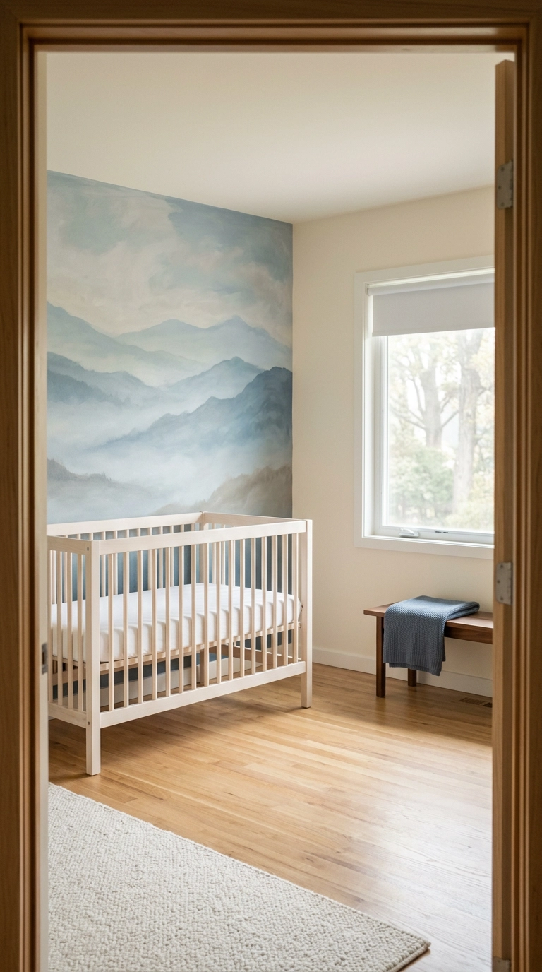
A soft-focus landscape mural gives a nursery an actual horizon, which makes a boxy 10×10 feel like it has depth it does not have. Keep the palette to three blues maximum and let the top third of the wall fade to almost nothing, since a busy mural fights every other thing you put in the room.
6. Inky Midnight Star Wallpaper Behind the Crib
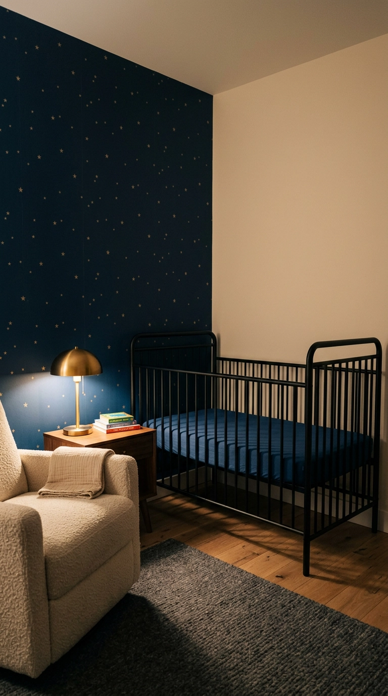
Star paper is the one pattern that photographs beautifully at night, which matters more than you think when half your time in this room happens in the dark. Keep the motif small and the spacing wide, because oversized stars date fast and read as a theme rather than a color story.
7. Blue and Cream Ticking Stripe Wallpaper
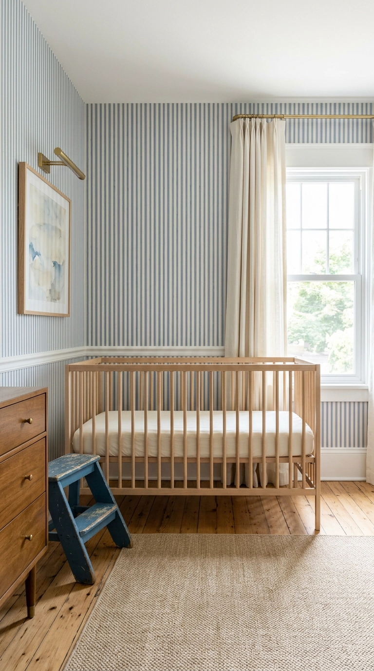
A narrow ticking stripe does something a solid wall cannot, it adds vertical lift, so ceilings feel taller and the room feels a touch more formal. Stick to stripes under an inch wide, because wide stripes turn into a circus tent in a small room fast.
8. A Single Arched Paint Shape Behind the Crib
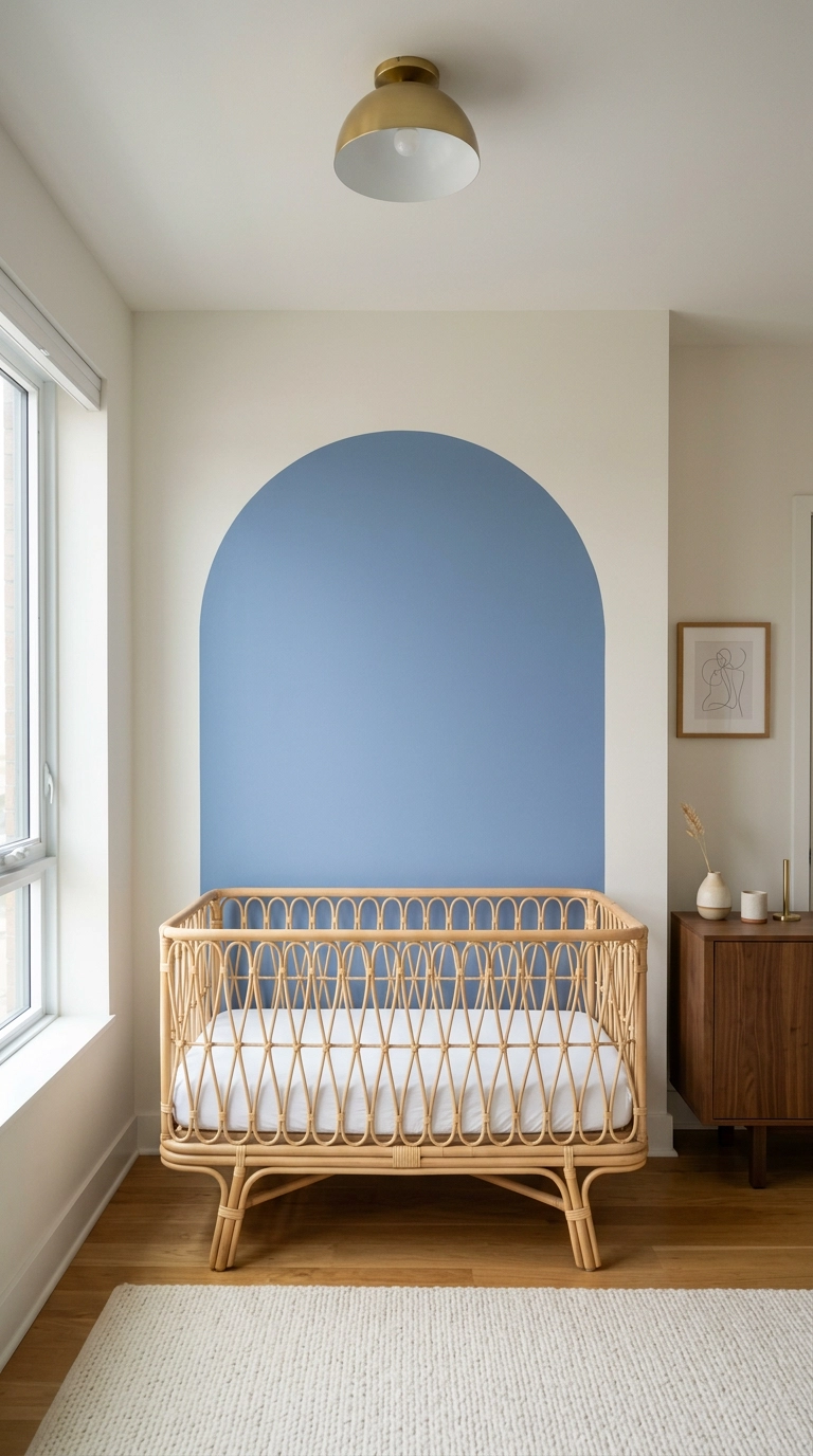
A painted arch is the closest thing to free architecture. It creates a visual headboard for the crib and pulls the eye to the focal point without hanging a single thing on the wall above it, which is exactly why I love it in a nursery.
9. Full-Height Navy Wainscot with White Above
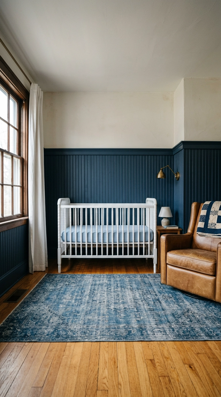
Wainscot taken up to two-thirds height feels traditional in the best way, and the cap rail is a natural spot to lean a small framed print instead of drilling into the wall. I put the sconce and the quilt by the glider because that corner is where you actually spend your nights.
10. Paint the Ceiling Powder Blue and Leave the Walls Alone
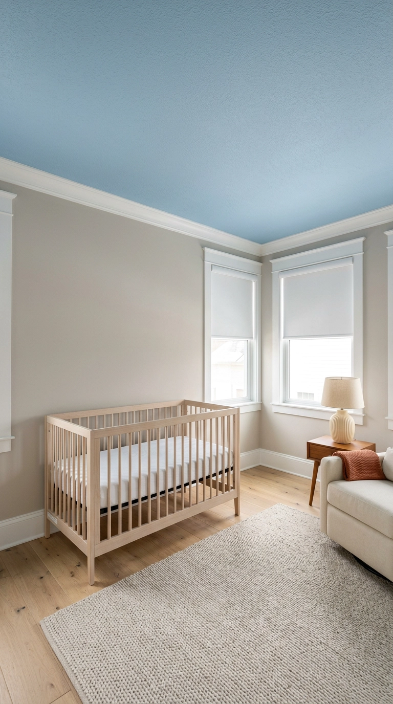
The ceiling is the one surface a baby stares at for months, so it is genuinely the most-viewed wall in the room. A soft powder blue up there throws a faint cool cast down onto neutral walls and makes the whole space feel airy without committing to blue everywhere.
11. Blue Trim on Crisp White Walls
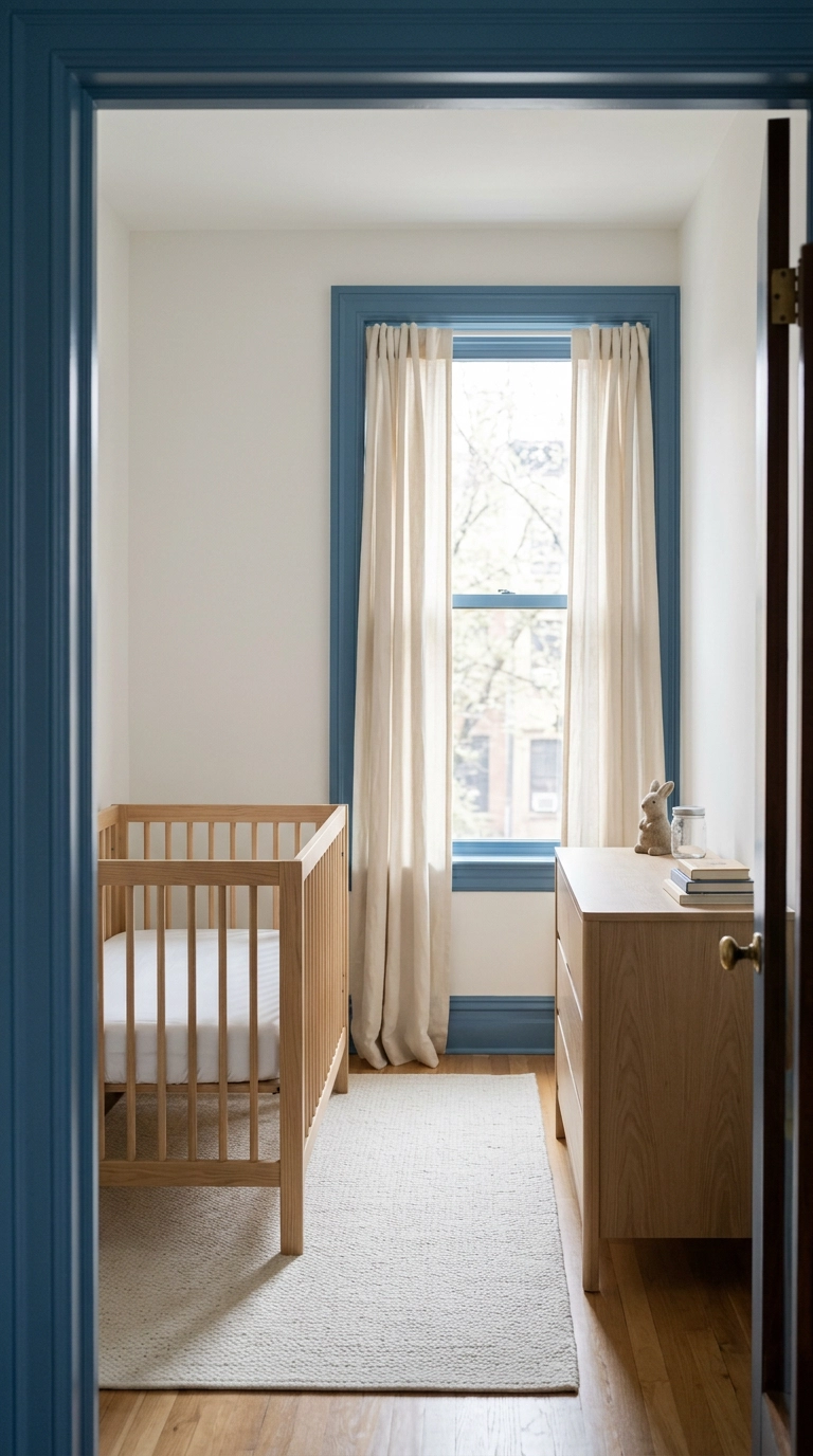
Painting only the trim blue is my favorite move for a north-facing nursery, where a full blue wall goes cold and slightly grey by three in the afternoon. You get the color story without losing the light-bouncing white walls that a dark room desperately needs.
12. Nautical Without a Single Anchor in Sight
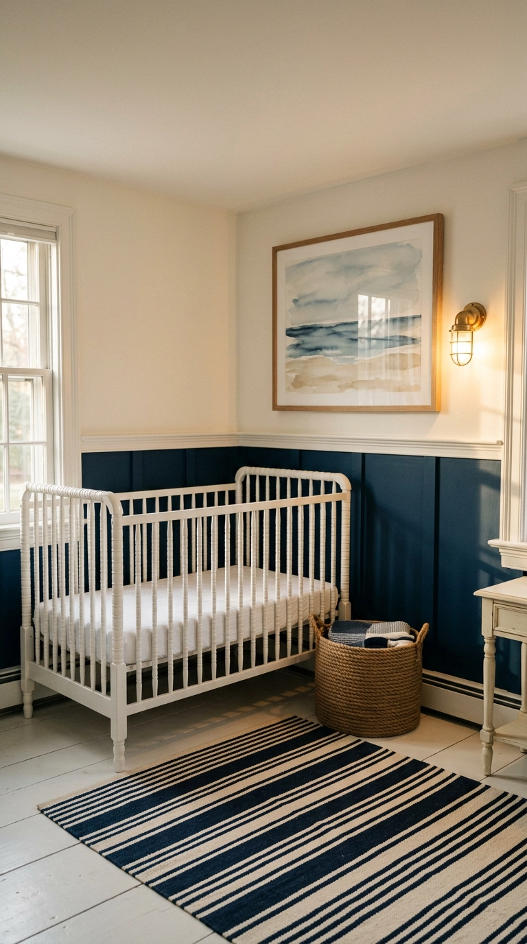
Nautical goes wrong the moment you add a wheel, an anchor decal, and a red accent. Do it with navy, cream, brass, and rope texture instead, and the room reads coastal-classic rather than themed birthday party.
13. A Stormy Blue-Green Woodland Corner
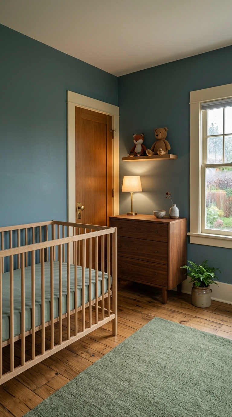
Blue-green is the shade I reach for when parents want a woodland room but hate the mushroom-and-fox cliche. It sits right between sage and slate, so it plays with walnut, moss, and any natural fiber you throw at it.
14. A Celestial Room in Deep Midnight and Brass
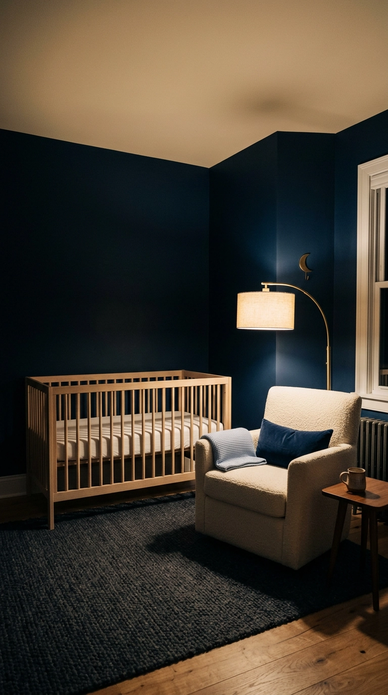
Celestial works best when you skip the glow-in-the-dark stickers and let the dark paint do the heavy lifting. Midnight blue absorbs light instead of bouncing it, which is exactly what you want at 3 a.m. when you are trying not to wake anybody up.
15. Pale Sky Blue Coastal with Natural Rattan
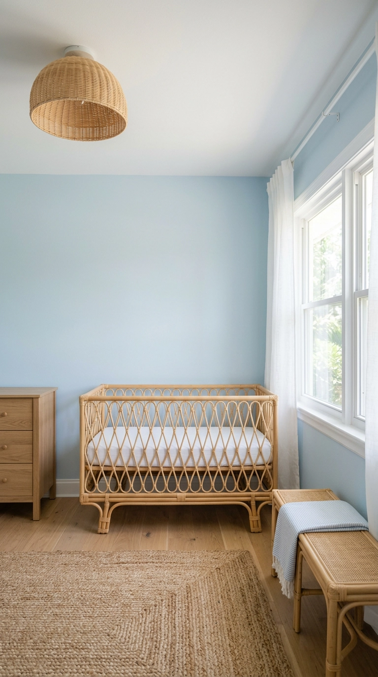
This is the version for a bright south-facing room, where a pale sky blue that would look washed-out anywhere else finally has enough light to read as a real color. In a dark room this same shade turns into sad hospital blue, so be honest about your windows.
16. Grandmillennial Blue and White with Delft Pottery
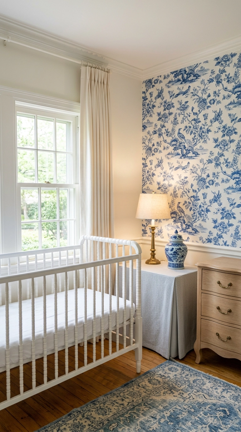
Blue and white porcelain is the oldest trick in the book and it still works because the contrast is so high that the room never looks muddy. The discipline is one pattern only, so if the wallpaper is doing the chinoiserie thing, the rug and curtains stay quiet.
17. Modern Minimalist Slate Blue with Black Accents
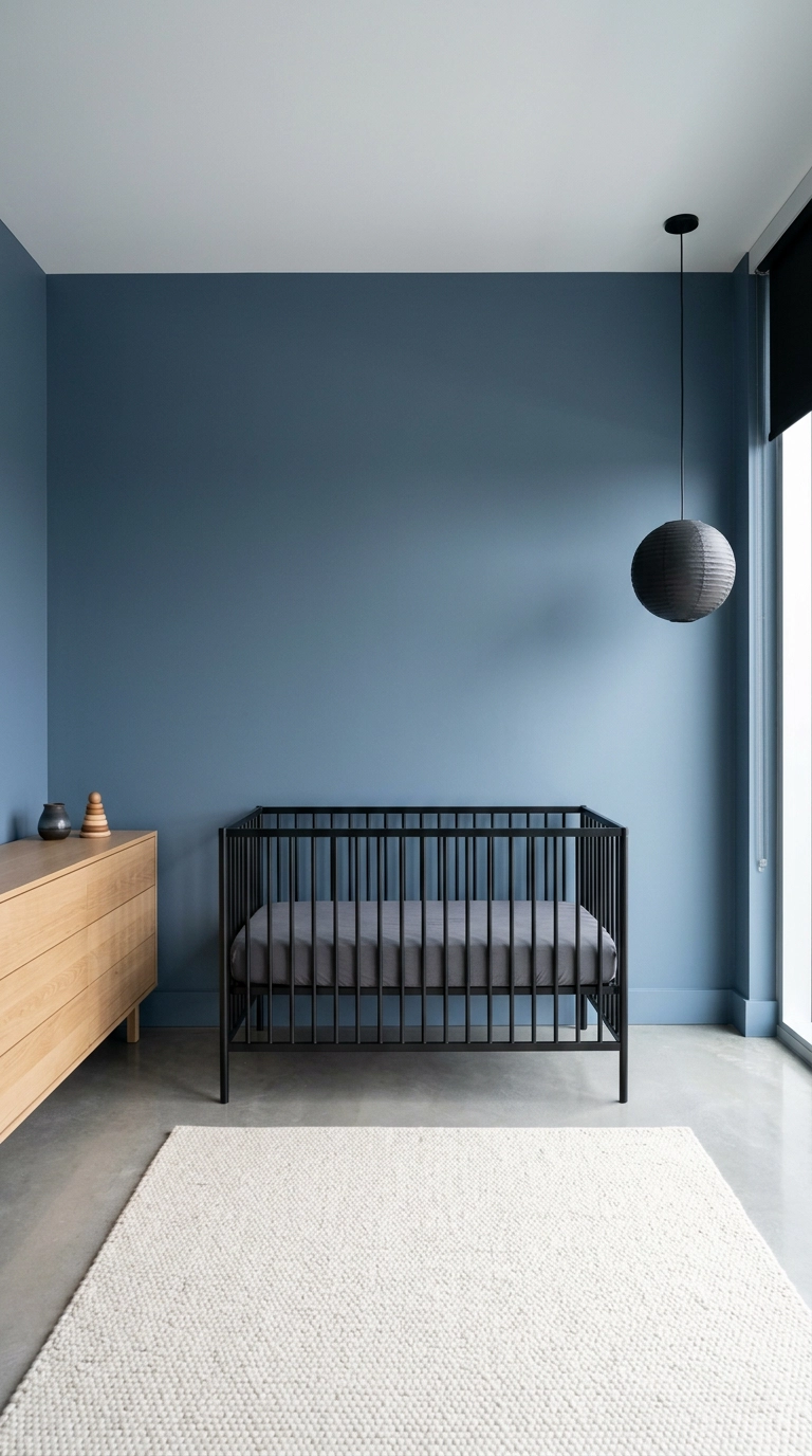
Minimalist nurseries get accused of being cold, and they are, unless you add one warm material. Here it is the oak dresser and the ivory wool, which keep the slate and black from tipping into office-lobby territory.
18. Faded Denim Blue with Vintage Toys and Antiques
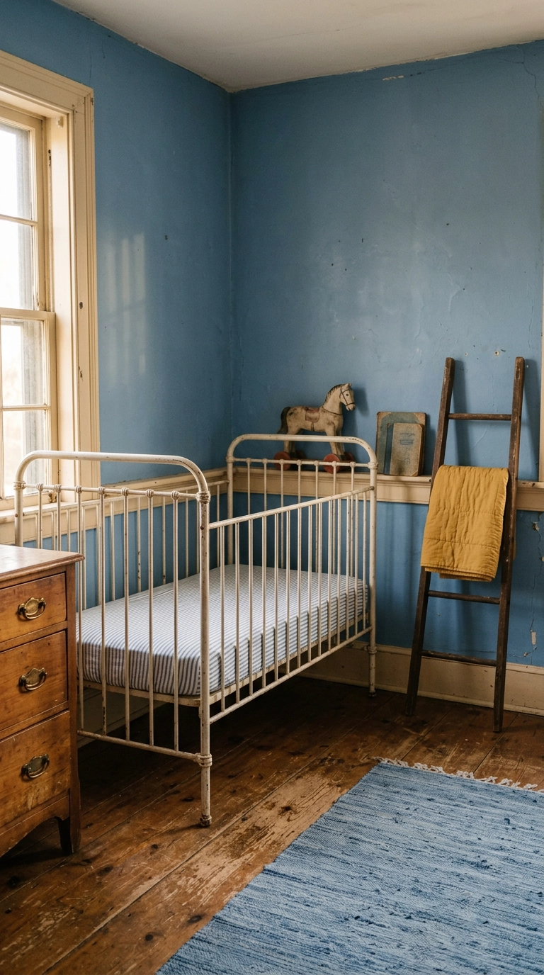
Faded denim is a forgiving blue, it looks like it has been on the wall for thirty years the day you finish painting. Pair it with real patina, chippy pine and unlacquered brass, and skip anything that looks new and glossy.
19. Blue-Painted Built-In Bookshelves Flanking the Window
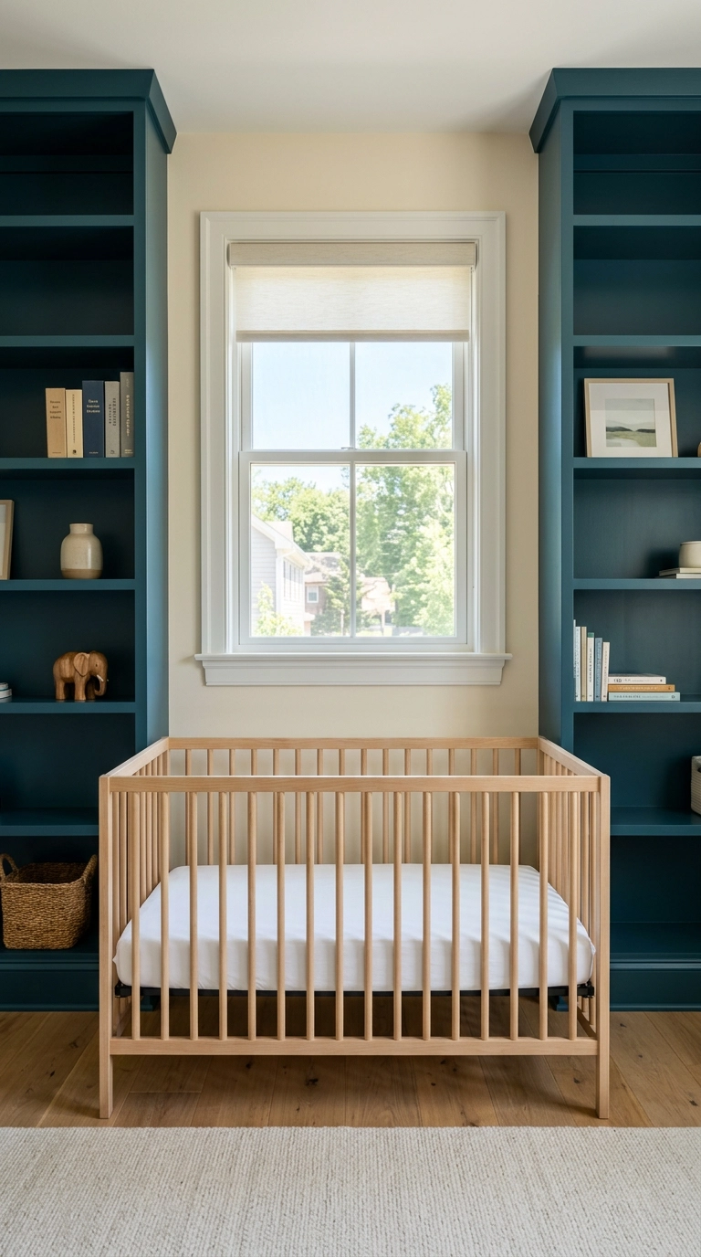
Built-ins flanking a window turn dead wall into storage and frame the light source, which makes a modest window feel architectural. Style them at about 60 percent full, because a shelf packed edge to edge reads as clutter and a half-empty one reads as expensive.
20. Let a Blue Glider Be the Only Source of Color
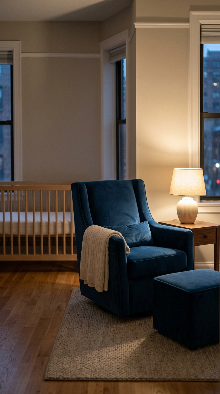
If you cannot paint, buy the blue instead. A saturated glider in French blue velvet carries the entire color story and it is the one piece of furniture you will use every single day for two years.
21. Blue Textiles Only Over Untouched Neutral Walls
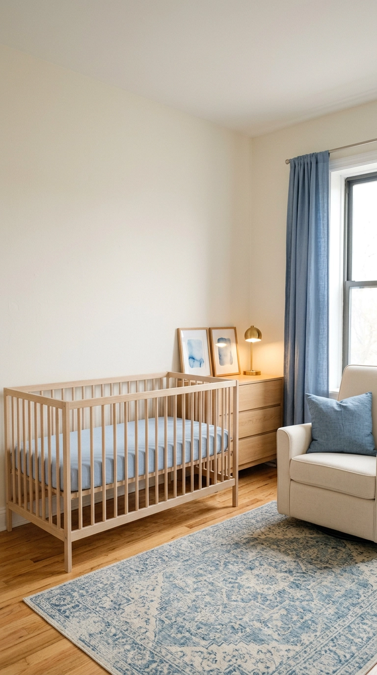
This is the version for renters with a no-paint clause and for anyone who does not want to commit. Curtains, rug, and one cushion give you as much perceived color as a painted wall because textiles carry more visual weight than flat paint does.
22. Let a Vintage Blue Rug Set the Whole Palette
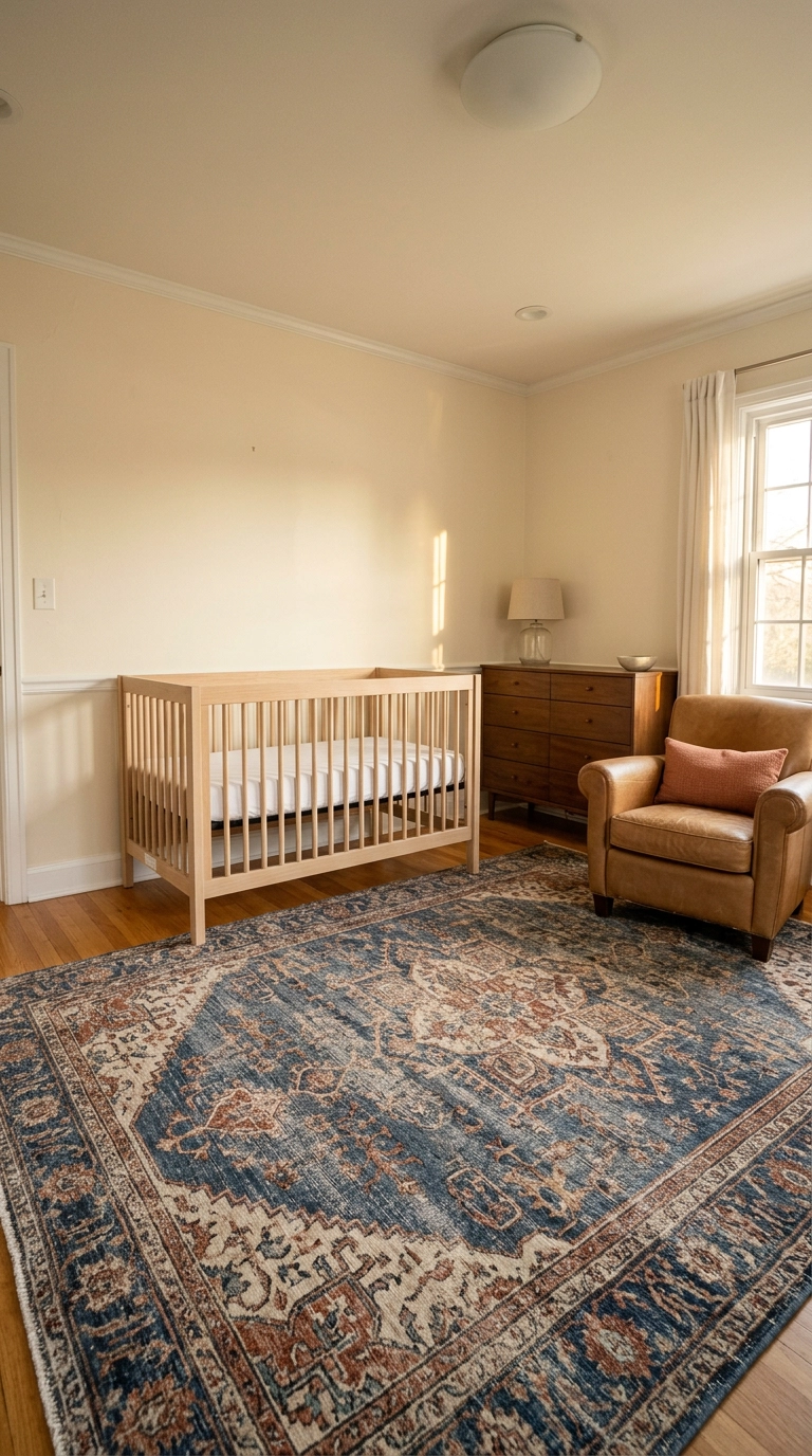
Starting from the rug is how professionals build a palette, because the rug already contains a tested combination of colors you can pull from. Buy one size bigger than feels right, an 8×10 in a 10×11 room, so the crib and chair legs all land on it and the room reads as one zone.
23. A Gallery Wall of Blue-Toned Prints on the Wall Opposite the Crib
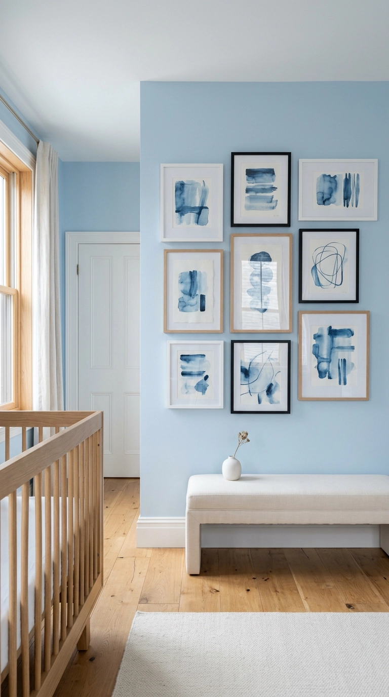
Lay the whole arrangement out on the floor first, then keep the gaps at a consistent 2 inches, because inconsistent spacing is the only thing that makes a gallery wall look accidental. Odd numbers of frames read better than even ones since the eye finds a center instead of splitting the group in half.
24. A Blue-Painted Vintage Dresser as the Changing Station
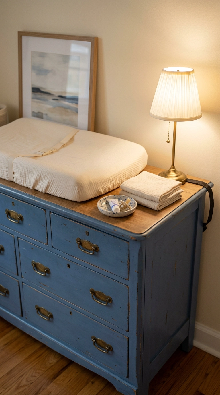
A dresser plus a strapped-on contoured changing pad beats a dedicated changing table every time, because the dresser is still furniture in five years when the pad is long gone. Look for one at 34 to 38 inches tall, anything lower wrecks your back at 3 a.m.
25. Hang Blue Blackout Curtains High and Wide
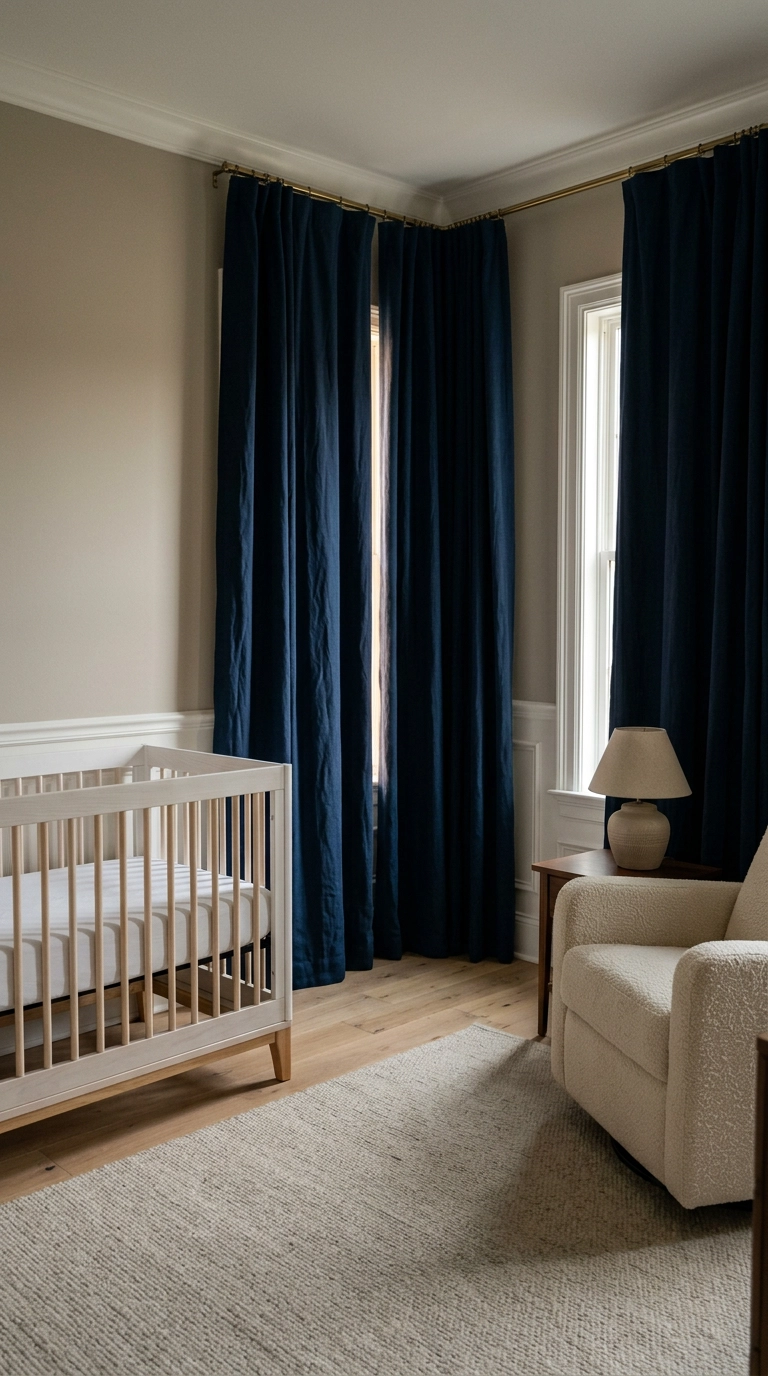
Mount the rod within 4 inches of the ceiling and extend it 8 to 12 inches past the window casing on each side. That does two things, it makes the ceiling feel taller and it kills the light leak down the sides, which is the actual reason most blackout curtains disappoint people.
26. A Reading Nook Under a Blue Canopy
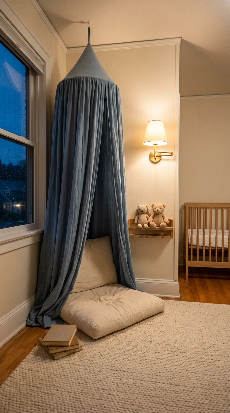
The canopy goes over the reading corner, never over the crib, because loose fabric anywhere near a sleeping baby is exactly what safe sleep rules exist to prevent. Over a floor cushion it is completely fine and it gives the room a second destination.
27. Blue Open Shelving Styled with Book Spines Facing Out
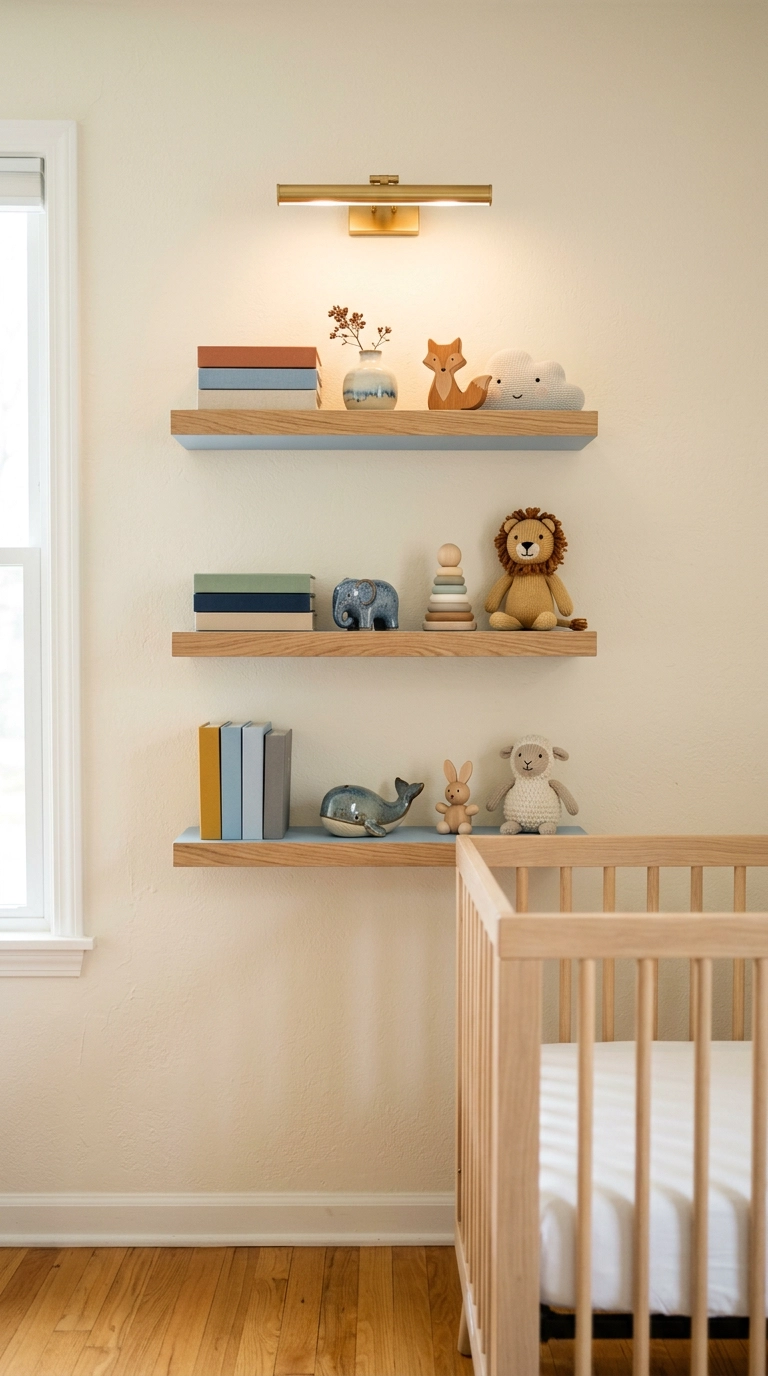
Four objects per shelf with real gaps between them is the count that photographs well and survives a real week of life. Front-facing board books turn your kid’s library into the artwork, which saves you from buying more art.
28. Paint the Closet Doors Peacock Blue and Stop There
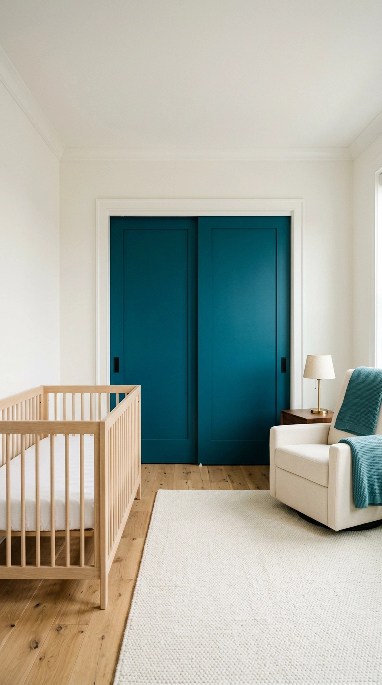
Painting just the closet doors is the lowest-commitment blue in this whole article and somehow one of the most striking, because a large flat plane of saturated color reads as intentional design rather than decoration. It also takes about two hours and one quart.
Bringing Your Blue Nursery Home
If you take one thing from these 28 blue nursery decor ideas, let it be that blue is not one color, it is a whole range with completely different personalities. The slate blue-grey color-drenched room and the pale sky coastal nursery share a fan deck and almost nothing else. Start by looking at which direction your windows face, because a north-facing room will drain the life out of a pale blue by mid-afternoon, and that single piece of information should decide whether you go chambray or midnight.
What I am seeing everywhere right now is color drenching, painted arches, and a real return to blue and white porcelain, which the grandmillennial crowd never abandoned and everybody else is rediscovering. Farrow and Ball Hague Blue keeps showing up in the nurseries that get shared the most, and the Pinterest boards I follow are full of the two-thirds wall with a crisp paint line. The ideas that survive longest are the architectural ones, board and batten, wainscot, built-in shelves, they grow into a big-kid room without a single change. The scenic murals and the star paper are the ones I quietly expect you to swap out around age four, and that is completely fine.
Whatever you choose, keep the crib bare, keep the heavy things off the wall above it, strap the dresser to a stud, and put every light in the room on a warm dimmer. Get those four right and you can play with color as much as you want. If you liked this one, sign up for my weekly newsletter, I send one real room, one paint color worth stealing, and one shortcut that saves you a weekend.


