
23+ Stunning Stair Riser Decor Ideas that are Easy and Gorgeous in [year]

I have a soft spot for stair risers because they are the most ignored vertical surface in the entire American house. Every single day you walk up a stack of blank rectangles at eye level and your brain edits them out, which is a shame, because the riser is the vertical face of each step and it is basically a free mini gallery. I have painted them, tiled them, stenciled them, and once spent an entire Saturday peeling vinyl decals off a client’s stairs because we picked a pattern that fought with her runner. So let me save you that Saturday and walk you through what actually works.
Stair Riser Decor Ideas
1. Peel-and-Stick Encaustic-Look Tile Decals on Every Riser
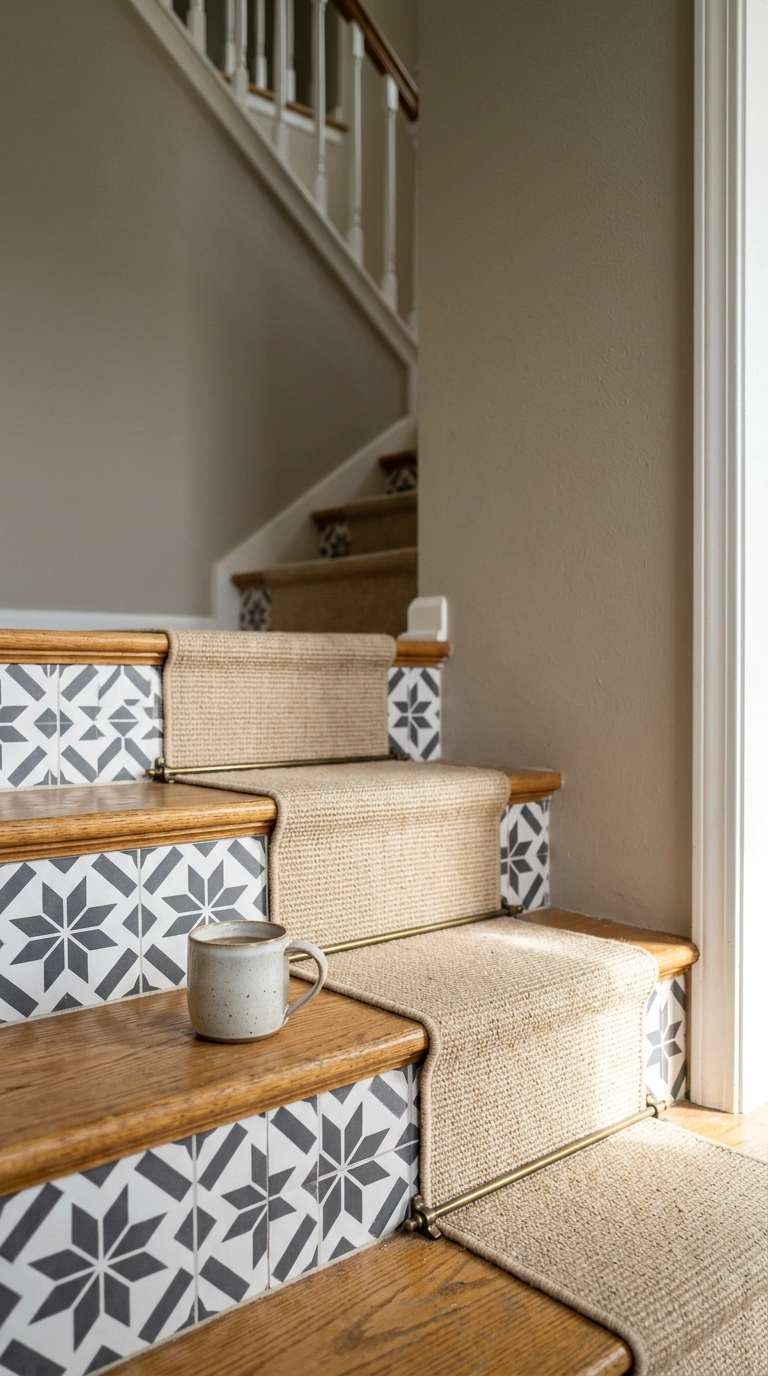
This is the idea I recommend most often, because it is genuinely reversible and it looks like real cement tile from four feet away. Decals come in sheets you trim to size with a straightedge and a fresh blade, and the whole flight is a long afternoon if your risers are clean and flat.
2. One Bold Accent Riser at the Bottom Step
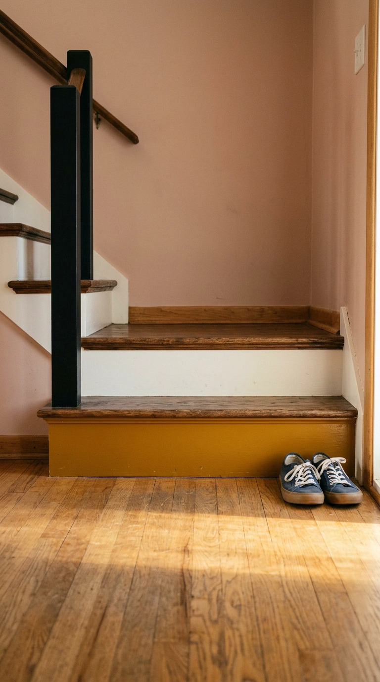
If you want the smallest possible commitment with the biggest possible payoff, paint one riser. The bottom step is the one people actually see from the living room, so it carries almost all of the visual weight, which is designer-speak for the amount of attention your eye gives something before it moves on.
3. High-Gloss Black Risers with Pale Oak Treads
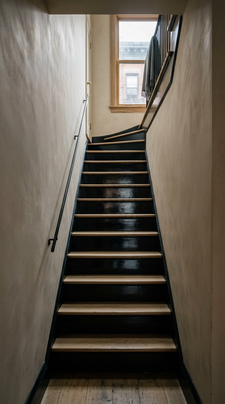
Black risers against light treads is the single most graphic thing you can do to a staircase, and it reads as intentional in almost any architecture. The contrast also does something practical: the dark face makes the light tread edge pop, so every step is easy to read on the way down.
4. Blue-and-White Portuguese Azulejo Decals
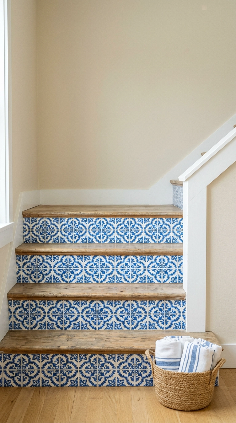
Blue-and-white azulejo is the pattern I reach for when a stairwell is dark or north-facing, because the high-contrast white ground bounces light back into a gloomy space. It also plays nicely with almost every existing wood tone, which is not true of warmer tile patterns.
5. A Painted Faux Runner Stripe Down the Center
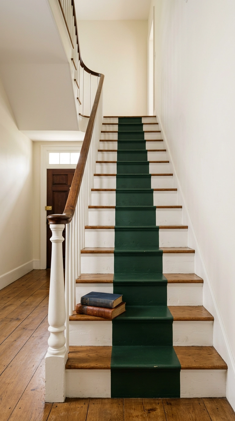
A painted stripe gives you the look of a stair runner for the cost of a quart of paint, and it is the fix I suggest when someone has beautiful old treads they do not want to cover. Center it by measuring the tread width and marking from both ends, never by eyeballing, because a stripe that is a half inch off center is somehow more visible than one that is three inches off.
6. Crisp Bone-White Risers Against Natural Oak Treads
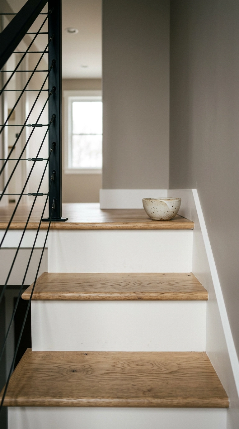
This is the safest look on the list and I will never apologize for it. White riser, wood tread, done, and it works because the warm wood keeps the white from going cold and clinical.
7. Ombre Gradient from Deep to Pale Up the Flight
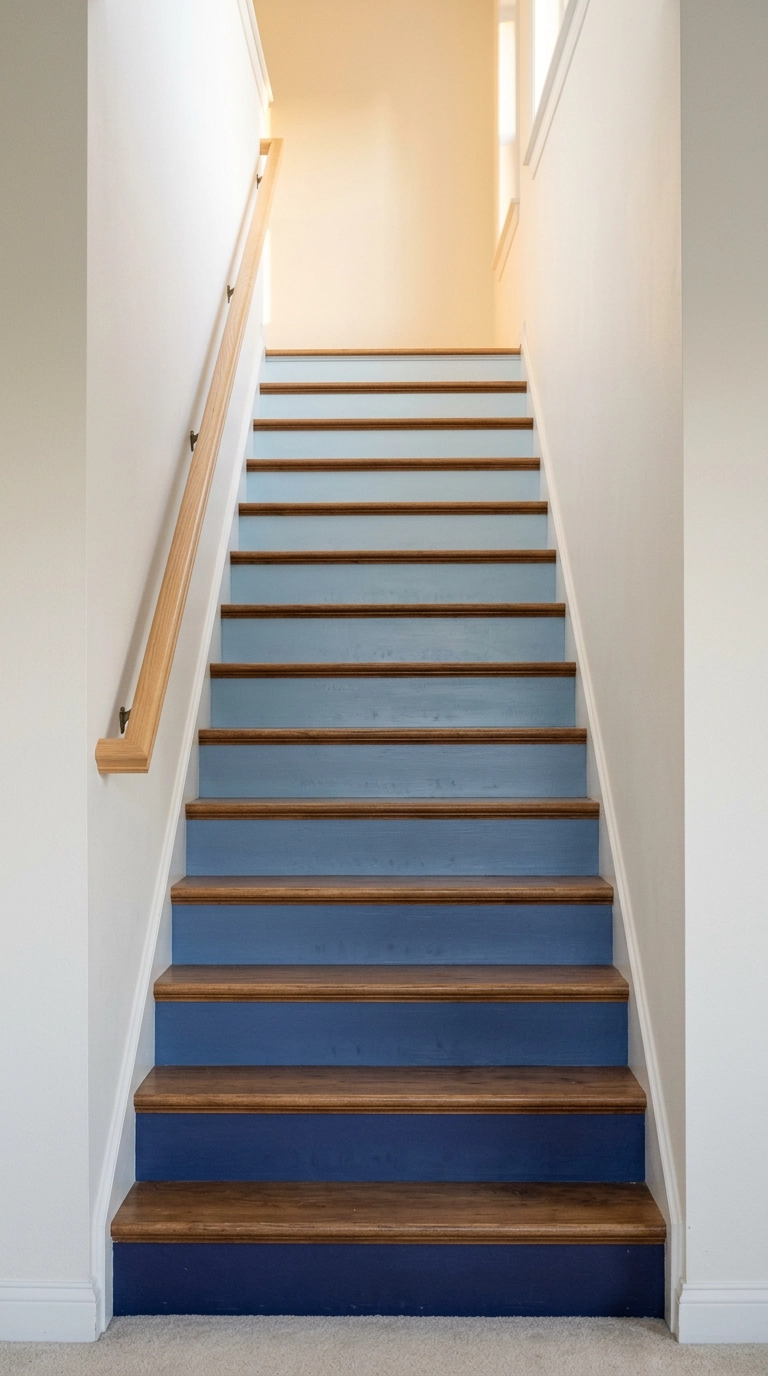
An ombre flight is the most photographed stair treatment on the internet and there is a reason: it turns a boring vertical stack into a single continuous object. The trick is to buy one paint color and its lighter shades off the same strip, then work bottom to top so the darkest sits where scuffs happen most.
8. The Quiet Tonal Version: Greige Shifting to Mushroom
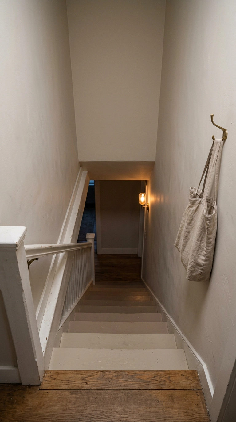
If a rainbow ombre makes you twitch, do the same technique in three neighboring neutrals. You still get that gradual shift up the flight, but from a distance it just reads as depth and shadow rather than as a project.
9. Removable Wallpaper Strips Cut to Riser Height
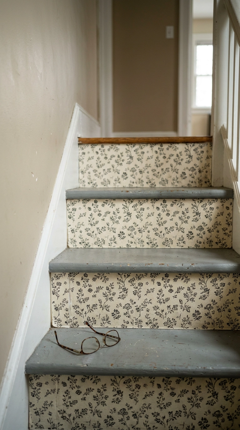
One roll of removable wallpaper covers a surprising number of risers because you are only using a strip about seven inches tall, so the leftover from a powder room job is often enough for a whole flight. This is the most rental-friendly option here, full stop.
10. Two-Tone Stenciled Moroccan Motif
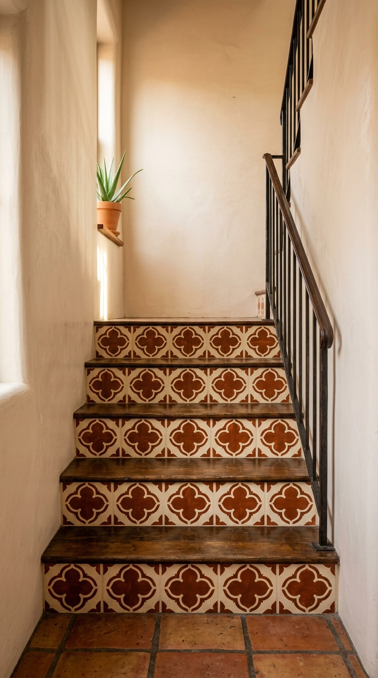
Stenciling costs almost nothing beyond the stencil and a small foam roller, but it is the most patience-intensive idea on this list. Load the roller lightly and offload it on a paper towel first, because a wet roller bleeds under the edges and turns crisp shapes into fuzzy blobs.
11. Painted Checkerboard Risers
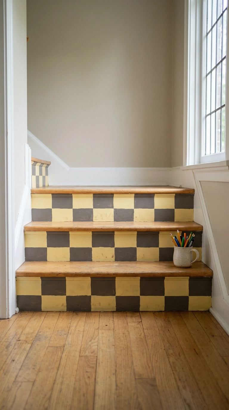
Checkerboard has been everywhere for a few years now and it has earned its keep, mostly because it is forgiving. Slightly wobbly hand-painted squares look charming in a way that a slightly wobbly stripe never does.
12. Horizontal Color-Block: Half Cream, Half Rust
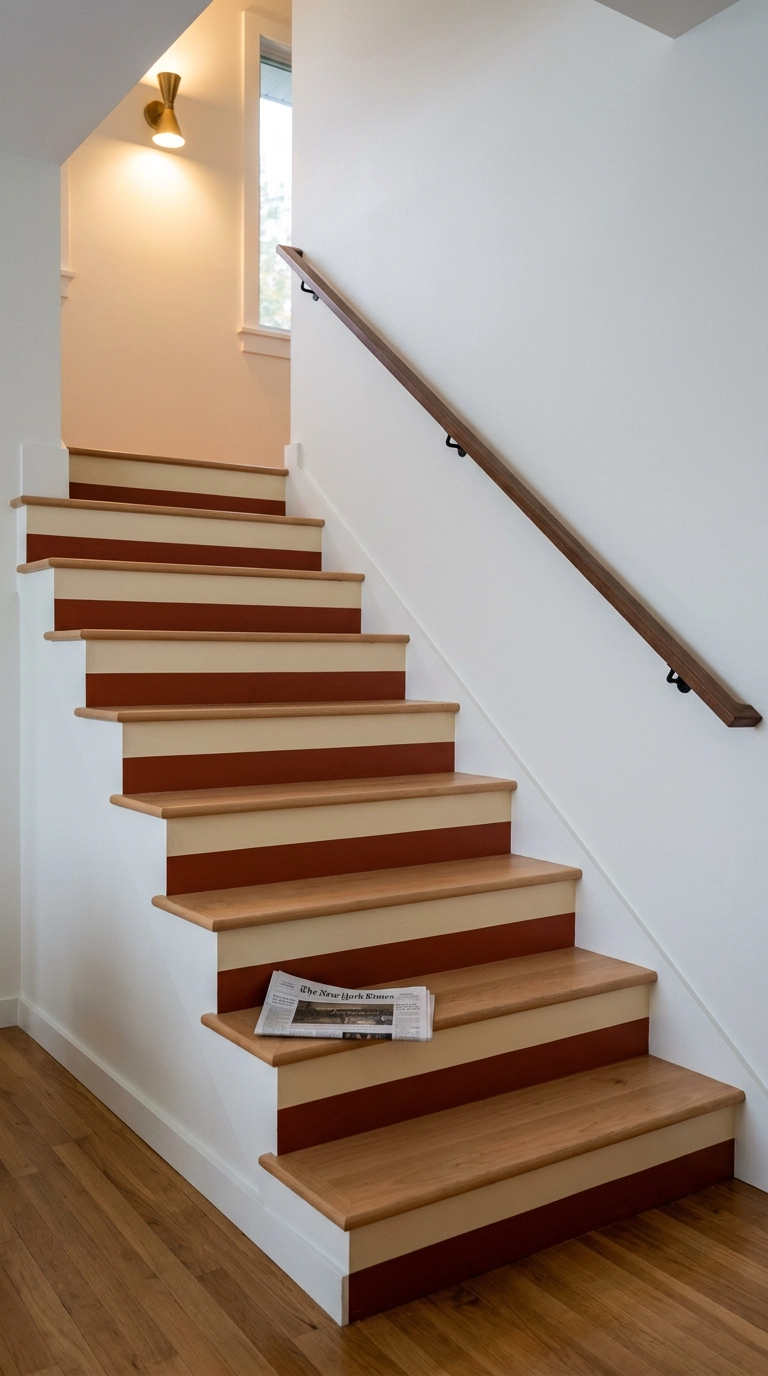
This one is my favorite low-effort trick for people who want color without pattern. Two colors, one tape line per riser, and the darker half at the bottom hides the inevitable toe scuffs where shoes catch the base of the step.
13. Color-Drenched Risers That Match the Wall
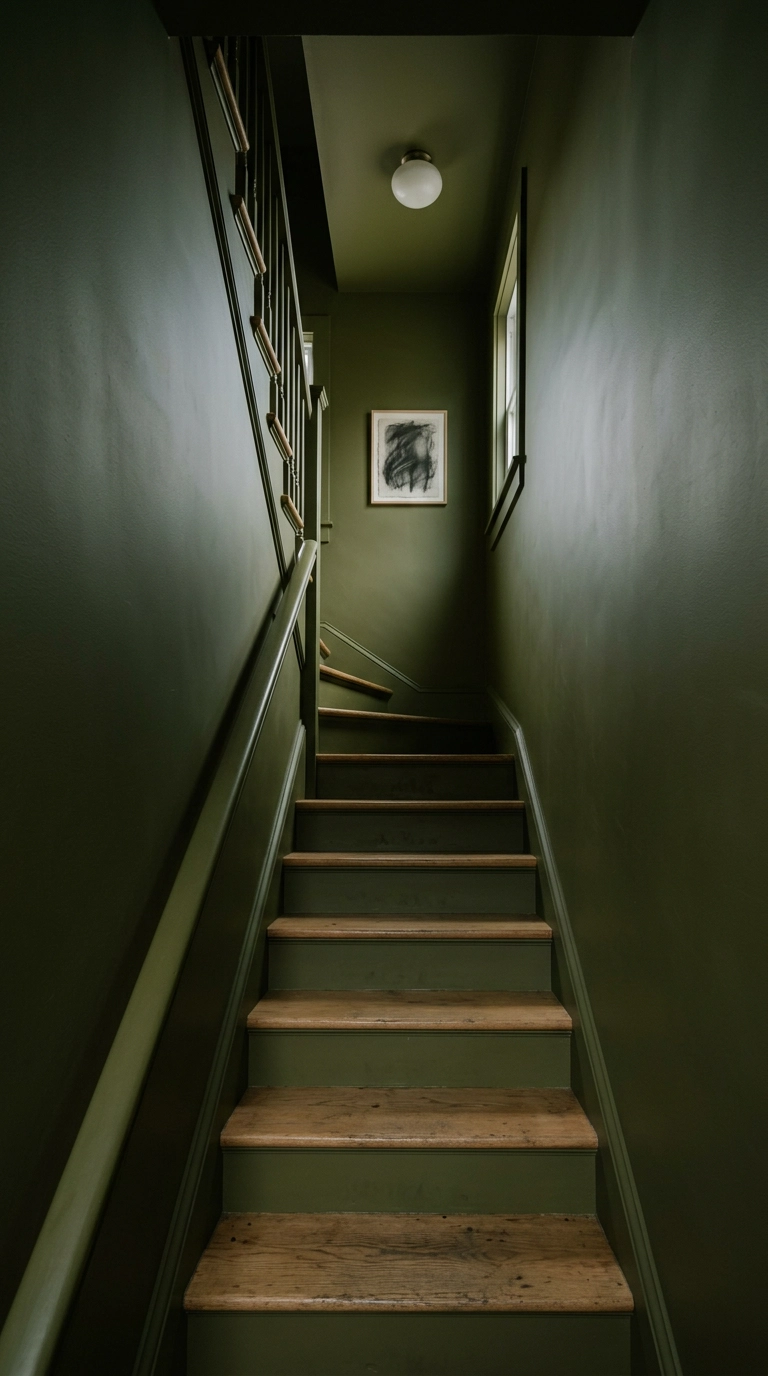
Color drenching means putting one shade on the walls, trim, and risers so there are no visual breaks, and in a cramped stairwell it is transformative. The edges dissolve, and a narrow space stops announcing how narrow it is.
14. Terracotta Zellige-Look Tile on the Riser Faces
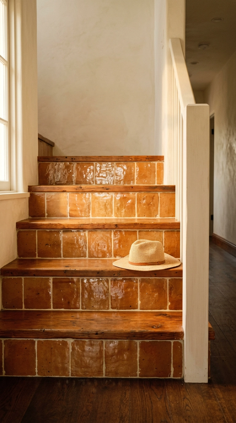
Zellige on a riser is a splurge, but it is the one material here that changes with the light all day because the glaze is deliberately uneven. Morning light makes it look flat and matte, late sun makes it glow.
15. Genuine Cement Encaustic Tile in Navy and Bone
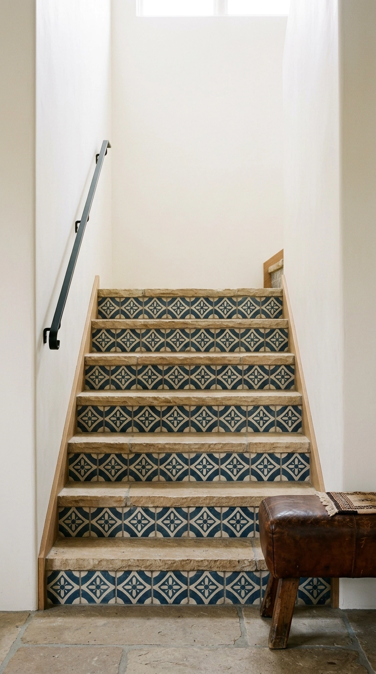
This is the permanent, do-it-once version of idea number one, and it looks it. Real cement tile has depth and slight color variation that no printed decal reproduces, and it will outlive the house.
16. Repeating Scalloped Arch Motif
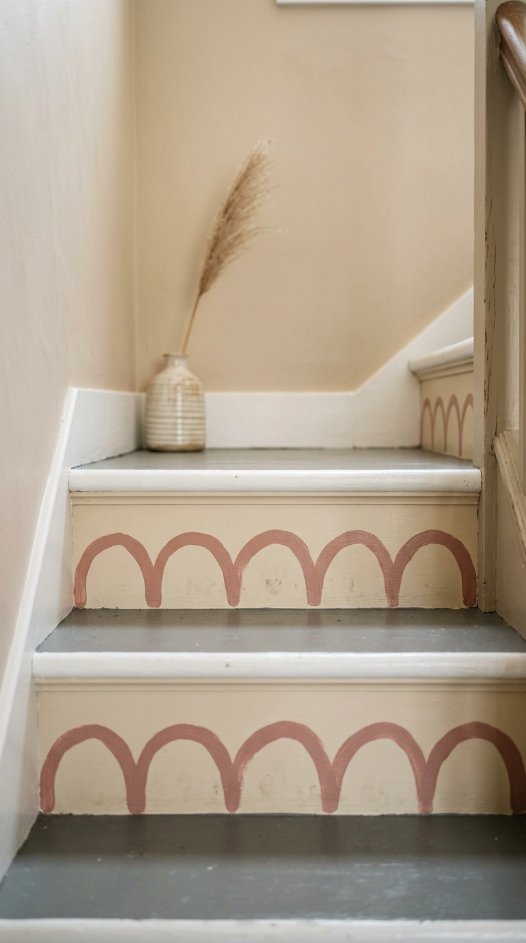
Scallops are having a long moment and they suit a cottage or a kid-adjacent hallway without tipping into theme-park territory. Trace a jar lid or a roll of tape for your curve template and you will get a consistent arc every time.
17. An Abstract Graphic Sequence Up the Flight
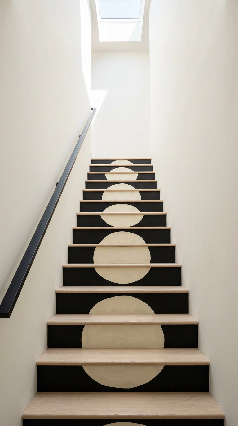
Numbered stairs are a classic, but I usually steer clients toward a shape sequence instead: a circle, a bar, or a dot that moves or grows as you climb. It gives you the same rhythm and progression without dating the staircase to a specific trend year.
18. Grasscloth-Look Texture Instead of Pattern
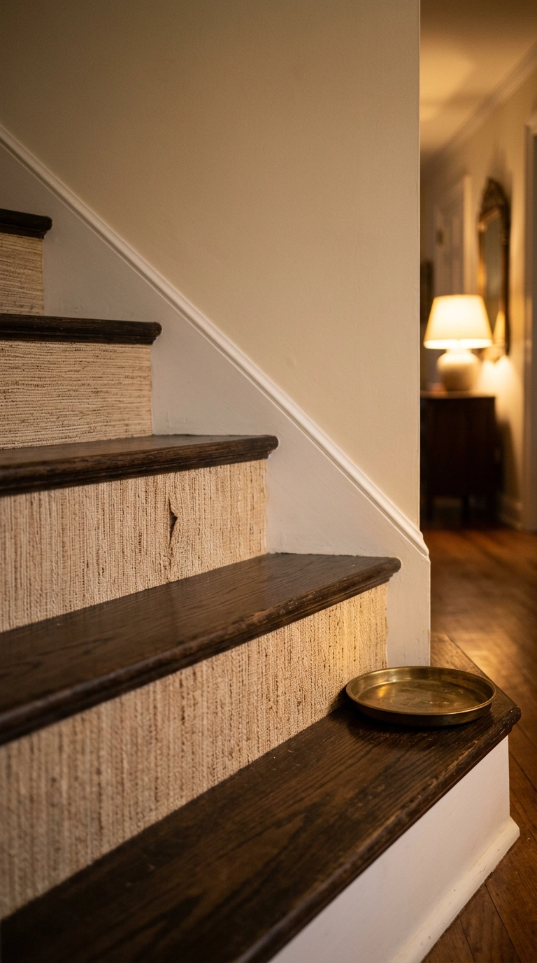
Not every riser treatment needs a pattern. A woven texture in a single neutral catches raking light and gives you interest that changes through the day, which is exactly what a hallway with one weak light source needs.
19. Beadboard Paneling Painted Soft Sage
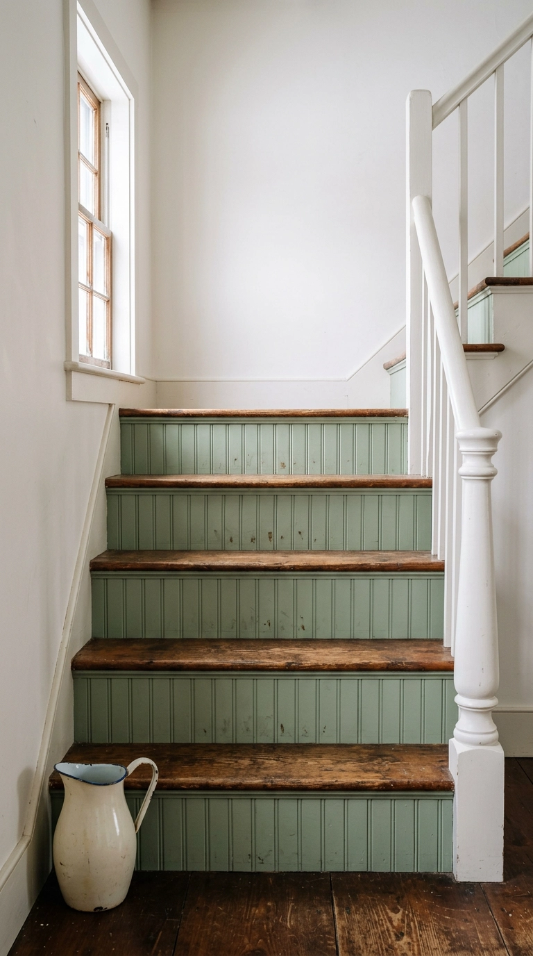
Thin beadboard panel, cut to riser height, glued and pin-nailed on, then caulked and painted. It adds architecture to a builder-grade staircase for the price of one sheet of paneling and looks like it came with the house.
20. Deep Green Risers with a Slim Brass Edge
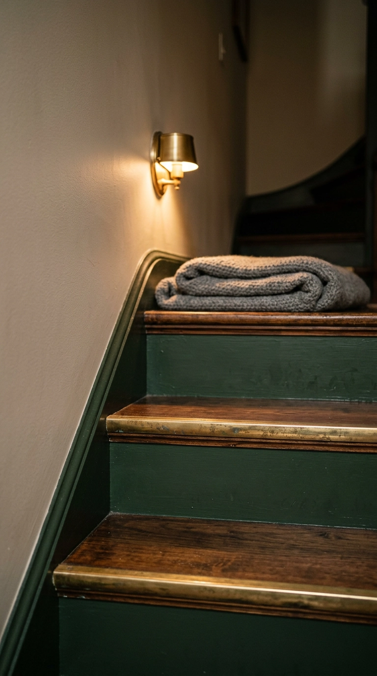
A thin metal strip along the top of each riser is a hotel-lobby move that scales down beautifully to a house. It catches light exactly where your foot is about to land, so it is one of the rare decorative details that also improves step visibility.
21. One Continuous Painted Arc Across the Whole Flight
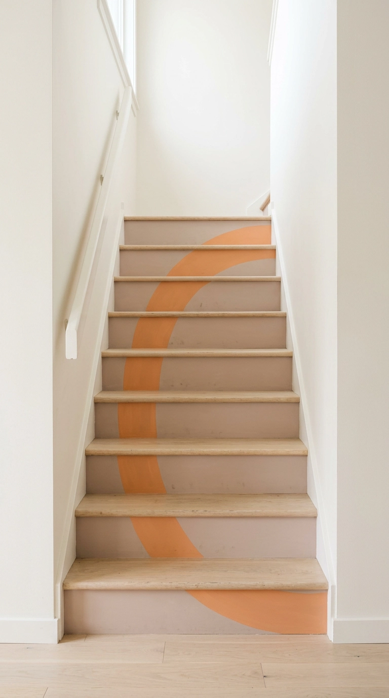
This is the idea people stop and stare at. You treat the entire stack of risers as one canvas and paint a single shape across it, so the flight only resolves into an image when you stand back at the bottom.
22. Deliberately Mismatched Patterns in One Palette
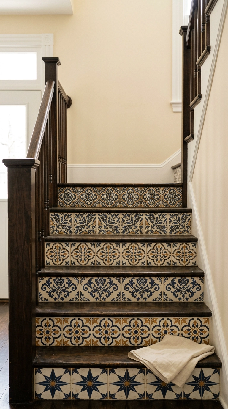
Maximalism on stairs only works with a rule, and the rule is palette. Every riser can wear a different pattern as long as they all share the same two or three colors, otherwise you get visual noise instead of a collection.
23. Chalky Limewash Risers in Soft Clay Pink
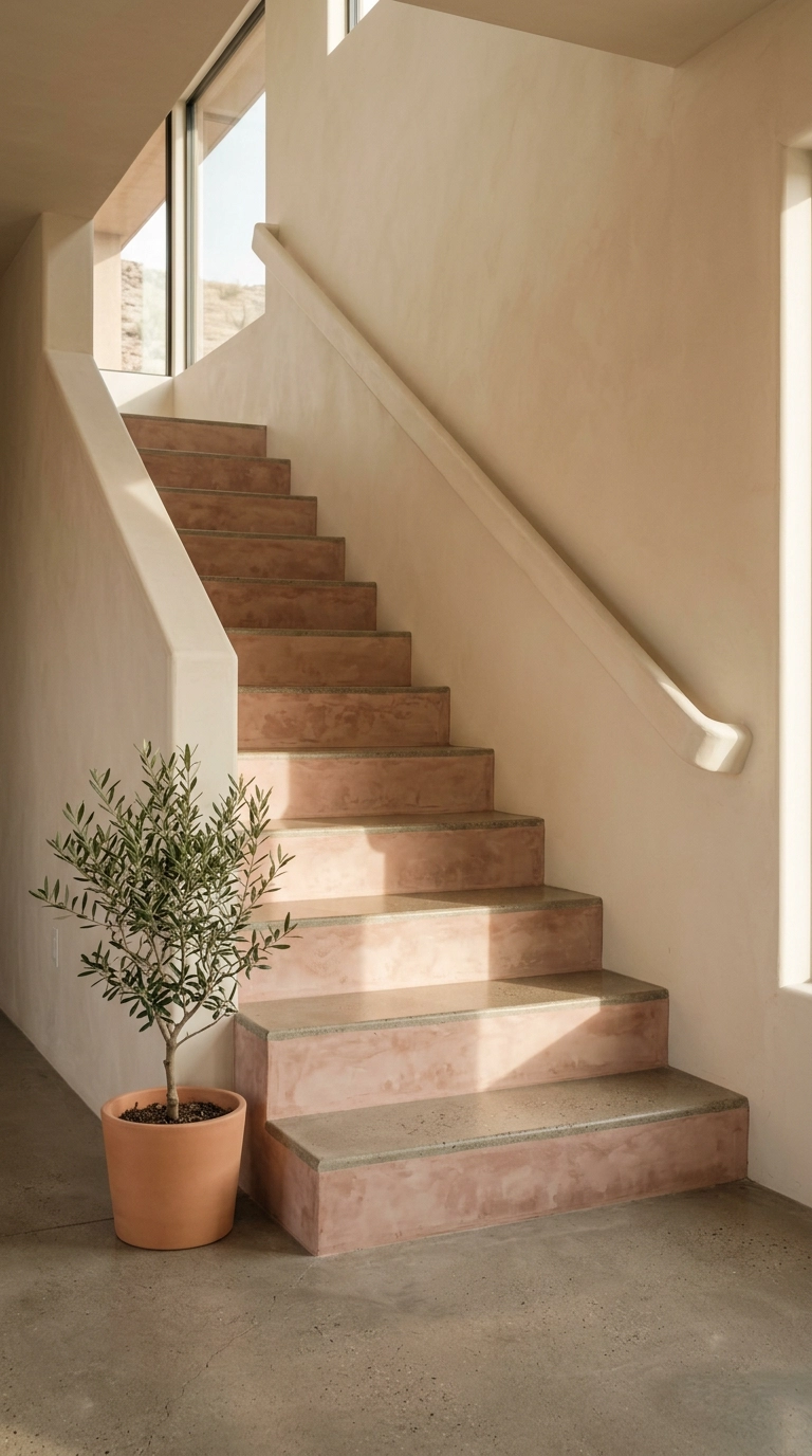
Limewash on a riser gives you a soft cloudy depth that flat paint cannot fake, and it suits homes with plaster walls or a warm southwestern lean. Brush it on in loose crosshatch strokes and let it be uneven, because uniform limewash defeats the entire purpose.
24. Painted Risers That Repeat Your Runner’s Border Color
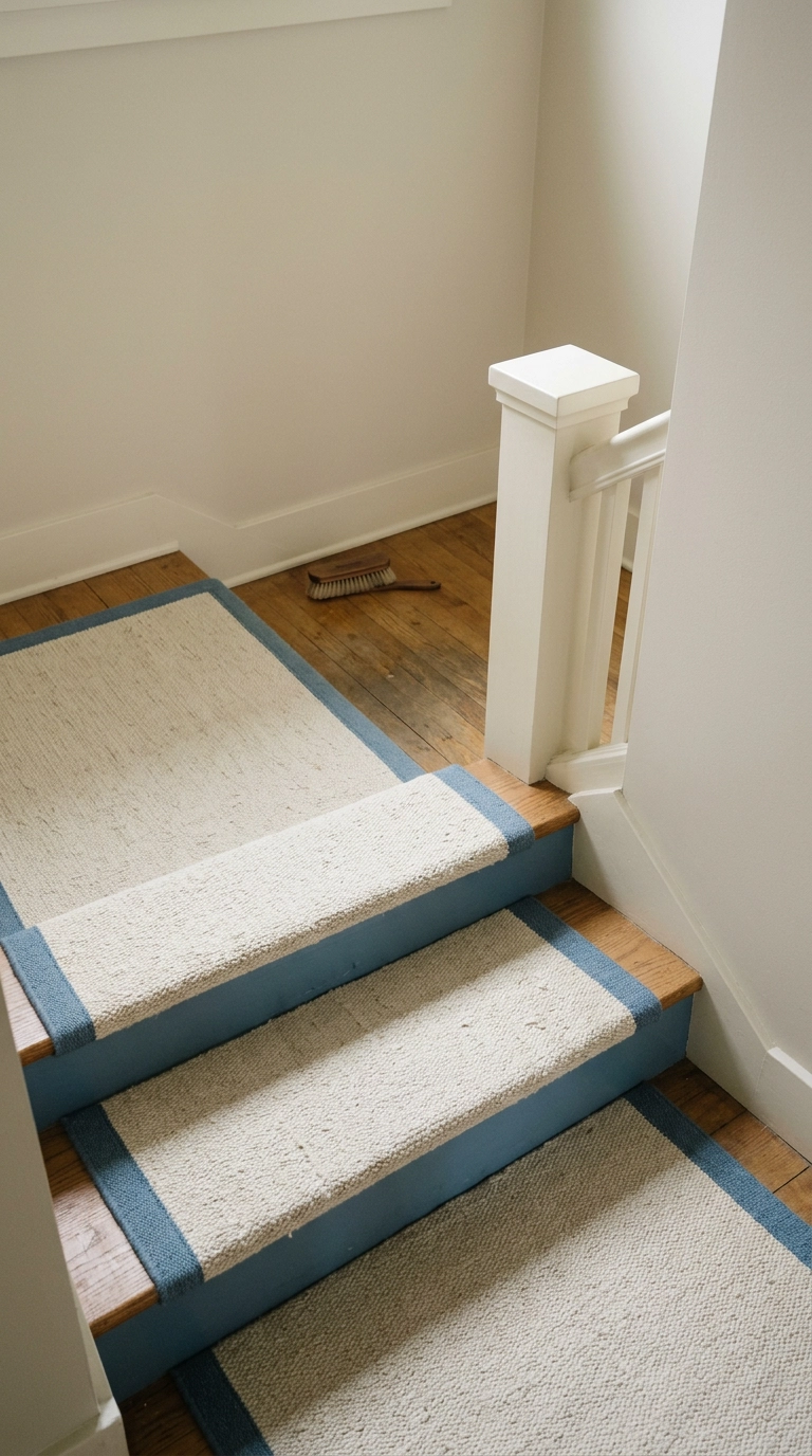
If you already own a runner you like, pull one color out of its border and put that exact shade on the risers. It makes a cheap runner look custom, because the eye reads repetition as intention.
Before You Reach for the Paintbrush
I want to leave you with the practical stuff, because a staircase is the one project where enthusiasm outruns preparation. Measure every riser individually, prime properly, and use a satin or semi-gloss on anything painted so you can actually wash a scuff off instead of repainting. And whatever you do, keep the treads readable underfoot, because a pattern so busy that you cannot tell where one step ends and the next begins is a genuine hazard for kids and older adults, not a design choice.
If I had to bet on what dominates [year], it is the quiet stuff: tonal gradients, single accent risers, and texture instead of pattern. But the loud looks are not going anywhere either, and I have watched patterned cement risers show up in everything from Athena Calderone’s layered New York interiors to the tiled entry stairs at half the boutique hotels in Charleston. The through line is always the same, which is a plain wall doing the quiet work behind a riser that gets to be the star.
My honest advice: start with the bottom step. Paint one riser on a Tuesday evening, live with it for a week, and see whether you keep smiling at it on your way to the kitchen. If you do, you will find the whole flight is just that Tuesday repeated twelve times, and if you want more ideas like this in your inbox before you commit, sign up for my weekly newsletter and I will send you the good ones first.


