27+ White Nursery Decor Ideas that are Soft, Textural, and Never Sterile

Every parent-to-be who tells me they want a white nursery also tells me they’re worried it’ll end up looking like a hospital room, and honestly, that fear is fair if all you do is paint everything the same flat white. The trick I use over and over is texture: a white room only works when your eye has different surfaces to land on. Here’s every version of that trick I’ve actually built.
White Nursery Decor Ideas
1. White Board and Batten Below a Chair Rail
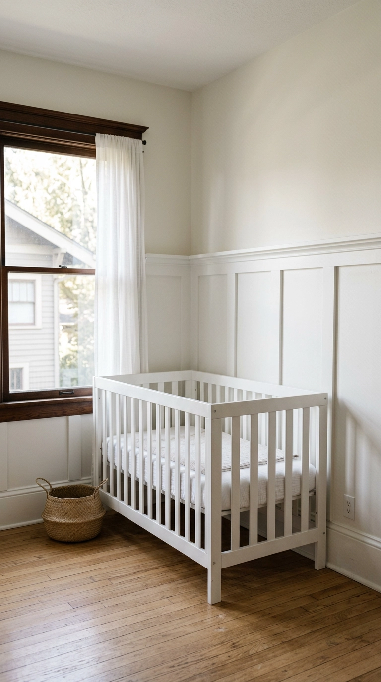
Board and batten in the same white as the wall above it still reads as texture because the raised molding catches shadow even without a color contrast, which is exactly what keeps an all-white room from going flat. Budget a full weekend for the millwork install, and use a matte finish on the wall above so the sheen doesn’t fight the crisp trim paint.
2. White Wainscoting with Textured Wallpaper Above
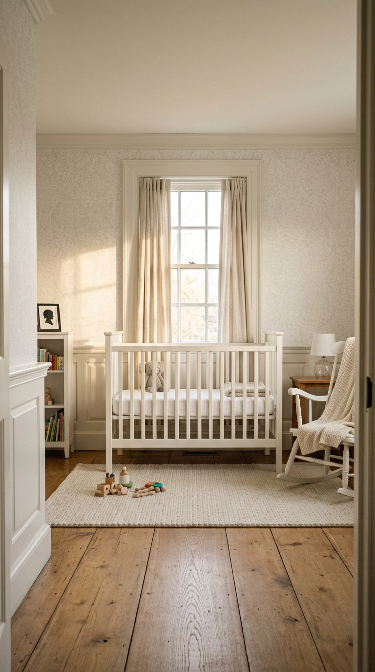
A tonal wallpaper above the rail gives you pattern without introducing a single new color, so the room stays genuinely all-white while still having something more interesting to look at than flat paint. This is a bigger project since you’re adding real millwork, so plan more than one weekend.
3. Color-Drenched White Walls and Ceiling in One Tone
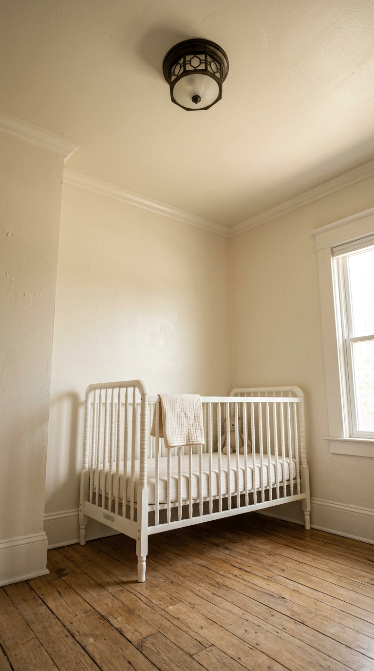
Painting the ceiling the exact same white as the walls erases the corner line where they meet, which is the same trick that works in any small boxy room, and it’s what keeps this from reading as a leftover white ceiling nobody bothered finishing. It’s genuinely one extra can of paint and one extra day of taping beyond a standard job.
4. Limewash Textured Plaster Walls in Warm White
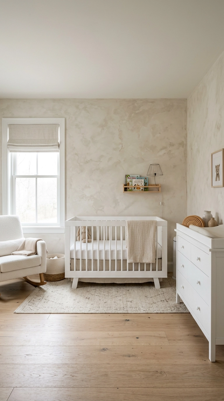
This is the single best fix for the sterile-white worry, since the mottled, handmade quality of limewash means no two square feet of wall look identical, and that variation alone reads as warmth. It’s a specialty technique worth hiring out unless you’ve practiced the plaster brush technique somewhere lower-stakes first.
5. White Boucle Glider with a Warm Wood Frame
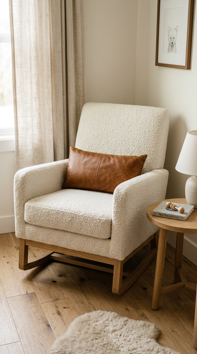
Keeping the wood legs visible rather than fully upholstering the chair is the small detail that grounds an all-white glider instead of letting it disappear into the wall behind it. This is the piece you’ll actually touch every day, so it’s worth the higher price tag more than almost anything else in the room.
6. Fluted White Closet Doors
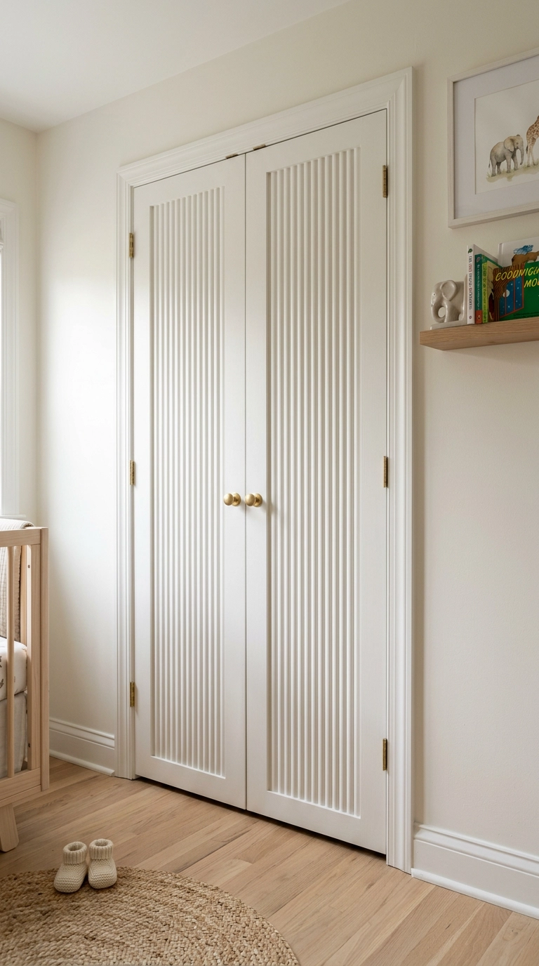
Fluted panel doors catch shadow along every groove even when painted a single white, so you get real dimensional texture on a surface most nurseries treat as an afterthought. Swapping flat doors for fluted ones is a moderate carpentry project, though pre-made fluted door panels are available if you’re not building from scratch.
7. White Shiplap Accent Wall Behind the Crib
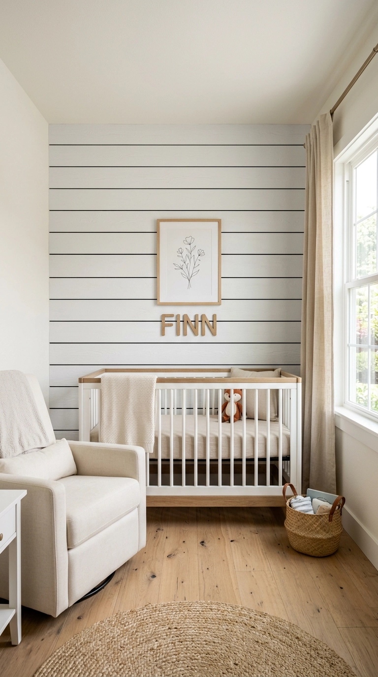
Shiplap’s small shadow gaps between boards do the same texture job as board and batten but read a little more casual and farmhouse, which matters if the rest of your home already leans that direction. It’s a genuinely doable weekend project for a single accent wall.
8. White Crib with Unlacquered Brass Hardware
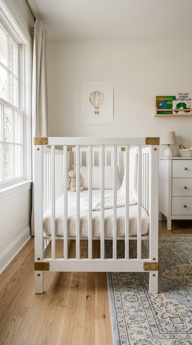
A crib with exposed brass joinery gives the room’s biggest piece of furniture a small warm-metal detail without adding an entirely separate accent item elsewhere. Unlacquered brass will tarnish naturally over time, which some parents love and others don’t, so it’s worth deciding upfront rather than being surprised a year in.
9. White Faux Fur Rug Layered Over Jute
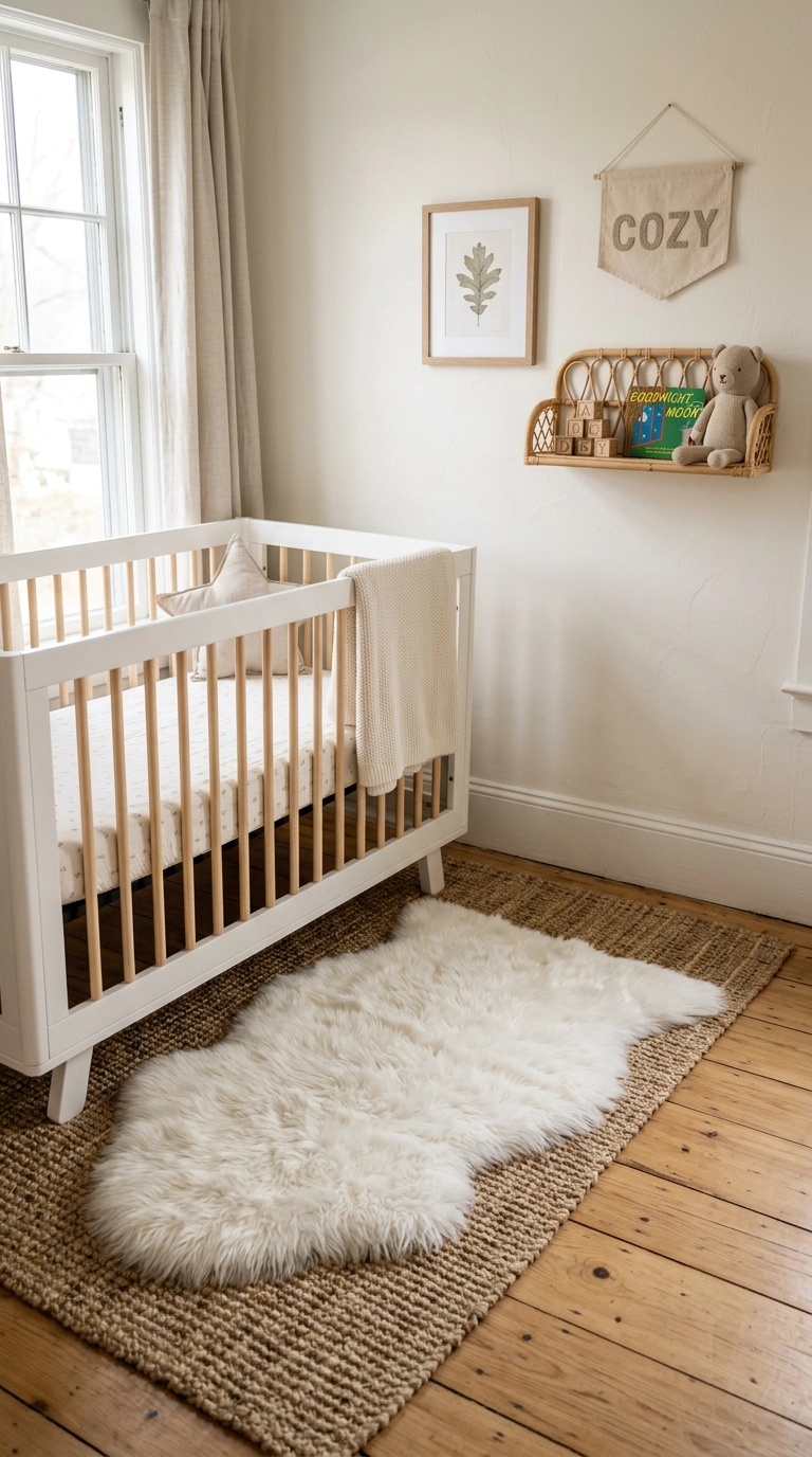
Layering a soft white faux fur over a natural jute base gives you two textures and two tones without introducing a new color, and the jute peeking out at the edges keeps the pairing from reading as one flat white shape on the floor. It’s a genuine twenty-minute swap and one of the cheapest texture upgrades on this list.
10. Tone-on-Tone Gallery Wall in White Frames
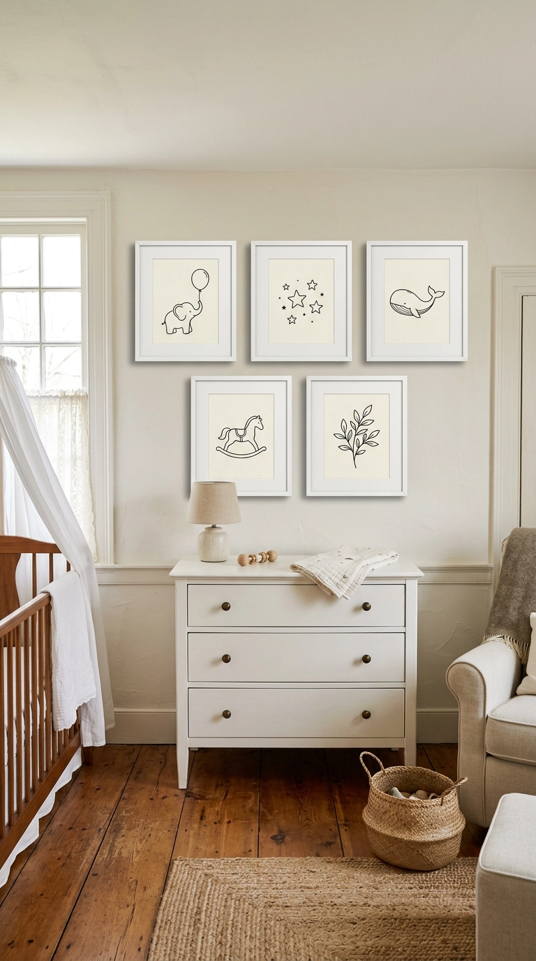
White frames against a white wall rely entirely on shadow and the art’s own contrast to read, which forces you to choose genuinely good line work instead of leaning on a frame color to do the heavy lifting. Budget a full weekend once you count sourcing prints and carefully leveling five frames.
11. White Linen Curtains Hung High Near the Ceiling
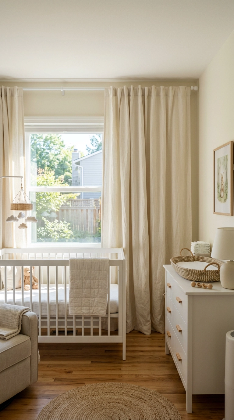
Linen’s natural texture and slight wrinkle is what keeps white curtains from looking flat and papery the way a cheap poly-blend panel does, and hanging the rod high near the ceiling makes a standard 8-foot nursery feel taller. Add a blackout liner behind these if the room needs true nap-time darkness.
12. Exposed White-Painted Ceiling Beams
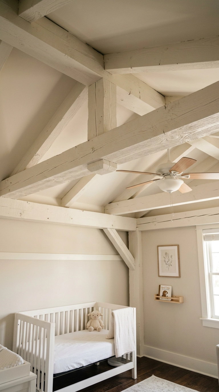
Painting existing beams white instead of leaving them stained wood keeps the room’s palette genuinely all-white while the beam’s raised shape still gives the ceiling real dimension. This only makes sense if the beams already exist structurally; it’s not worth adding fake ones purely for the look.
13. White Bookshelf Styled with Neutral-Spine Books
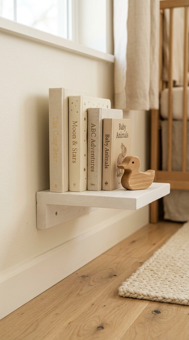
Choosing books with cream or neutral spines instead of bright primary colors keeps the shelf from becoming the one loud element in an otherwise quiet room, while still giving a toddler-eye-level shelf real personality up close. Four or five larger pieces with visible gaps is the ceiling here; past that it reads as storage overflow.
14. Pom Pom Trim Detail Along Plain White Curtains
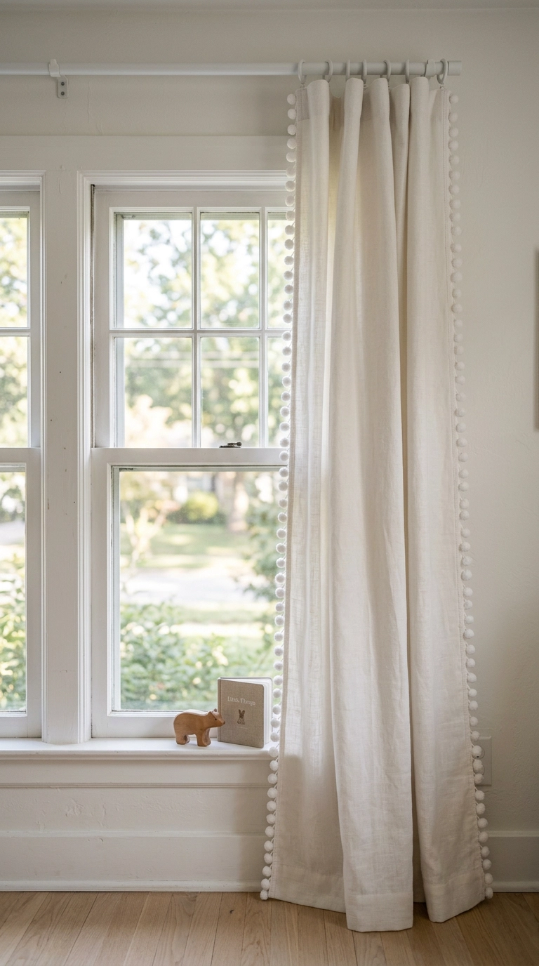
A single trim detail is enough to keep plain curtains from reading as an afterthought, and it’s a small enough gesture that it doesn’t tip a serene white room into overly cute. This is a genuinely cheap sew-on or iron-on addition to curtains you may already own.
15. Scalloped Shelf Edge Above the Changing Table
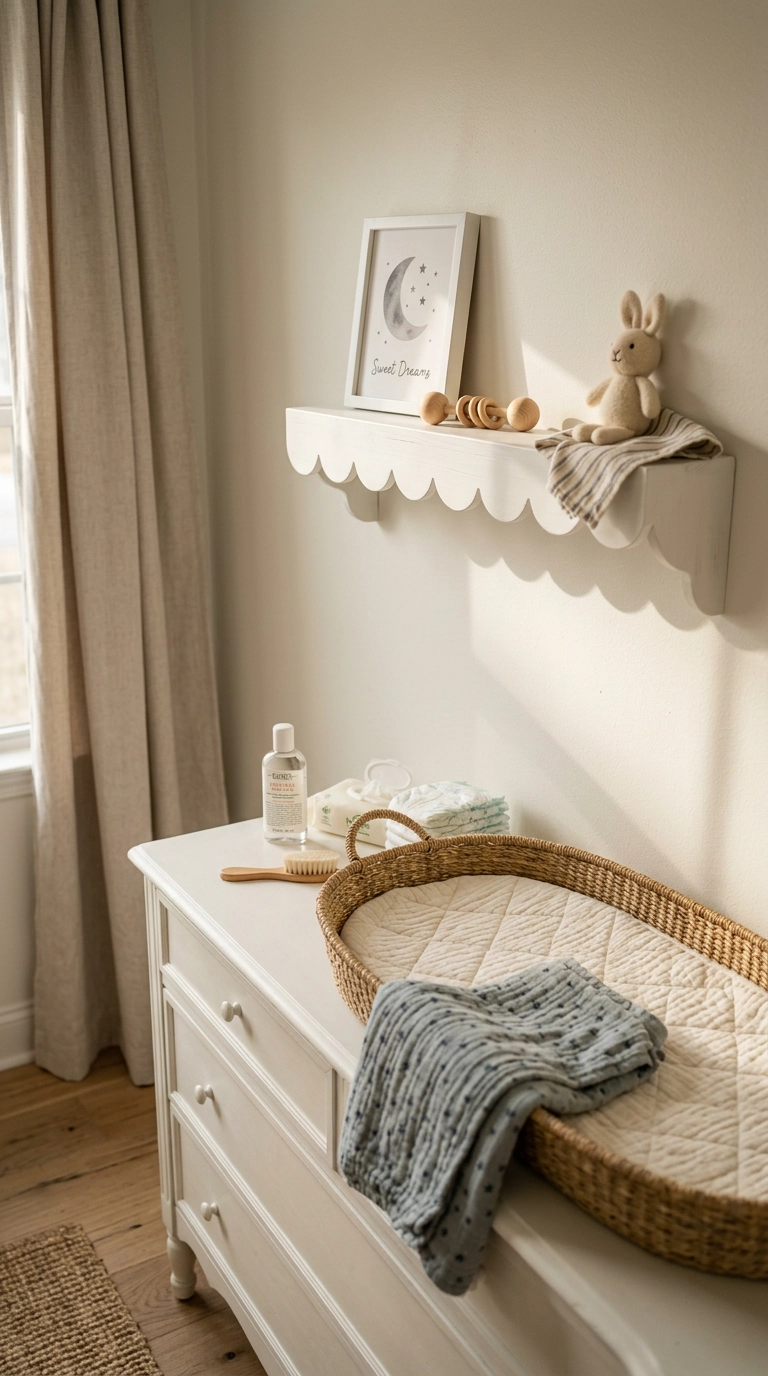
A scalloped edge on an otherwise plain shelf is a small custom-feeling detail you can cut yourself with a jigsaw and a simple template, so it’s one of the more approachable DIY upgrades on this list. Keep what sits on it minimal; the shape itself is the decoration.
16. White Painted Arch Nook for the Crib
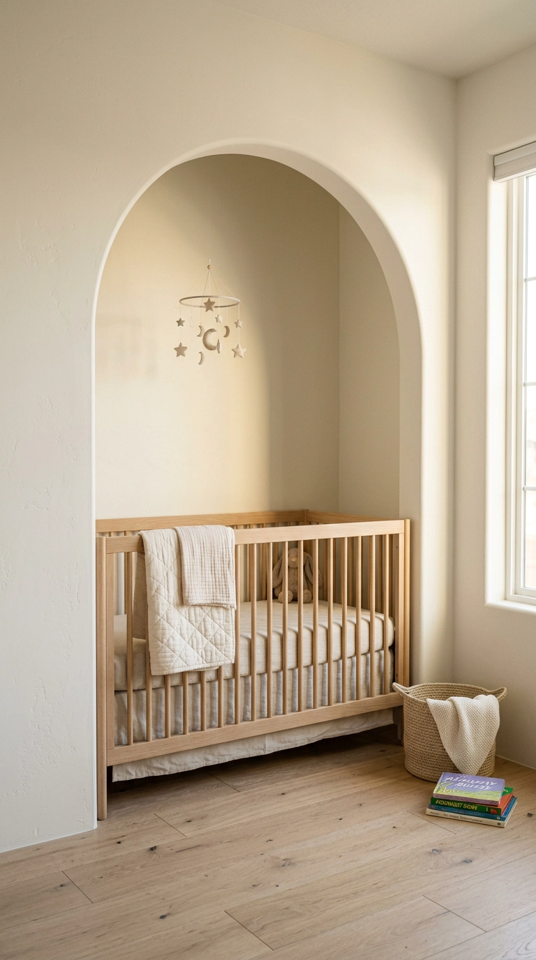
Even without a color contrast, an arched niche creates enough shadow and depth around the crib to make it the room’s obvious focal point. This is a real construction project if you’re building the niche from scratch, so it only makes sense where the nook already exists.
17. Framed Wallpaper Panel Behind the Crib
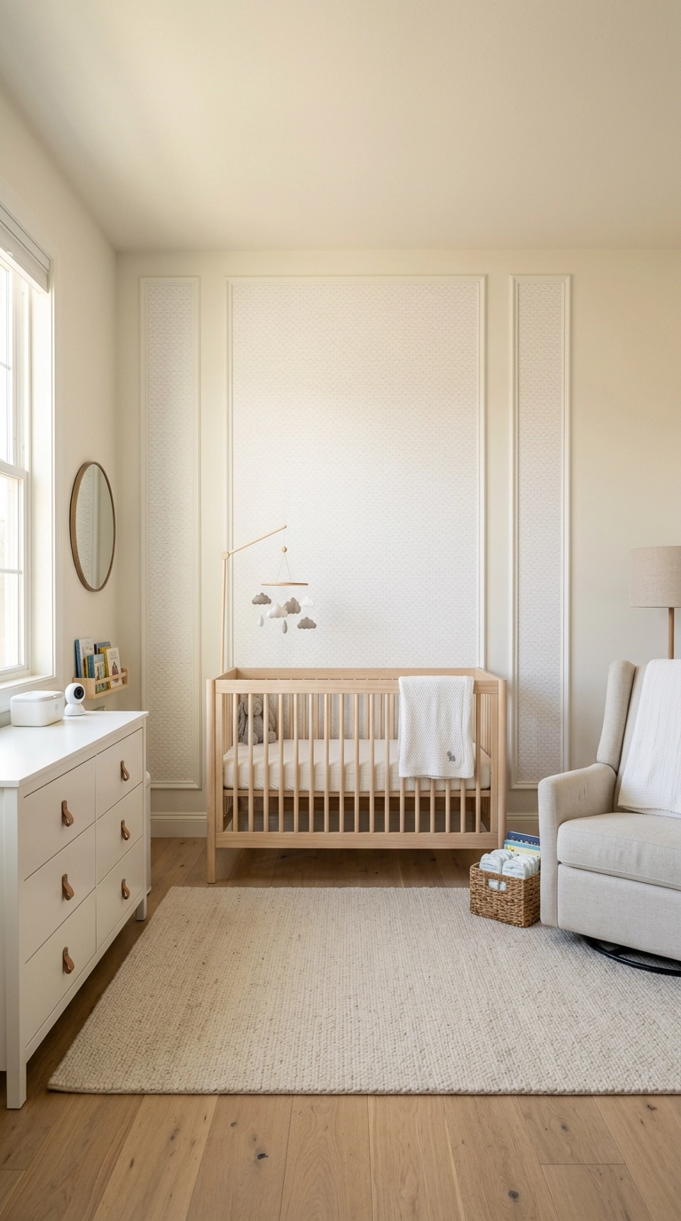
Framing a small textured wallpaper panel like art, rather than papering the whole wall, gives you one roll’s worth of pattern and a genuinely custom-millwork look for a fraction of the cost of a full accent wall. It’s a full weekend project once you count the molding and paint.
18. White Ceiling Medallion Around a Simple Fixture
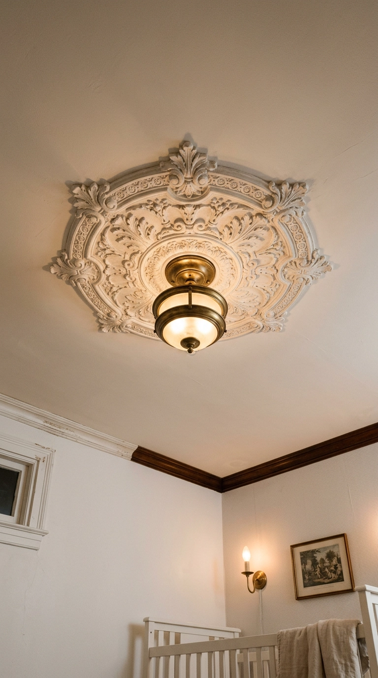
Leaving an existing medallion in its raw plaster texture instead of painting it flush white keeps a subtle but real dimensional detail overhead that a flat white paint job would otherwise erase. This only works if the medallion already exists; it’s a preservation move, not a new install.
19. Woven White-Washed Storage Baskets
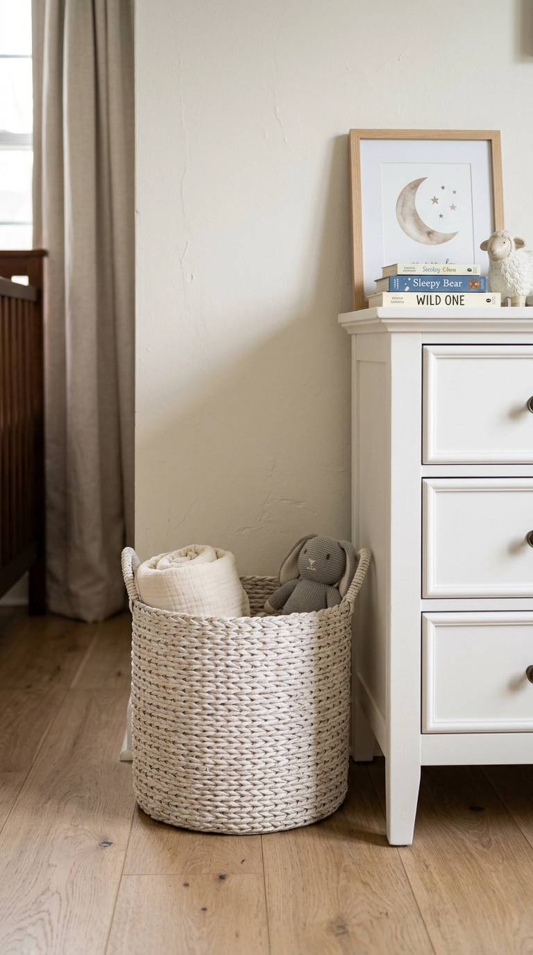
A white-washed finish still lets the natural weave pattern show through, so the basket reads as texture rather than a flat white blob the way a solid-painted version might. One basket within reach of the changing table is enough; more starts to look like overflow storage instead of styling.
20. White Wooden Name Sign with Subtle Texture
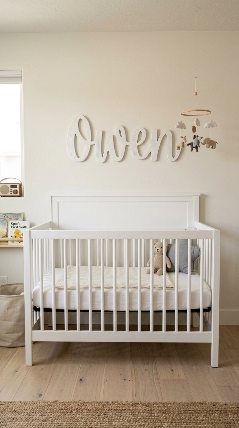
A carved or routed texture under the white paint gives a name sign shadow and depth that a flat laser-cut version won’t have, which matters since it’s usually the single largest piece of wall art in the room. Center it on the crib, not the wall, since the crib is what anchors the composition.
21. Textured Ceramic Lamp on the Dresser
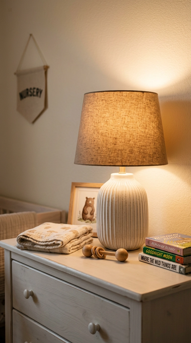
A ribbed or textured ceramic base catches light and shadow along its grooves even in a room with no color contrast at all, doing real styling work that a smooth glossy lamp base can’t manage on its own. This is a genuinely easy, low-cost swap if you’re just replacing an existing lamp.
22. Whitewashed Exposed Brick Accent Wall
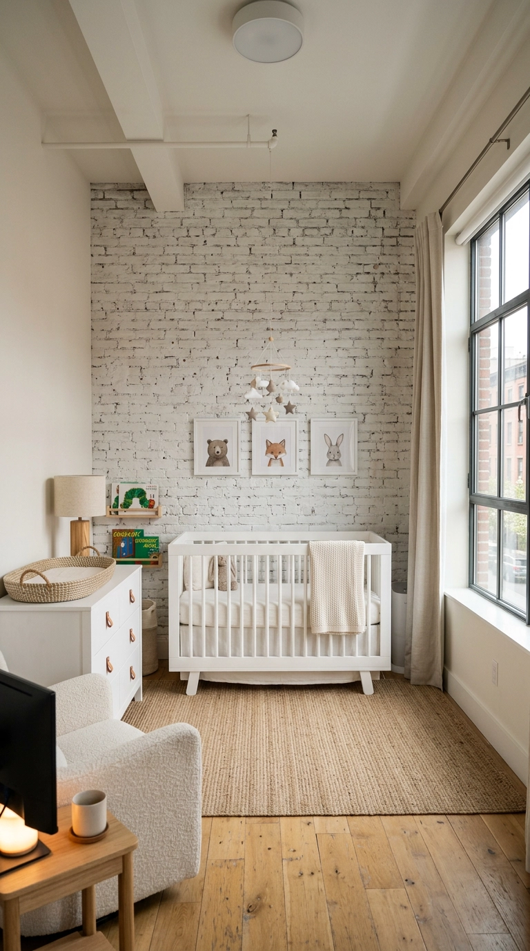
A whitewash technique, rather than a solid coat, lets the brick’s original texture and slight color variation show through, which is what keeps this from looking like painted drywall pretending to be brick. This only makes sense if you already have real exposed brick; it’s not worth faux-finishing drywall to fake it.
23. Sheer White Canopy Drape Over the Crib
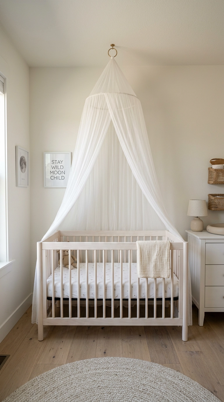
A sheer canopy adds real fabric volume and movement above the crib without introducing any color, and it’s genuinely one of the softest, most romantic details you can add to an otherwise minimal room. Always follow standard crib safety guidance and keep any canopy fully secured well out of reach.
24. White Rocking Chair with Cane Webbing
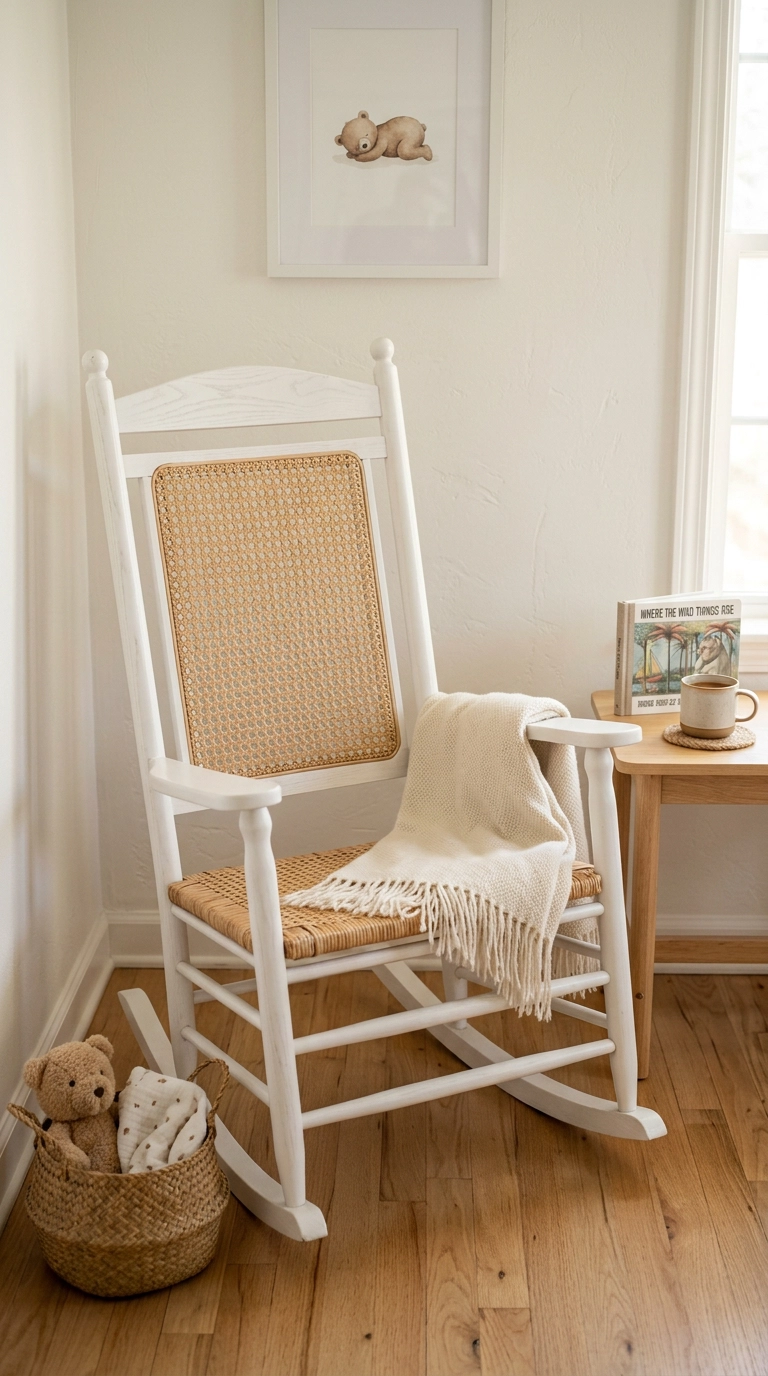
Cane webbing left in its natural tone against a white-painted frame gives a rocking chair genuine texture and warmth without breaking the room’s white palette. It’s a mid-range furniture cost and one of the easier pieces to find secondhand and repaint yourself.
25. Marble-Look Shelf Above the Changing Nook
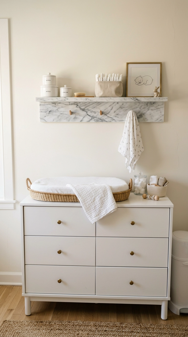
A shelf with real veining, even in an engineered marble-look material, gives a functional surface actual visual interest instead of one more flat white plank. It’s a mid-range material upgrade over painted wood, and it wipes clean easily, which matters more here than in almost any other room.
26. Scandinavian Minimalist White Nursery with One Wood Accent
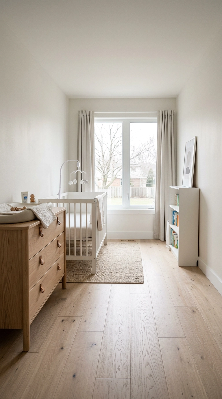
Limiting the room to exactly one warm wood piece is what keeps a Scandinavian-leaning white nursery from tipping cold, since that single material carries all the warmth the walls and crib don’t provide. This is the safest, most timeless version on the whole list if you’re white-curious but nervous about full commitment.
27. Fully Layered White Cocoon Nursery
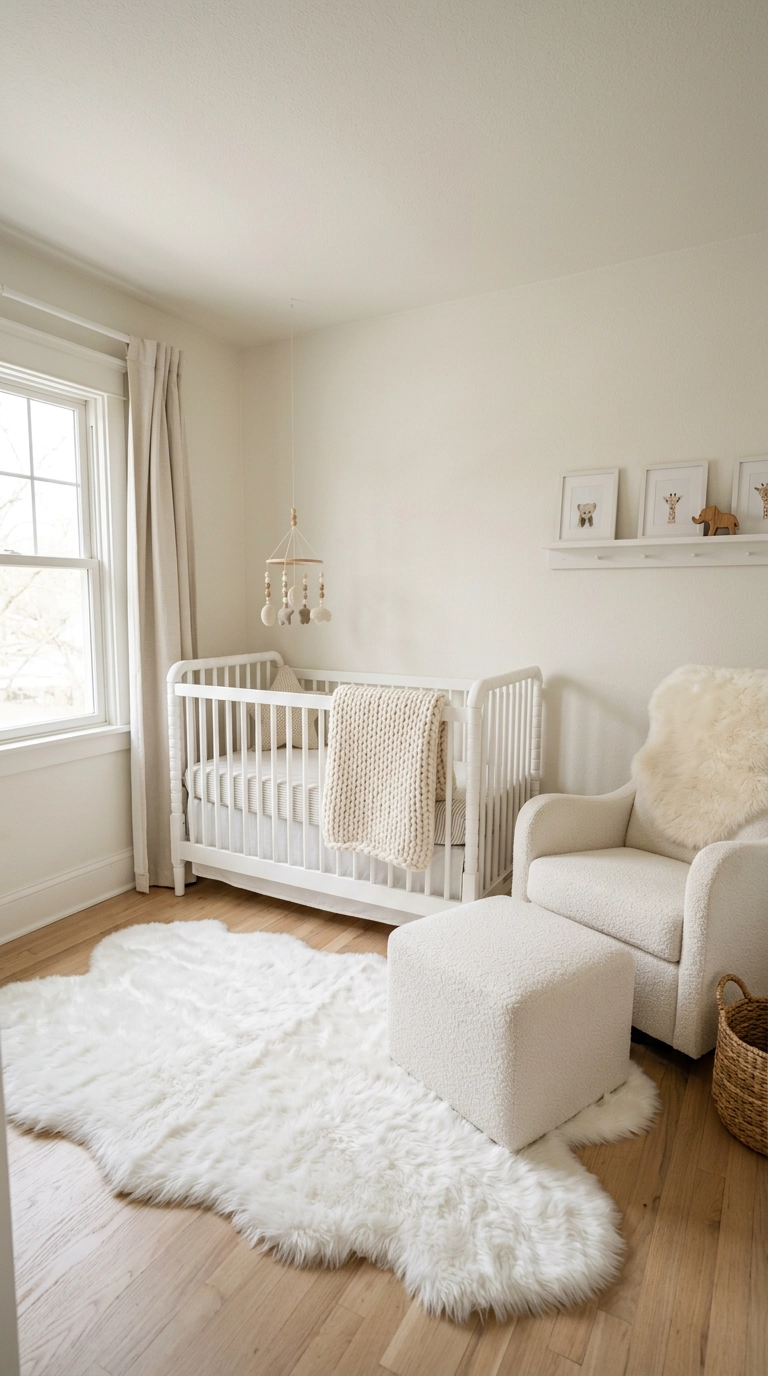
Saving this for last because it’s the hardest version to pull off and the most rewarding when it works: every single texture on this list stacked in one room, boucle, fur, knit, plaster, wood, so the eye has somewhere new to land every few feet even though the color never changes. This is the full splurge, both in budget and in the restraint it takes to keep everything genuinely white rather than sneaking in an accent color halfway through.
Texture Over Color
If there’s one thing I want every white-nursery parent to walk away with, it’s that texture is doing all the work color usually does. Limewash, boucle, cane, fluted panels, every idea above is really the same trick applied to a different surface, and that’s genuinely what separates a considered white room from a room that just ran out of paint colors.
My honest advice is to pick two or three textures max rather than trying every idea on this list at once; a room with too many competing textures can feel just as busy as one with too many colors. A shade like Benjamin Moore White Dove is the one I reach for most often as the base, warm enough not to read clinical, and it’s a good starting point if you want a name to hand your painter.
White gets written off as the safe, boring choice, but a well-textured white nursery is honestly one of the harder rooms to get right, which is exactly why it’s so satisfying when it works. If you want more nursery ideas like these before I publish them, sign up for my weekly newsletter and I’ll send new inspiration straight to your inbox.