
29+ Winter-Inspired Bedroom Color Ideas for Cozy Cold Nights

A winter bedroom refresh is about more than swapping in a heavier duvet. The right color can change how a room feels the moment the days get shorter and the light turns grey and thin. Some colors lean into that stillness — deep navy, charcoal, midnight black — while others push back against it with warmth, like mustard, terracotta, or champagne. Here are 30 different color directions to take a bedroom this winter, along with what to pair each one with to get the mood right.
1. Navy Blue
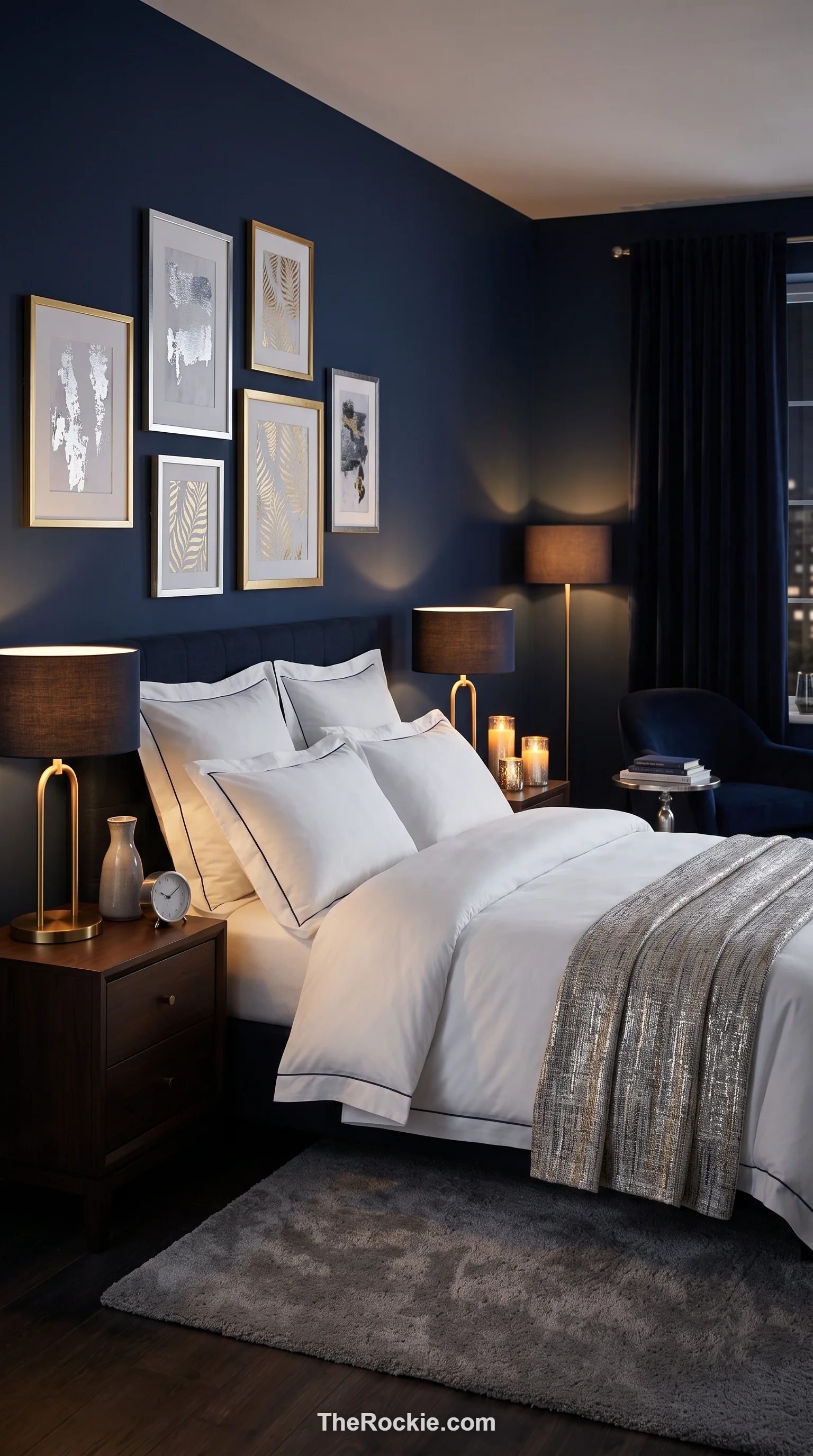
Navy has a grounding depth that suits the shorter days of winter, almost like the color of early twilight in January. On the walls, it creates a cocoon-like, secure feeling, and crisp white linens keep the contrast sharp rather than heavy. A little silver or gold hardware pushes the whole room toward high-end suite territory.
2. Sage Green
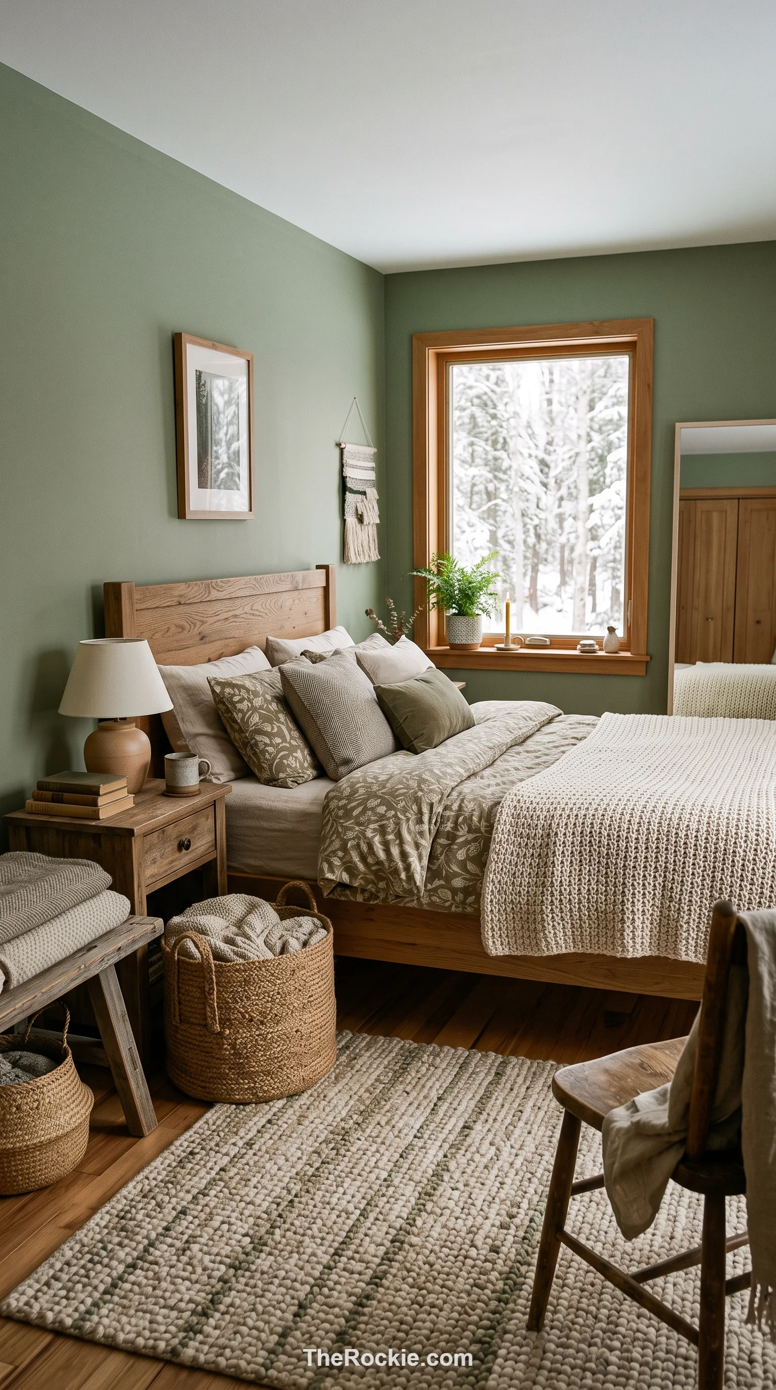
Sage brings a muted, frost-dusted evergreen quality indoors, and it’s soft enough to use across every wall without overwhelming the room. Wooden furniture and woven textures play up the organic feel, and because it’s such a gentle shade, it still reads as airy even with the winter light streaming in low and grey.
3. Charcoal Gray
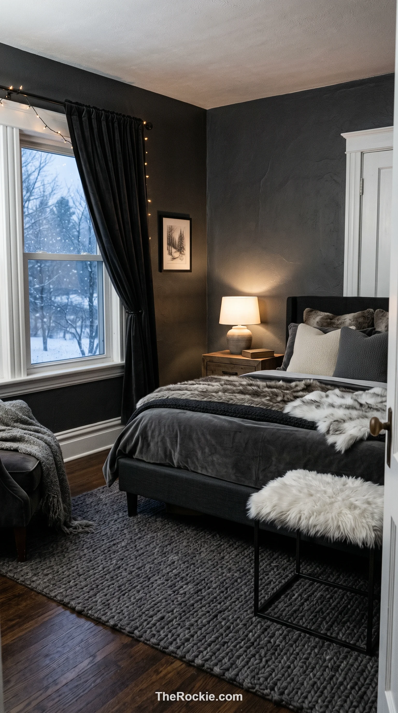
Charcoal adds drama and makes a big bedroom feel more focused and enclosed, which is exactly what you want during a snowstorm. It’s an excellent base for texture — wool, velvet, faux fur all show up beautifully against it — and bright white trim or light flooring keeps the whole look from feeling too heavy.
4. Warm White
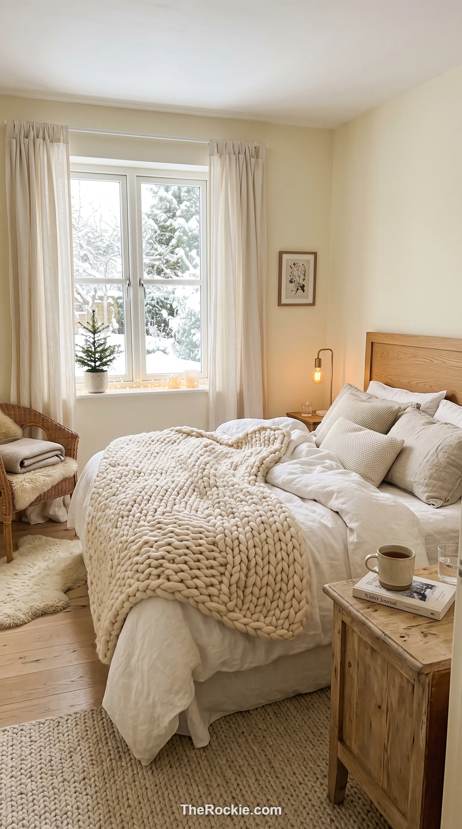
A warm white with a hint of yellow or red undertone avoids the clinical chill of stark gallery white while still reflecting whatever thin winter light comes through the window. Building depth through white-on-white textures — a chunky knit throw, linen curtains — keeps the room feeling like a soft cloud rather than a blank canvas.
5. Forest Green
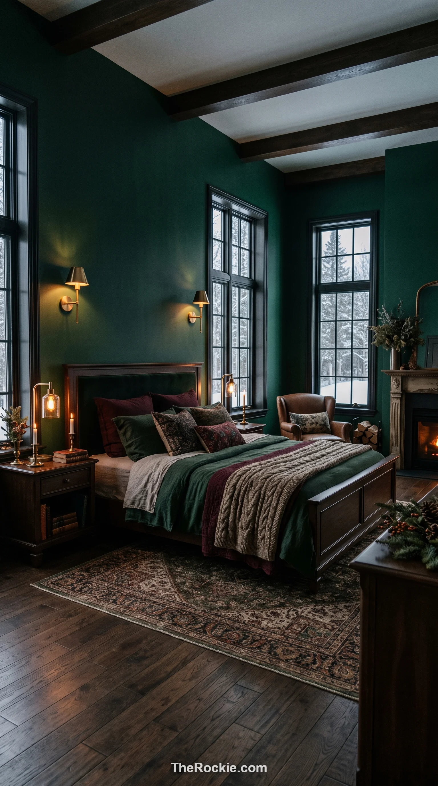
Forest green has enough weight to feel luxurious and permanent, especially in a room with high ceilings or big windows where it can really ground the space. Dark wood keeps it classic, while brass fixtures push it more contemporary — either way, the deep color makes a great backdrop for art.
6. Silver Gray
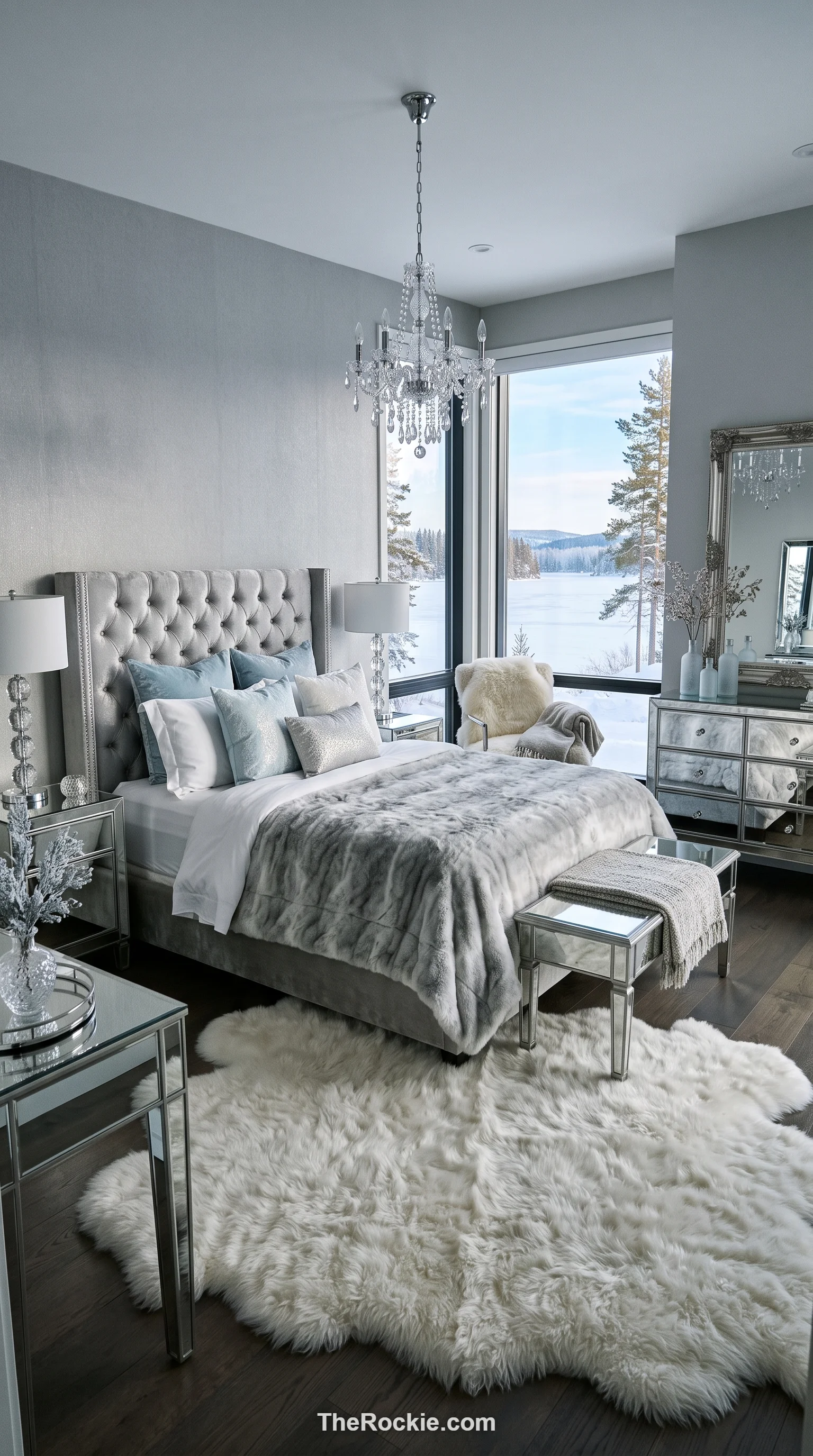
Silver gray has a shimmering, light-catching quality reminiscent of a frozen lake or morning mist, and it’s especially useful in smaller bedrooms since it helps the space feel more open. Mirrored furniture and glass accents lean into that reflective quality, while a sheepskin rug or flannel bedding keeps the room from feeling cold underfoot.
7. Dusty Rose
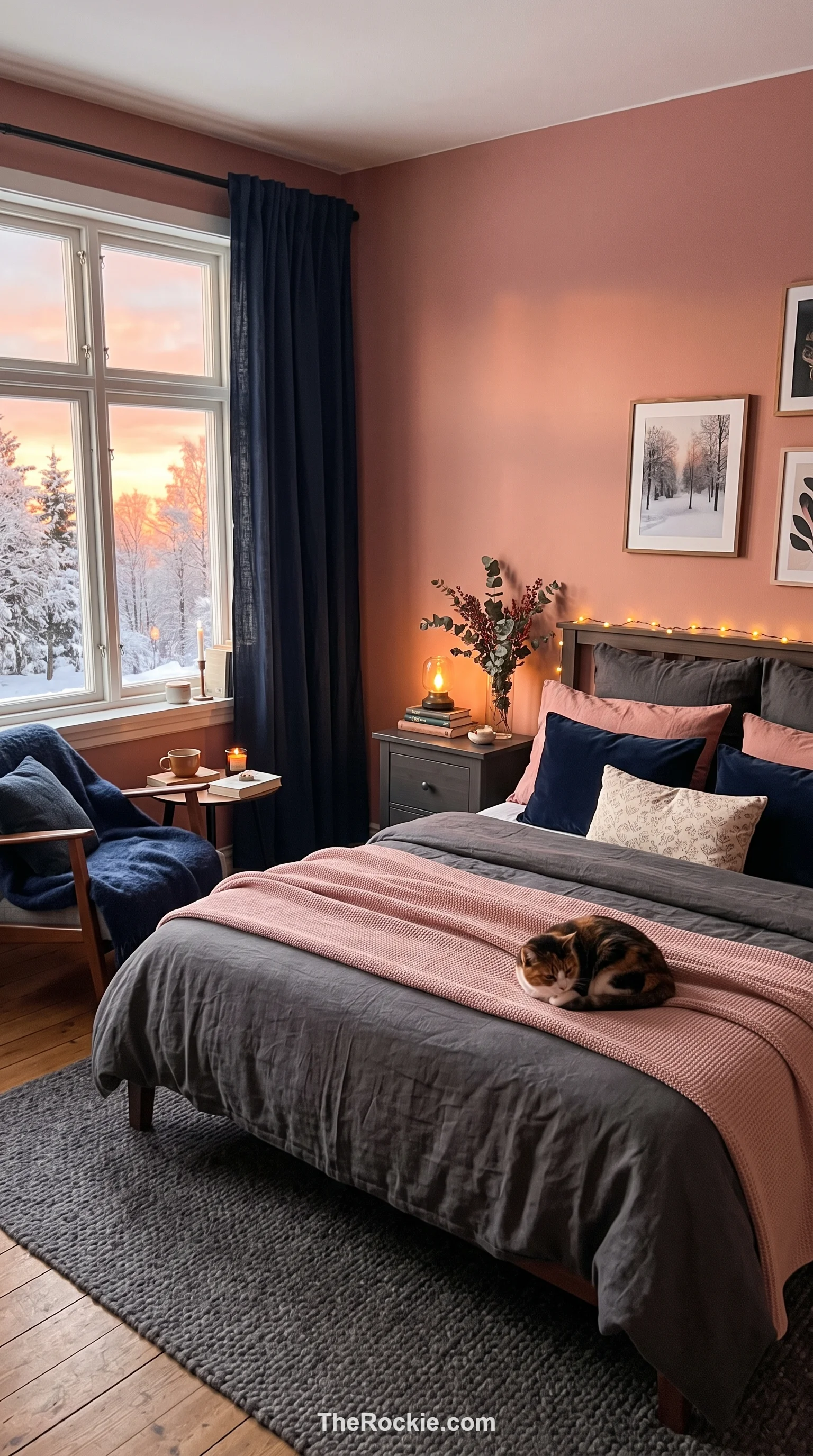
Dusty rose brings warmth without tipping into overly feminine or bright, thanks to its muted, gray-tinged undertone. It bridges warm and cool palettes easily, and pairing it with charcoal or navy creates a balanced, sunset-like glow that’s especially inviting on a slow winter morning.
8. Midnight Black
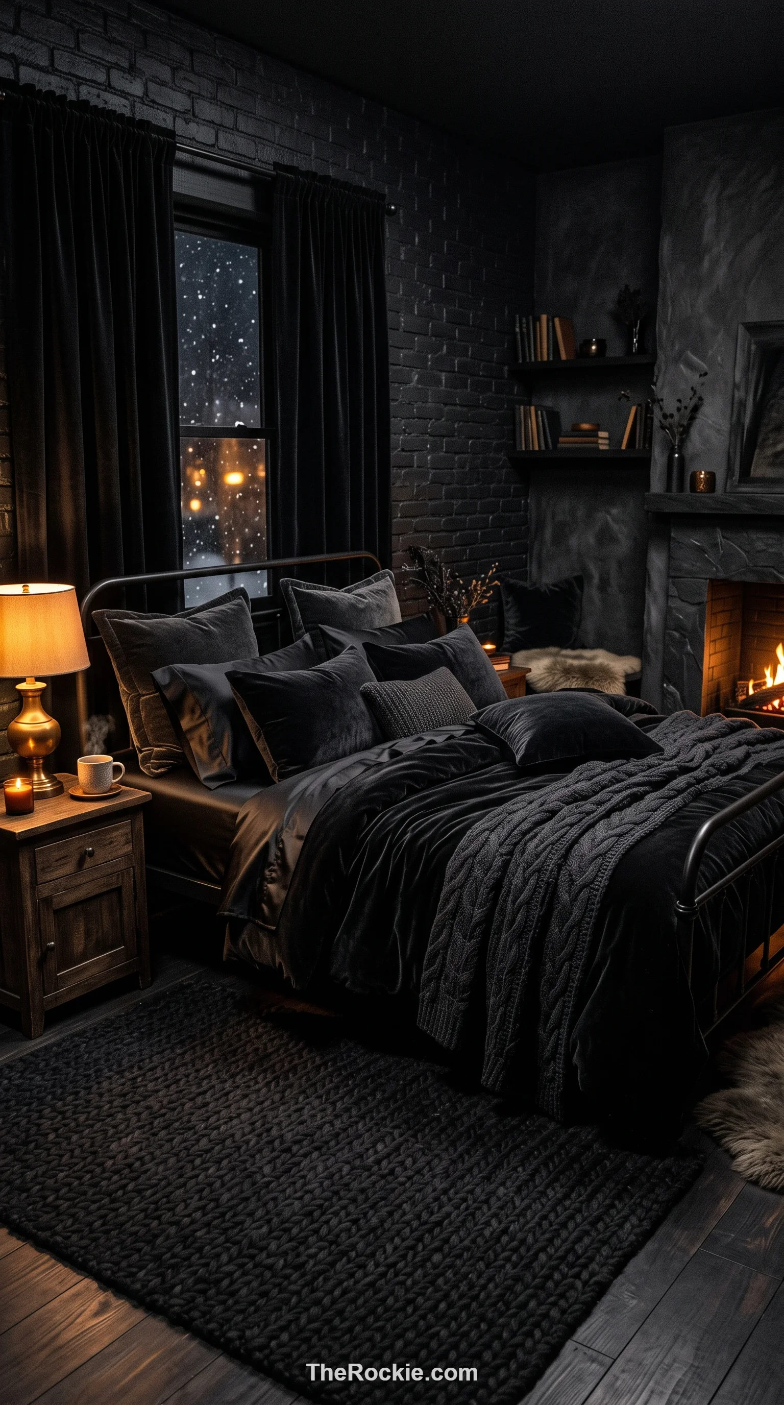
Black walls sound intimidating, but done well they make a room feel limitless rather than cramped, especially at night. The key is layering plenty of texture — velvet, silk, wool — so the space doesn’t read as flat, and good lighting so the darkness feels intentional rather than gloomy.
9. Terracotta
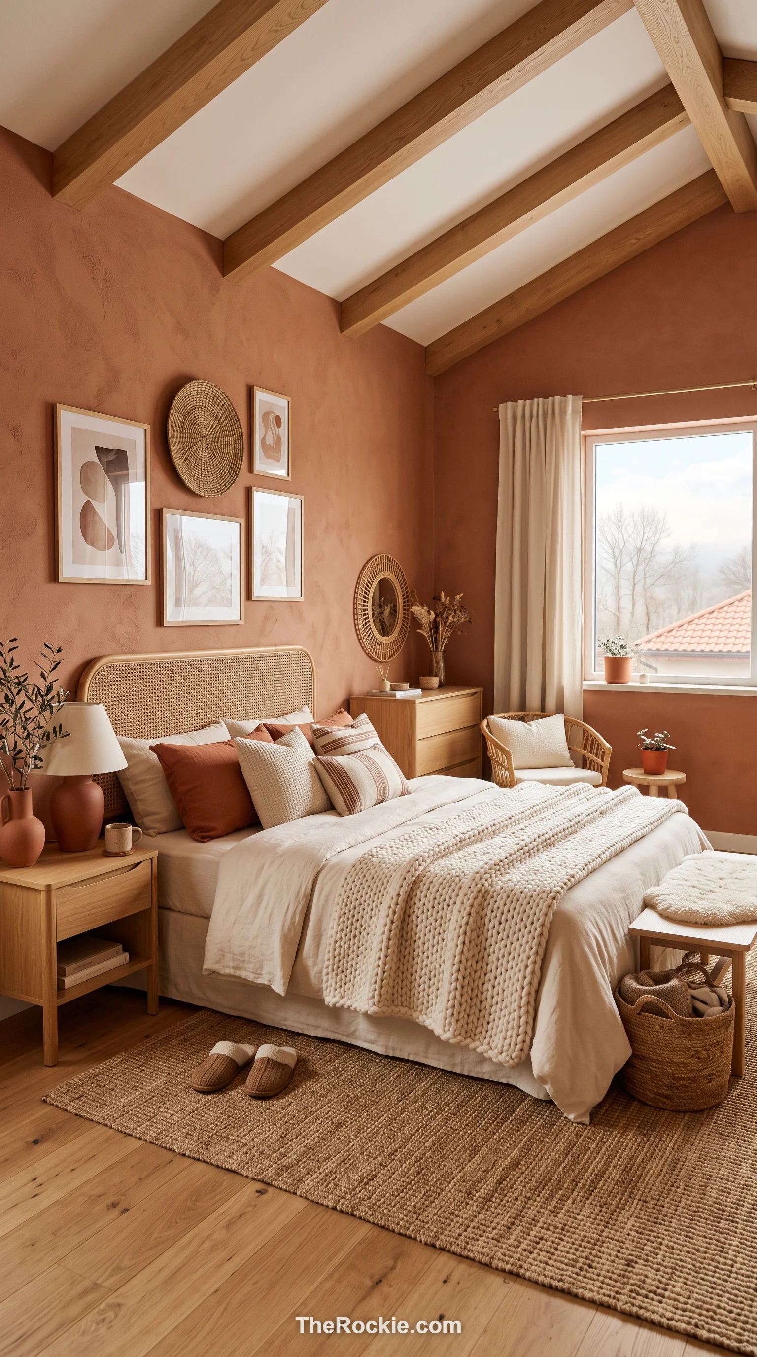
Terracotta’s clay warmth is a direct counterpoint to icy weather outside, bringing a Mediterranean glow into the room. It pairs naturally with rattan, jute, and light oak, and layering in cream or beige keeps the overall look bright rather than heavy.
10. Cream and Gold
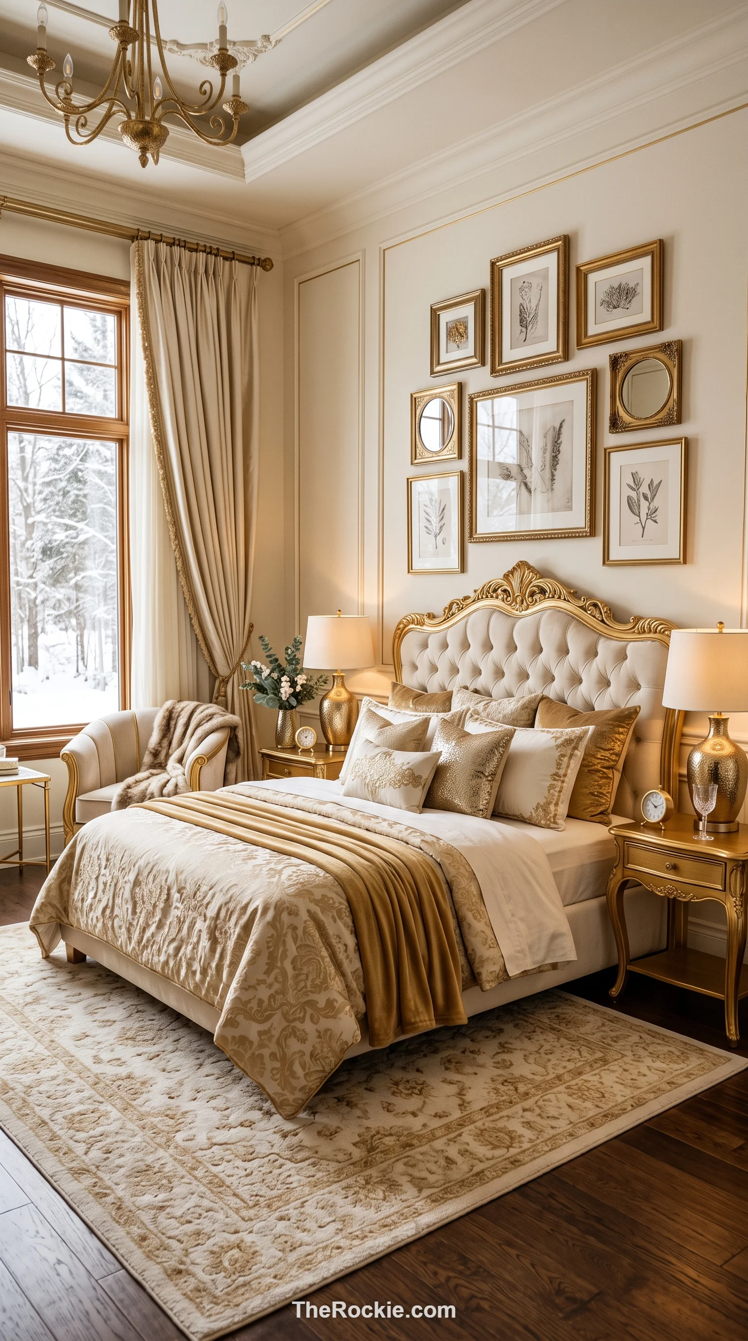
Cream is a much warmer base than pure white, and gold accents — through frames, lamp bases, or metallic thread in the pillows — add sparkle reminiscent of candlelight on a long winter evening. The combination reads as upscale and optimistic, a nice counterbalance to a grey winter sky.
11. Icy Blue
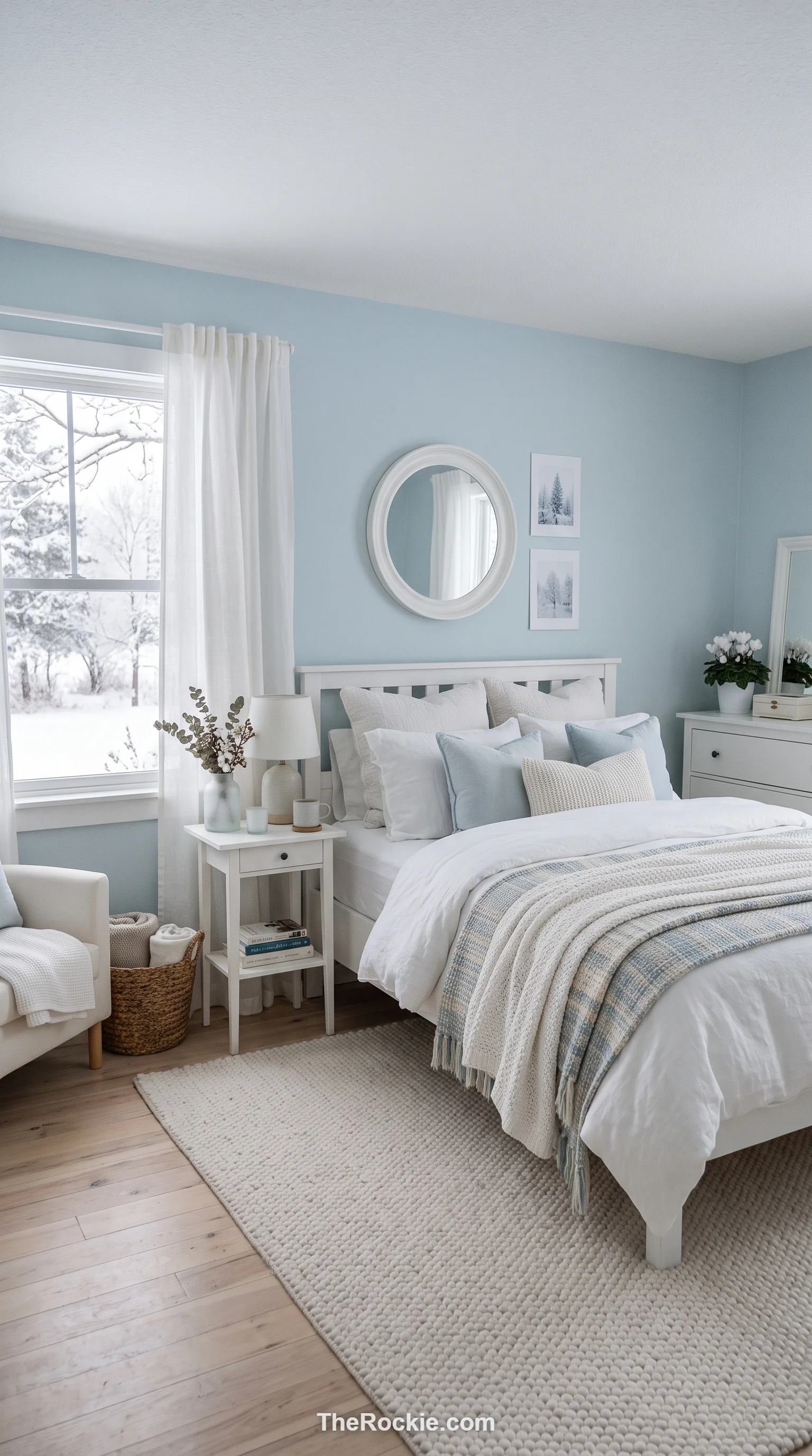
Icy blue captures the crisp, clear feeling of a cold morning without tipping into gloomy. Paired with white furniture and light flooring, it creates a cohesive, frozen-landscape look, and layering on soft fabrics and blankets keeps the room comfortable rather than sterile.
12. Deep Plum
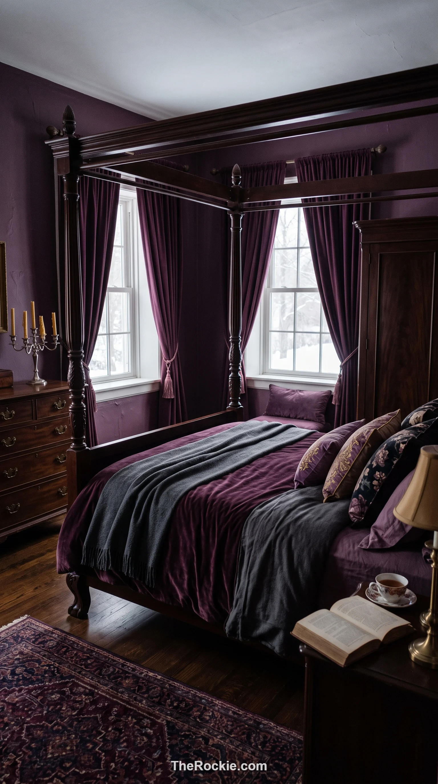
Plum has real weight to it — a saturated, purple depth that feels substantial and sheltering. Dark wood furniture and heavy velvet curtains lean into that mood, and you can brighten things with lavender accents or keep it darker with black and grey details, depending on how moody you want the room to feel.
13. Slate Gray
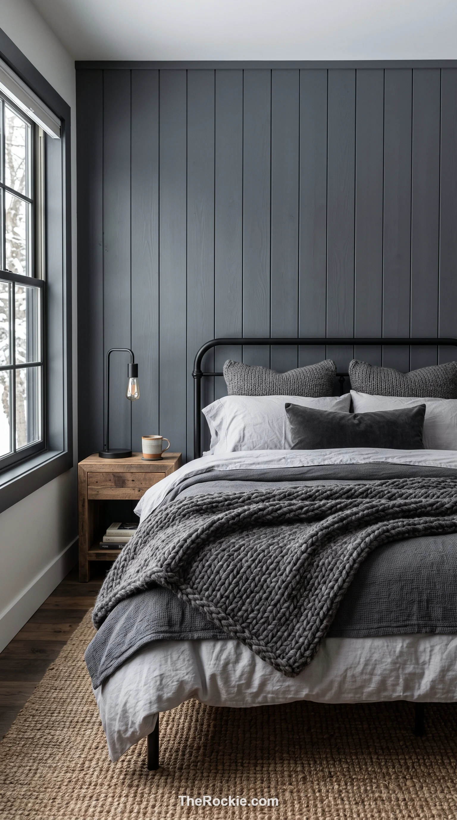
Slate carries subtle blue-green undertones that give it more personality than a flat, standard gray. It works especially well as a paneled or accent wall behind the bed, and chunky knit blankets soften what could otherwise feel like a fairly industrial color.
14. Emerald Green
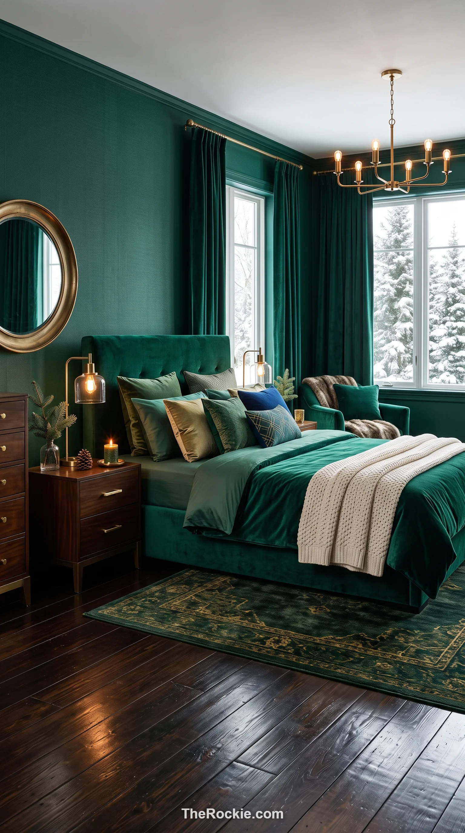
Emerald has a jewel-toned richness that makes even a simple room feel a little more like a royal chamber. It pairs beautifully with metallic accents and dark polished floors, and it’s saturated enough to make colorful bedding or art really pop against it.
15. Oatmeal and Tan
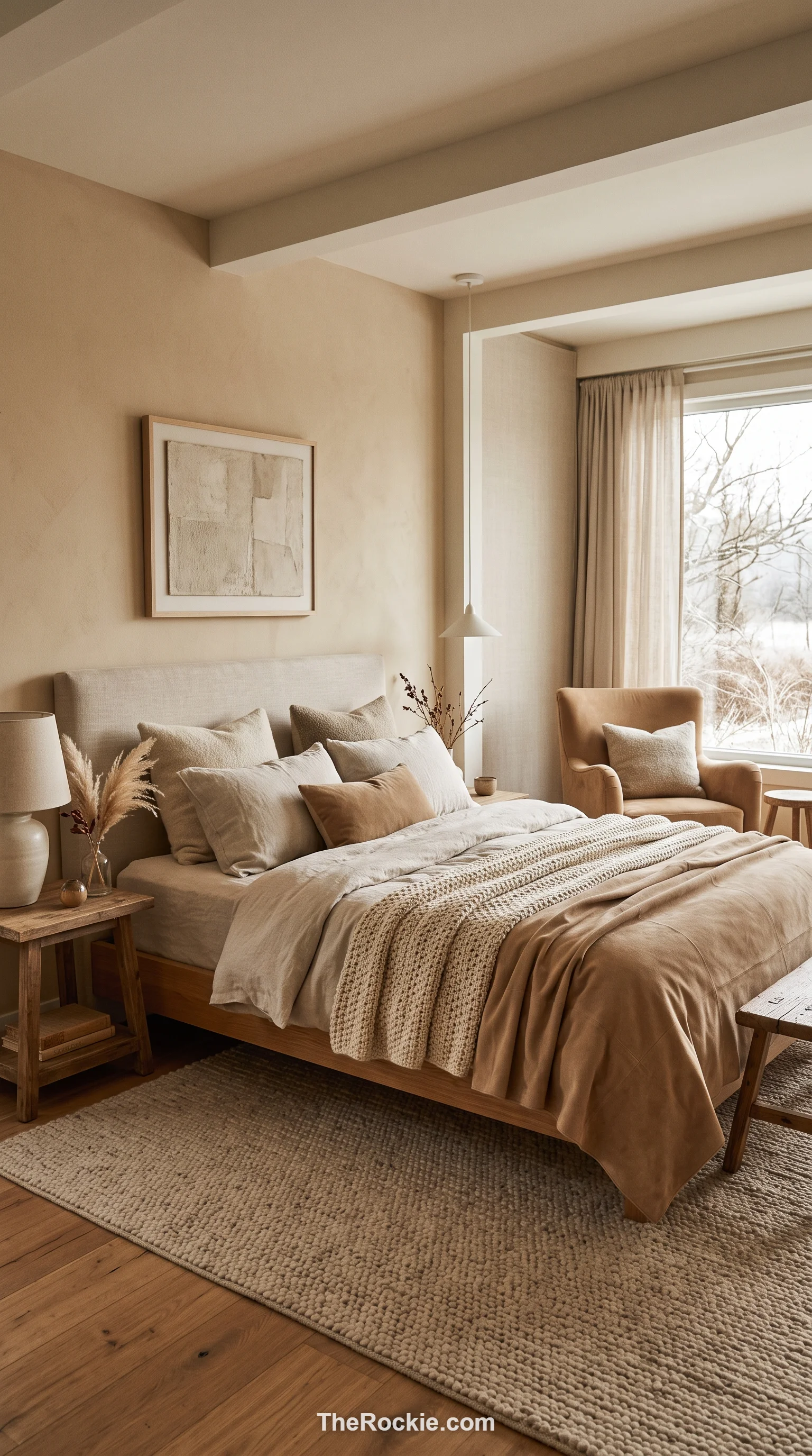
Oatmeal and tan bring a natural, fiber-inspired calm to a room, with the depth coming entirely from texture rather than color contrast — linen, wool, suede all layered in similar tones. It’s a quiet, unassuming palette well suited to a minimalist bedroom that still wants to feel warm.
16. Burgundy
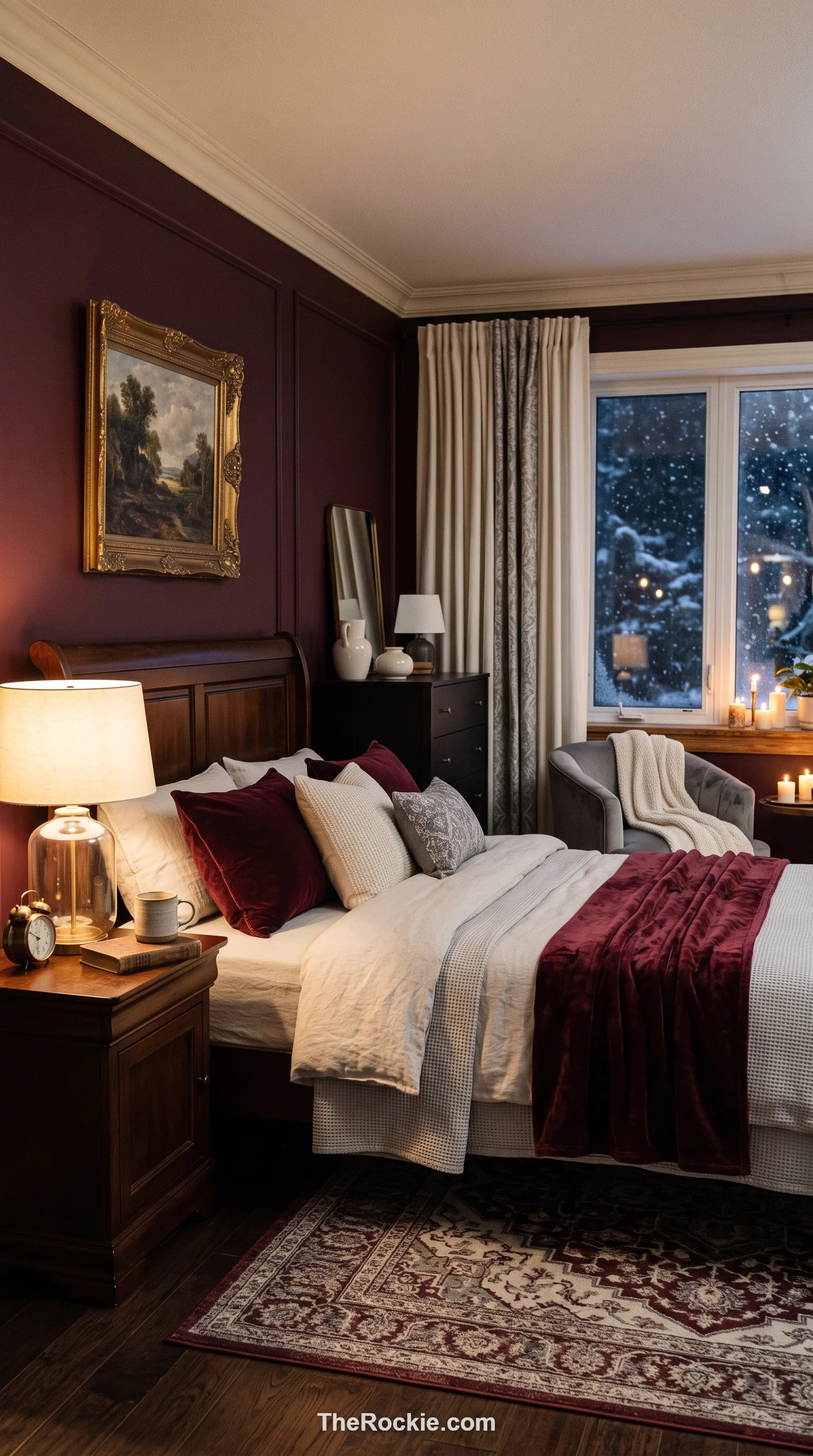
Burgundy’s purple-tinged red gives a room an instant, classic focal point, and its depth makes a space feel smaller and more intimate — which is often exactly the goal in winter. Balancing it with cream or light grey keeps the intensity in check while still letting the color take the lead.
17. Frosty Lavender
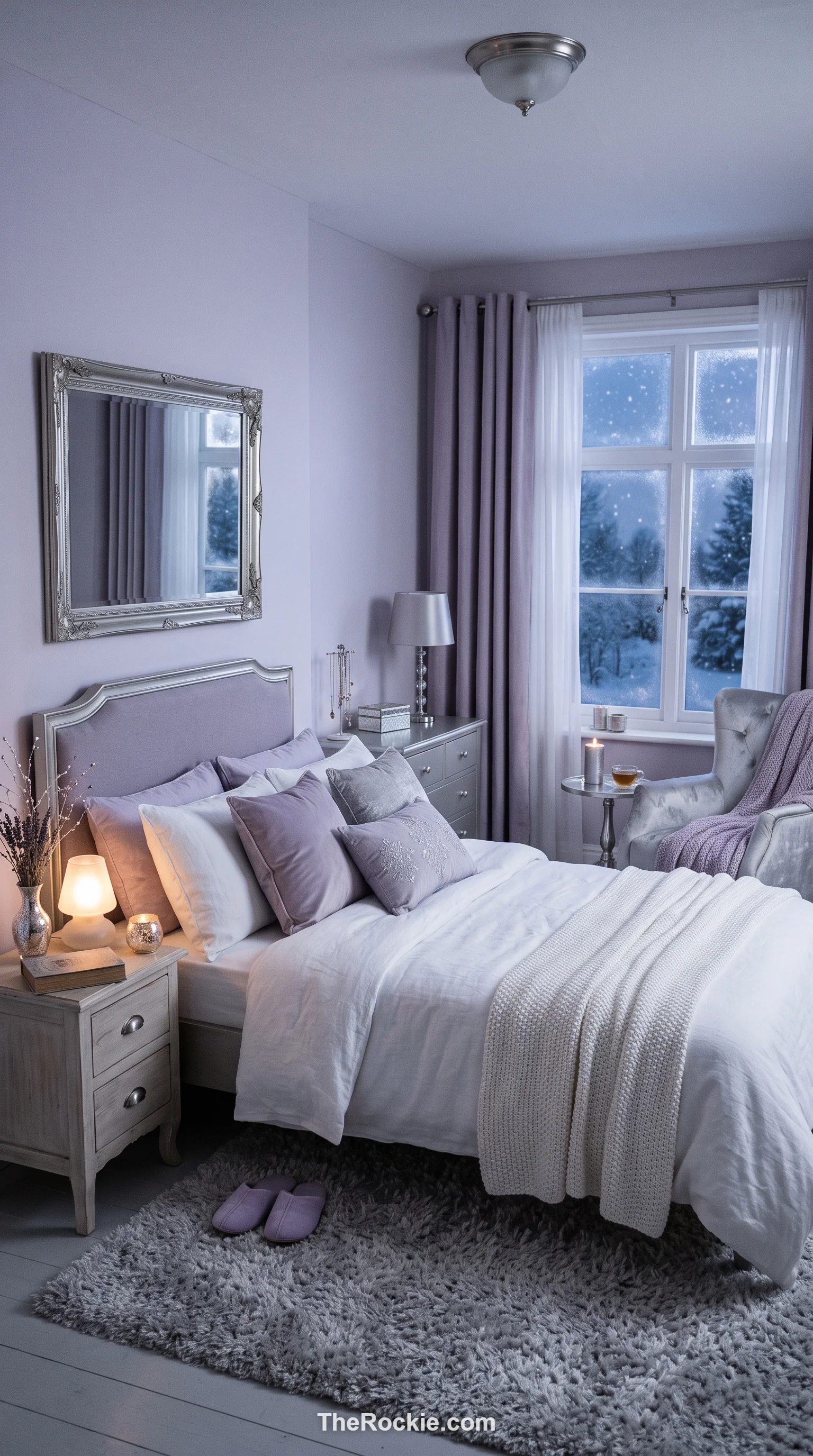
Frosty lavender has a cool undertone reminiscent of light on a snowy field at dusk, and it’s genuinely calming — a nice middle ground for anyone who finds blue too cold but wants more color than plain grey. Silver accents and white bedding keep the whole look fresh and a little magical.
18. Soft Taupe
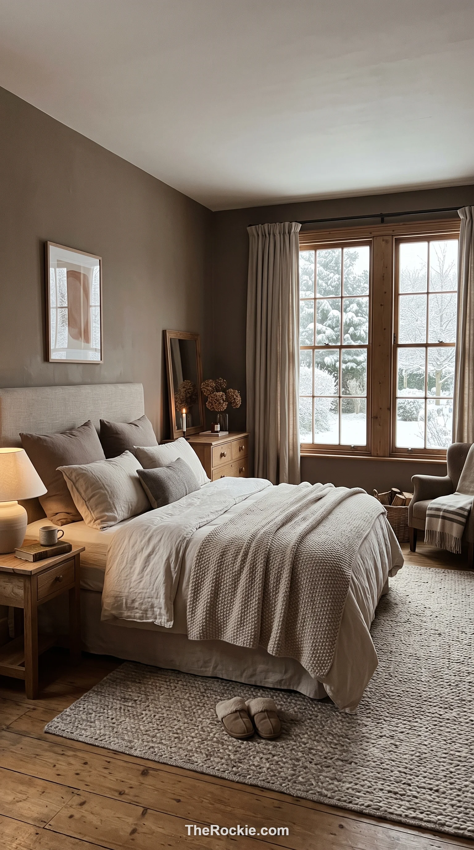
Taupe leans slightly more brown than a standard greige, which gives it extra coziness. It’s a color that genuinely shifts through the day — fresh and light in the morning, deep and comforting by evening — and it’s flexible enough to either stay fully neutral or take on pops of color through the bedding.
19. Mustard Yellow
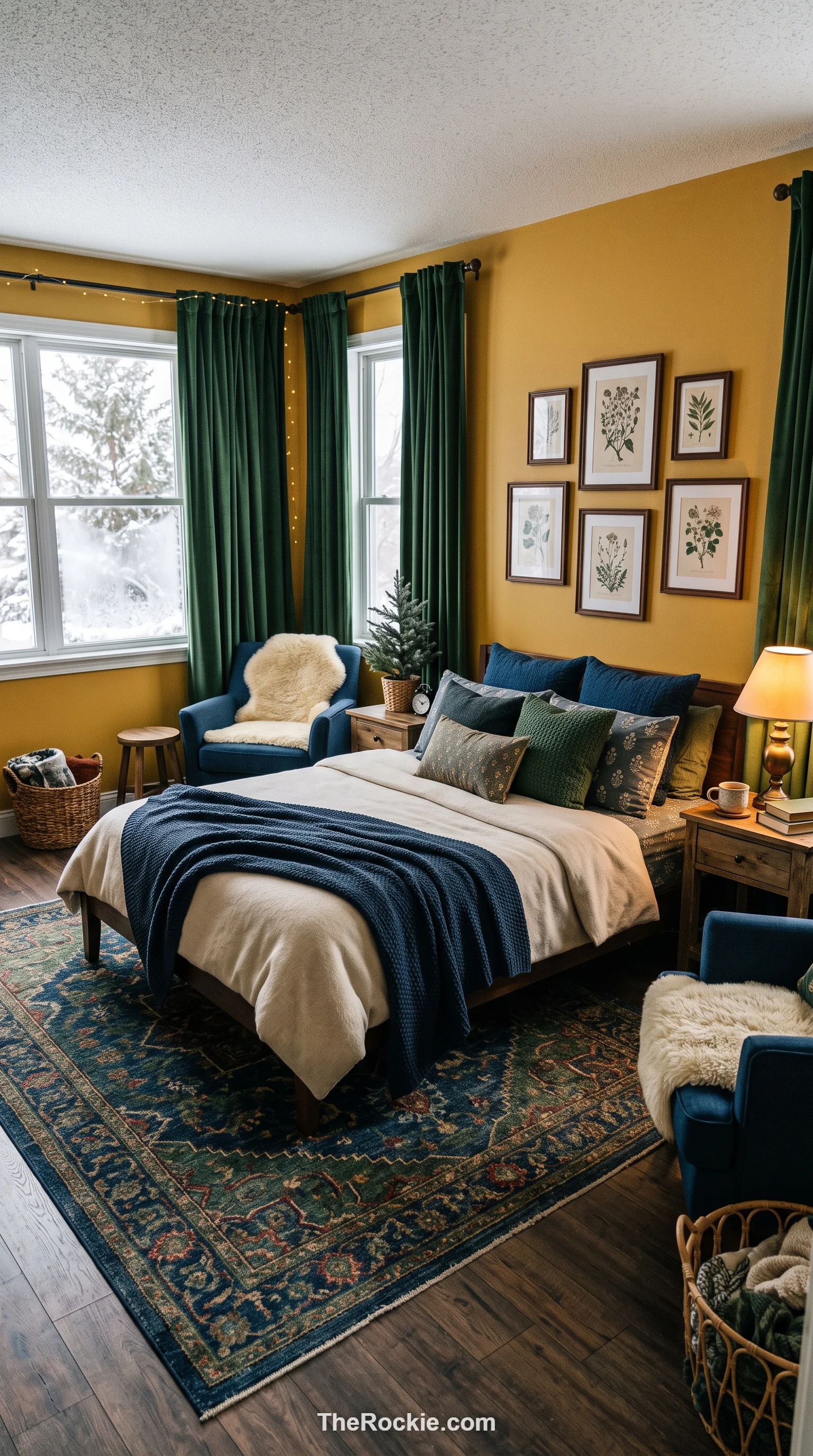
Mustard is deeper and more grounded than a bright lemon shade, which is exactly why it works in winter rather than feeling out of season. Paired with dark blue or deep green, it creates a curated, designer look, and used on an accent wall or heavy curtains, it genuinely warms up the temperature of a room.
20. Pine Green
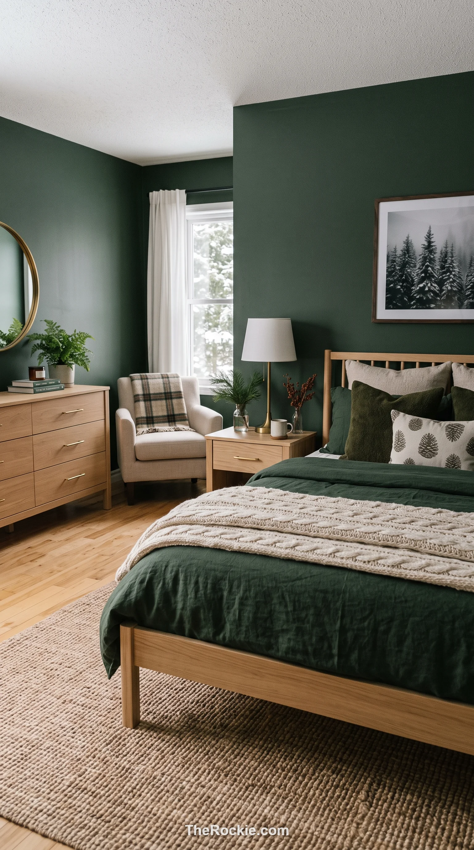
Pine sits a little brighter than forest green while still feeling substantial enough for winter. It works especially well with light wood and brass hardware for a modern-farmhouse feel, and layering it with other greens and browns creates a genuinely forest-like sanctuary.
21. Mocha Brown
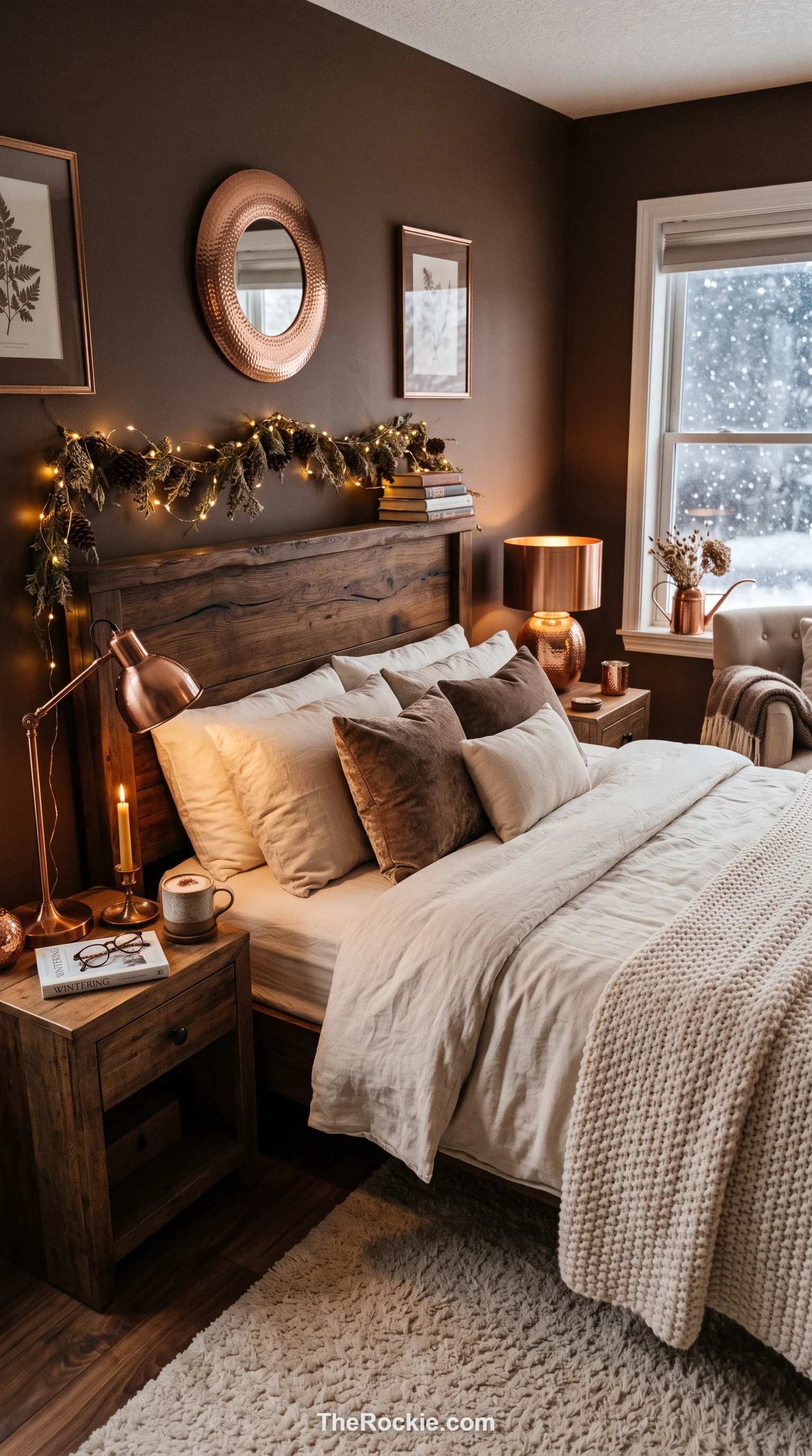
Mocha has a chocolatey warmth that feels immediately comforting, like a hot drink on a cold day. It creates a moody environment that still stays soft and approachable, especially paired with cream bedding and warm metallics like copper or bronze.
22. Sky Blue
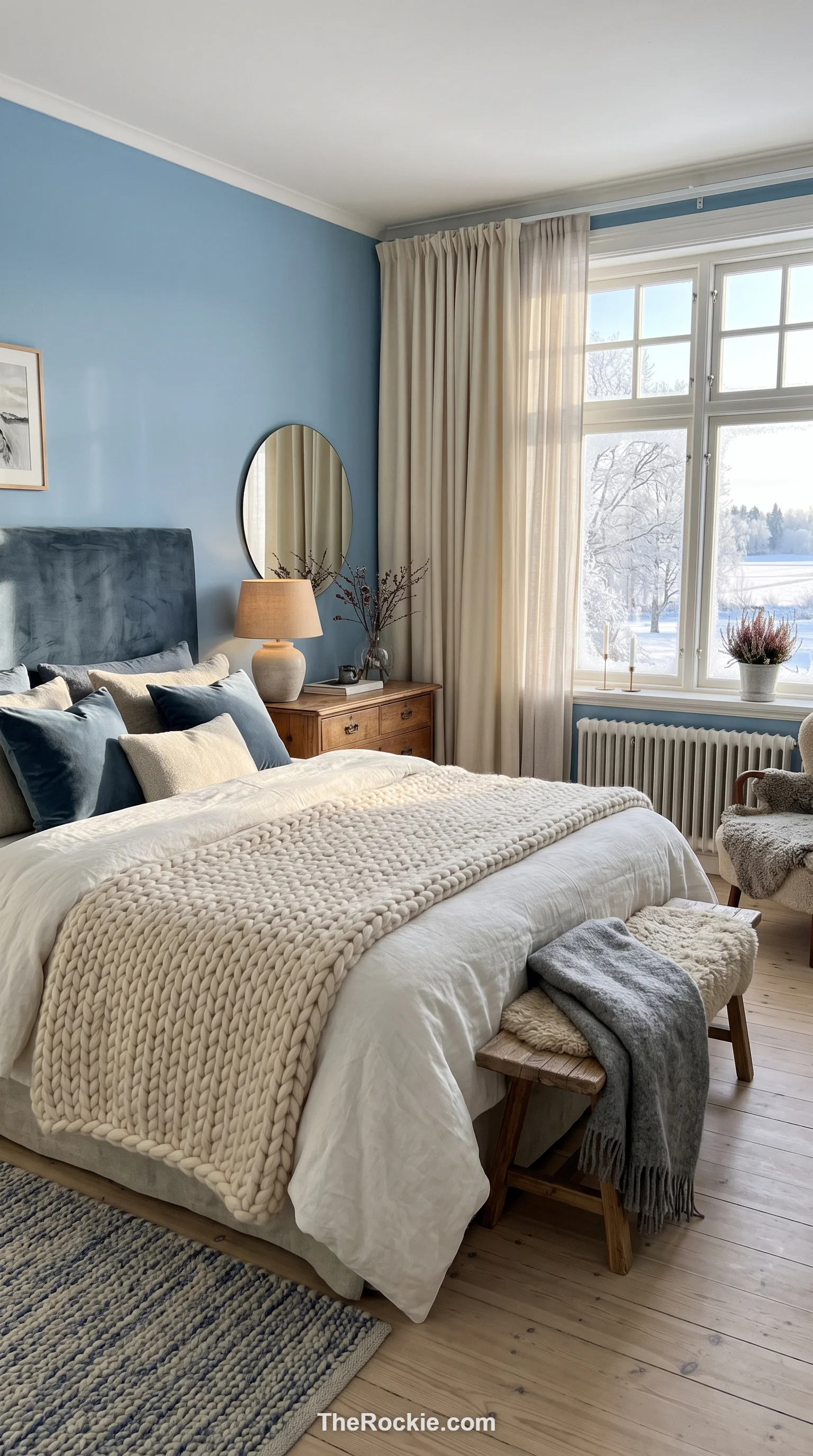
Sky blue reads differently in winter than in summer — more like the clear, cold sky on a January morning than a beach day. Pairing it with heavy fabrics like wool or velvet gives it the warmth it needs to work in a cold-weather room while keeping things bright and peaceful.
23. Steel Gray
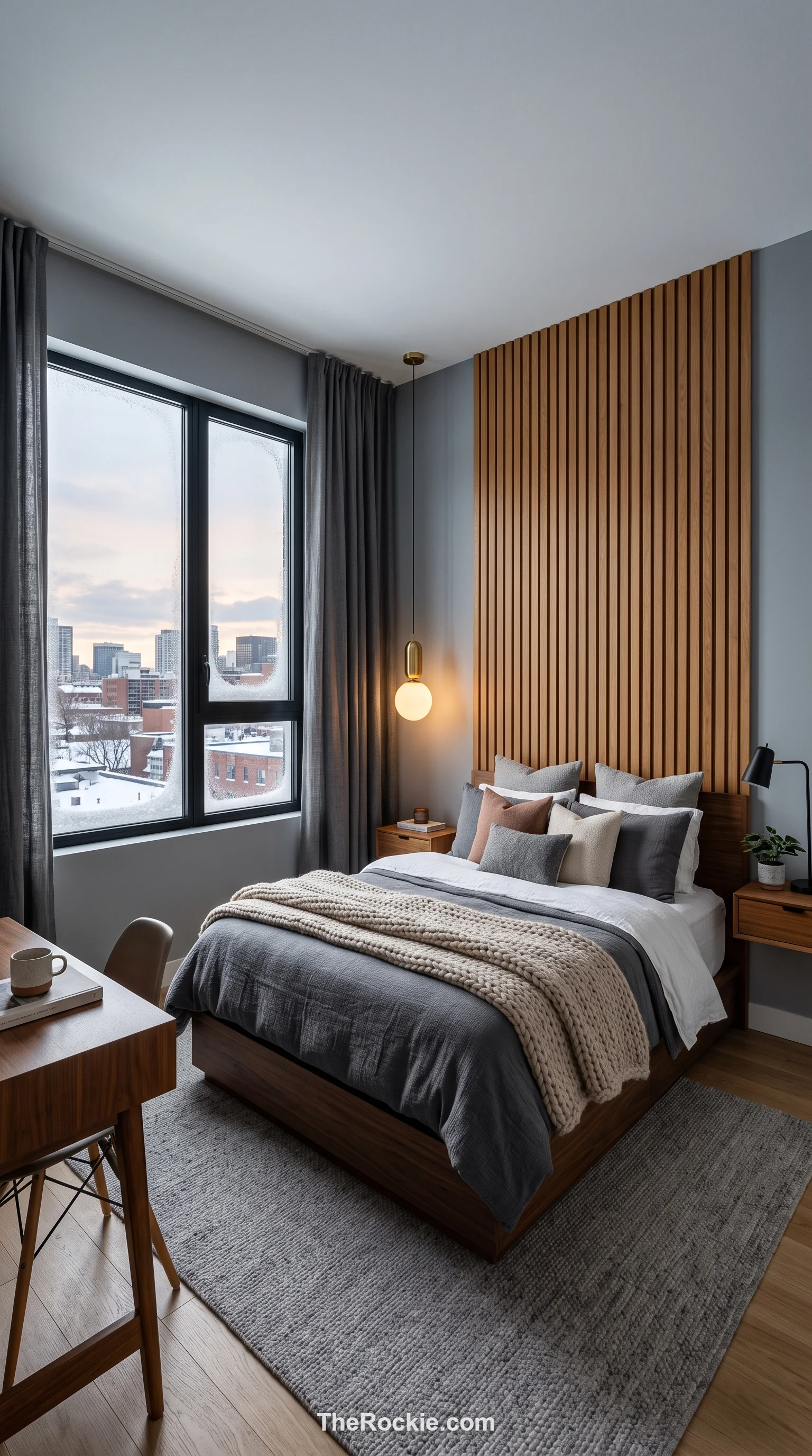
Steel gray has a cool, contemporary edge that suits urban apartments and large windows especially well. Adding warm wood and soft textiles keeps the industrial feel from turning cold, letting furniture and art take center stage against a clean, structured backdrop.
24. Olive Green
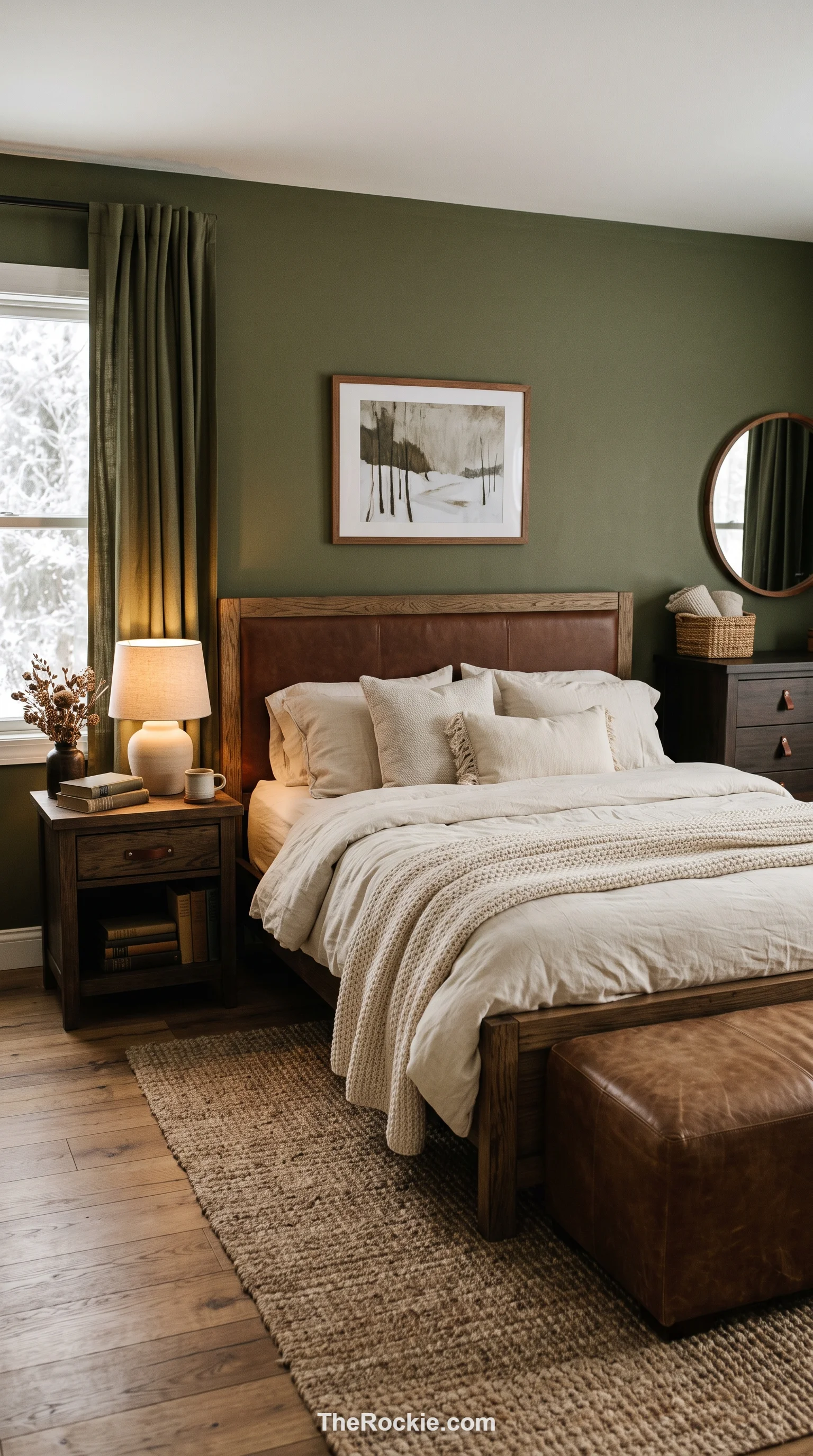
Olive’s yellow undertone keeps it from feeling as cold as some other neutrals, making it a more interesting alternative to plain beige or gray. It pairs naturally with leather, wood, and cream linens, and it flexes easily across bohemian, traditional, or modern styles.
25. Champagne
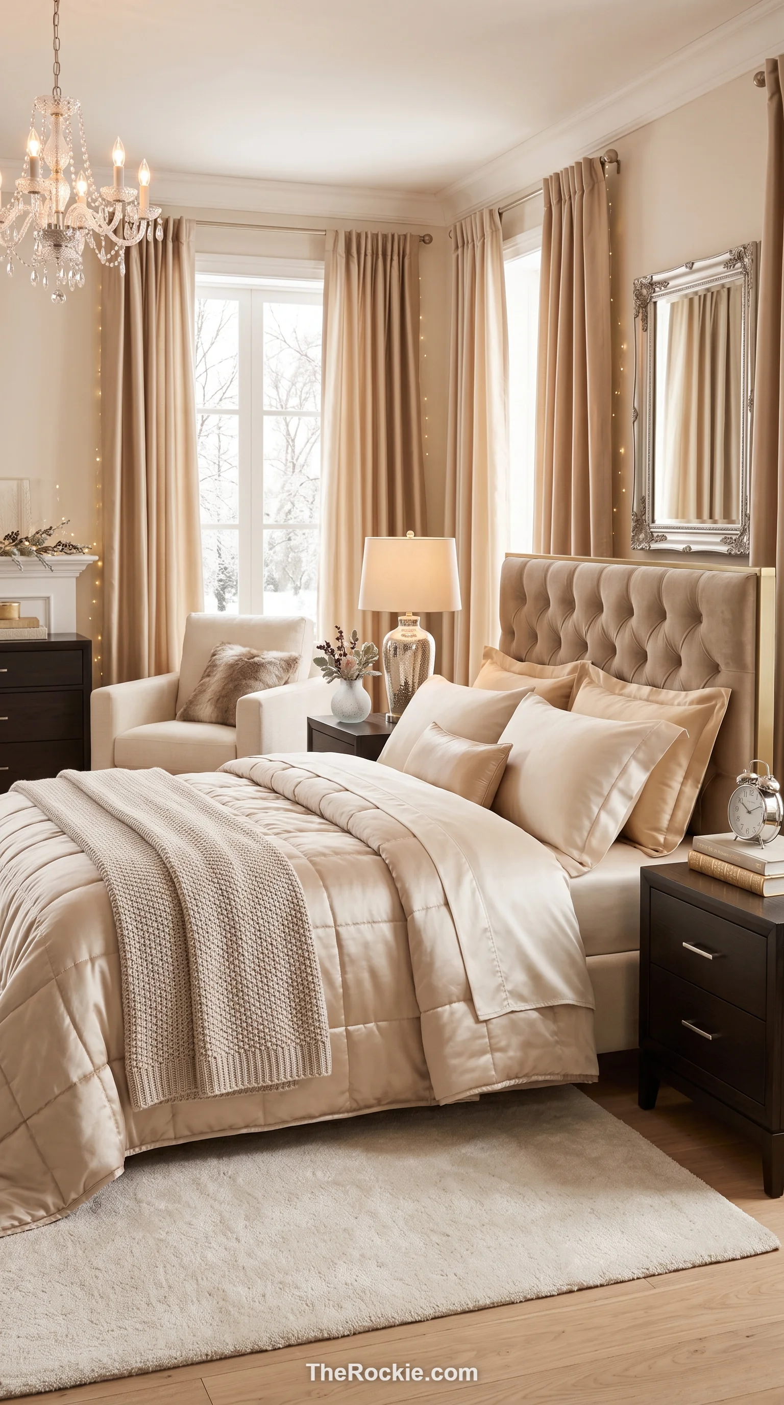
Champagne is a pale, warm beige with a hint of shimmer, giving a room a bright, celebratory feel. Silk and satin fabrics enhance the glow, and silver or gold accents finish the look as a softer, more sophisticated alternative to plain white.
26. Berry Red
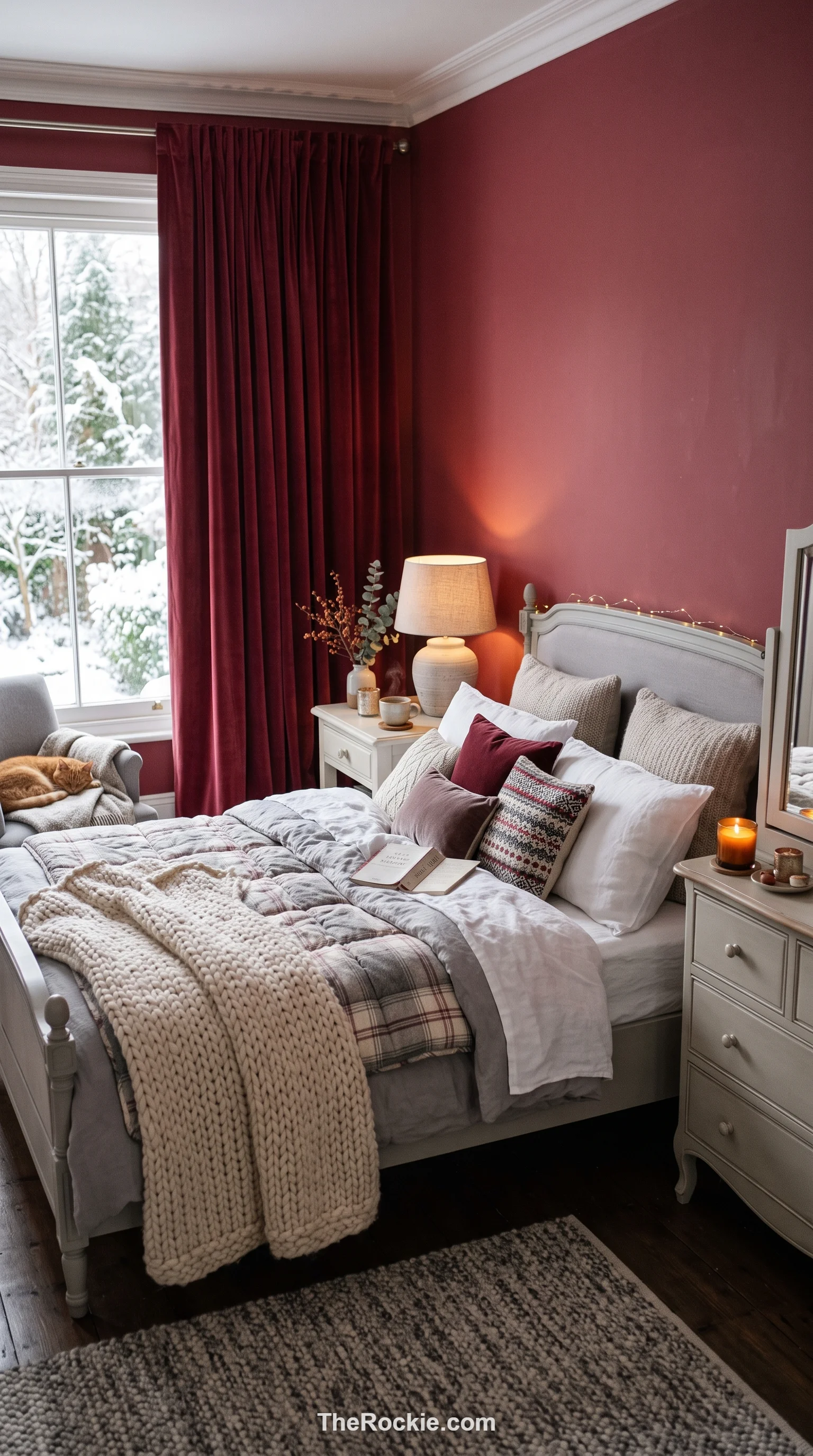
Berry red carries a touch of blue or purple that makes it feel more refined than a straightforward fire-engine red. Used on an accent wall or in heavy drapery, it creates real warmth and energy, especially when balanced against soft gray or warm white furniture.
27. Greige
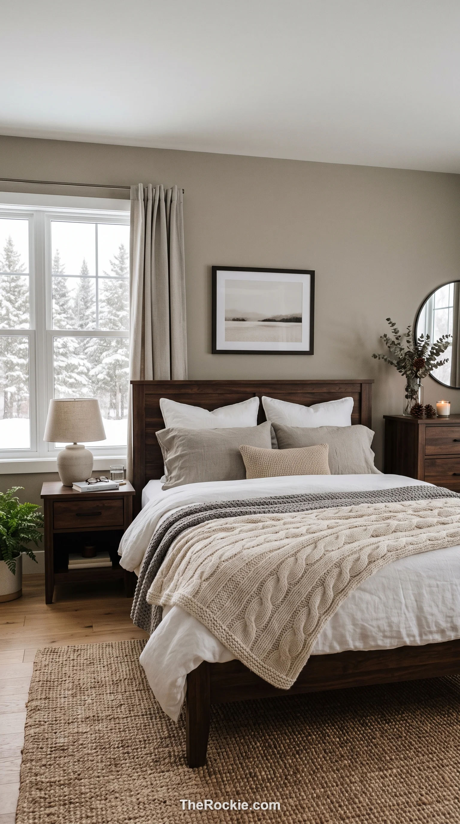
Greige splits the difference between gray and beige, giving you the coolness of one and the warmth of the other. It’s an easy color to decorate around, and dark wood furniture plus textured blankets add winter character without pushing the palette in a bolder direction.
28. Teal
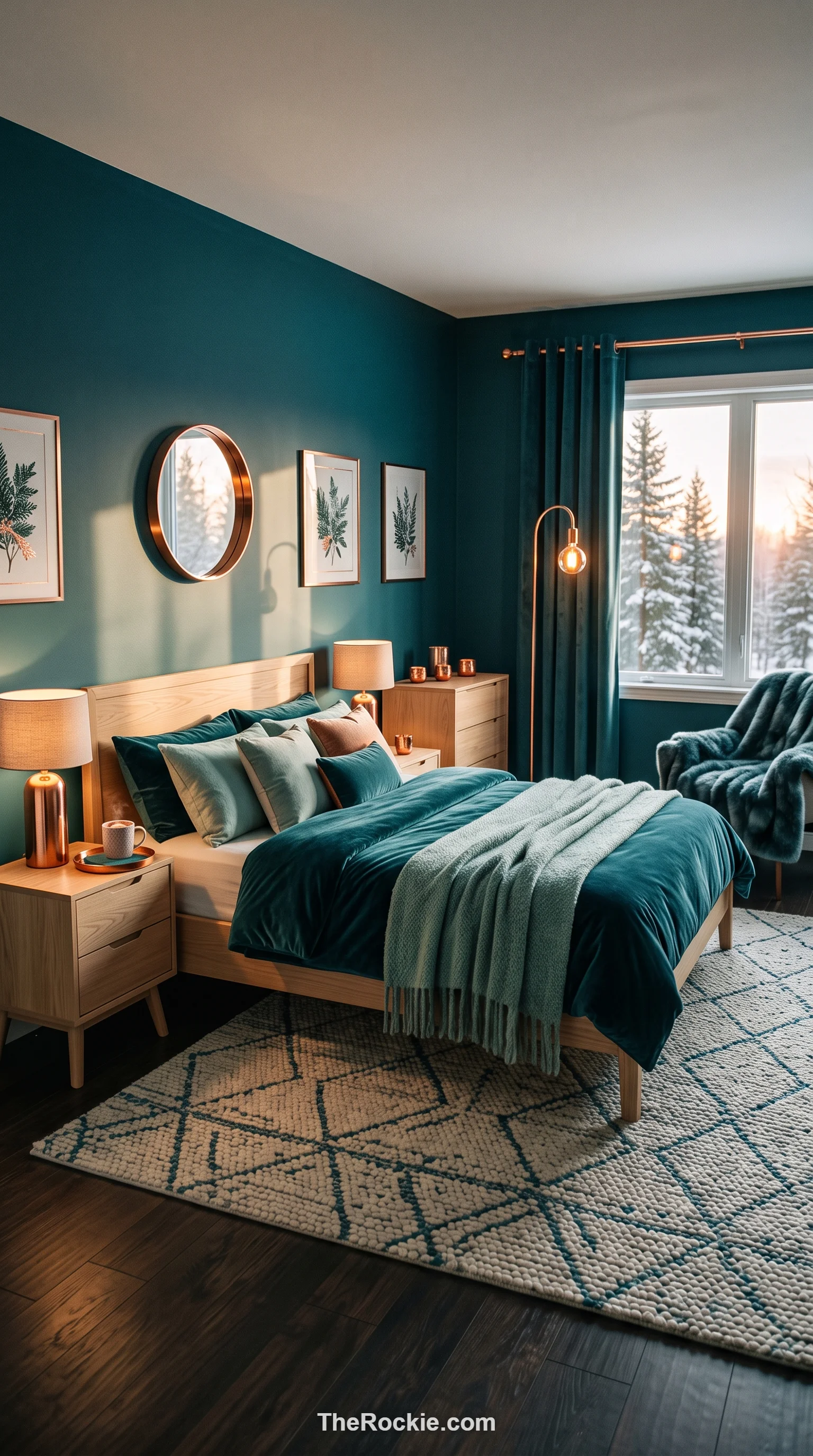
Teal’s blue-green depth feels mysterious and a little luxurious, making a room feel intimate rather than sparse. Copper accents or light wood furniture play well against it, evoking the feel of a deep ocean or a forest at night.
29. Copper and Brown
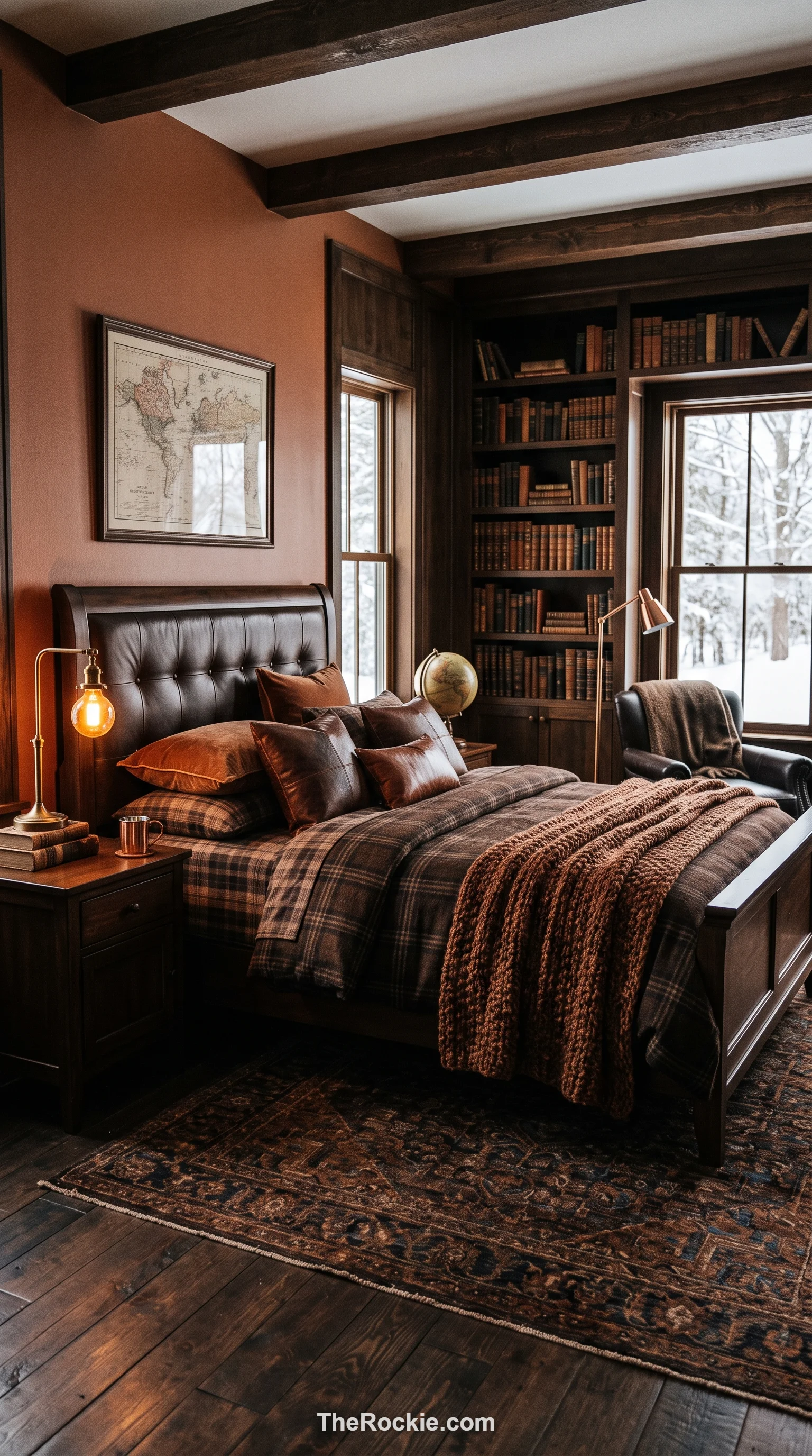
This combination has an old-world-library feel — brown as the grounding base, copper adding brightness through light fixtures, a bed frame, or pillows. Leather, wood, and wool textures round it out for a masculine, secure feeling that works well against a snowy backdrop outside.
30. Soft Lilac
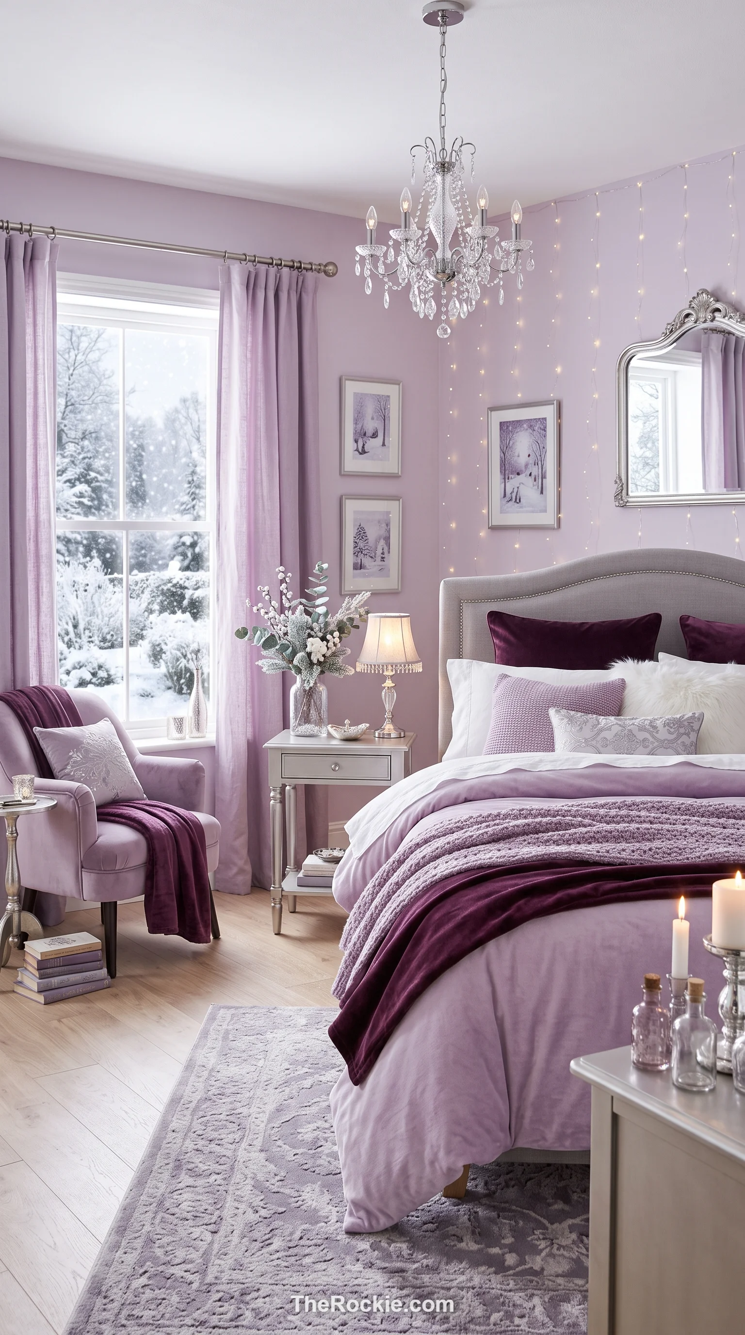
Soft lilac is an unexpected but effective winter choice, offering a gentle warmth and a bit more personality than plain gray or beige. Paired with deeper plum accents or silver finishes, it creates a layered, sophisticated look that’s especially pretty under bedside lamps on a long winter evening.
Final Thought
There’s no single “right” winter color — it really comes down to whether you want the room to feel dramatic and enclosed, like navy or midnight black, or bright and optimistic, like champagne or mustard. Whichever direction you lean, build the whole scheme around it: texture, lighting, and metal accents all shape how a color actually reads once the days get short and the lamps come on early.


