
21+ Jewel Tone Bedroom Decor Ideas that are Rich, Moody, and Gorgeous in 2026

I resisted jewel tones in bedrooms for years because I assumed saturated color would make a room feel smaller and louder, and I was wrong on both counts. Deep emerald, sapphire, garnet, and amethyst actually blur a room’s corners and make walls recede, which is why a dark bedroom so often feels bigger at night than the white one it replaced. I’ve done these colors as full color-drenched rooms and as a single velvet pillow on an otherwise beige bed, and I promise there’s a version here that fits your lease, your budget, and your nerve.
Jewel Tone Bedroom Decor Ideas
1. Color-Drench the Whole Room in Sapphire Blue
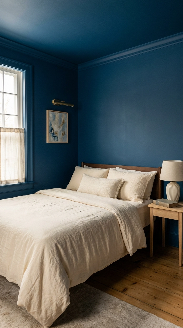
Color drenching just means walls, trim, and ceiling all wear the same shade, and it works because your eye stops registering where the wall ends and the ceiling begins. Farrow and Ball Hague Blue is the shade I reach for most, and it’s shockingly forgiving in a north-facing room that never gets direct sun. Budget honestly for two coats plus primer over anything previously white, and give yourself a full weekend rather than a Saturday.
2. Anchor a Neutral Room with One Emerald Velvet Headboard
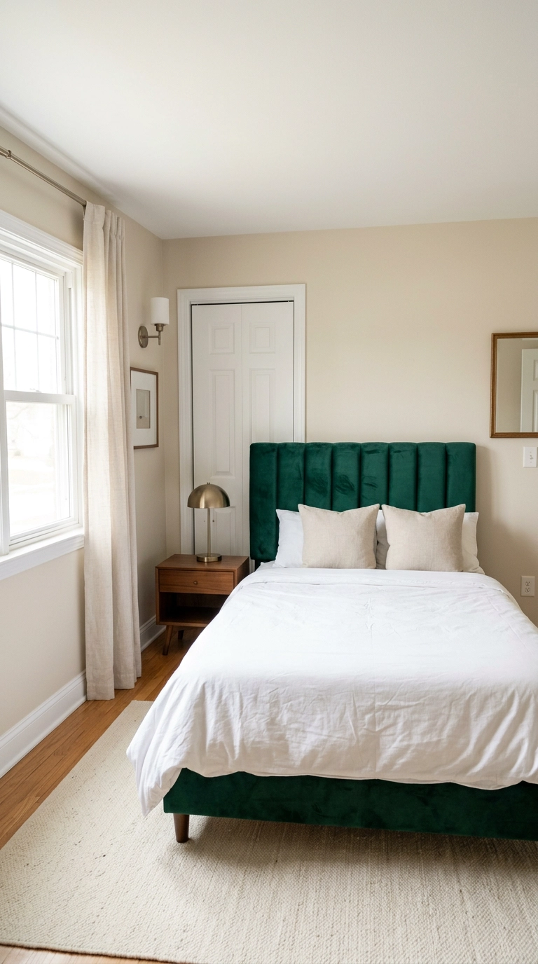
If painting is off the table, buy the color instead of applying it, and a tall upholstered headboard is the single biggest piece of jewel tone you can introduce without touching a wall. Go taller than feels normal, roughly 54 to 60 inches from the floor, so the color reads as architecture rather than as a furniture accessory. It’s a splurge item, usually the priciest thing in this article, but it’s also the one guests comment on.
3. Swap Only the Bedding to Amethyst and Call It Done
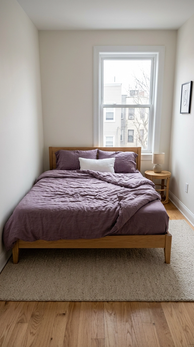
This is the twenty-minute version of the whole trend, and it’s the one I recommend to anyone testing whether they actually like living with saturated color. Washed linen in a dusty amethyst reads soft rather than costume-purple, and it photographs beautifully in a dim room because the fiber catches light unevenly. Keep everything else white or oak so the bed is unmistakably the loudest thing in the room.
4. Use Ruby in Small, Deliberate Doses on the Nightstand
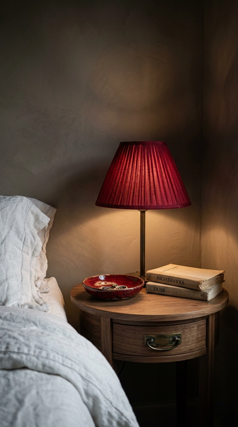
Ruby is the hardest jewel tone to live with in volume, so I dose it the way you’d dose chili flakes. A pleated lamp shade in a deep true red throws the warmest light of any shade color, which is why it makes a beige room feel occupied instead of unfinished. Shades in this style run cheap online and take about four seconds to install, so it’s the lowest-risk red in the article.
5. Hang Topaz Velvet Curtains High and Wide
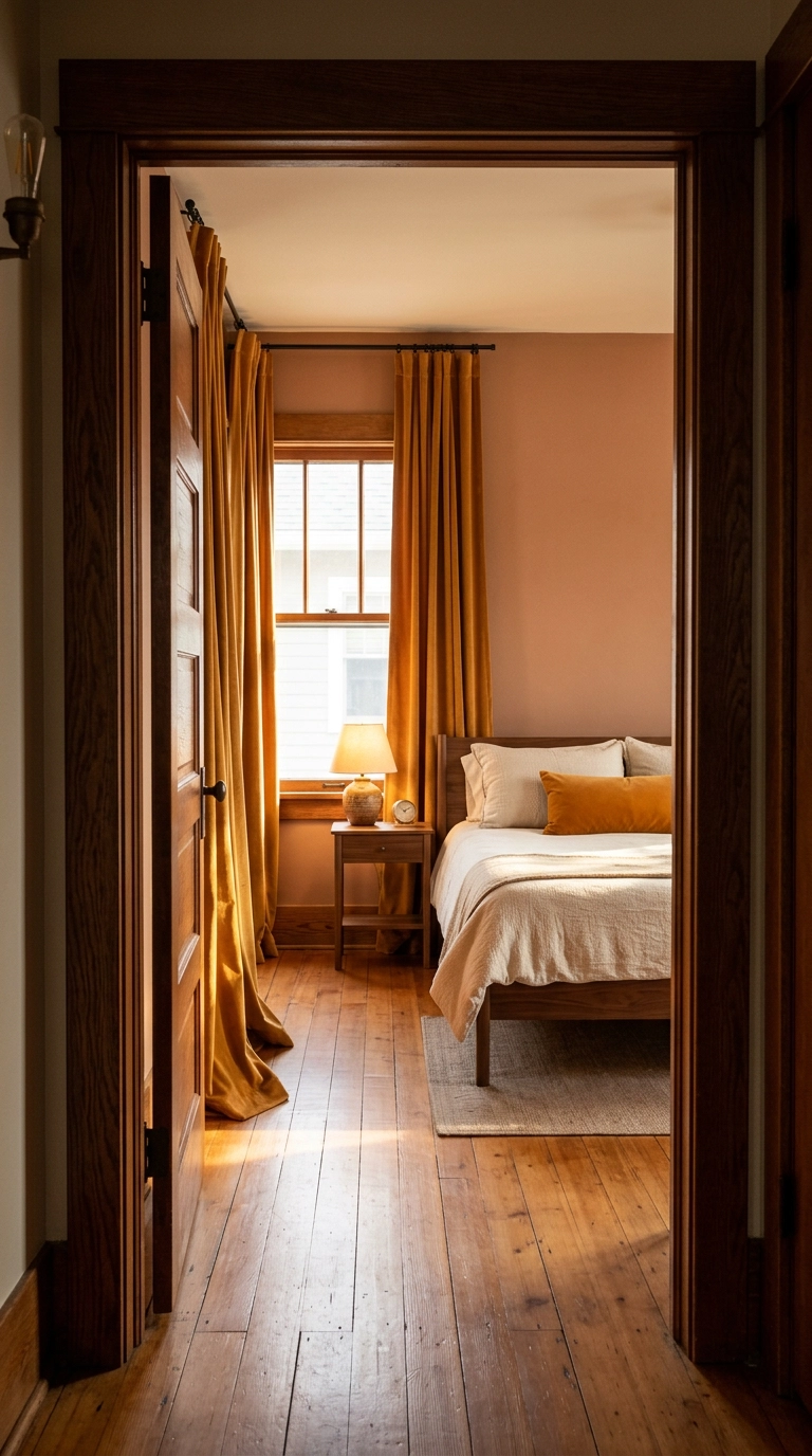
Mount the rod four to six inches below the ceiling and extend it eight to ten inches past the window frame on each side, because the eye reads the fabric edge as the window edge and the whole wall grows. Topaz and amber velvet do something specific in late-day light that flat cotton simply cannot do, catching a warm sheen along every fold. Rental note: tension rods will not hold velvet, but a command-hook mounted lightweight rod handles a single panel pair if you skip the blackout lining.
6. Anchor the Floor with a Garnet Vintage Rug
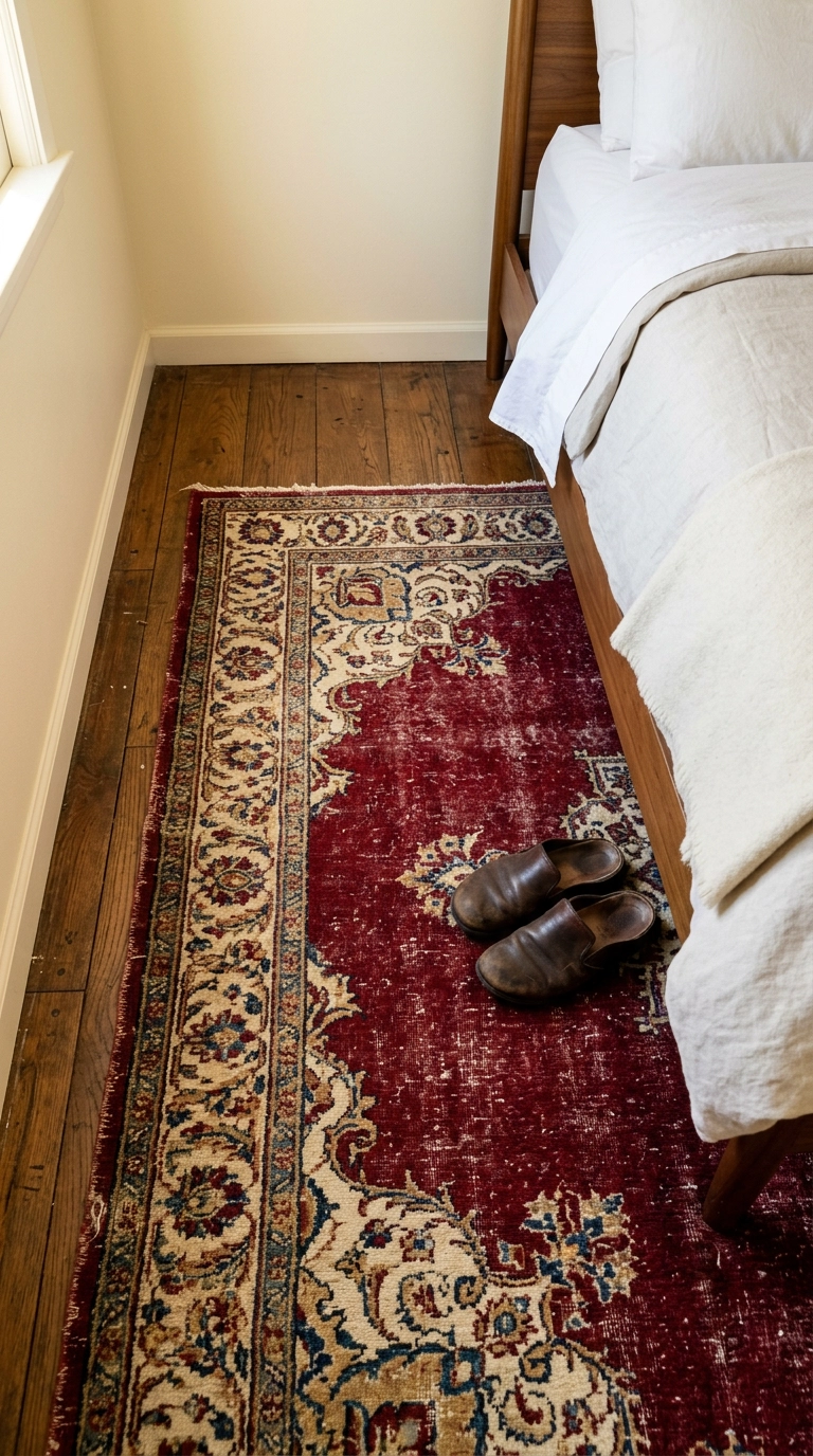
A faded antique rug is the cheapest way into jewel tones if you’re patient, because the reds and blues have already softened into something a new rug spends a decade trying to fake. Size up: the rug should run at least 24 inches past the sides and foot of the bed so your feet land on wool, not cold floor. Estate sales and online vintage dealers beat retail here, and a genuinely worn rug hides everything a new one announces.
7. Paint the Ceiling Deep Teal and Leave the Walls Pale
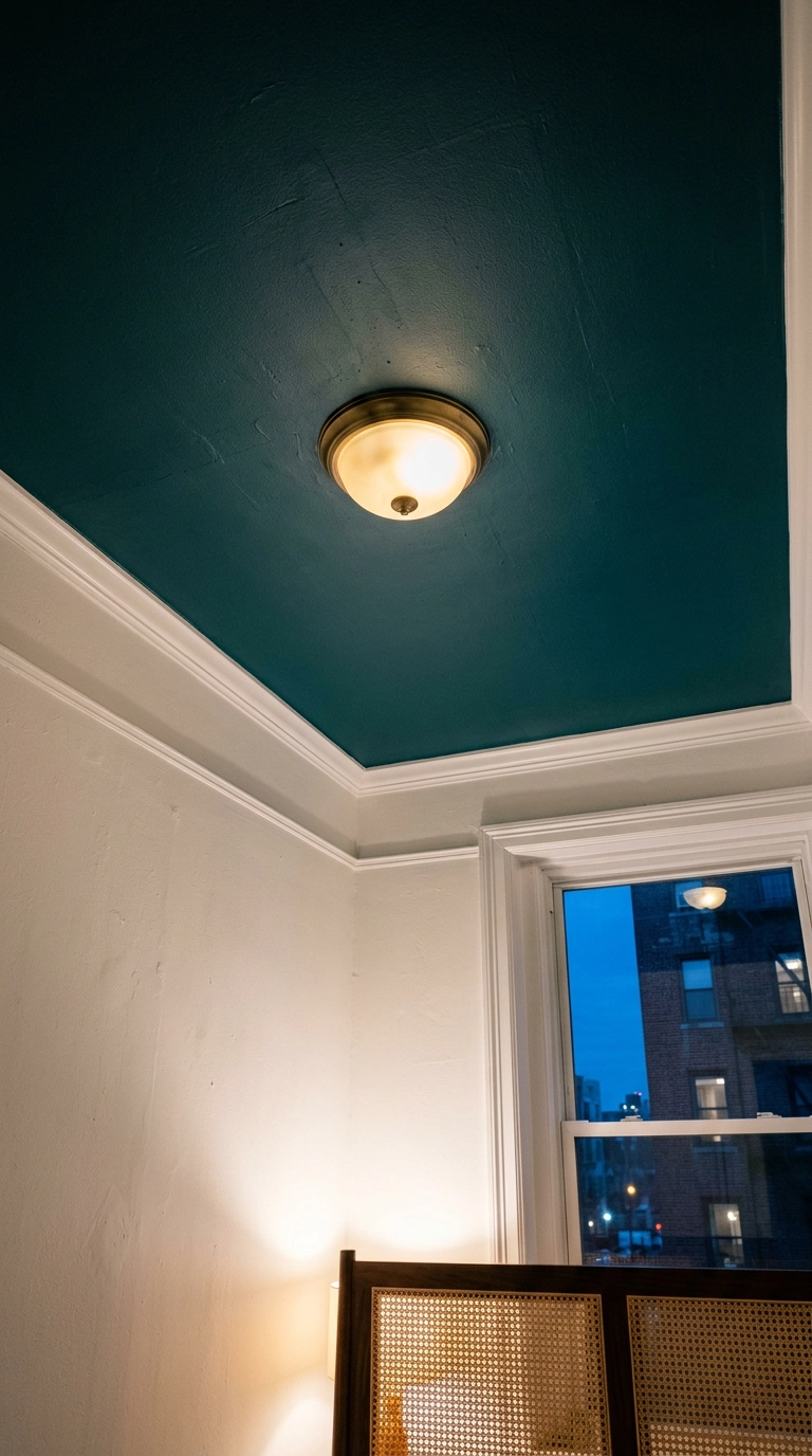
The ceiling is the one surface nobody expects color on, which is exactly why it lands. A saturated ceiling over pale walls lowers the visual weight overhead and makes a room feel enclosed in the good way, ideal if you have 9-foot ceilings that feel airport-tall when you’re trying to sleep. One gallon typically covers a standard bedroom ceiling, so this is a hundred-dollar idea and half a Saturday.
8. Put a Plum Velvet Bench at the Foot of the Bed
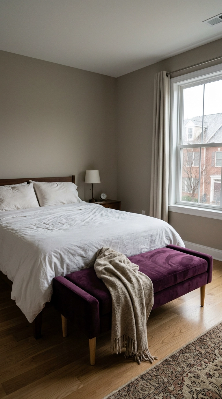
The foot of the bed is dead space in most bedrooms, and a bench fixes that while giving you somewhere to put the pile of clothes that is not technically dirty. Keep the bench a few inches narrower than the bed so the sightline down the room stays clean, meaning the eye travels the length of the space without hitting a snag. Plum is a good gateway purple because it leans brown in low light rather than lilac.
9. Wrap an Alcove in Emerald Peel-and-Stick Wallpaper
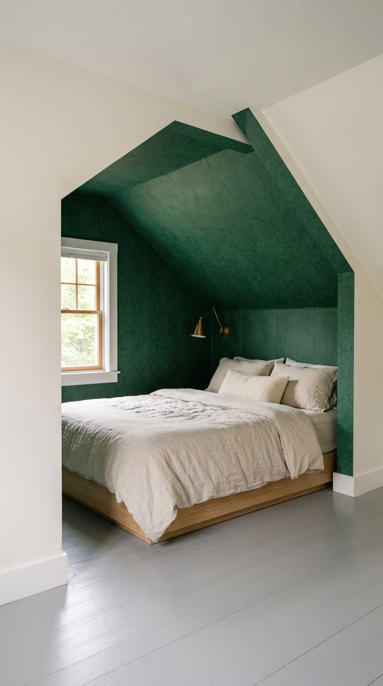
Peel-and-stick has genuinely gotten good, and an alcove or dormer is the perfect place to test it because the small square footage keeps both cost and mistakes contained. Papering only the recess makes the bed read as a built-in nook, which is a trick I use constantly in attic rooms with awkward slopes. Plan on a full evening for a single alcove and buy ten percent extra for pattern match.
10. Add Texture with Navy Grasscloth Behind the Bed
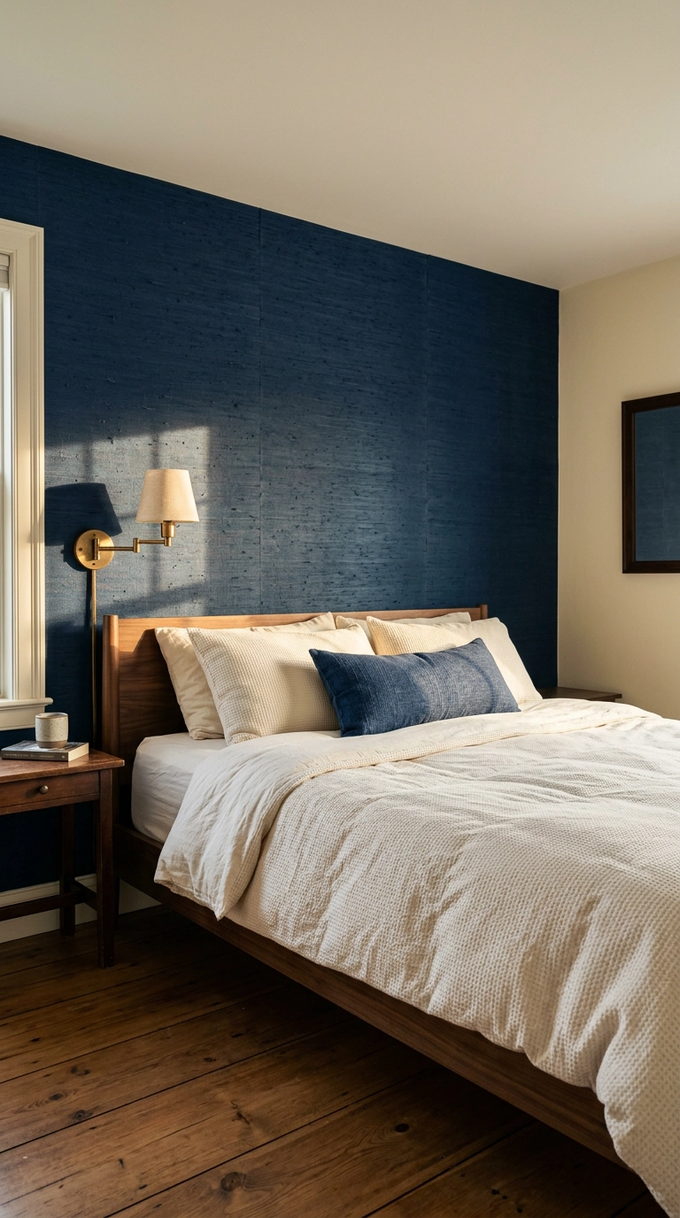
Flat dark paint can go cave-like in a room with one small window, but grasscloth in the same value catches light along every fiber and keeps the wall alive. Use it on the bed wall only, since the headboard protects the most vulnerable section from scuffs. It’s more expensive than paint per square foot and it does not love humidity, so skip it if your bedroom shares a wall with a steamy bathroom.
11. Mount Amber Glass Sconces Instead of Table Lamps
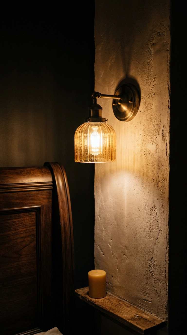
Amber and topaz glass is the sneakiest jewel tone because it only fully shows up when the bulb is on, which makes it a nighttime-only color. Sconces also free up the entire nightstand surface, and a bedroom where you can actually set down a glass of water is a bedroom that works. Renters can get the exact look with plug-in sconces and a cord cover painted to match the wall.
12. Hang One Large Ruby Textile Over the Dresser
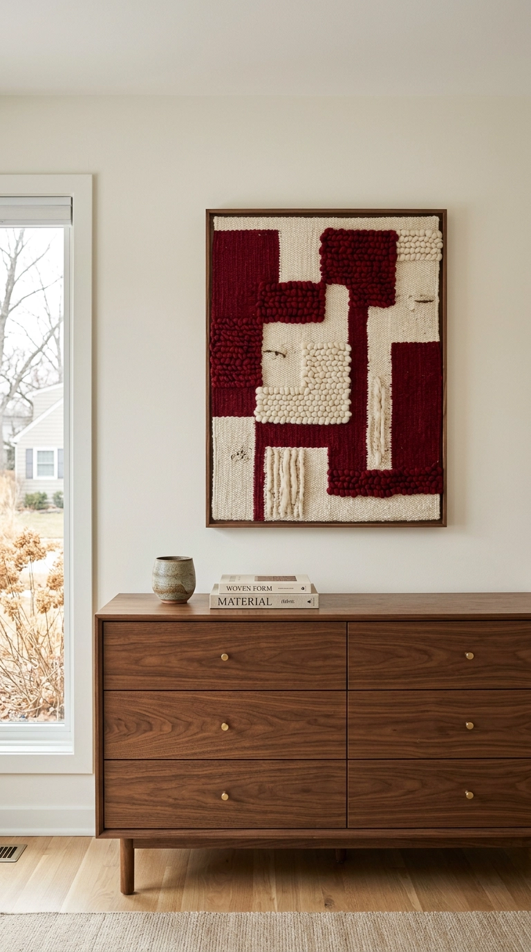
Textile art solves two problems at once: it brings deep color to a big blank wall and it soaks up echo in a room with hard floors. Go big, roughly two-thirds the width of the dresser below it, because undersized art floating over a large piece of furniture is the single most common styling mistake I fix. Hang the bottom edge six to eight inches above the dresser top so the two pieces read as one group.
13. Layer Garnet Bedding for a Dark Academia Bedroom
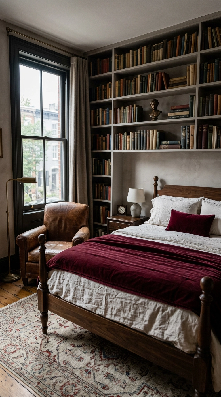
Garnet is what happens when red grows up, and layered over ivory sheets it feels closer to a library than a Valentine. Fold the coverlet back at a third of the bed length rather than pulling it flat, because the exposed sheet gives the eye a place to rest. Cotton velvet in this shade is widely available at mid-range retailers, so the look costs far less than it reads.
14. Paint Built-In Bookcases a Deep Emerald
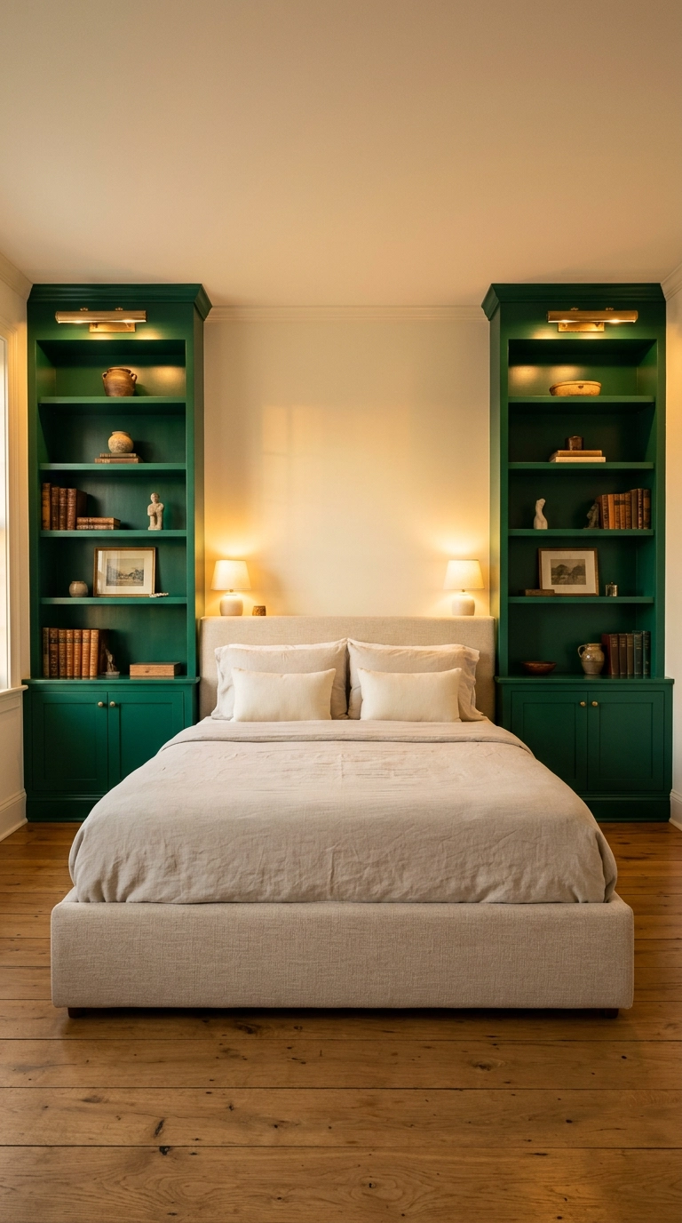
Painting millwork a saturated color instead of white is the fastest way to make builder-grade shelving look intentional. Emerald in a satin finish reflects just enough light to keep the recesses from going flat black, and Benjamin Moore Peale Green is a genuinely reliable version of this shade. If your shelves are IKEA rather than built-in, prime with a bonding primer first or the paint will peel off the laminate in a month.
15. Paint the Door and Trim Aubergine, Keep the Walls Quiet
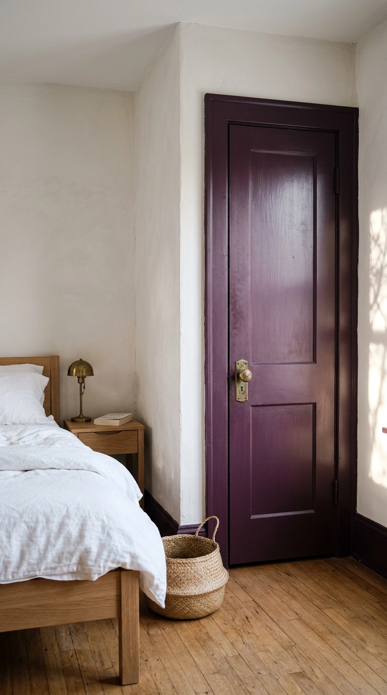
Trim color is the commitment-phobe’s jewel tone: one quart, one afternoon, and the room reads completely differently. Painting the casings and baseboards a deep aubergine while the walls stay pale outlines the room’s architecture and makes ordinary drywall look considered. Farrow and Ball Brinjal is the reference shade here, and it goes nearly black in a north-facing room, which is either a feature or a warning depending on your light.
16. Refinish a Thrifted Dresser in Sapphire Lacquer
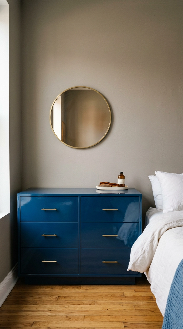
A solid-wood dresser from a thrift store plus two cans of quality lacquer costs a fraction of anything comparable new, and the high gloss is what sells the jewel effect. Gloss bounces light back into a dark room, so this piece works hardest in a bedroom with a single window. Do the spraying outside, sand between coats, and accept that this is a real weekend project rather than an evening one.
17. Pair Topaz Gold with Cane and Mid-Century Wood
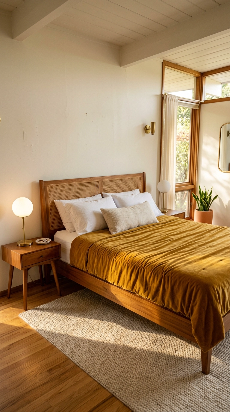
Topaz gold and mid-century teak are practically a factory pairing, since the warm orange undertone in the wood and the yellow in the textile sit right next to each other on the color wheel. This is the jewel tone I’d pick for a south-facing room, because strong afternoon sun turns gold luminous instead of muddy. In a dark north-facing bedroom, the same coverlet can read a little dishwater, so test a swatch at 4pm before you commit.
18. Style a Malachite Green Tray Vignette on the Dresser
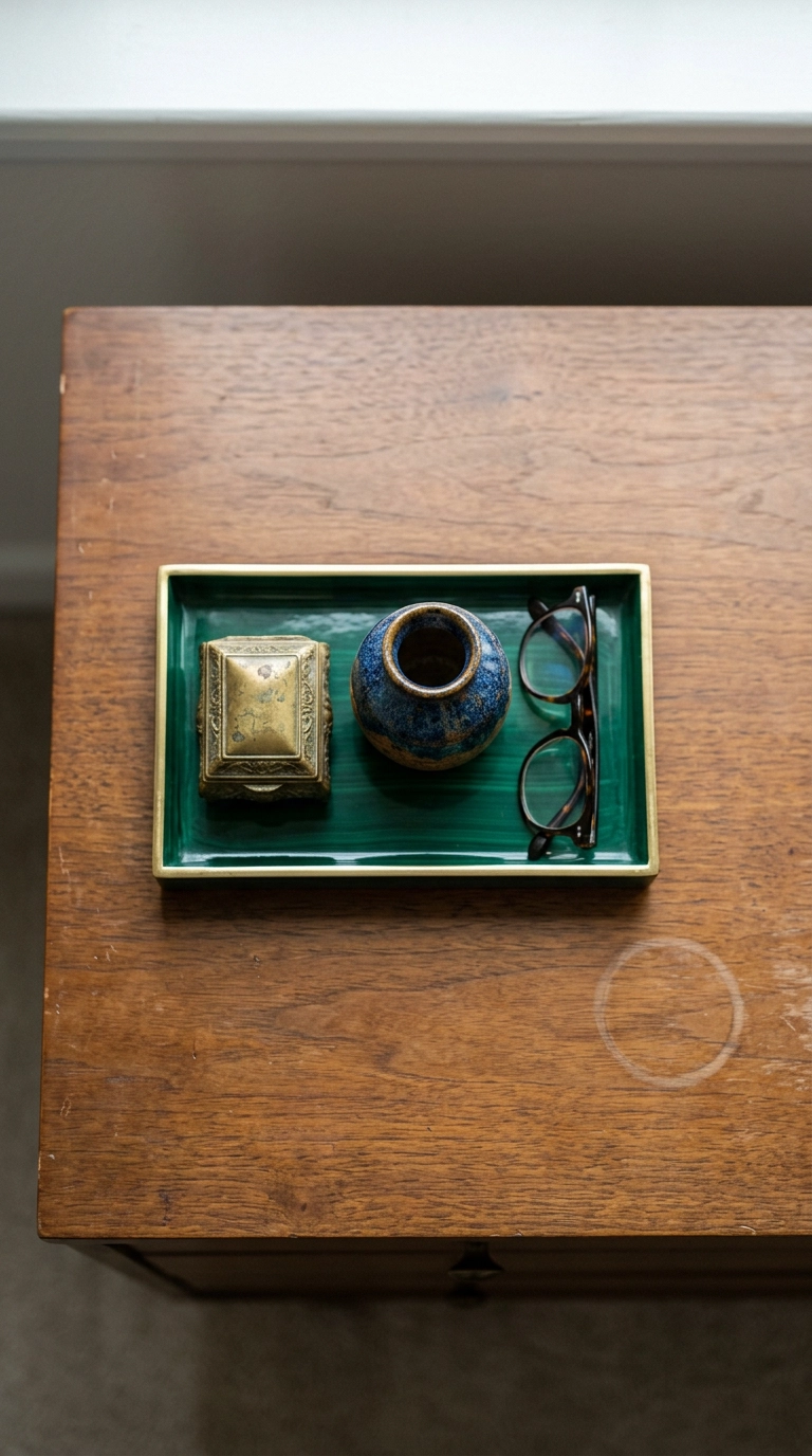
If you want jewel tones without repainting anything, a lacquered tray is a twenty-dollar entry point that also corrals the pile of stuff that migrates onto every dresser. Three objects, odd number, varied heights, because odd groupings read as arranged and even ones read as matched pairs. Keep the wood around the tray visibly bare so the vignette has a frame.
19. Go Full Oxblood in a Small Guest Room
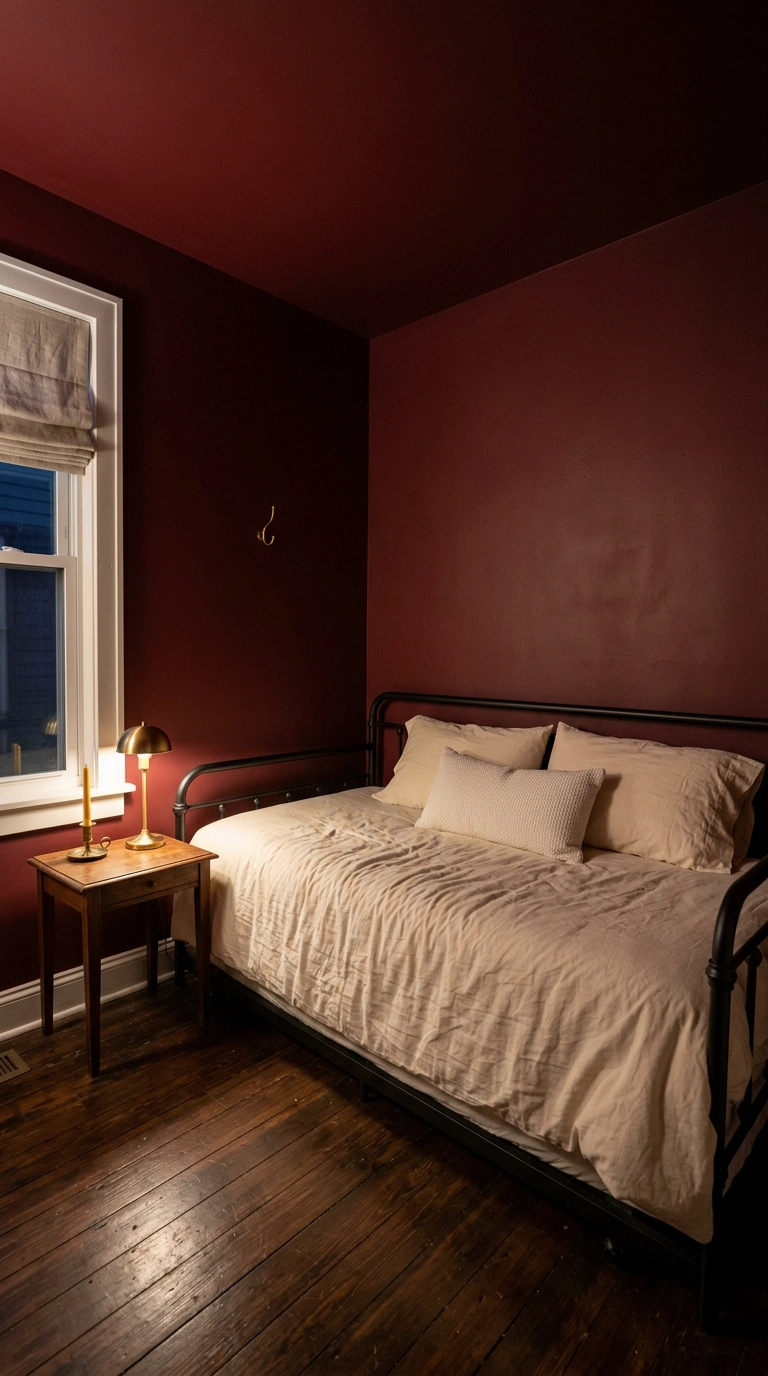
Guest rooms are the perfect place to be brave, because nobody sleeps there more than a few nights a year and you get to enjoy the drama without living in it. Oxblood is red with the sweetness taken out, and in a small windowless-feeling room it makes the space feel deliberately dim rather than accidentally dark. Farrow and Ball Preference Red is the version I keep going back to.
20. Hang Sapphire Linen Panels on a Canopy Frame
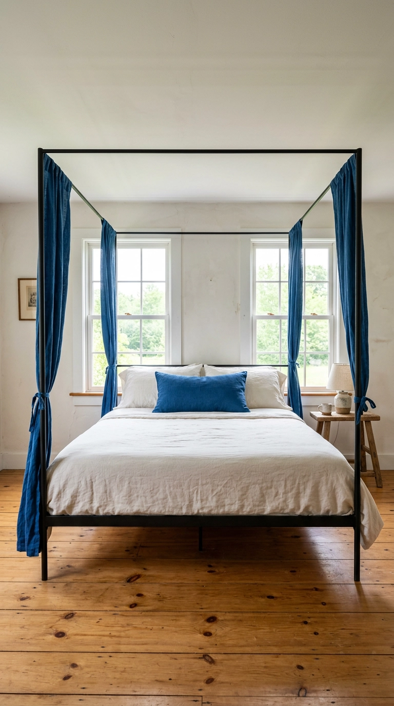
Canopy panels give you a huge amount of color at eye level without touching a single wall, which makes this one of the best rental-friendly jewel tone moves I know. Tie the panels at the corners rather than drawing them closed so the frame still reads as open and the room keeps its sightlines. Loose-weave linen is the right fabric here since heavy velvet on a slim frame looks like a stage curtain fell.
21. Run an Amethyst Upholstered Headboard Wall-to-Wall
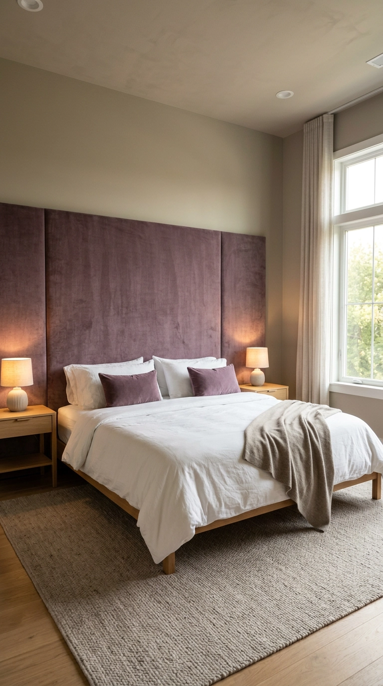
In a big primary bedroom, a standard king headboard often looks stranded, and running an upholstered panel the full wall width fixes the proportion instantly. This is a splurge or a serious DIY with plywood, batting, and a staple gun, so decide which camp you’re in before buying fabric. Muted amethyst is the one purple I trust in a large room, since brighter versions get loud fast at that scale.
22. Pair Emerald with Topaz for a Two-Jewel Room
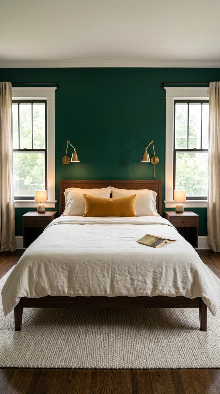
Two jewel tones is the ceiling for me, and the pairing works because emerald and topaz sit opposite enough to contrast without fighting. Give one color roughly ninety percent of the room and the other one small, saturated object, which is the ratio that separates a designed room from a bag of Skittles. If you want a third color, make it a metal or a wood tone rather than another jewel.
Where I’d Actually Start
If you take one thing from this list, make it the ratio: jewel tones behave beautifully when one color leads and everything else steps back into linen, oak, wool, and brass. The sapphire color-drenched room and the oxblood guest bedroom are the two I get the most messages about, but the honest truth is that the amethyst bedding swap and the ruby lamp shade change a room almost as much for about one percent of the effort.
What I’m seeing heading into 2026 is less full-room maximalism and more of what I’d call a single confident gesture: one grasscloth wall, one velvet headboard, one painted ceiling, and then restraint everywhere else. Kelly Wearstler has been making the case for saturated color paired with heavy texture for years, and the mainstream finally caught up, which is why every mid-range retailer now sells a decent emerald velvet pillow. The paint companies noticed too, and shades like Farrow and Ball Hague Blue and Benjamin Moore Peale Green have quietly become the default answer whenever a client says the word moody.
My real advice is to start with the thing you can undo. Buy the pillow, hang the curtains, live with it for two weeks, and then decide whether you’re a whole-room person, because the people who paint first and think second are the ones who message me in a panic on a Sunday night. If you want more of this, sign up for my weekly newsletter, where I send one room breakdown, one paint shade I’m currently obsessed with, and the occasional confession about a project that did not work.


