
23+ Cozy Blue and Grey Bedroom Decor Ideas that Feel Warm Instead of Cold in 2026

I’ll be blunt with you, because somebody has to be – blue and grey is the single easiest color pairing to get wrong, and I’ve walked into more sad, chilly, hotel-lobby bedrooms in this combination than any other. The problem is never the colors themselves, it’s that both of them are cool, so a room built on the two of them has nothing warm holding it together. Every idea below exists to fix that, and I’ve flagged what each one actually costs you in money, effort, or landlord goodwill.
Blue and Grey Bedroom Decor Ideas
1. Slate Blue Bed Wall Against Warm Greige Everywhere Else
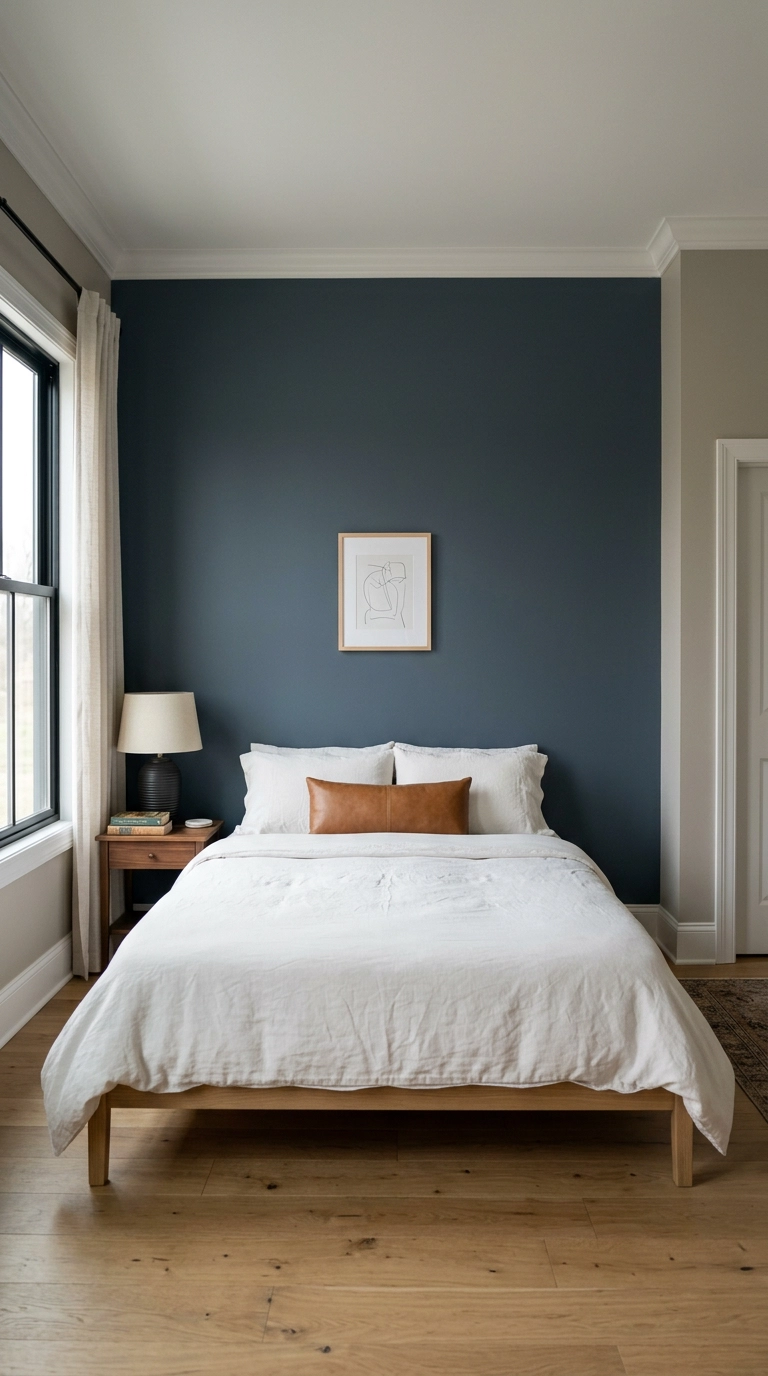
This is the highest-impact version of the palette and the one I start almost every client with. You put the blue on one wall only – the bed wall – and let a warm greige carry the other three, which stops the room from reading as one flat cool wash.
2. Rearrange What You Own So It Isn’t All Mid-Tone (Free)
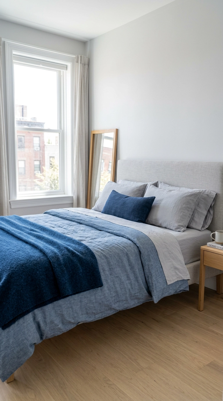
Here’s the diagnosis nobody gives you – most failed blue and grey bedrooms are failed because everything sits at the same value, meaning the same lightness. Mid-grey walls, mid-blue duvet, mid-grey rug, and the eye has nothing to grab onto, so the room reads flat and cold.
3. Warm Grey, Not Cool Grey – The Decision That Settles Everything
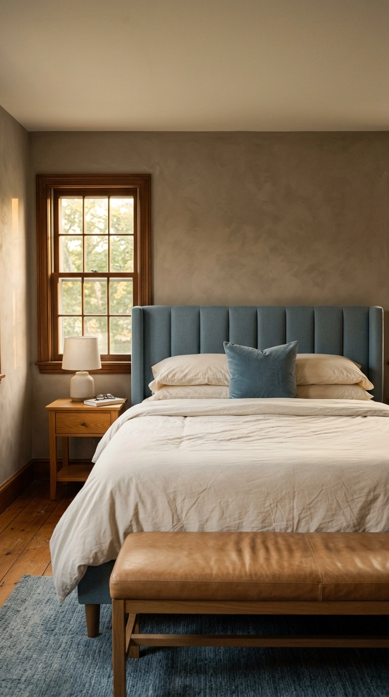
If you take one thing from this article, take this – grey splits into two camps, and mixing them is why your room feels off. Warm greys have a brown, taupe, or greige base. Cool greys have a blue, violet, or green base.
4. The Non-Negotiable Warm Third Element
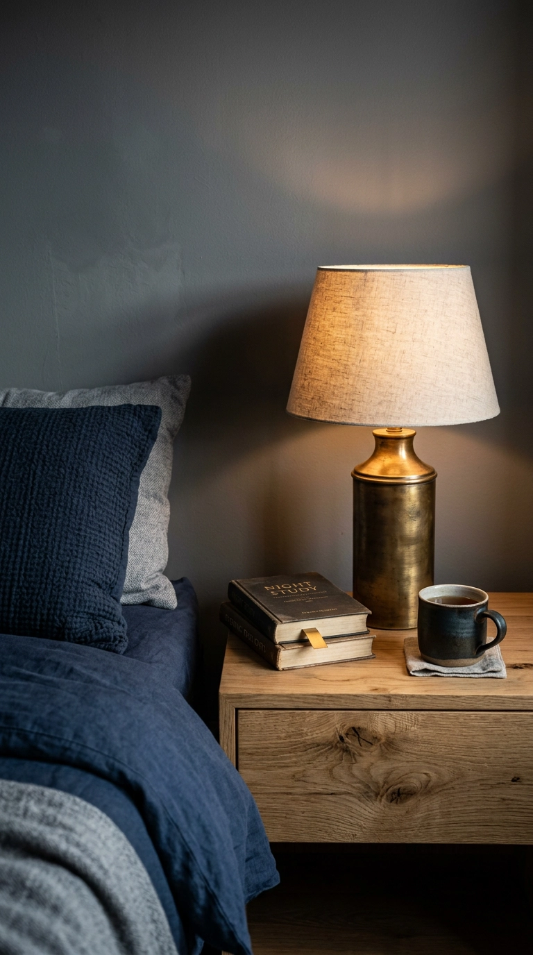
A blue and grey room needs a warm third element or it will never feel finished. Not optional, not a nice-to-have – structural. Your four best options are oak or walnut wood, camel or cognac leather, unlacquered brass, and terracotta.
5. Undertone Matching – Pair Dusty Blue With Warm Grey, Never Icy Blue With Warm Grey
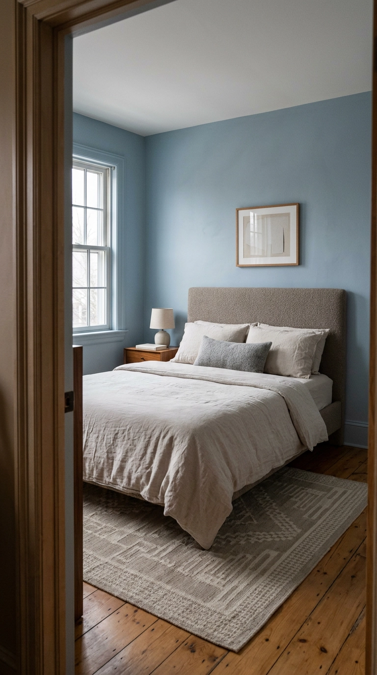
Undertones have to agree. A dusty, slightly greyed blue like Sherwin-Williams Storm Cloud has warmth buried in it, so it sits happily next to a greige. An icy, clean blue with a green undertone will fight that same greige and make the grey look muddy and yellow.
6. Texture Is What Carries a Low-Contrast Palette
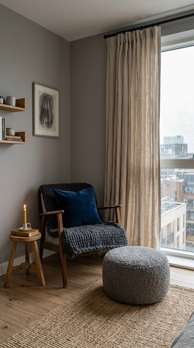
Blue and grey sit close together on the color wheel, which means low contrast, which means texture has to do the work color isn’t doing. This is why an all-smooth-cotton blue and grey room feels like a rental car interior.
7. Swap Your Cool White Bulbs for 2700K (20 Minutes, Under $20)
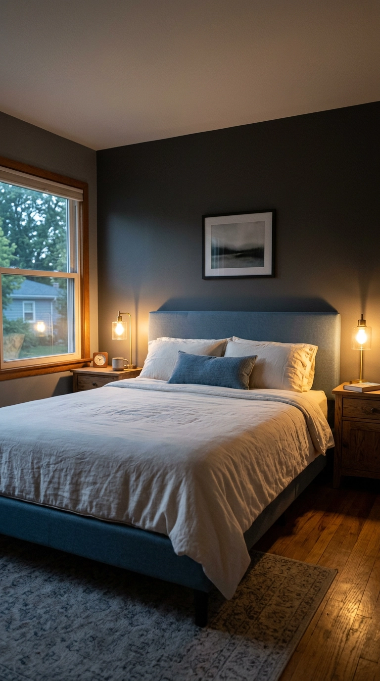
Half the cold blue and grey bedrooms I’ve been called into didn’t have a paint problem, they had a bulb problem. A 4000K daylight bulb pushes every grey toward blue and every blue toward icy, and no amount of throw pillows will save you.
8. A Camel Leather Bench at the Foot of the Bed (The Splurge Worth Making)
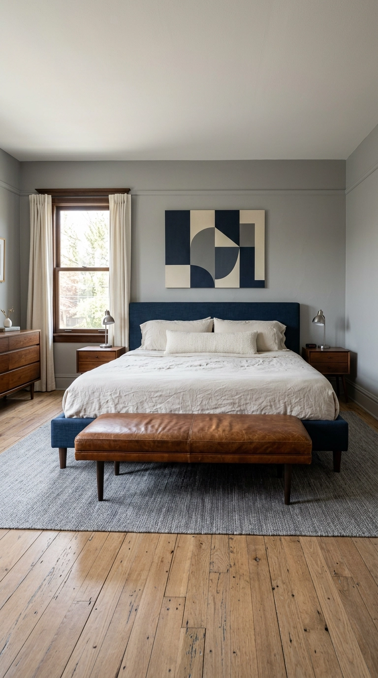
If you’re going to spend real money on one piece, spend it here. A cognac or camel leather bench sits at the exact eye level where the room’s coldness is most obvious, and leather brings both warmth and sheen in one object.
9. Color Drench One Small Bedroom in a Single Blue-Grey
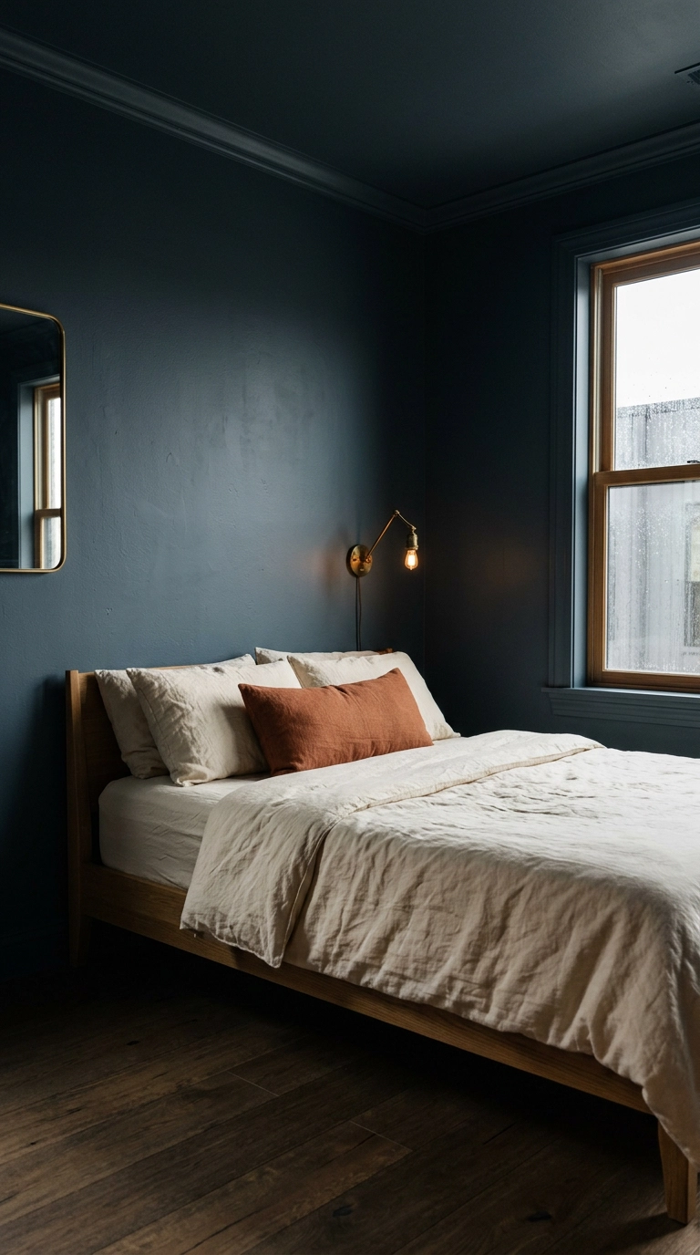
Color drenching means painting walls, trim, and ceiling all the same shade, and it’s the one time I’ll let you go all-in on a single blue-grey. It works because it erases the visual breaks that make a small room feel choppy, so the walls recede and the room reads bigger.
10. Renter-Safe Peel-and-Stick Grasscloth Behind the Bed
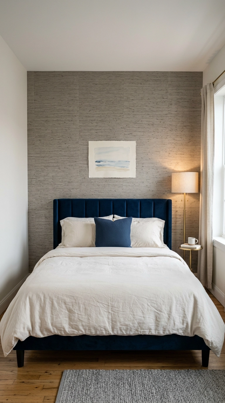
Grasscloth in a warm grey is my favorite renter cheat in this palette, because the woven texture reads as warmth even though the color is technically grey. Peel-and-stick versions have gotten genuinely good, and a single accent wall takes two rolls and an afternoon.
11. Navy With Charcoal for a Dark, Grown-Up Bedroom
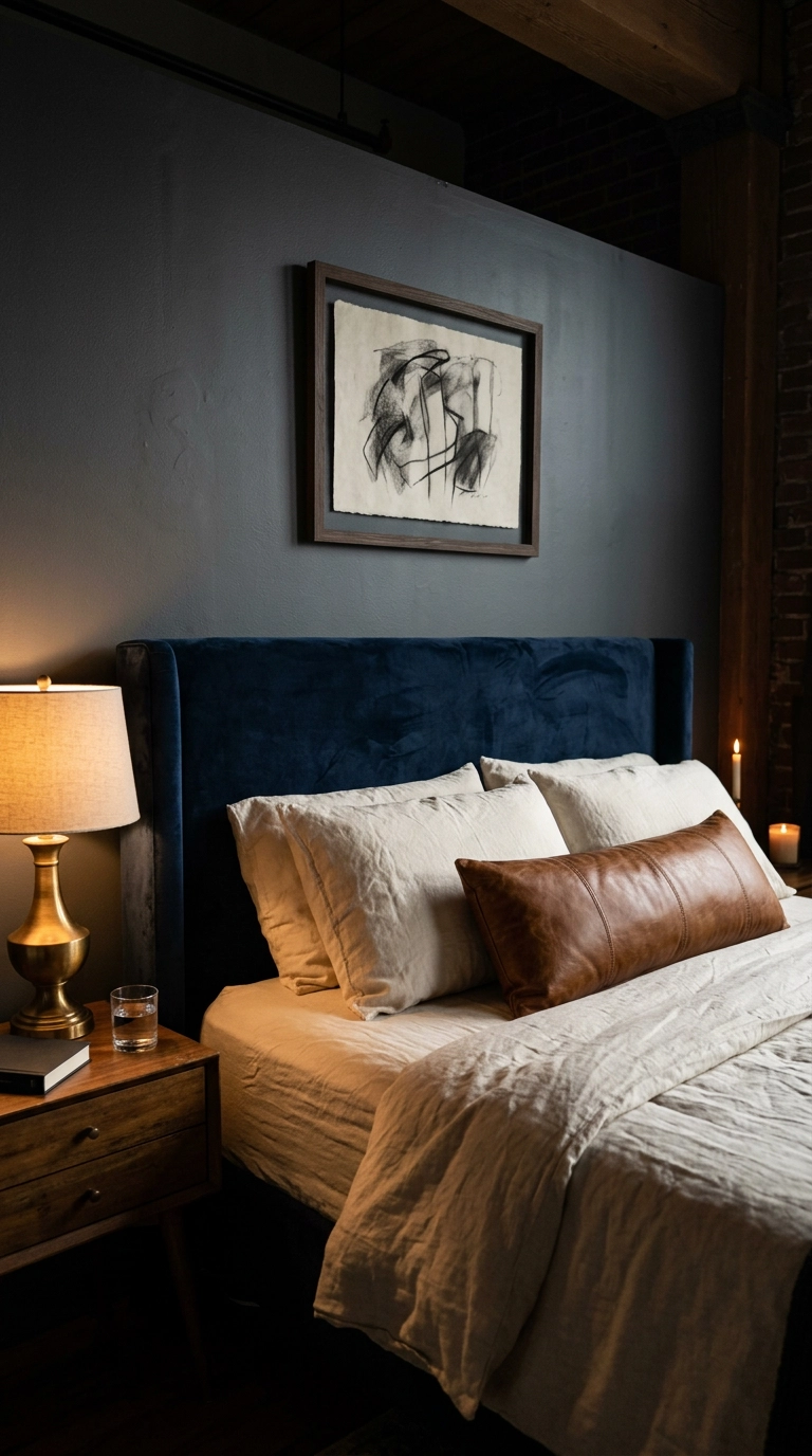
Navy against charcoal is the pairing that never lets me down, because there’s enough value difference between them to create contrast without needing a third color to referee. It reads expensive and it reads adult.
12. Hang Curtains High and Wide in a Warm Oatmeal, Not Grey
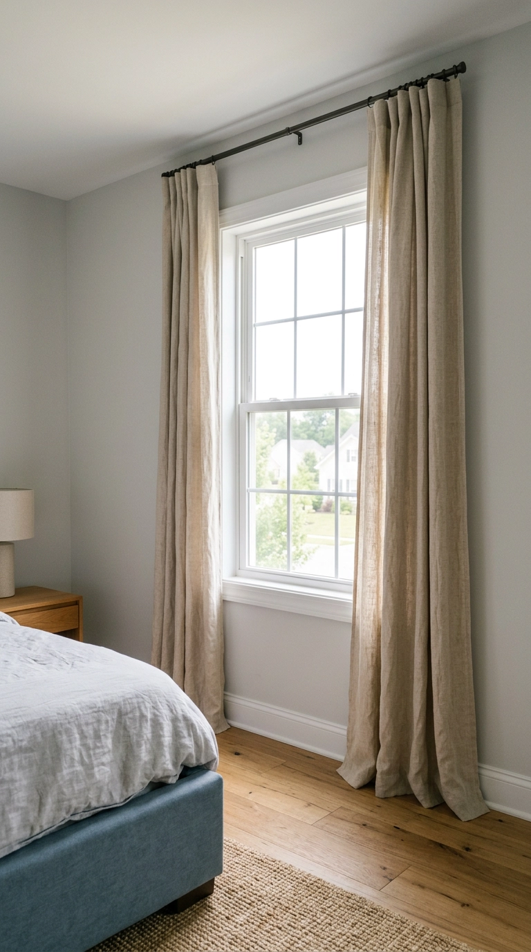
Everyone’s instinct in a blue and grey room is grey curtains. Resist it – that’s a third cool surface and it flattens the whole scheme. Warm oatmeal or bone linen gives the room the neutral it’s missing.
13. Weekend DIY: Board and Batten Wall Molding in Dusty Blue
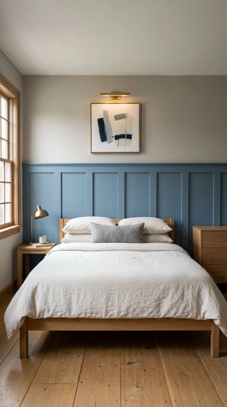
Board and batten is the best return on a weekend and a hundred and fifty dollars in lumber I know of. Running the blue on the lower two thirds and a warm grey above gives you built-in value variation without any decorating skill required.
14. A Vintage Wool Rug in Faded Blue and Rust
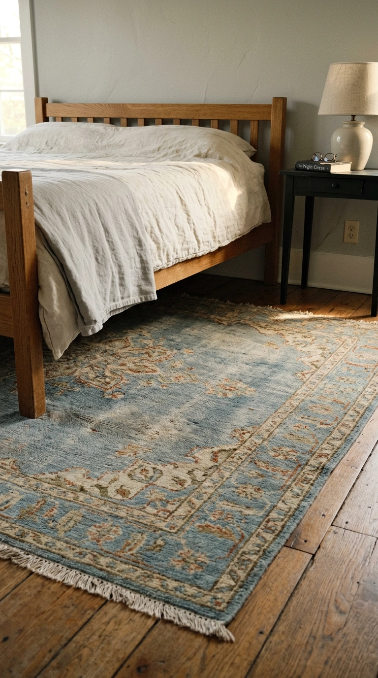
A vintage Persian or Turkish rug with faded blue and rust in it solves three problems at once – it adds the warm accent, it adds pattern, and it adds age, which is the thing brand-new blue and grey rooms are most missing.
15. Chambray Blue and Greige for a North-Facing Room
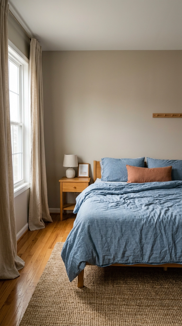
North-facing bedrooms get cool, flat, blue-tinged light all day, which is exactly the light that kills this palette. The fix is to lighten and warm both halves – chambray instead of navy, greige instead of true grey.
16. Swap Chrome Hardware for Aged Brass (One Screwdriver)
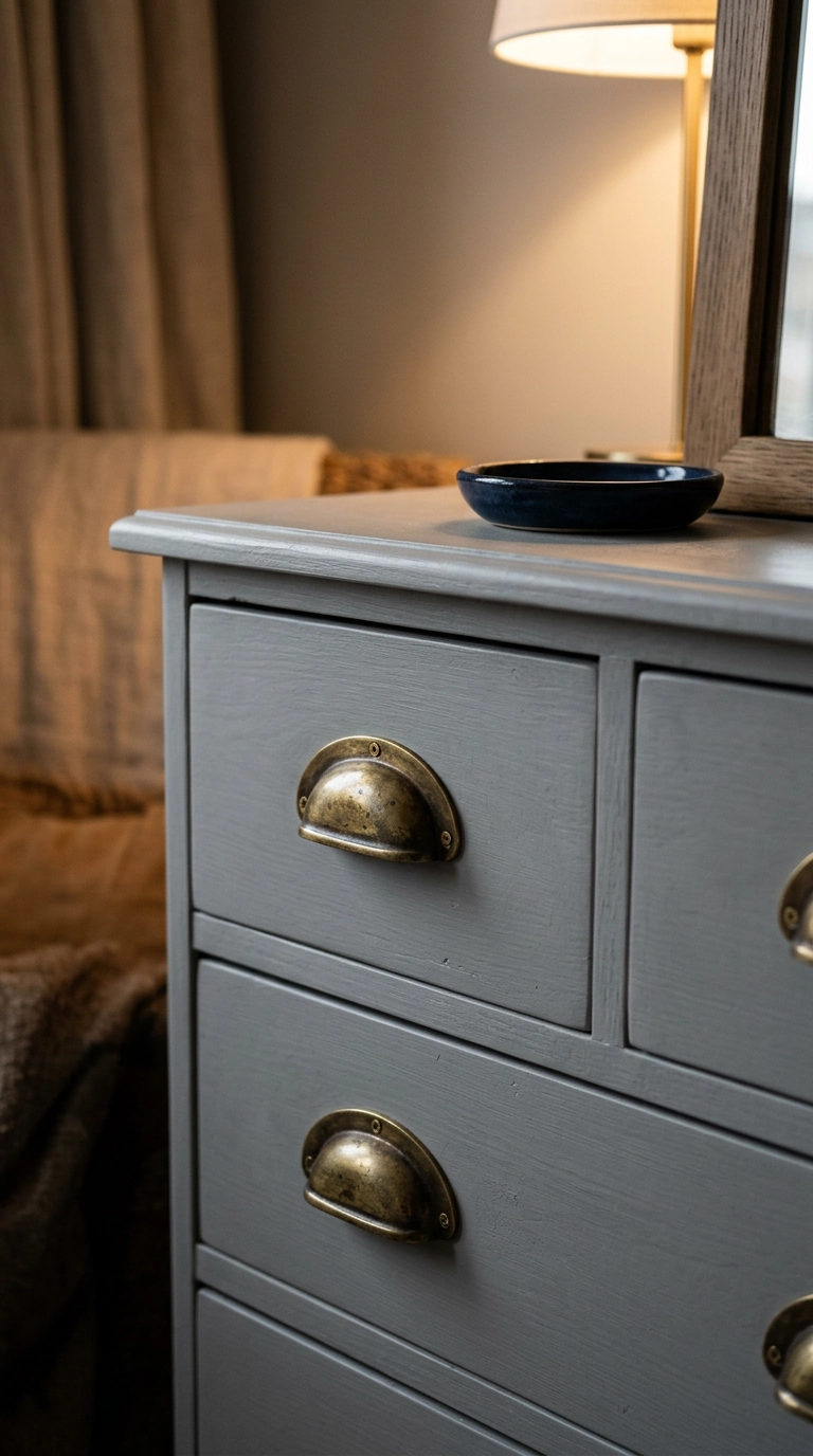
Chrome and polished nickel are cool metals, and in a blue and grey room they’re the fourth cool thing nobody counted. Swapping dresser and closet hardware to aged or unlacquered brass warms the room instantly.
17. Grey Walls, Blue Ceiling (The Move Nobody Expects)
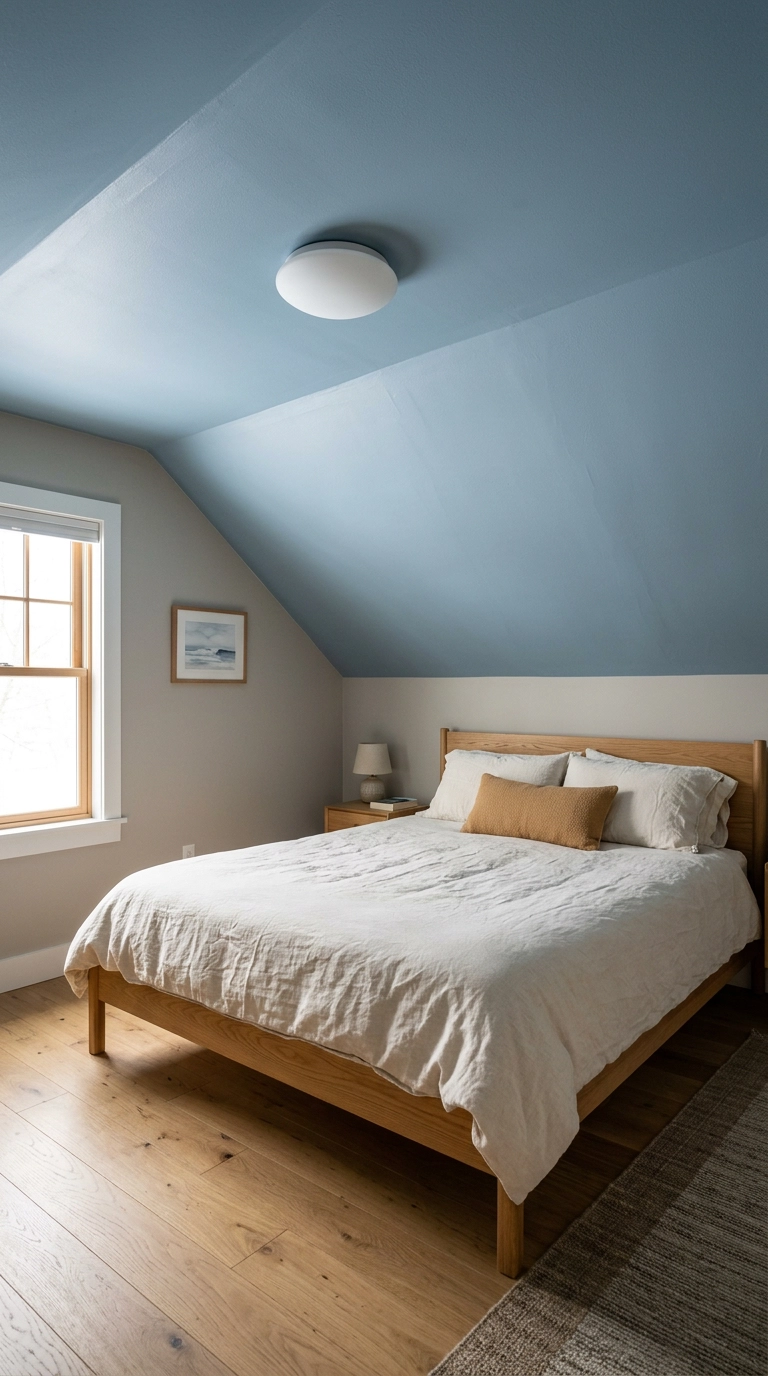
Putting the blue overhead instead of on the walls is my favorite trick for sloped-ceiling and attic bedrooms. You get the color without the walls closing in, and lying in bed staring at a soft blue ceiling is a genuinely lovely thing.
18. Lean Oversized Art Instead of Hanging It
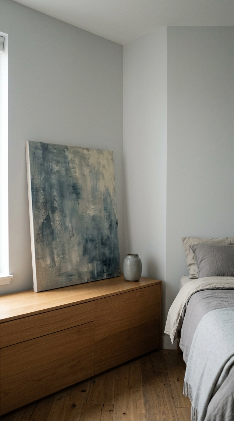
Leaning a big canvas on a dresser instead of drilling into the wall is the renter’s version of a statement piece, and honestly it looks more collected and less careful than a perfectly centered frame.
19. Pale Blue Walls With Charcoal Bedding (Flip the Ratio)
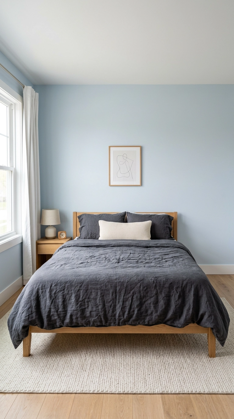
Most people put grey on the walls and blue on the bed. Flipping it – pale blue walls, charcoal bedding – gives you a much better value range, because the bed becomes the dark anchor the room needs.
20. One Small Olive Tree, and That’s Your Only Plant
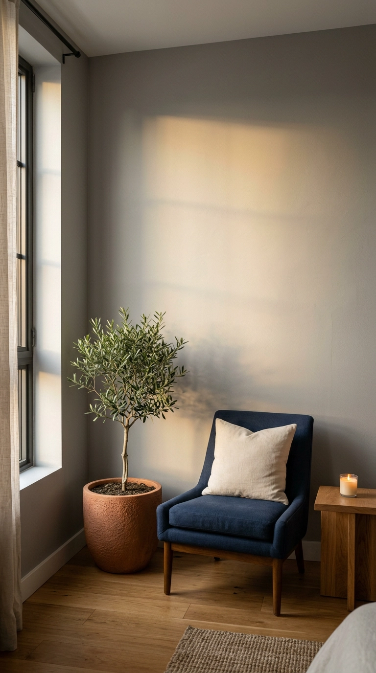
Greenery is the cheapest warmth you can buy, but a blue and grey bedroom needs exactly one plant, not seven. Silver-toned foliage like olive or eucalyptus sits naturally in this palette without looking like a garden center exploded.
21. Warm Up the Floor Before You Repaint Anything
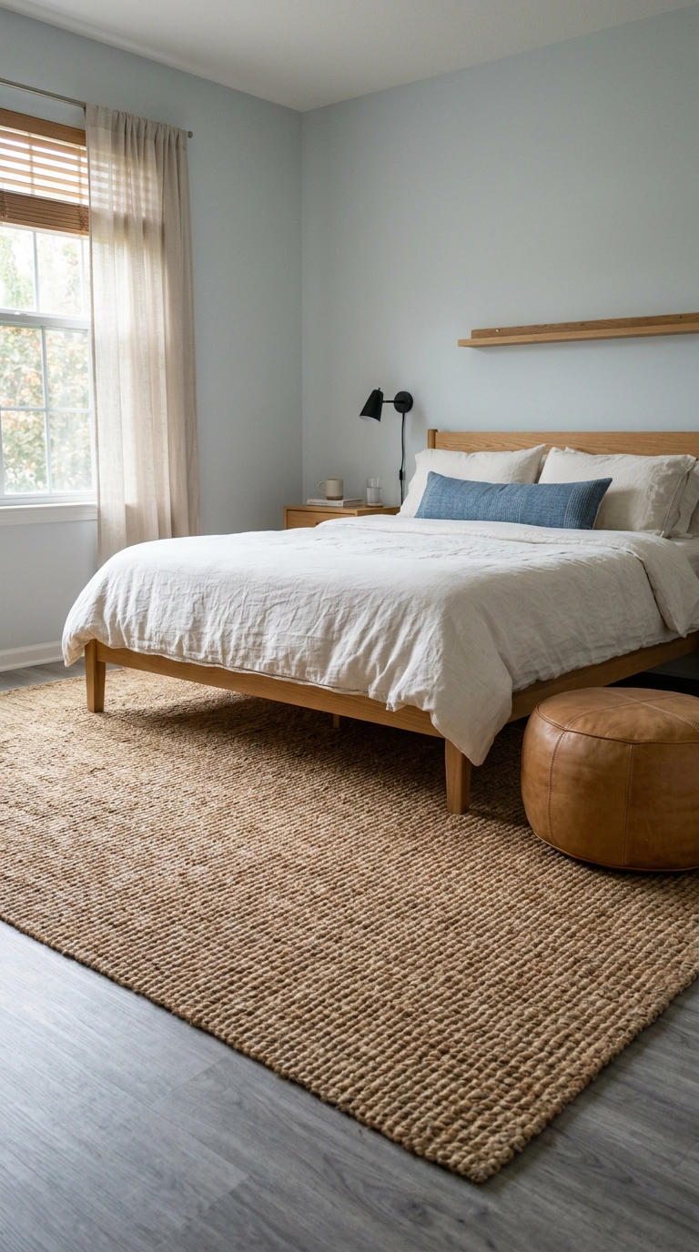
If your bedroom has grey laminate or grey-washed floors, that’s a huge cool surface working against you, and no wall color will outvote it. Cover it before you repaint.
22. Teal-Grey and Cool Concrete Grey: The Pairing to Avoid
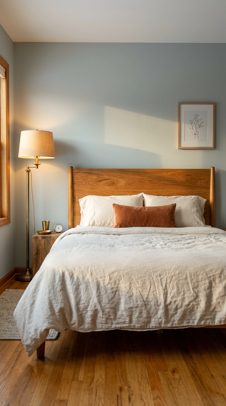
Let me name the failures directly so you can sidestep them. Teal-leaning blue with cool concrete grey goes green and institutional. Violet-based grey with any true blue turns muddy and reads purple in evening light. Icy pastel blue with silvery grey and white bedding is the nursery trap.
23. A Full-Height Upholstered Grey Headboard Behind a Blue Room (The Big Splurge)
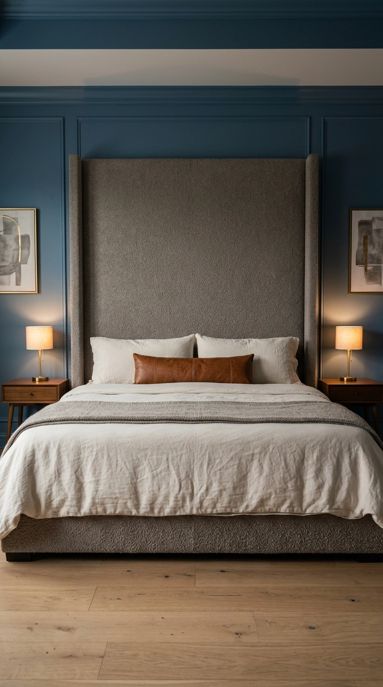
This is where I’d spend the money if the budget allowed one grand gesture. A headboard that runs nearly floor to ceiling in a warm grey boucle turns the entire bed wall into architecture, and the nubby texture keeps the grey from going flat.
Making Blue and Grey Feel Like Somewhere You Want to Sleep
If this article had a single sentence, it would be this – blue and grey doesn’t fail because of the colors, it fails because nothing in the room is warm. Warm grey over cool grey, matched undertones, and one warm third element repeated three times will rescue almost any version of this palette, and none of those three things require a renovation.
The ideas I’d start with are the cheap ones, honestly. Change your bulbs to 2700K, throw a warm jute rug over that cool grey floor, swap the chrome pulls for aged brass, and rearrange your bedding so it isn’t all one value. Do those four and then decide whether you still need to paint. If you do, the slate blue bed wall against greige is the one I’ve never regretted, and the dusty blue board and batten molding is the version that keeps showing up in the rooms I save.
What I’m seeing everywhere going into 2026 is this palette getting warmer and moodier – less silver-and-ice, more denim-and-taupe, with oak and cognac leather doing the heavy lifting. Farrow & Ball De Nimes and Benjamin Moore Hale Navy are still the shades designers reach for when they want blue that doesn’t go cold, and the full-height boucle headboard trend shows no sign of slowing. If you try any of these, I’d genuinely love to see how it turns out. Sign up for my weekly newsletter and I’ll send you the palettes, paint pairings, and shortcuts I’m testing in real client rooms before they hit the blog.


